Cohost
行业类型:生活方式
生活方式
酒店与休闲
实践类型:品牌唤新
品牌唤新
字体设计
视觉识别系统
艺术指导
SECTOR:Lifestyle
Lifestyle
Hospitality & Leisure
PRACTICE AREA:
Brand Refresh
Brand Refresh
Type Design
Visual Identity System
Art Direction
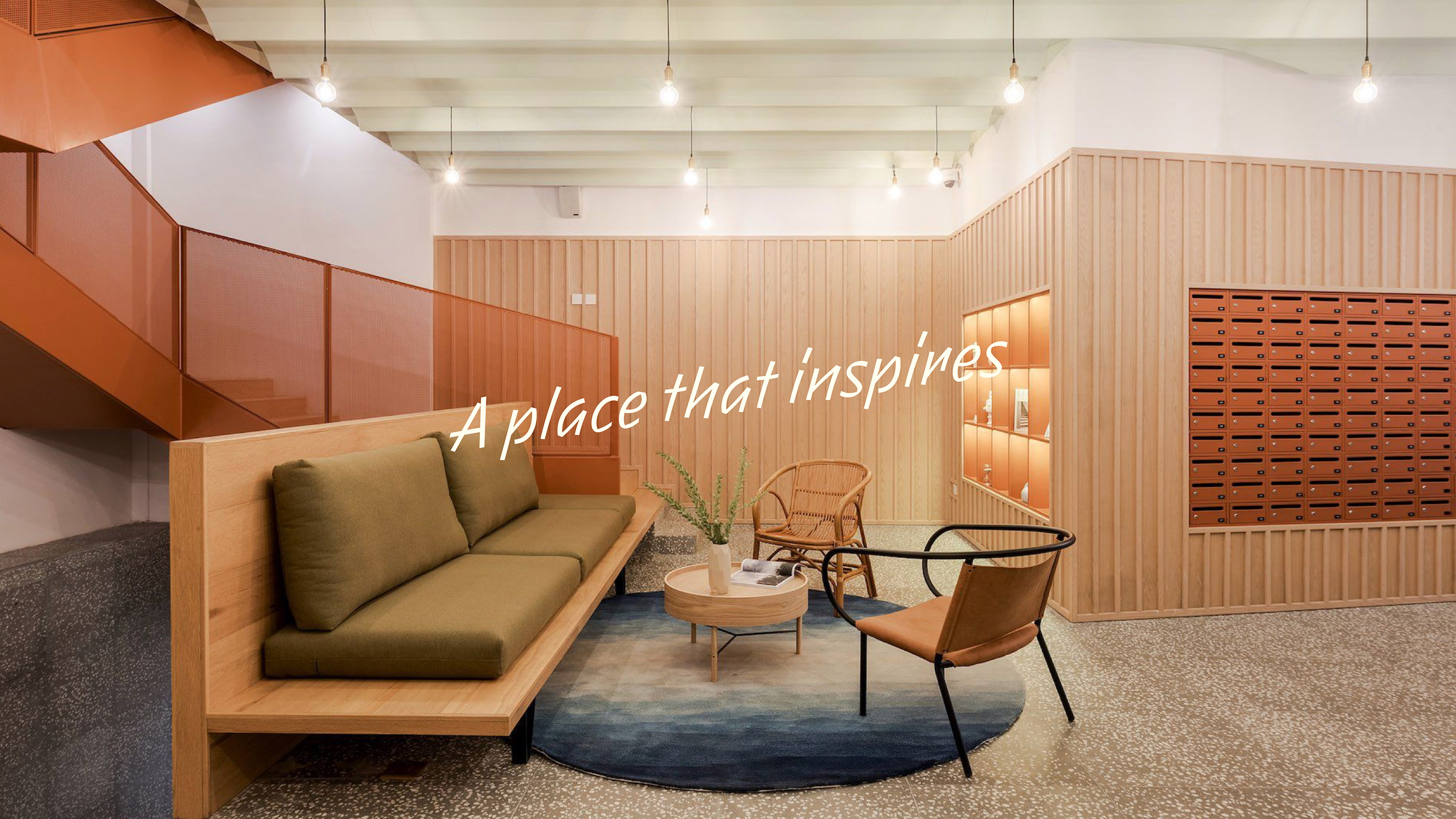
Cohost 是一家以提供优质租赁公寓作为产品,专注于“设计、社区、生活方式”,在微妙中注入灵魂的公寓社群文化运营商。他们相信空间的变革力量,相信美好的生活是由丰富的时刻组成的,希望通过精心设计的空间为日常生活带来舒适和愉悦,并激发出新的行为、新的观点、新的思维方式。Cohost 也希望自己能够成为租户个人信仰和价值观的展示,成为他们理想生活方式的具体体现。
Pocca 在该项目中旨在通过品牌唤新系统性优化 Cohost 的视觉识别系统,为品牌赋予显著的个性,帮助品牌有力且简洁的呈现“为租户提供社交、创意、联系、建设性社区、鼓舞人心的机会”的愿景,并能够与更多中国本土年轻用户与消费者建立简洁且更具情感化的连接。
Pocca 在该项目中旨在通过品牌唤新系统性优化 Cohost 的视觉识别系统,为品牌赋予显著的个性,帮助品牌有力且简洁的呈现“为租户提供社交、创意、联系、建设性社区、鼓舞人心的机会”的愿景,并能够与更多中国本土年轻用户与消费者建立简洁且更具情感化的连接。
Cohost is a premium rental apartment community operator that offers high-quality apartments, with a focus on design, community, and lifestyle. They believe that space has the power to transform lives and that a good life is made up of moments that are rich and fulfilling. Their aim is to create well-designed spaces that bring comfort and pleasure to daily life and inspire new behaviors, perspectives, and ways of thinking. Cohost also wants their apartment community to be a reflection of their tenants' personal beliefs and values, embodying their ideal lifestyle.
The objective of the brand refresh is to personify Cohost in a clear and expressive way, using a bold and simple visual identity to showcase their vision of providing opportunities for their tenants to be social, creative, connected, and constructive to their neighborhoods, as well as inspiring people. This will help them connect with younger customers.
The objective of the brand refresh is to personify Cohost in a clear and expressive way, using a bold and simple visual identity to showcase their vision of providing opportunities for their tenants to be social, creative, connected, and constructive to their neighborhoods, as well as inspiring people. This will help them connect with younger customers.
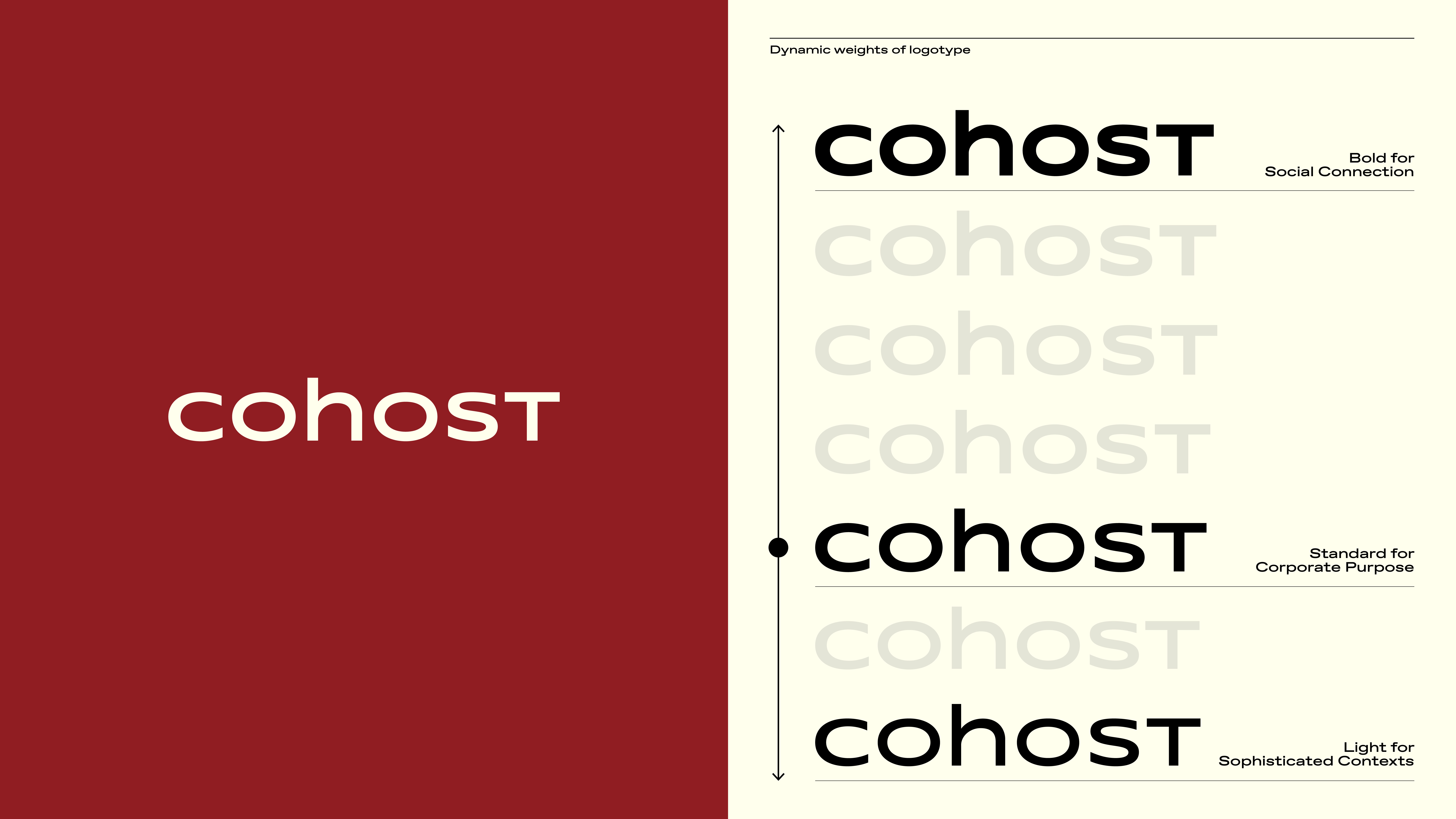
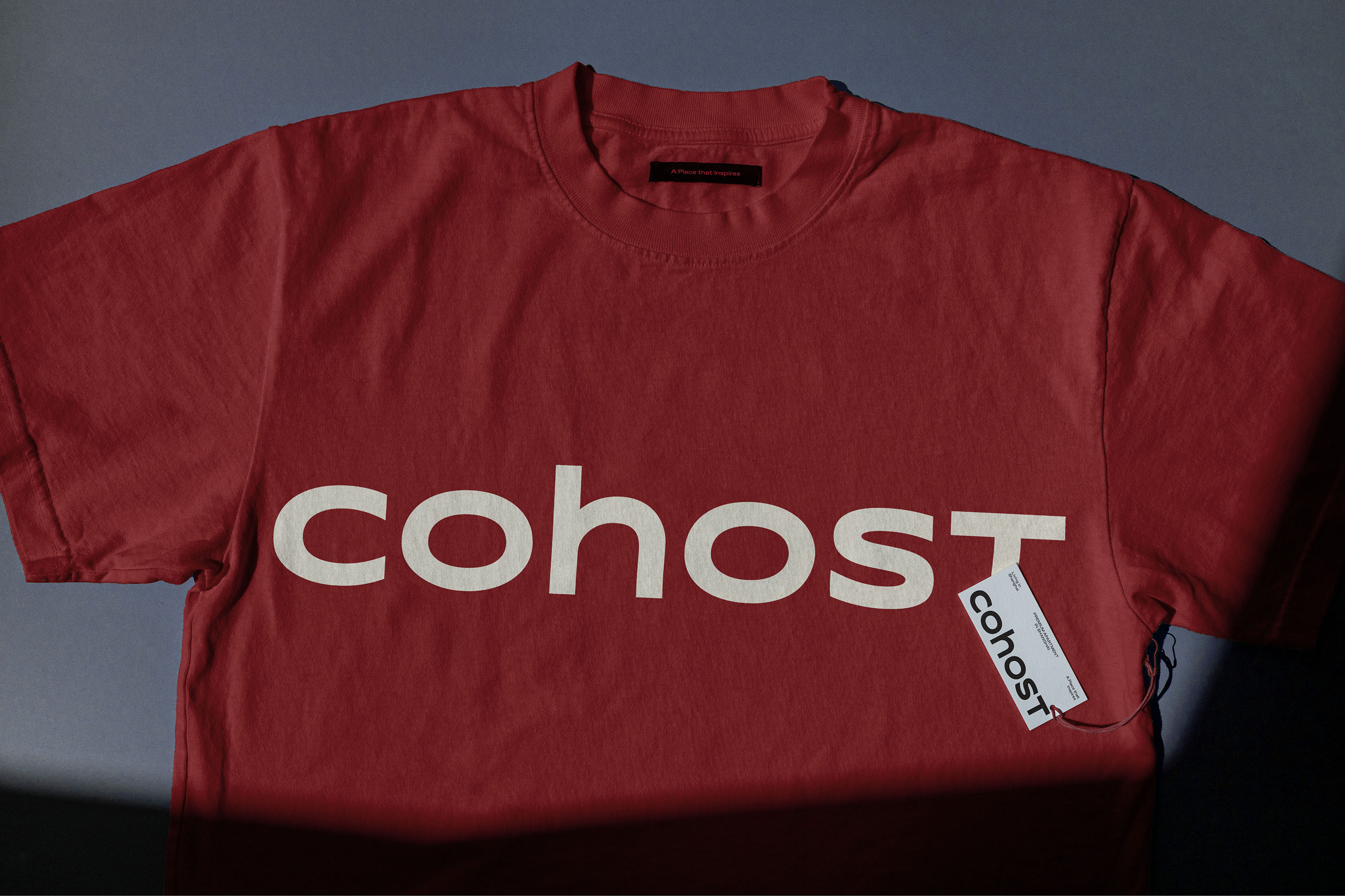
与通常为品牌确定一枚唯一的 logo 所不同的是,我们在为 Cohost 定制设计了独特的标识字型后,将字型扩展出 7 种不同的粗细版本,并首先启用其中的 3 种粗细版本都作为品牌的字型标识使用。通过这种方式,品牌的视觉标识能够在保持一致性的同时,以不同的音量灵活适用于不同的沟通场景之中。比如,最细的版本更多使用于需要安静和避免打扰的场景中,标准版本会出现在品牌进行 B2B 商业运营的场景中,最粗的版本将多用于和消费者直接对话的社群活动和社交媒体之中。
In this project, instead of creating only one logo for Cohost, we designed a customizable logo with seven different weights. After the new identity launch, three of these weights were selected to be used as the brand’s logo in the initial stage. This approach allows the brand’s logo to be easily adapted to different communication scenarios and volumes while maintaining consistency. For example, the thinnest version can be used in situations that require quietness and minimal distractions, the standard version can be used when the brand is conducting B2B operations, and the boldest version can be used in community and social media platforms when directly engaging with customers.
In this project, instead of creating only one logo for Cohost, we designed a customizable logo with seven different weights. After the new identity launch, three of these weights were selected to be used as the brand’s logo in the initial stage. This approach allows the brand’s logo to be easily adapted to different communication scenarios and volumes while maintaining consistency. For example, the thinnest version can be used in situations that require quietness and minimal distractions, the standard version can be used when the brand is conducting B2B operations, and the boldest version can be used in community and social media platforms when directly engaging with customers.

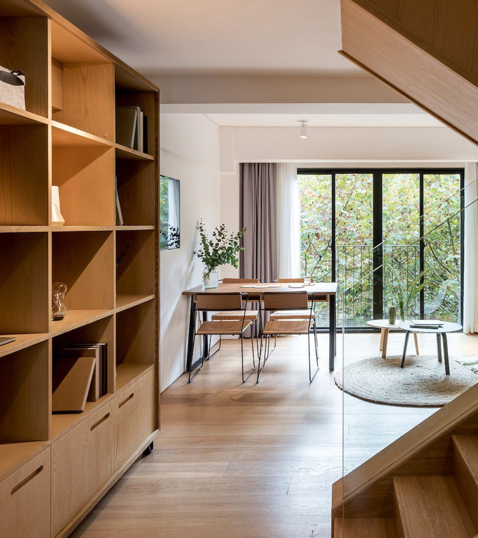


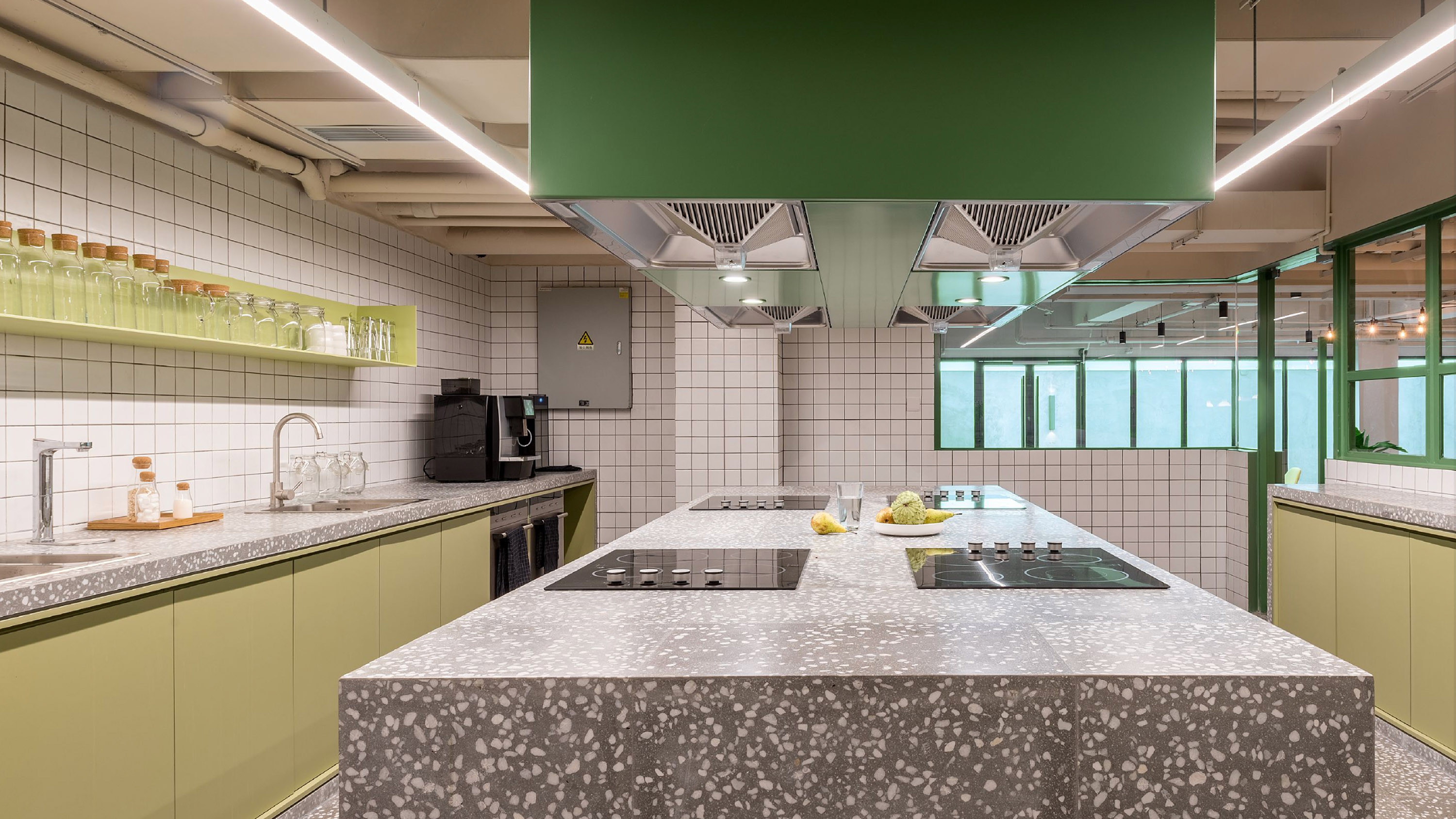
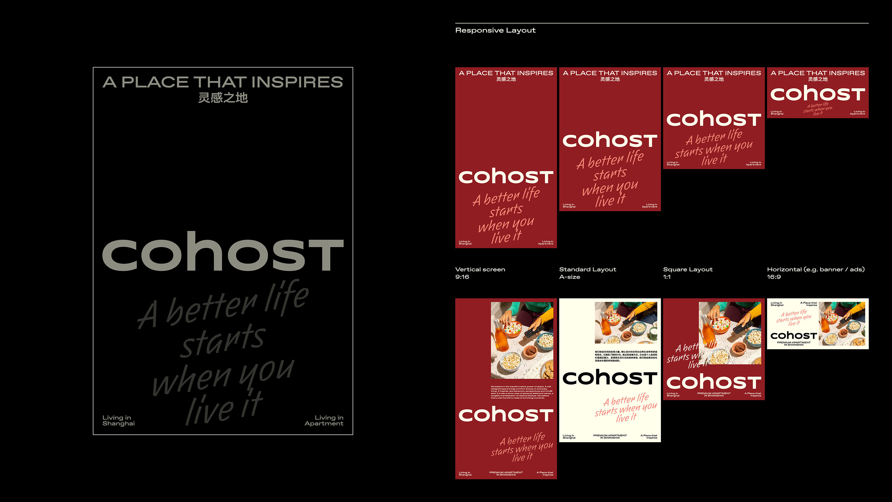
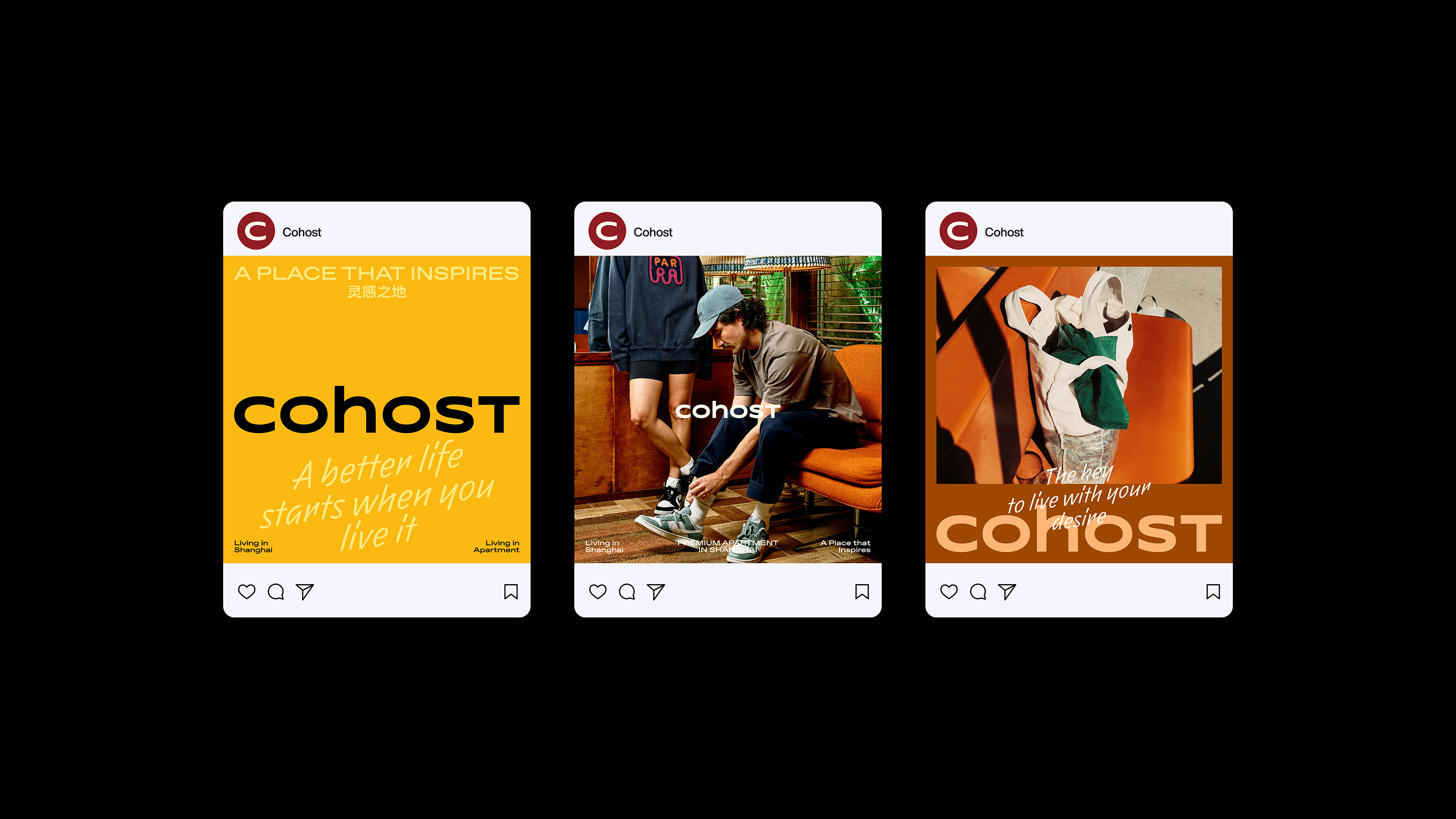
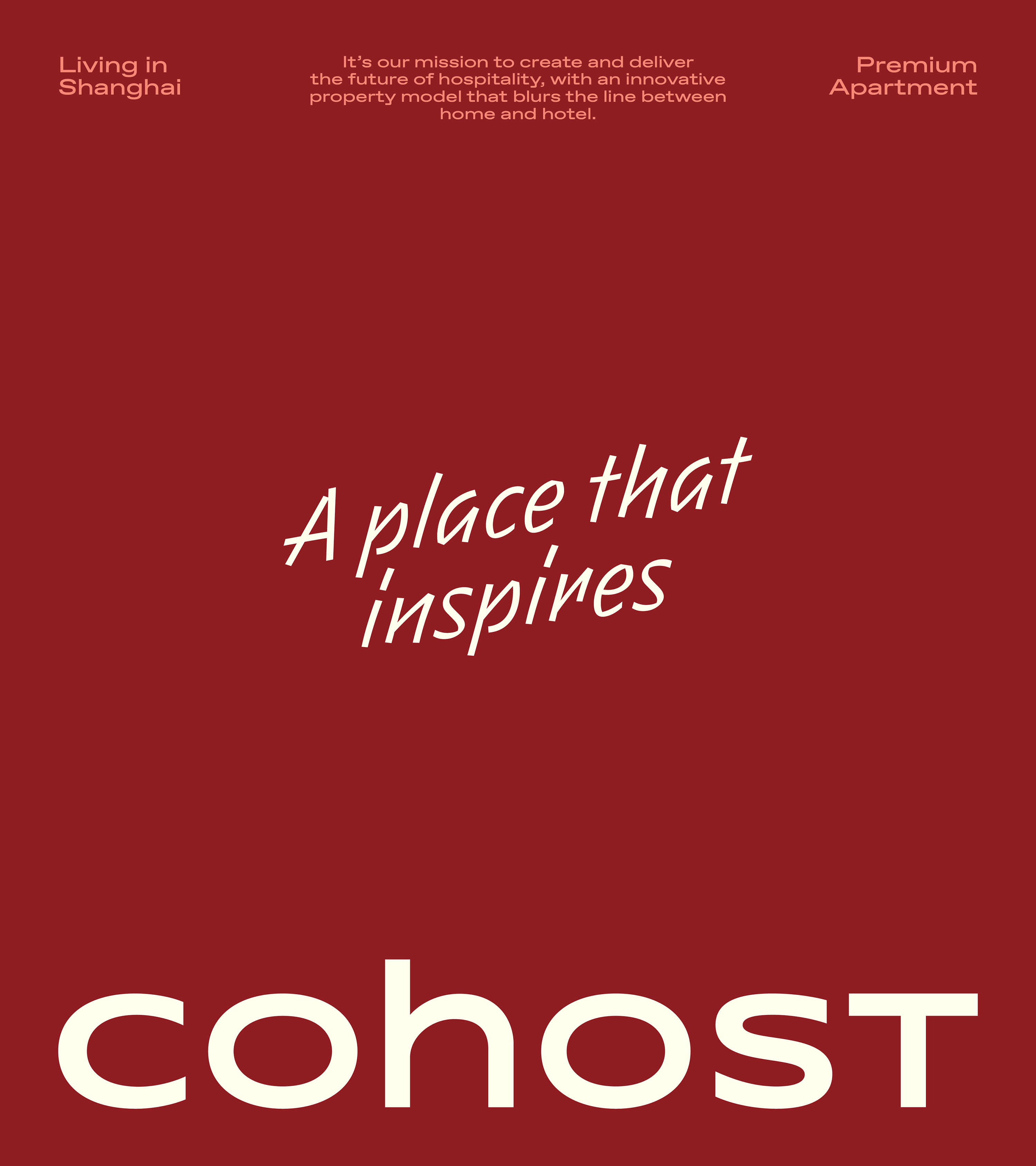
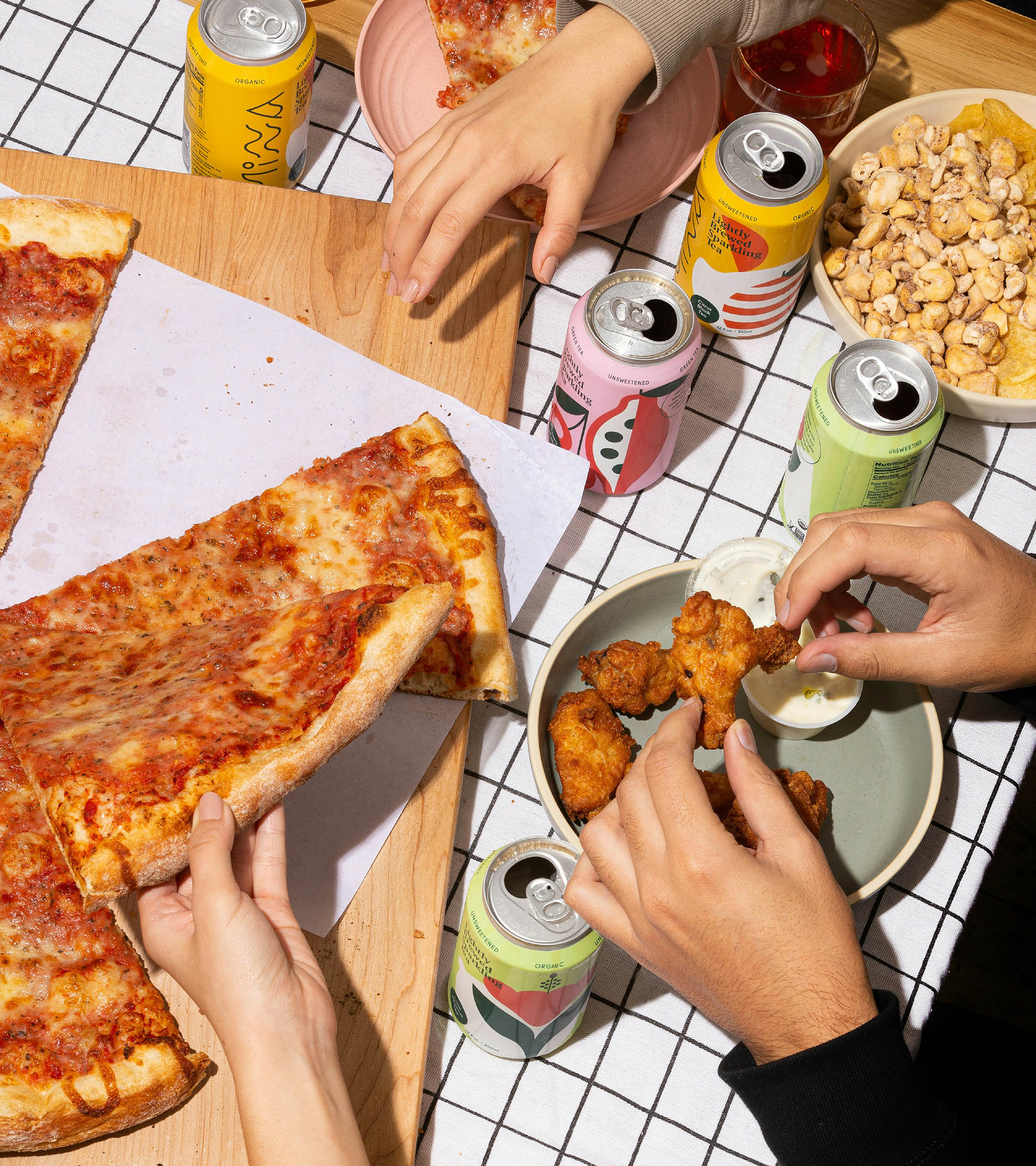
源于 Cohost 简约、多彩,且具有稍稍装饰趣味的空间设计风格,我们在视觉识别系统的表达中也将浓郁且多彩的格调收录其中,为品牌的视觉沟通创造丰富多样的情绪。与此相对应,我们创建了响应式的版面编排网格系统,以满足从竖版显示屏、标准海报,到社交媒体图片和横版的网站条幅的不同媒介尺寸的统一性和整体性。
Based on Cohost’s interior design style, which is simple, colorful, and slightly decorative, we incorporated rich and varied elements into the visual identity system to convey different emotions for the brand’s communication. To ensure consistency and coherence across different media sizes, including vertical displays, standard posters, social media images, and horizontal website banners, we developed a responsive layout system.
Based on Cohost’s interior design style, which is simple, colorful, and slightly decorative, we incorporated rich and varied elements into the visual identity system to convey different emotions for the brand’s communication. To ensure consistency and coherence across different media sizes, including vertical displays, standard posters, social media images, and horizontal website banners, we developed a responsive layout system.
