循环现物
Circunow
行业类型:制造业
制造业
循环经济
实践类型:
投资与运营
投资与运营
商业策略
商业模型设计
品牌策略
产品策略
品牌运营
品牌力管理
品牌命名
视觉识别系
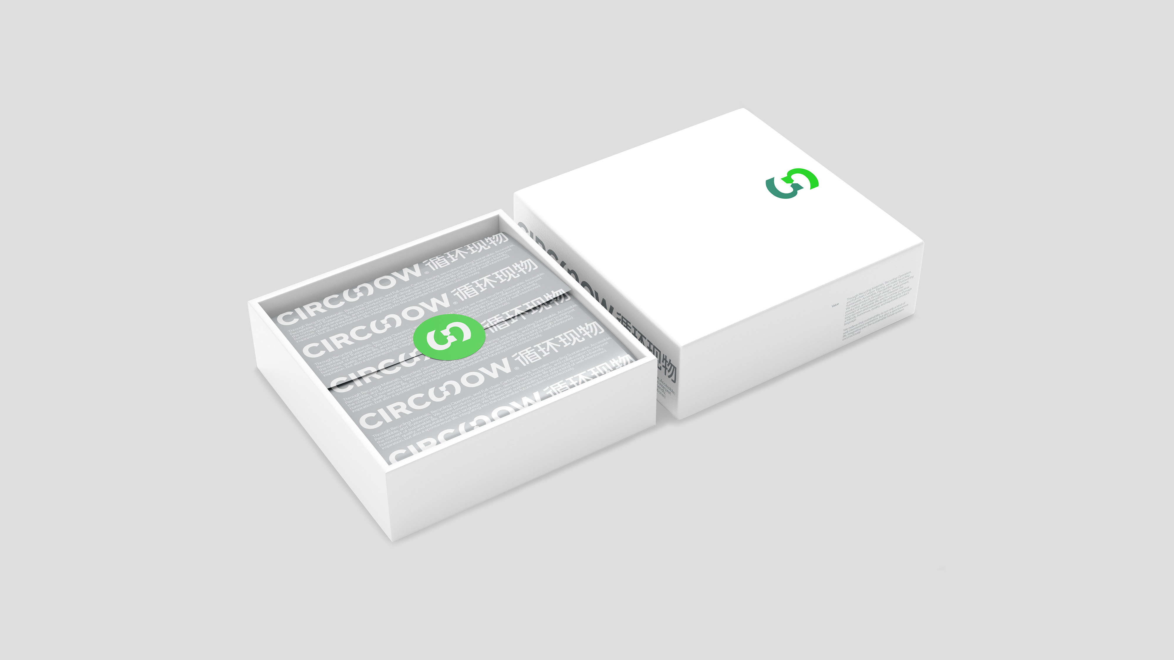
包装设计
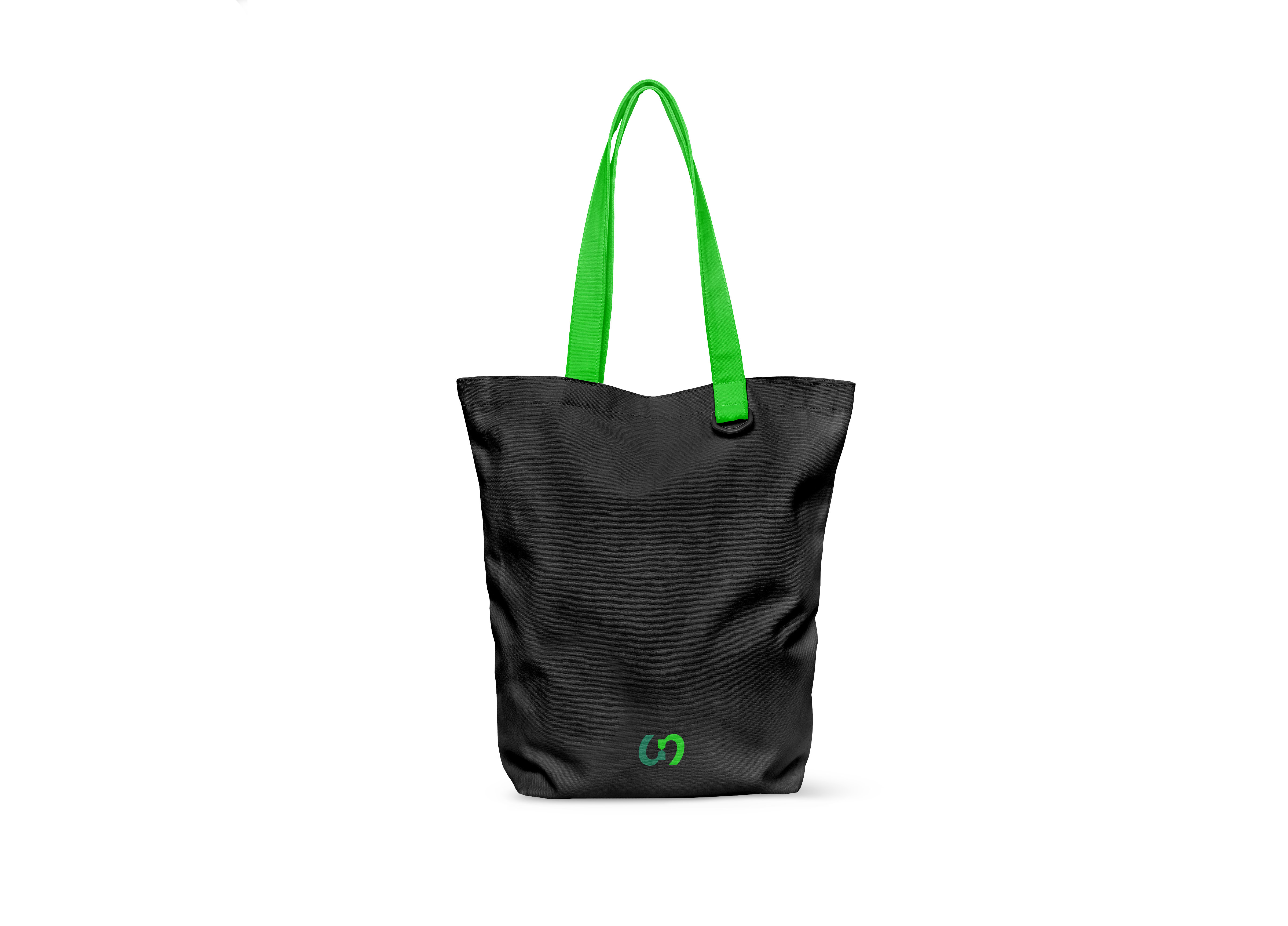
产品设计
活动策划与设计
SECTOR:Manufacturing
Manufacturing
Circular Economy
PRACTICE AREA:
Investment & Operation
Investment & Operation
Business Strategy
Business Model Design
Brand Strategy
Product Strategy
Brand Operation
Brand Growth Management
Naming
Visual Identity System Design
Packaging
Product Design
Event Planning and Design
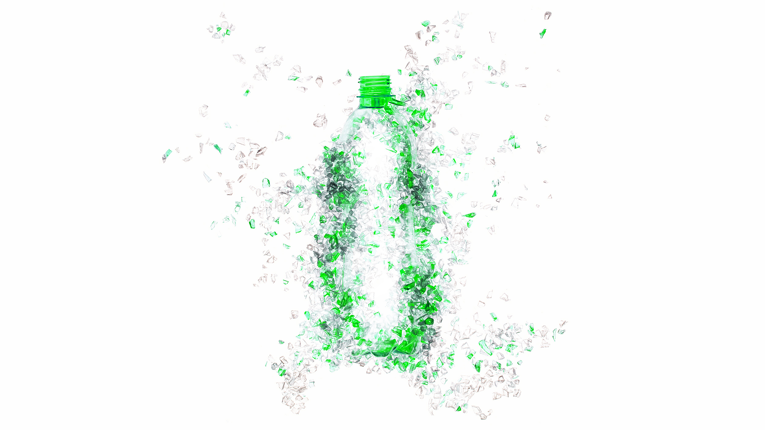
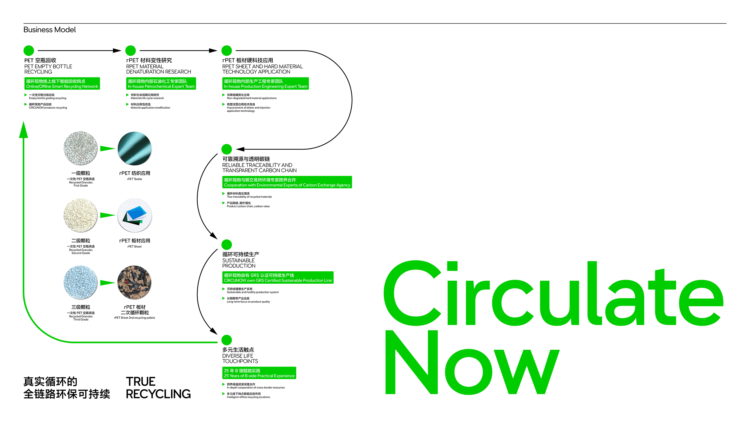
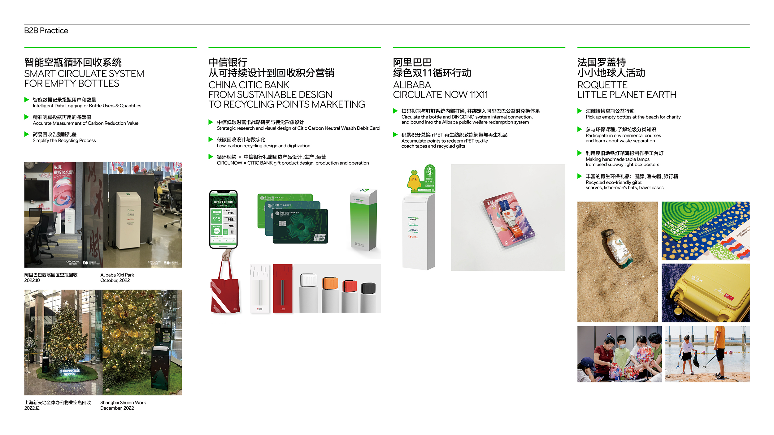
Circunow 循环现物是由 Pocca 作为股东之一参与孵化、设计、运营、管理的一间公司与品牌,成立于 2021 年,其专注于循环材料、循环运营、全链路碳追踪的系统性解决方案的实践。品牌强调通过真实的循环,创造友善、平等、轻趣、有品的产品与行动,以实现真实有效的低碳实践。截止目前,品牌已成功与阿里巴巴西溪园区、瑞安办公、中信银行、法国罗盖特、等知名企业完成不同形式与类别的合作,并也积极投身于与庆元县教育公益、UNFOLD上海艺术书展等项目合作的公益与共益的环保实践当中。
Circunow is a company and brand that Pocca participates in incubation, design, operation, and management as one of its shareholders. It focuses on the practice of systematic solutions for circular materials, circular operations, and full-chain carbon tracking. The brand emphasizes the creation of friendly, equal, fun, and quality products and actions through a real cycling to achieve real and effective low-carbon practices. Up to now, the brand has successfully completed different forms and categories of cooperation with well-known enterprises such as Alibaba Xixi Park, Shui On Office, China CITIC Bank, France Roquette, etc., and has also actively participated in cooperation with Qingyuan County Education Public Welfare, UNFOLD Shanghai Art Book Fair in the public welfare and mutual benefit practice of environmental protection.
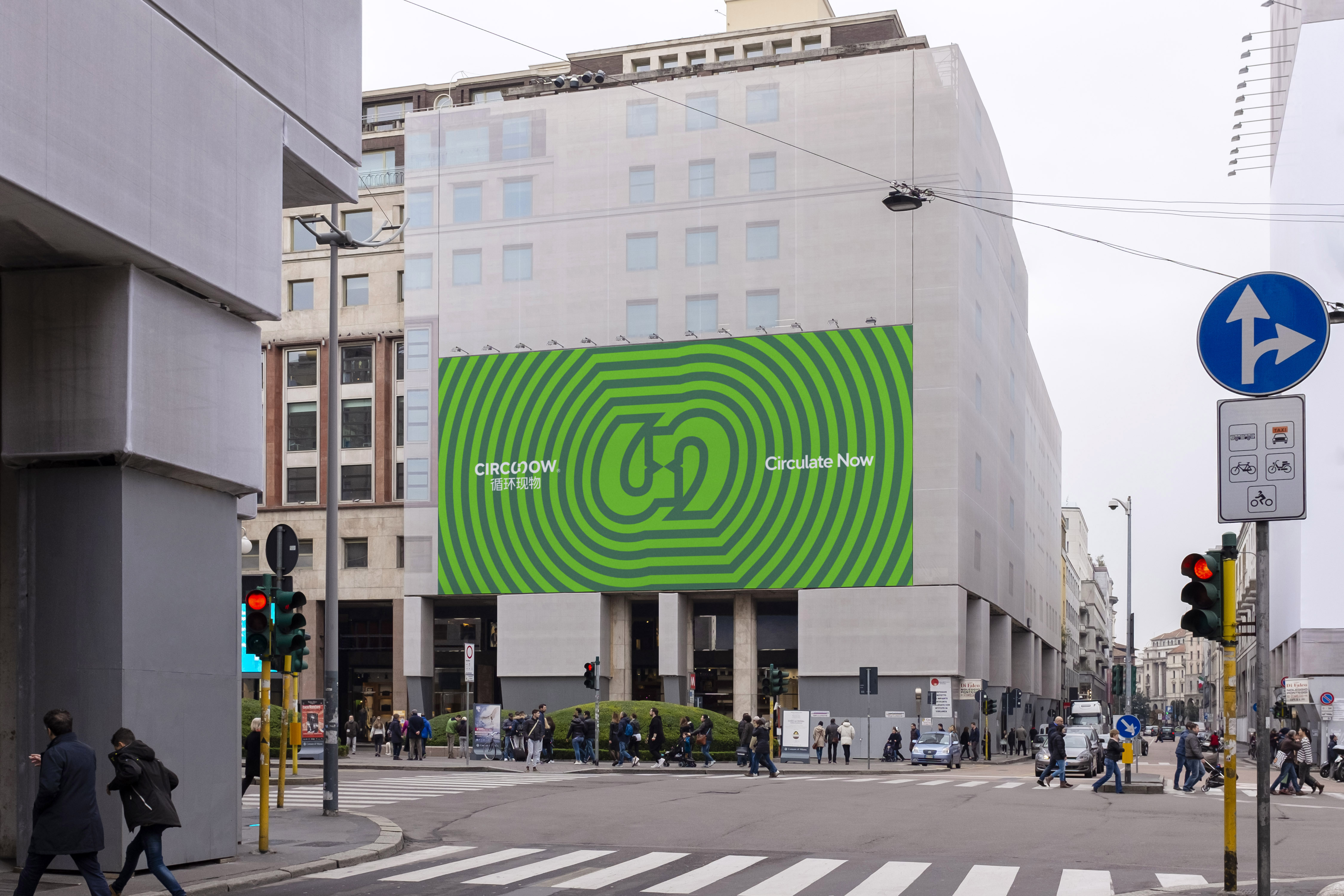

Circunow 品牌的名称来源于我们将 circulate(循环)中的“late(迟到)”替换为“now(现在)”,寓意“即刻循环”。与之对应的中文名称“循环现物”则强化了循环的倡导和行动不仅仅是一种善意的感召,更是一种真实且即刻可触可感的生活。
品牌的视觉符号源于公众最广泛的对于“循环再生”的图像化的印象,也来自于品牌名称 Circunow 中“循环”与“现在”无缝相连的愿景 的意象。中英文文字标识中,去除多余冗扰细节的定制的中英文字型,呈现基于工业制造的标准化、基础款的气质,以匹配 Circunow 企图通过产品传递的大众、基础、标准、平等、友善的愿望,让循环与环保走入大众与日常。
品牌的视觉符号源于公众最广泛的对于“循环再生”的图像化的印象,也来自于品牌名称 Circunow 中“循环”与“现在”无缝相连的愿景 的意象。中英文文字标识中,去除多余冗扰细节的定制的中英文字型,呈现基于工业制造的标准化、基础款的气质,以匹配 Circunow 企图通过产品传递的大众、基础、标准、平等、友善的愿望,让循环与环保走入大众与日常。
The brand name ‘Circunow’ comes from our replacement of the ‘late’ in ‘circulate’ with ‘now’, which means ‘To Circulate Now’. The corresponding Chinese name strengthens that the advocacy and actions of the circular are not only a kind appeal, but also a real and immediately palpable life.
The symbol originates from the public's most widespread pictorial impression of ‘recycling’, as well as the vision of the seamless connection between ‘circulate’ and ‘now’ in the brand name Circunow. In the bilingual wordmark, the customized Chinese and English typefaces that remove redundant details present a standardized and basic temperament based on industrial manufacturing, in order to match Circunow’s desire to convey the public, foundation, standard, equality, and friendliness through products, and to let recycling and environmental protection enter the public and daily life.
The symbol originates from the public's most widespread pictorial impression of ‘recycling’, as well as the vision of the seamless connection between ‘circulate’ and ‘now’ in the brand name Circunow. In the bilingual wordmark, the customized Chinese and English typefaces that remove redundant details present a standardized and basic temperament based on industrial manufacturing, in order to match Circunow’s desire to convey the public, foundation, standard, equality, and friendliness through products, and to let recycling and environmental protection enter the public and daily life.

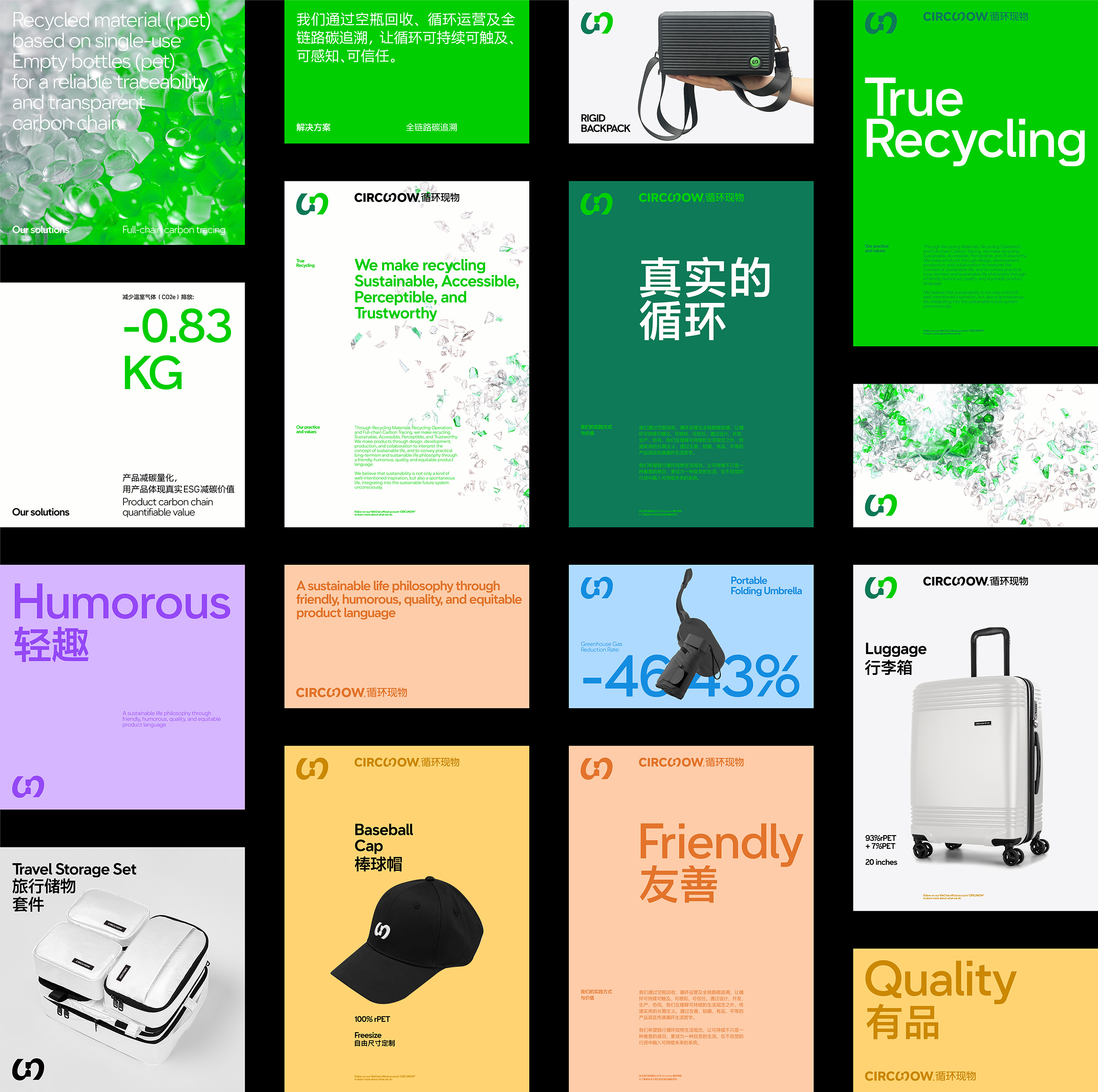
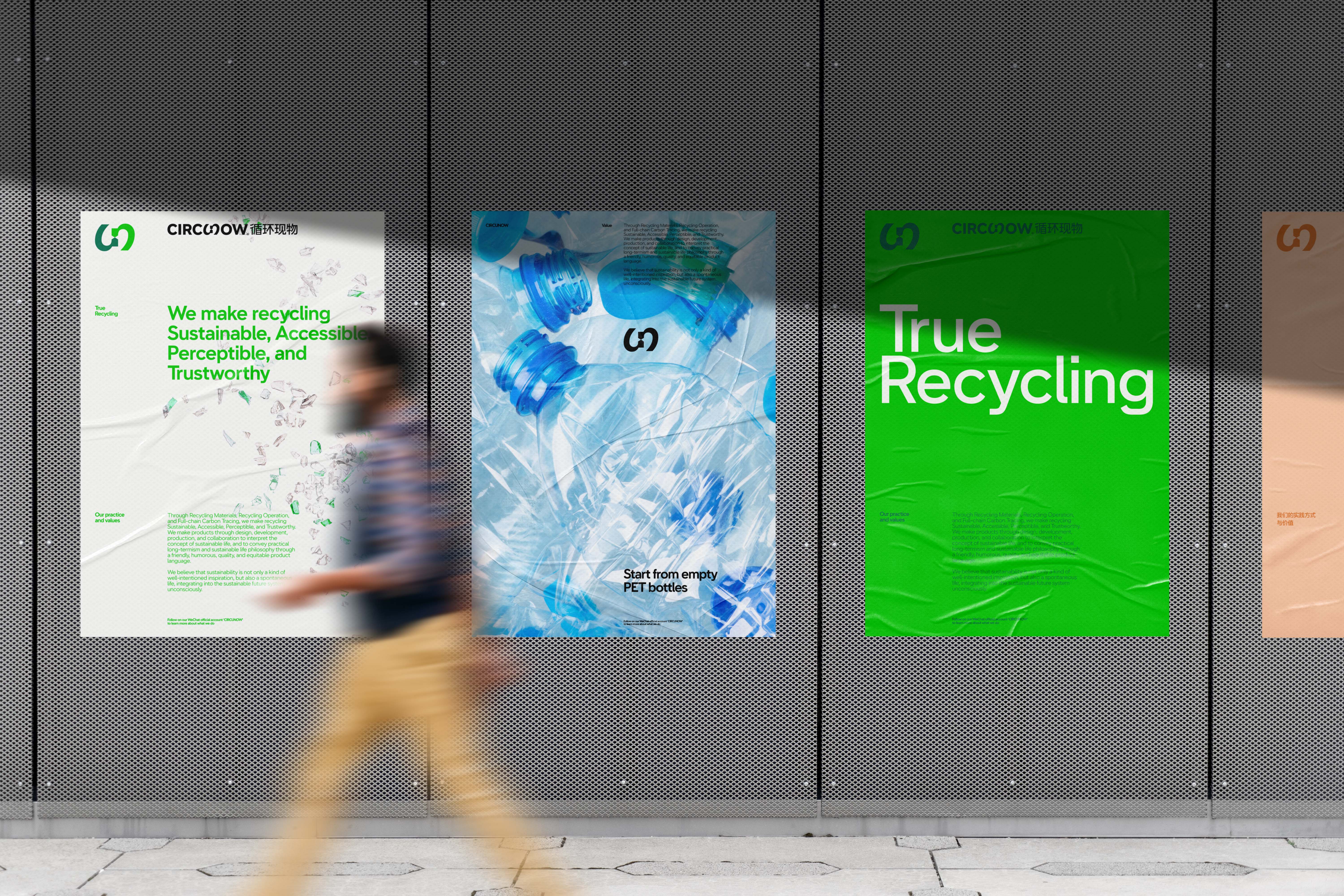
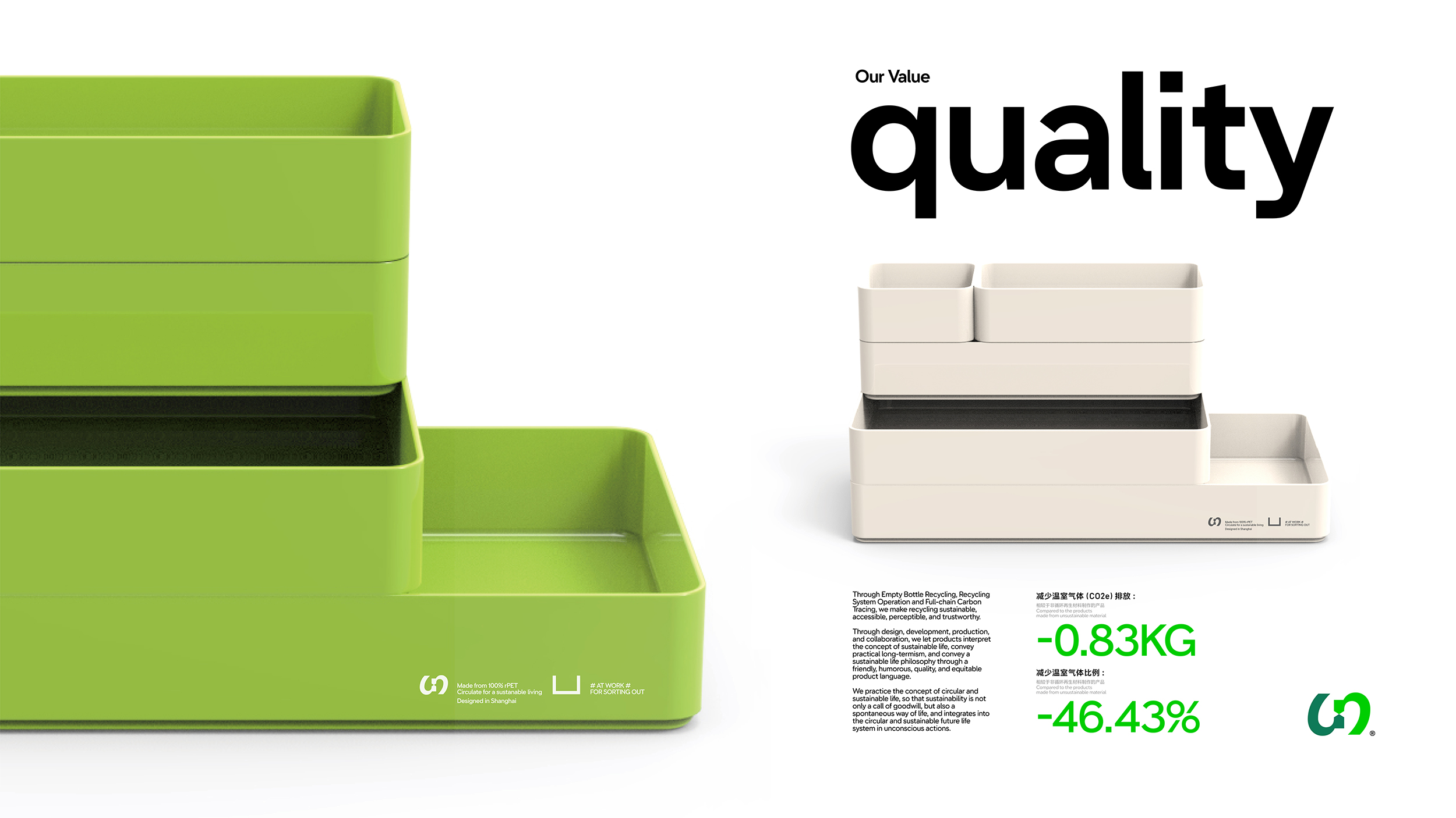
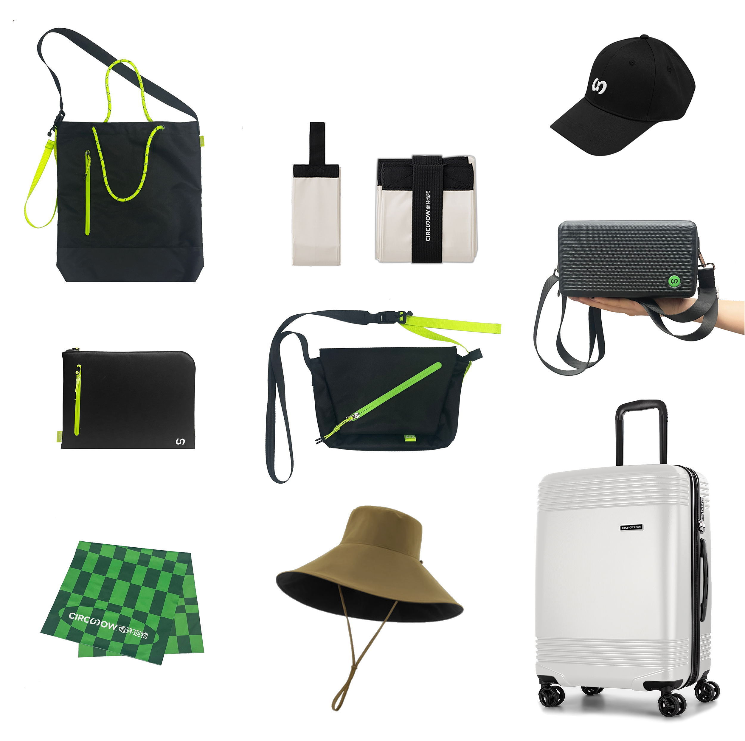
色彩中,与黑白灰所搭配的绿色系列是作为 B2B 业务呈现的标准识别色彩组合,也成为品牌被认知的第一色彩感受。对应品牌的四个产品语言友善、平等、轻趣、有品而产生的红色、蓝色、紫色、黄色则为品牌的视觉沟通增添了更多轻松与活力,帮助品牌在面对普通大众的情况下也拥有足够的包容感与亲切感。
品牌的文字与版面系统通过最直观的产品图像与最简洁的文字层级组合进行呈现,这也是对 Circunow 的品牌价值观的又一处恰如其分的转译,尽量减少阅读上的沟通成本,也剔除过于风格化后而可能产生的距离感。
品牌的文字与版面系统通过最直观的产品图像与最简洁的文字层级组合进行呈现,这也是对 Circunow 的品牌价值观的又一处恰如其分的转译,尽量减少阅读上的沟通成本,也剔除过于风格化后而可能产生的距离感。
Among the colors, the green series matched with black, white and gray is a standard identification color combination presented as a B2B business, and it has also become the first color image for the brand to be recognized. The red, blue, purple, and yellow colors corresponding to the four product language ‘Friendly, Equality, Humorous, Quality’ add more ease and vitality to the visual expression of the brand, and helping the brand face the general public with enough tolerance and intimacy.
The typographic and layout system is presented through the most intuitive product image and the most concise text hierarchy combination, which is another appropriate translation of Circunow's brand values, minimizing the communication cost of reading and eliminate the sense of distance that may arise from overly stylized.
The typographic and layout system is presented through the most intuitive product image and the most concise text hierarchy combination, which is another appropriate translation of Circunow's brand values, minimizing the communication cost of reading and eliminate the sense of distance that may arise from overly stylized.