萃生颜
Chosen Young
行业类型:健康与护肤
健康与护肤
零售
实践类型:品牌定位研究
品牌定位研究
品牌命名
品牌概念指导
视觉识别系统
包装设计
SECTOR:Healthcare
Healthcare
Retail
PRACTICE AREA:
Brand Positioning
Brand Positioning
Brand Naming
Brand Concept Direction
Visual Identity System
Packaging Design

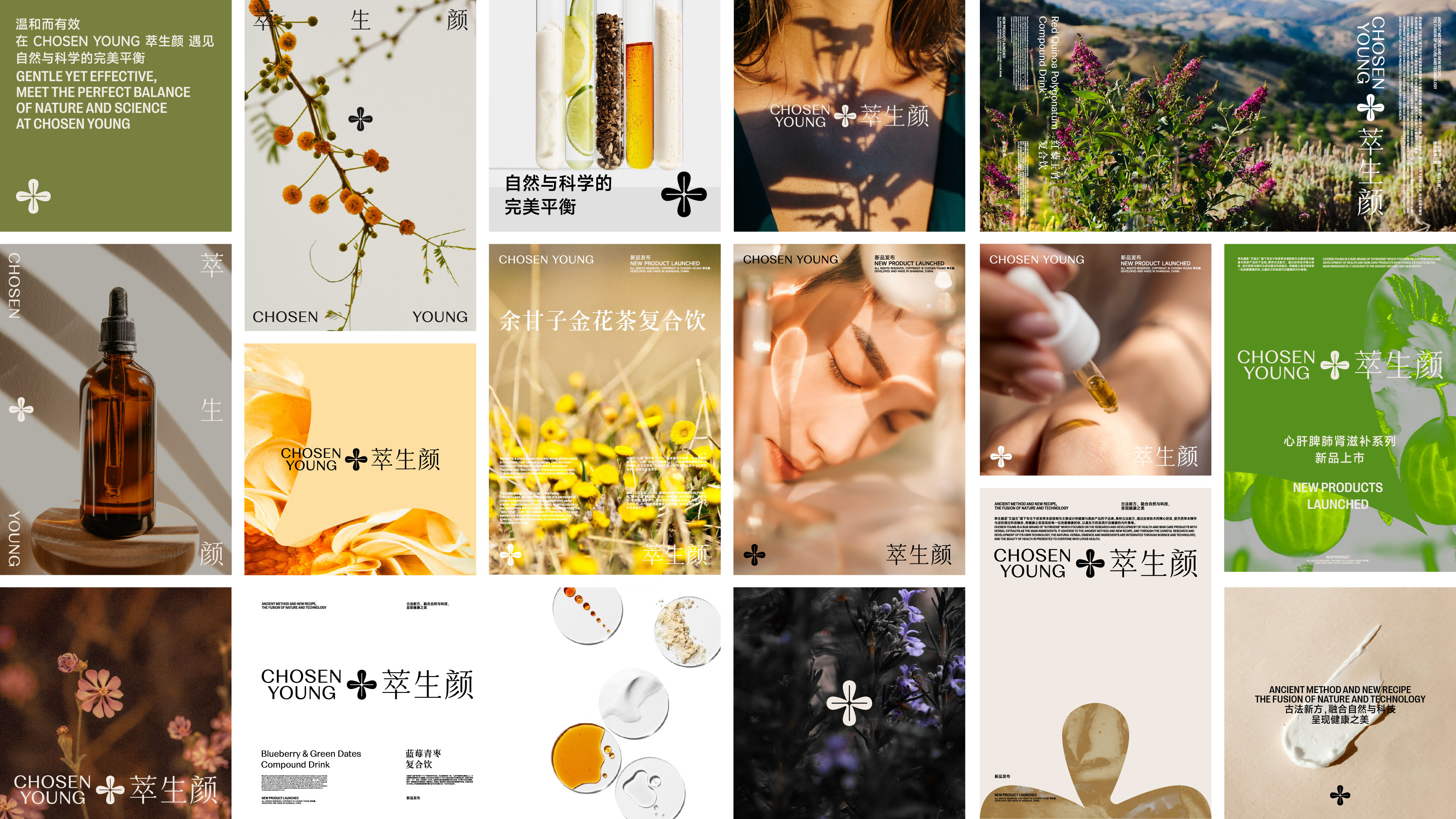
萃生颜是“艾益生”旗下专注于研发草本提取物为主要成分的健康与美肤产品的子品牌。通过自有技术的精心研发,使天然草本精华与成份通过科技融合,将健康之美呈现给每一位热爱健康的人们,以最东方的实践开启健康的内外兼修。Pocca 受到“萃生颜”的委托,从为品牌梳理和优化品牌概念开始,为其定义了“自然与科技融合”和“古法新方”的品牌价值,并通过对企业内部的对话和研究,帮助品牌逐渐清晰自己的叙事态度:“自然”、“人文”、“未来”。
Chosen Young is a sub-brand of AIYISHENG that specializes in developing health and beauty products using herbal extracts as their primary ingredients. The brand combines the natural herbal essence with science and technology to present healthy beauty to everyone who enjoys it. This is achieved by opening up the internal and external cultivation of health with the ways of oriental practice. Pocca was commissioned by Chosen Young to optimize the brand concept and define the brand value of “The Fusion of Nature and Technology” and “Ancient Method and New Recipe” for the brand. Through the dialogue and research within the company, Pocca helps the brand to gradually clarify its narrative attitude of Nature, Humanity, and Future.


在品牌的真实内核初具雏形的基础上,我们为“萃生颜”创建了品牌的英文名称“Chosen Young”,与中文名称的发音近似,同时也寓意着永葆年轻的健康与活力。
We developed the English name “Chosen Young” for the brand, based on its true essence. The name has a similar pronunciation to the Chinese name and signifies the energy and wellness associated with youth.


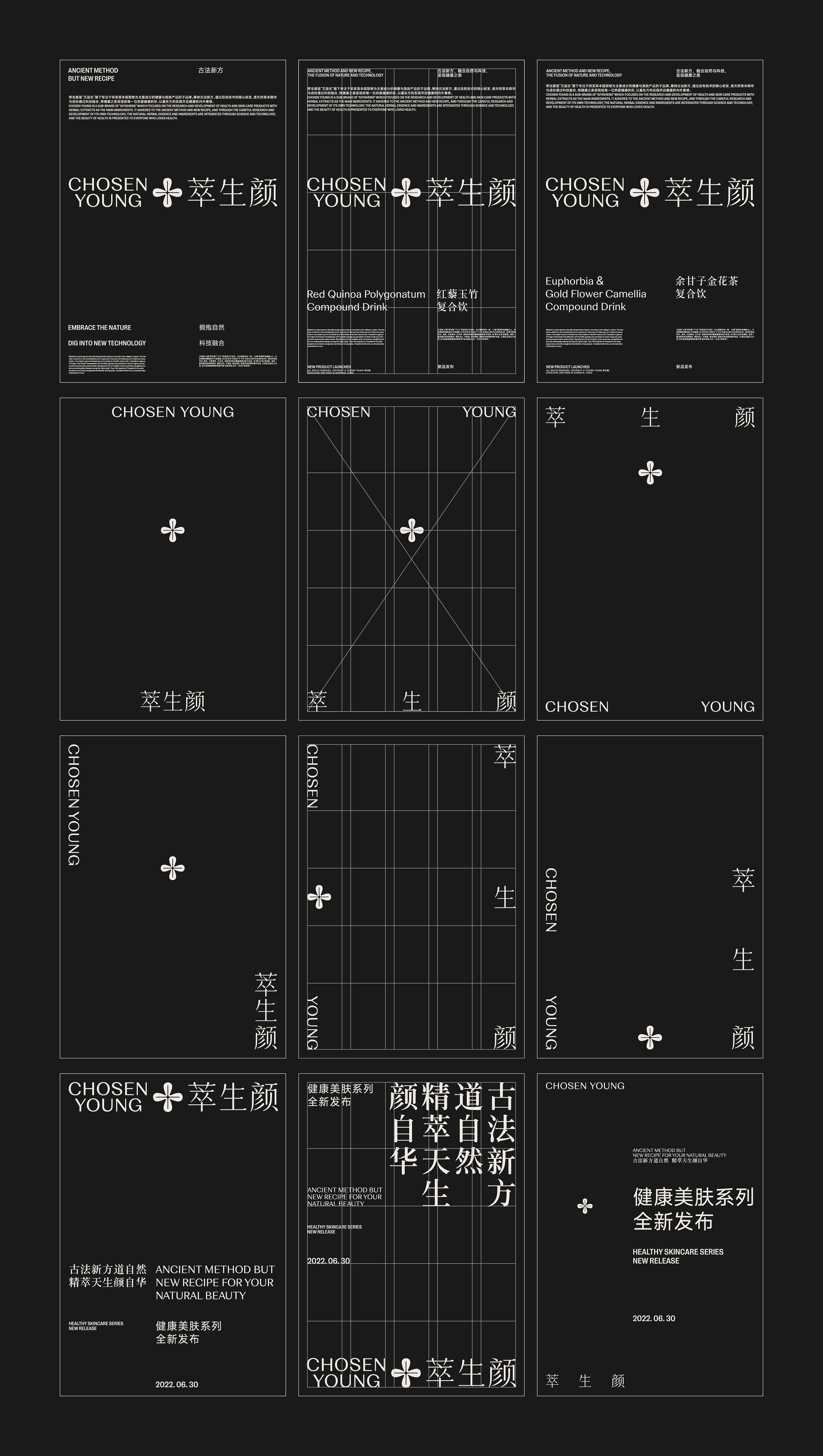
在视觉标识的设计中,我们将品牌的价值与态度聚焦在品牌中文名称“萃生颜”中的“萃”字上,以此为源,首先设计出一枚让“草本”与“科技”和谐共融的图形符号,通过“圆润的”细节呈现自然与草本的亲切,也通过“尖锐的”细节呈现科学与技术的精准。与此同时,这种希望平衡“草本”与“科技”的造型逻辑,也呈现在我们为品牌定制设计的品牌中文名称的字型中。
When it comes to the visual identity of the brand, we focus on the Chinese word “萃” (Cui) which means “extract”. This word represents the values and attitudes that we want our brand to embody. To visually express this concept, we have designed a graphic symbol that mixes the ideas of “herbal” and “science and technology” in a harmonious way. We have used round details to convey the intimacy of nature and herbs, and sharp details to represent the precision of science and technology. This desire to balance the “herbal” and “science and technology” elements is also reflected in the logotype of the Chinese name that we have customized for the brand.
When it comes to the visual identity of the brand, we focus on the Chinese word “萃” (Cui) which means “extract”. This word represents the values and attitudes that we want our brand to embody. To visually express this concept, we have designed a graphic symbol that mixes the ideas of “herbal” and “science and technology” in a harmonious way. We have used round details to convey the intimacy of nature and herbs, and sharp details to represent the precision of science and technology. This desire to balance the “herbal” and “science and technology” elements is also reflected in the logotype of the Chinese name that we have customized for the brand.


我们在工作的过程中了解到品牌名称中的“萃”字本身源于中国传统八卦中的“萃”卦,而以长短不一的横画构成的卦象符号与平面设计中常用的网格系统恰巧形成了视觉样式上的统一与重合,也因此,“萃”卦的造型成为了品牌视觉识别系统中网格系统设计的基础,既吸收了品牌本身具备的中国传统文化气质,也很实用的能够帮助中英文并列的双语编排的有效呈现。在这个对于信息编排格式的设计中,我们对传统符号和常用网格的结合,也成了一种对于“古法新方”的视觉化解读。
Through the process, we discovered that the brand name’s character “萃 (Cui, meaning extract)” has its roots in the traditional Chinese eight trigrams. The hexagram symbol, which consists of horizontally-drawn lines of different lengths, coincides with the grid system commonly used in graphic design. Thus, the graphical shape of “Cui” forms the foundation of the visual identity’s grid system design. This design not only embodies the brand’s traditional Chinese cultural essence but also effectively presents bilingual Chinese and English arrangements. The combination of traditional symbols and graphical grids in the information layout design also visually interprets the brand’s “Ancient Method and New Recipe” philosophy, which Chosen Young practices.