希美
XIMEI ART
行业类型:专业服务
专业服务
文化艺术
实践类型:品牌唤新
品牌唤新
视觉识别系统设计
SECTOR:Professional Services
Professional Services
Arts & Culture
PRACTICE AREA:
Brand Refresh
Brand Refresh
Visual Identity System Design
「XIMEI ART 希美」是位于上海的一间专注于艺术微喷、艺术品制作和艺术活动策划的知名工作室,成立于 2014 年。品牌在 2021 年底决定搬到一处全新的空间,以便为艺术家、设计师、收藏家等群体提供更专业的艺术品输出和制作的全方位立体且专业的服务,并提供更充足的艺术品展示空间。在此之际,Pocca 受到希美的邀请,为品牌重新梳理和设计全新的视觉识别。
XIMEI ART is a renowned studio in Shanghai specializing in Fine Art Printing, Artwork Making and Art Event Planning, established in 2014. At the end of 2021, they decided to move to a brand new space in order to provide artists, designers, collectors and other groups with a more professional service of artwork output and making, and to provide more space for artwork display. At this time, Pocca was invited by XIMEI ART to reconstruct the brand concept and to devise a new visual identity for the brand.
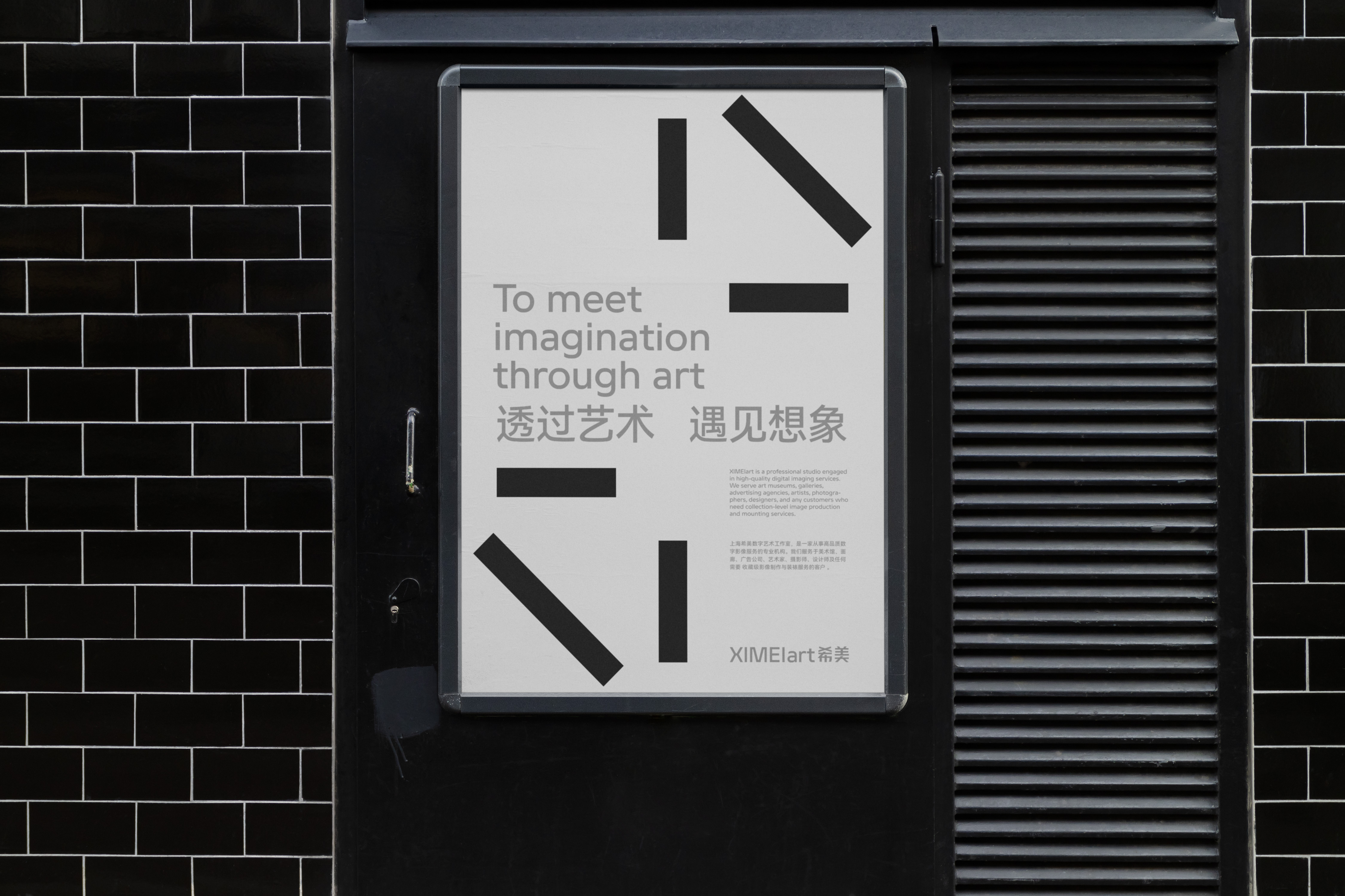

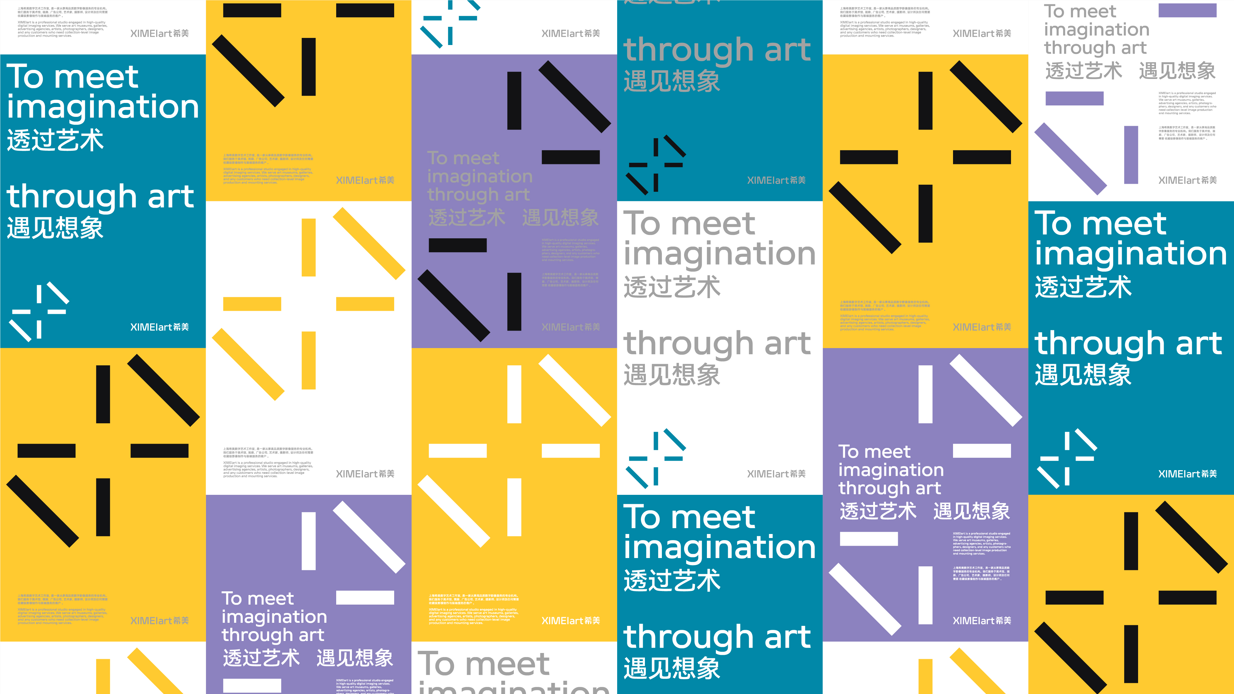
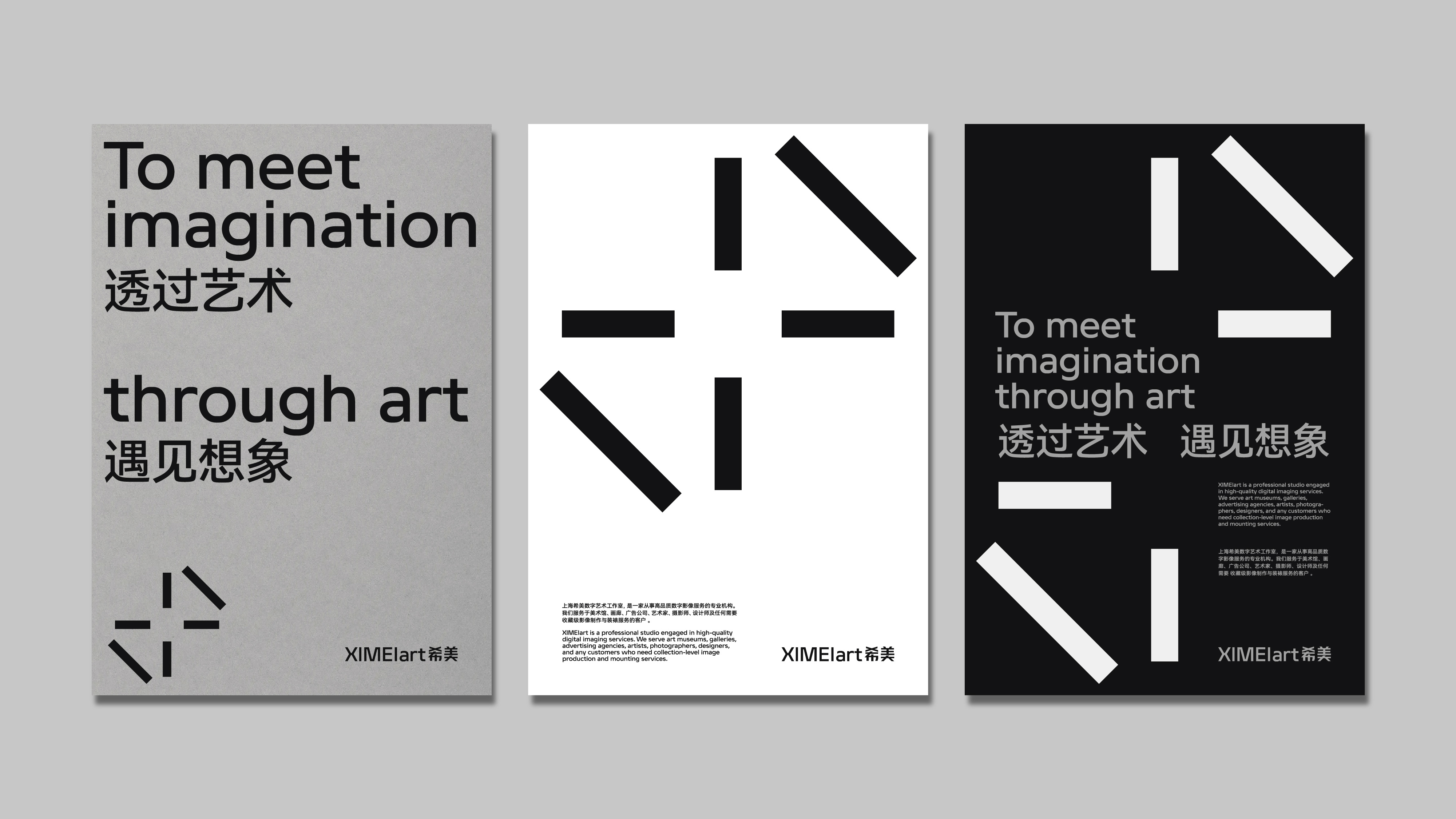
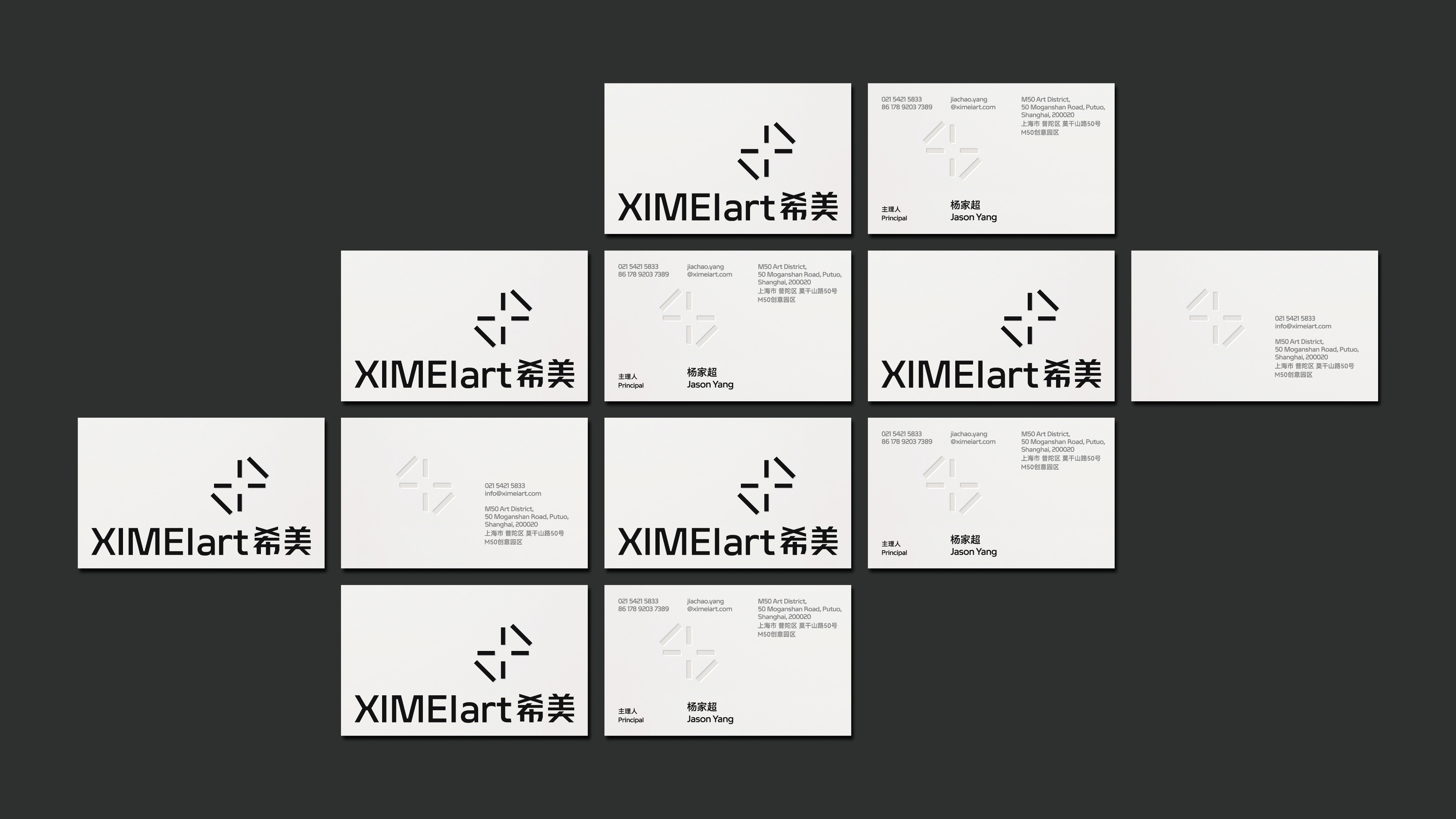
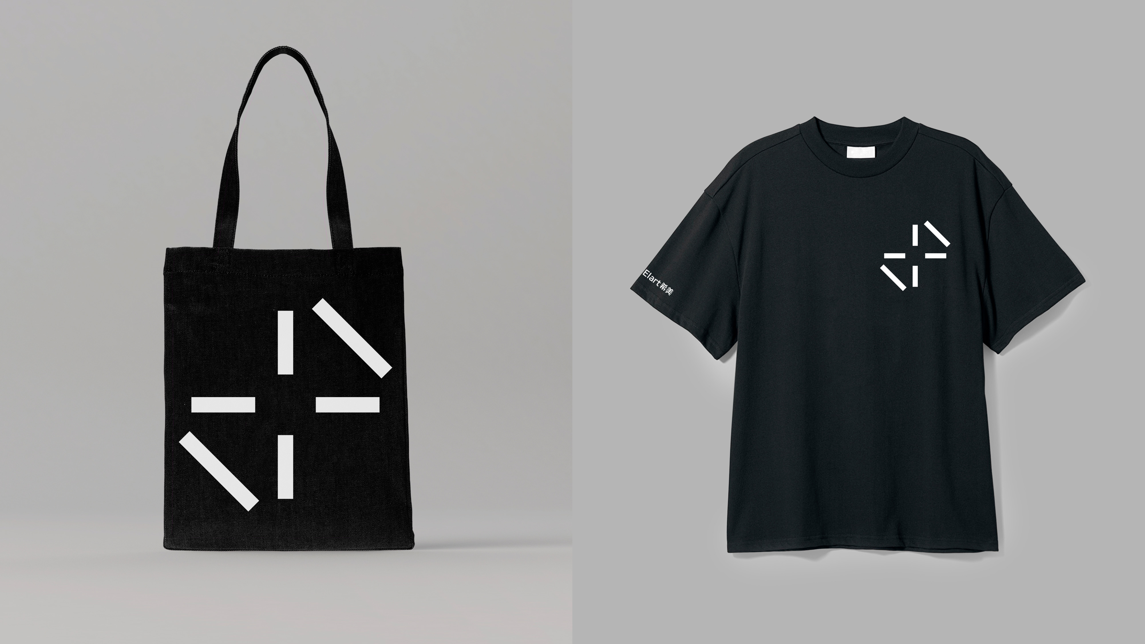
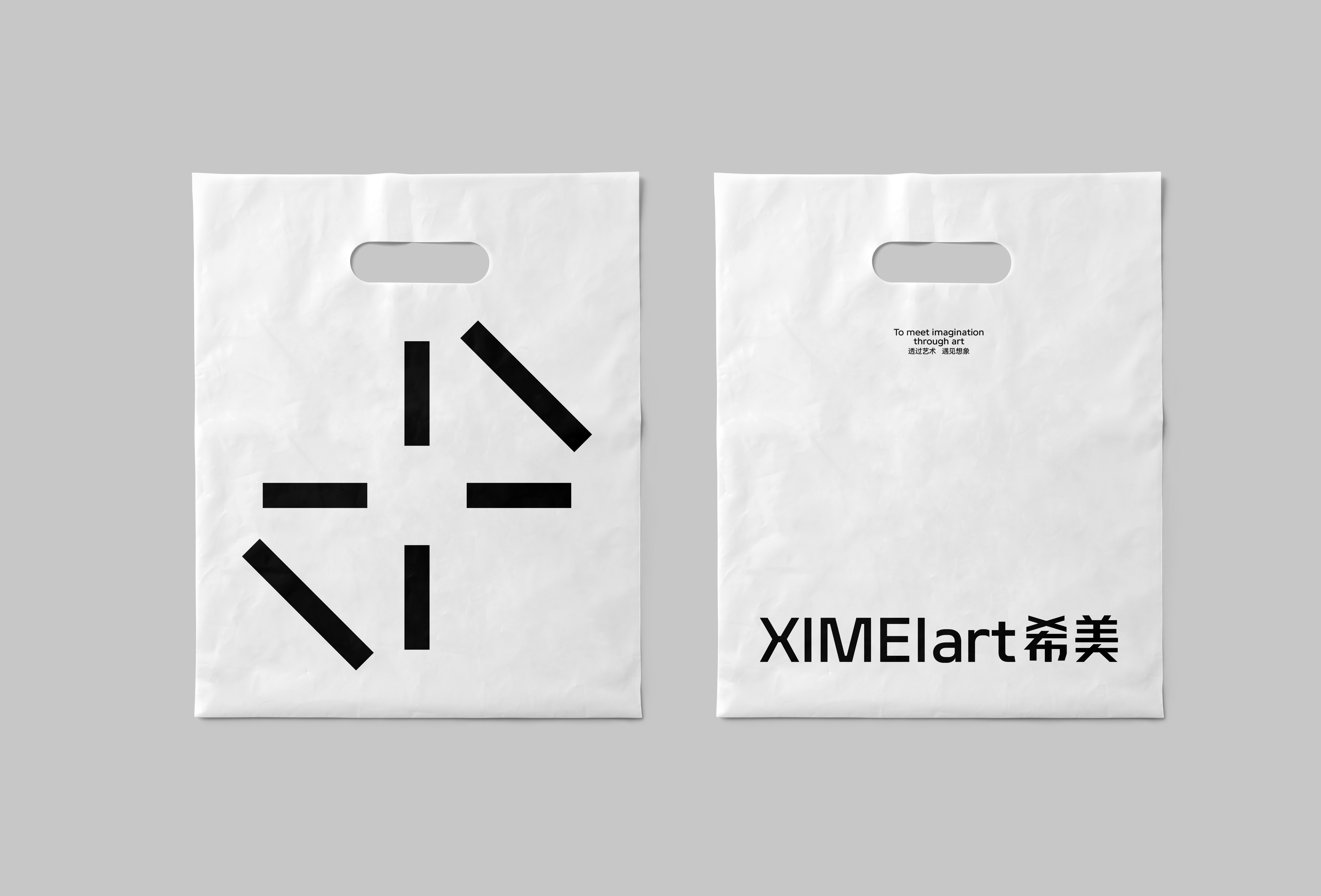
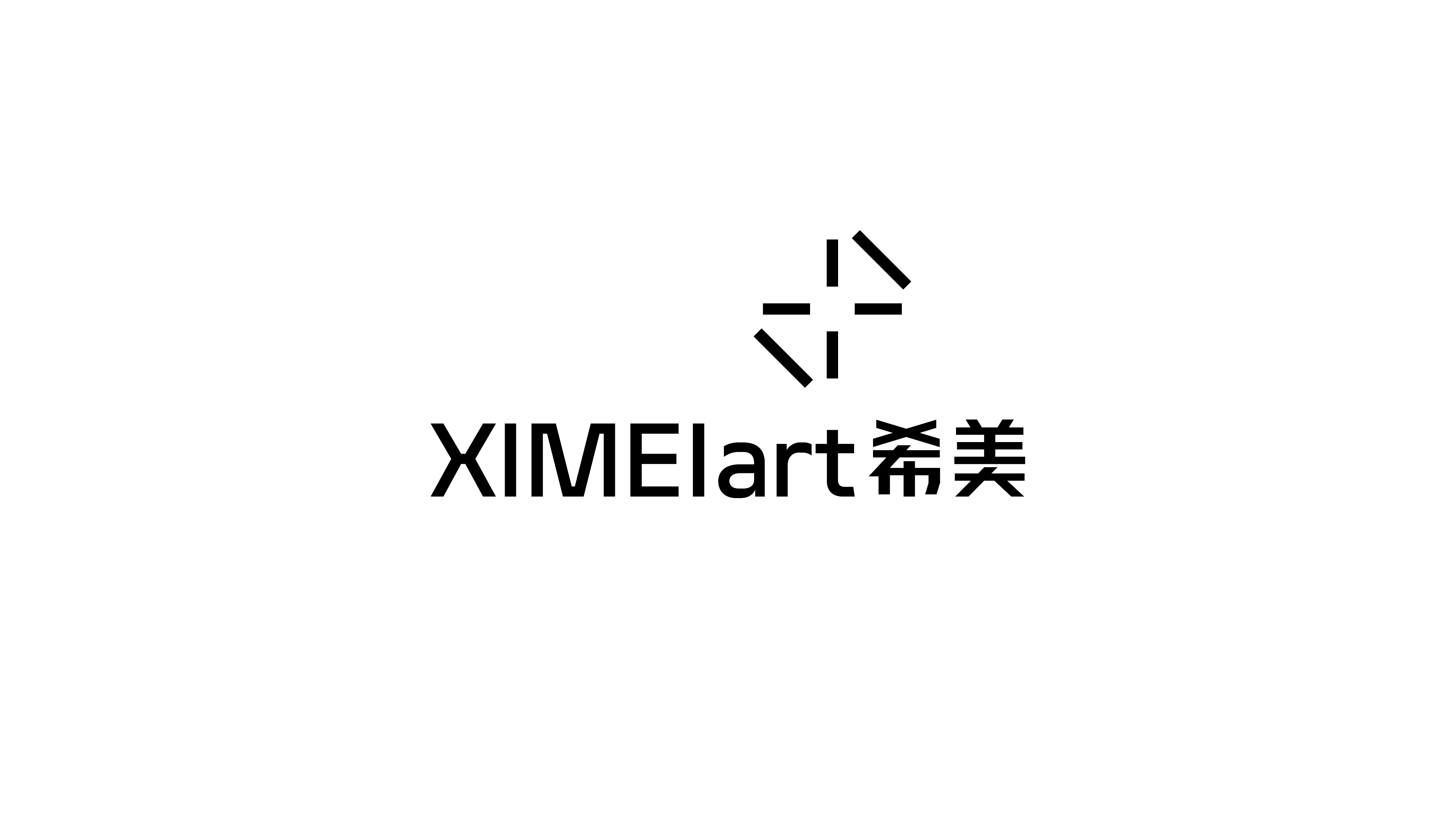
以 「印刷校准线 」和 「专业精度 」为概念线索,从字母 X 和 M 作为造型探索的起点,我们首先设计了一枚仅由 6 根短线条组成的抽象符号作为品牌的视觉符号,它既拥有希美聚焦和深耕专业的凝聚性,也拥有可以灵活拆解重构的不确定性,而这种凝聚性与灵活的不确定性的叠加也恰与希美所实践的行业特征与所服务的群体特征产生共鸣。
Taking "printing calibration line" and "professional precision" as the conceptual clues, and the letterforms of X and M as the starting point for stylistic exploration, we designed an abstract symbol consisting of only 6 short lines as the brand's visual symbol, which has both the cohesiveness of XIMEI ART’s focus and deep professionalism, and the uncertainty of flexible disassembly and reconstruction. This cohesiveness and flexible uncertainty also resonate with the characteristics of the industry and the groups served by XIMEI ART.

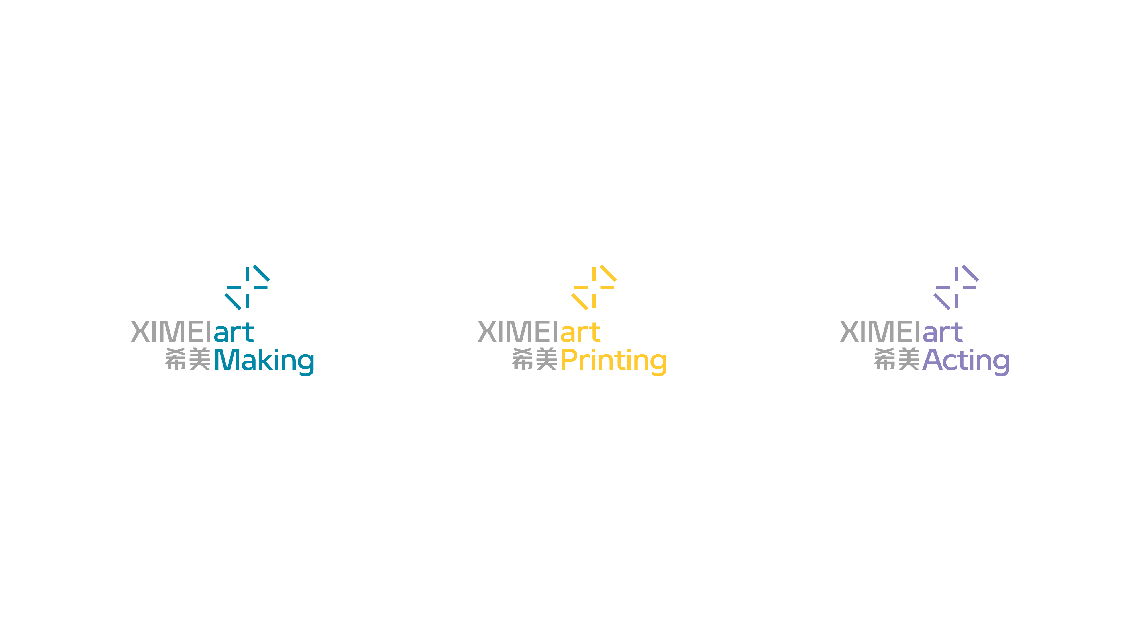
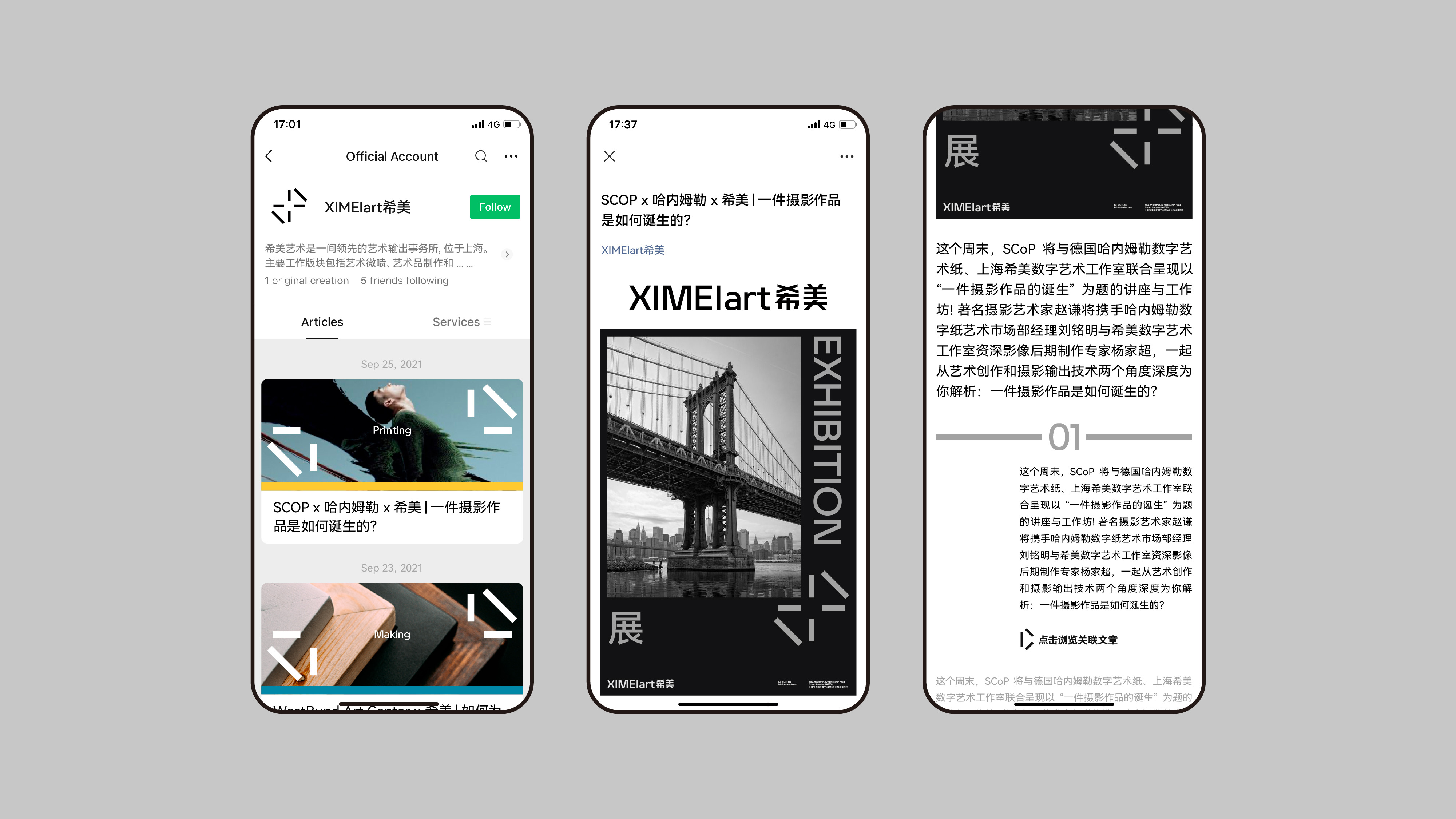
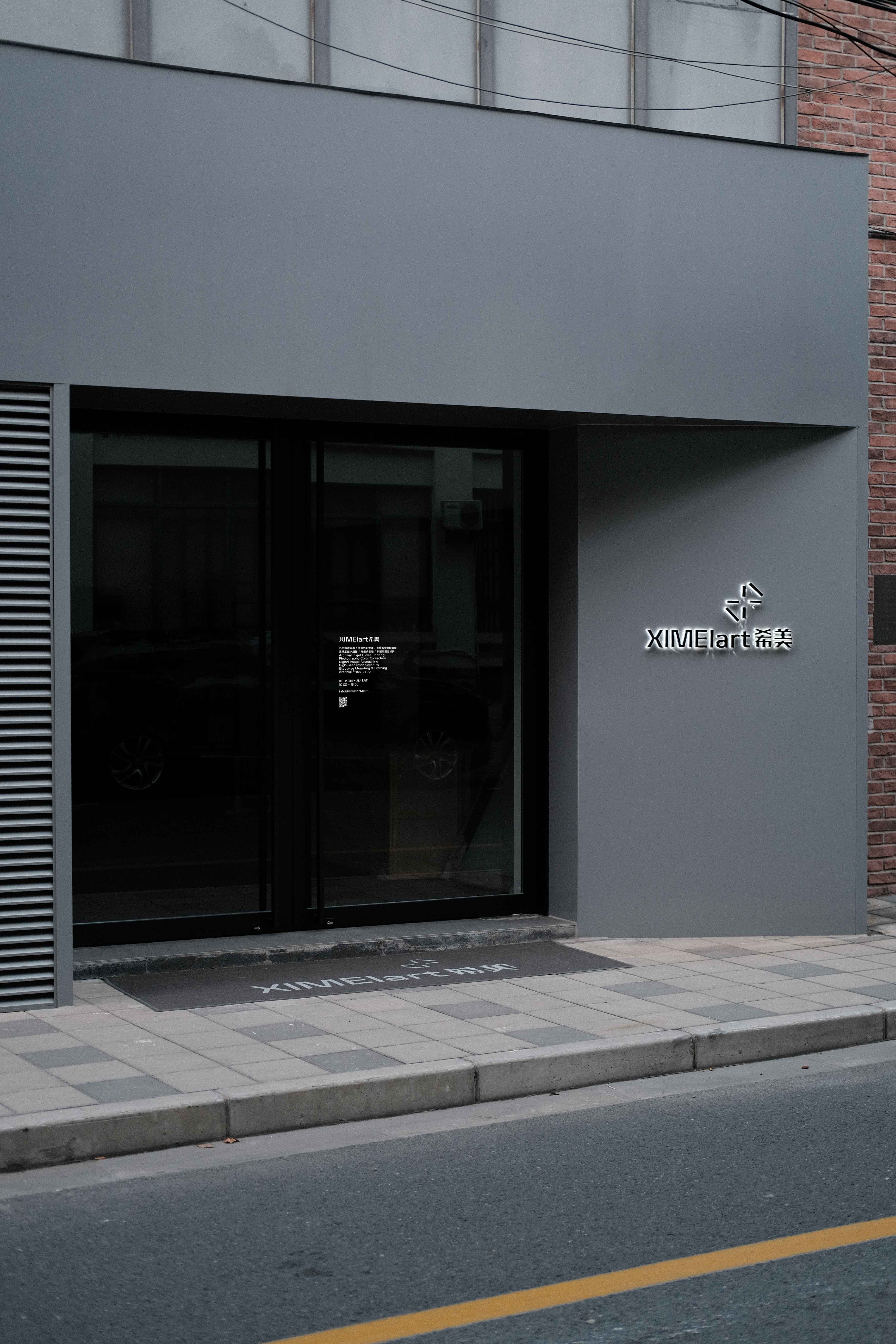
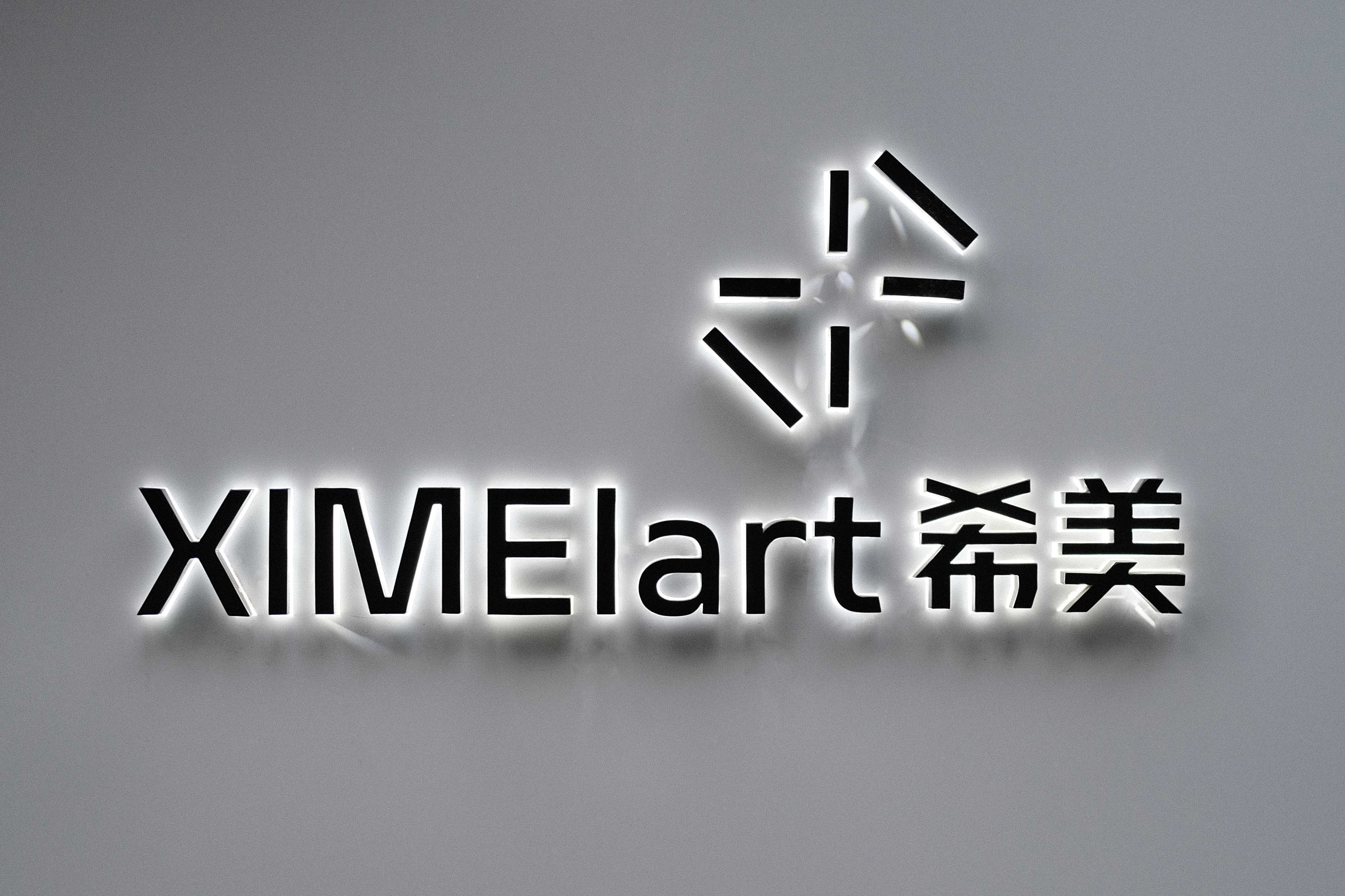
「XIMEIart希美」成为品牌的标准标识,并且以黑白灰作为品牌视觉识别的主要色彩,通过这种中性的设定为其制作和服务的项目提供更多不被打扰的空间。我们将重新梳理出的三个专业板块分别命名为 art Making、art Printing 和 art Acting,辅以三种不同的颜色作为内部工作版块的划分。
XIMEI ART has become the brand's standard logotype, and uses black, white and gray as the main colors of the brand's visual identity, providing more undisturbed space for the projects it produces and serves through this neutral color setting. Then we named the three professional sections as art Making, art Printing and art Acting, with three different colors as the division of internal work sections.
