白洞工作室
White Hole Studio
行业类型:
文化艺术
实践类型:
视觉识别设计
SECTOR:
Arts & Culture
PRACTICE AREA:
Visual Identity Design
白洞工作室是一个新媒体艺术团体,致力于创造和实现新媒体艺术、数字艺术、人机交互在科技时代语境下的可能性,通过装置、影像、互动程序等多种形式探索科技与艺术、身体与机器、虚拟与现实的边界。
White Hole Studio is a new media art group dedicated to creating and realizing the possibilities of new media art, digital art, and human-computer interaction in the context of the technological era, exploring the boundaries between technology and art, body and machine, and virtual and reality through various forms such as installation, video, and interactive programs.
White Hole Studio is a new media art group dedicated to creating and realizing the possibilities of new media art, digital art, and human-computer interaction in the context of the technological era, exploring the boundaries between technology and art, body and machine, and virtual and reality through various forms such as installation, video, and interactive programs.


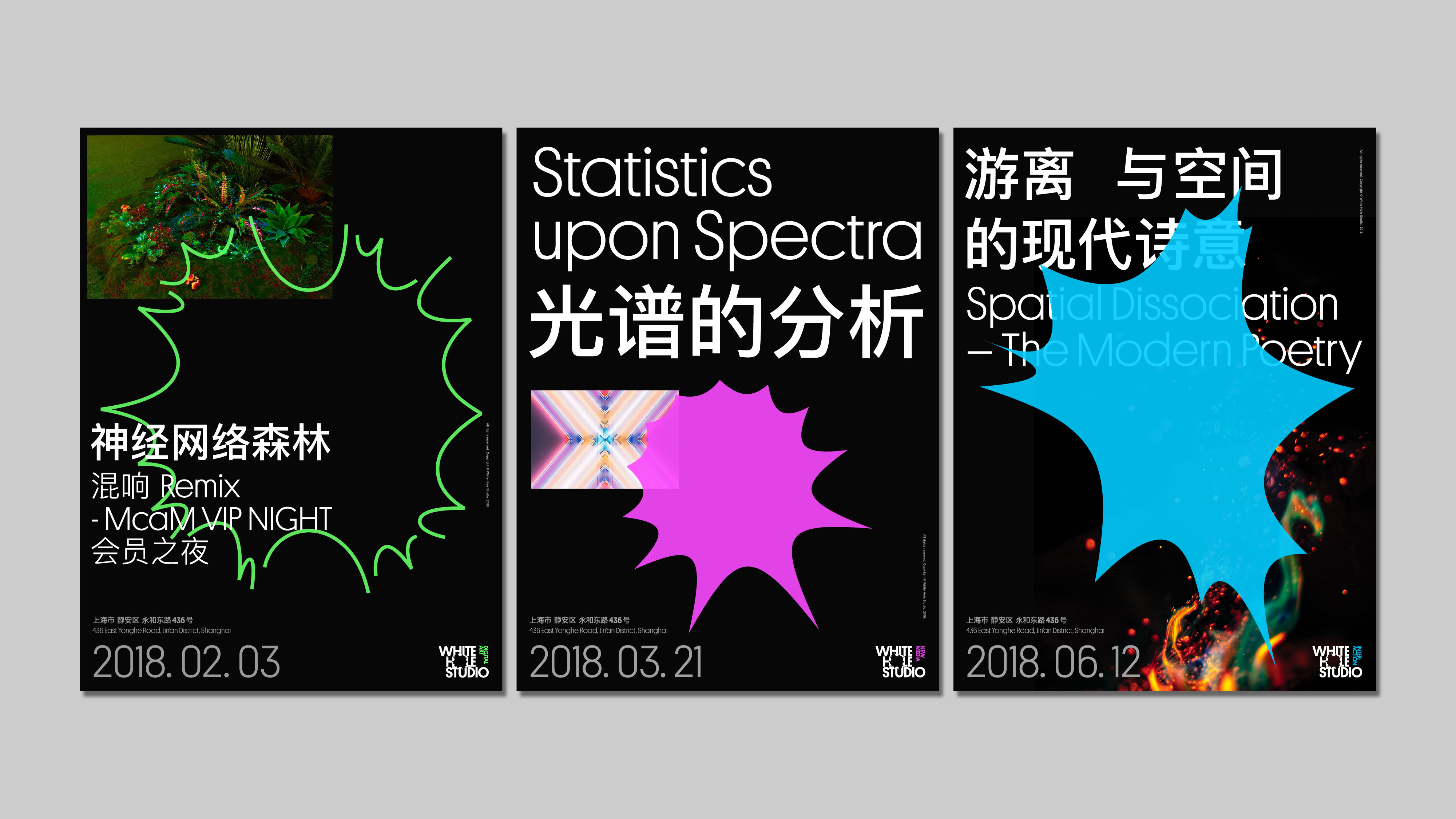
在字体标识的设计上,我们从「白洞」这个词的物理概念出发,尝试探索将具有向外放射性质的白洞(与具有吸收性质的黑洞相反)转换为视觉造型的可能性。将 White Hole Studio 作三行的排列后,我们将视觉重点聚焦到字母 O 上,随即进行一系列不同放射程度的图形实验,并最终挑选出其中一种在细节度、放射大小、放射幅度上均较为平衡且不影响字母辨识度的选项,成为品牌的一级标识。继而,在标识右侧的负空间增加三个艺术版块的名称并赋予三种不同的数字感的色彩,成为三枚分属不同版块的二级标识。
In the design of the logotype, we start from the physical concept of the word "white hole" and try to explore the possibility of transforming the outward radiating nature of white hole (as opposed to the absorbing nature of black hole) into visual form. After arranging White Hole Studio in three rows, we focused on the letter O. We then experimented with a series of different levels of radiation, and finally selected one that was more balanced in terms of detail, radiation size, and radiation magnitude, without affecting the recognition of the letters, as the brand's primary logo. Then, three practice sections were added to the negative space on the right side of the logo and given three different digital colors to become three secondary logos belonging to different sections.

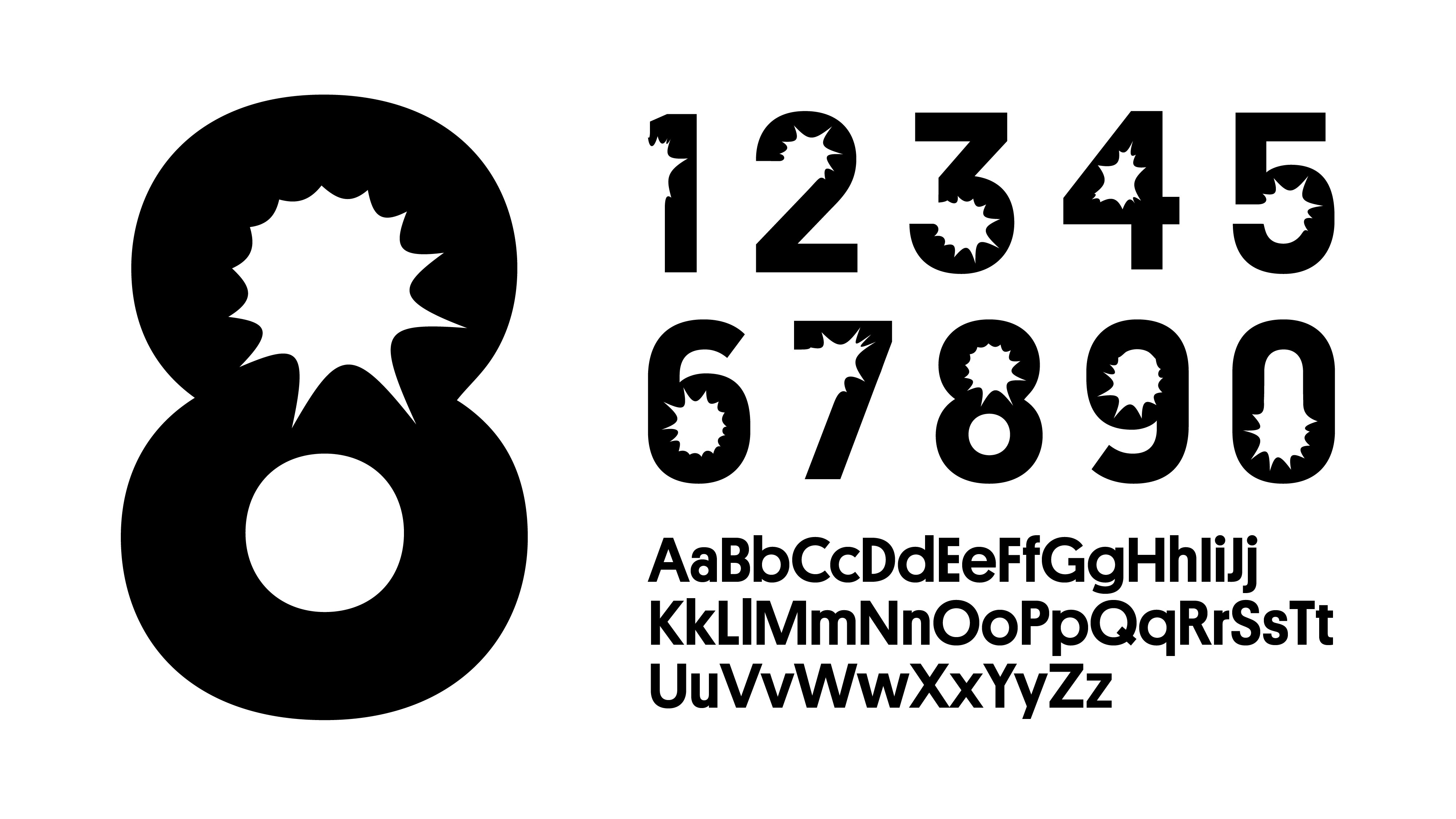
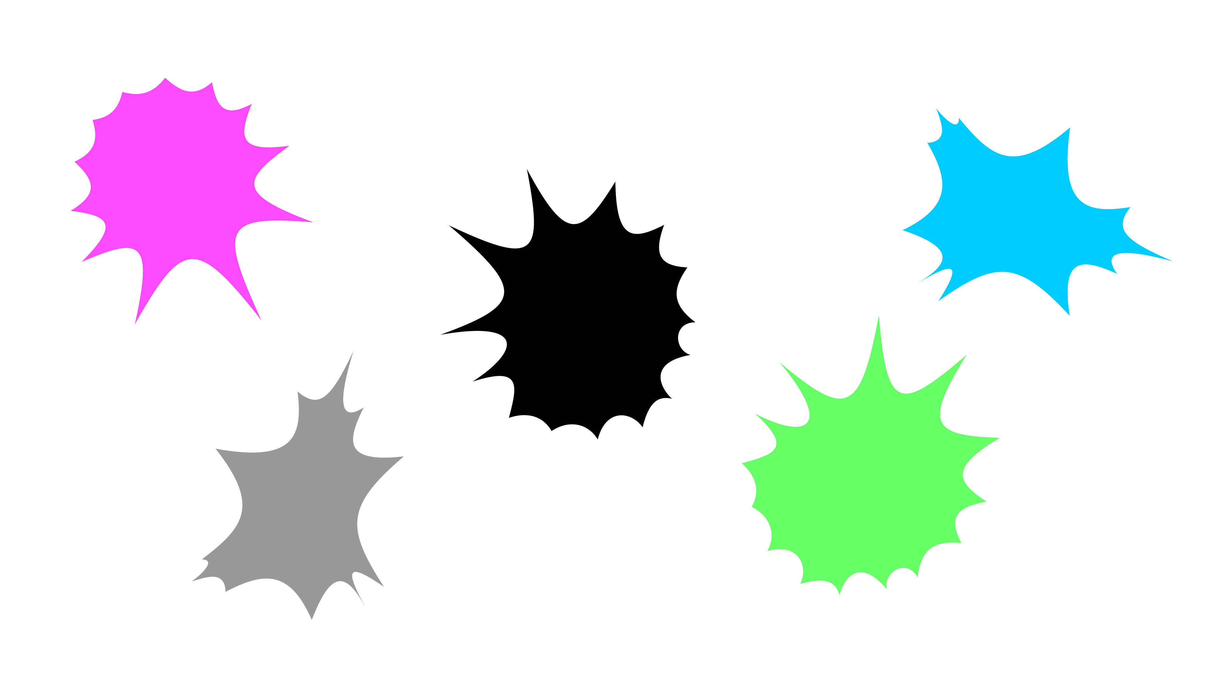
基于品牌标识中的放射状结构,我们在英文标题字体的数字部分也加入了相同的元素,作为一种在文字应用中连贯的视觉线索。而拆解为实体色块的放射状块面,作为一系列辅助图形能够被自由的使用在大小不同的画面之中,既增加了趣味性,也强化了视觉样式,成为品牌身份的一种宣言。
Based on the radial structure of the brand identity, we added the same element to the numerical part of the English title typeface as a coherent visual cue in the typography side. The radial blocks, which are broken down into solid blocks, can be freely used as a series of secondary graphics in different sizes, adding interest and reinforcing the visual style as a statement of the brand identity.
Based on the radial structure of the brand identity, we added the same element to the numerical part of the English title typeface as a coherent visual cue in the typography side. The radial blocks, which are broken down into solid blocks, can be freely used as a series of secondary graphics in different sizes, adding interest and reinforcing the visual style as a statement of the brand identity.