WONDER>FIT
行业类型:生活方式
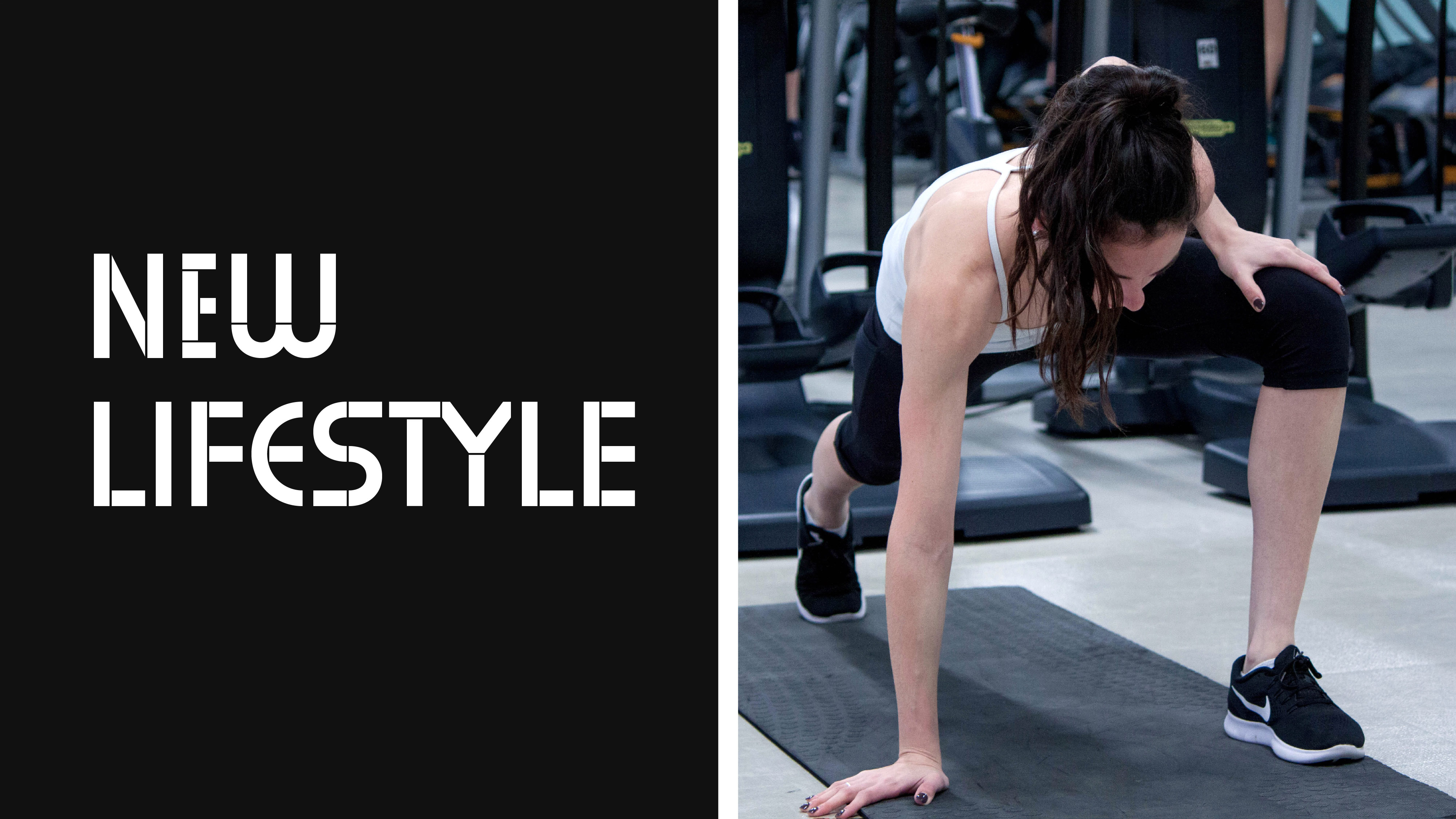
生活方式
专业服务
实践类型:品牌唤新
品牌唤新
视觉识别系统设计
包装设计
环境图形设计
品牌力管理
SECTOR:Lifestyle
Lifestyle
Professional Services
PRACTICE AREA:
Brand Refresh
Brand Refresh
Visual Identity System Design
Packaging Design
Environmental Graphics
Brand Growth Management
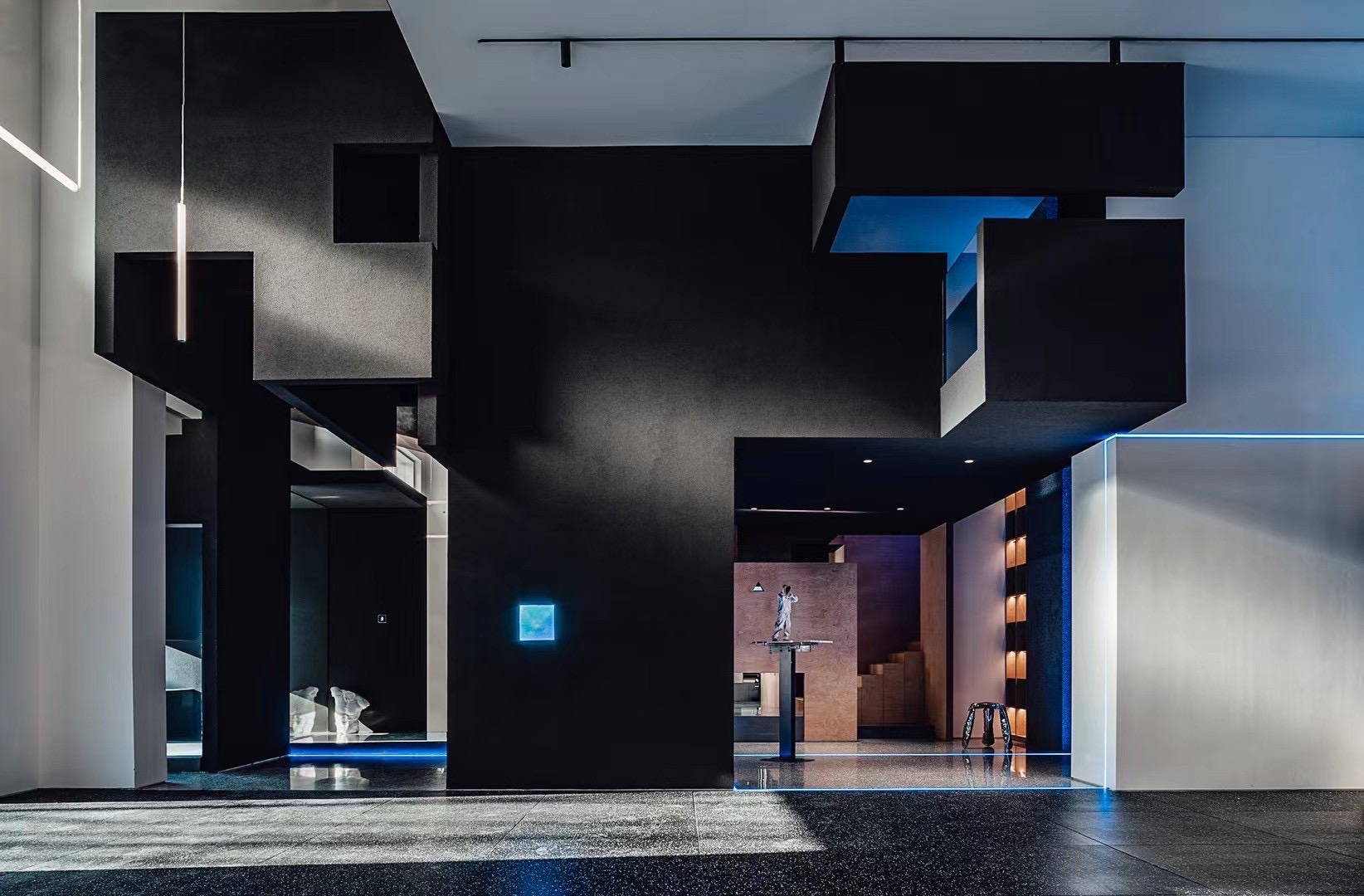
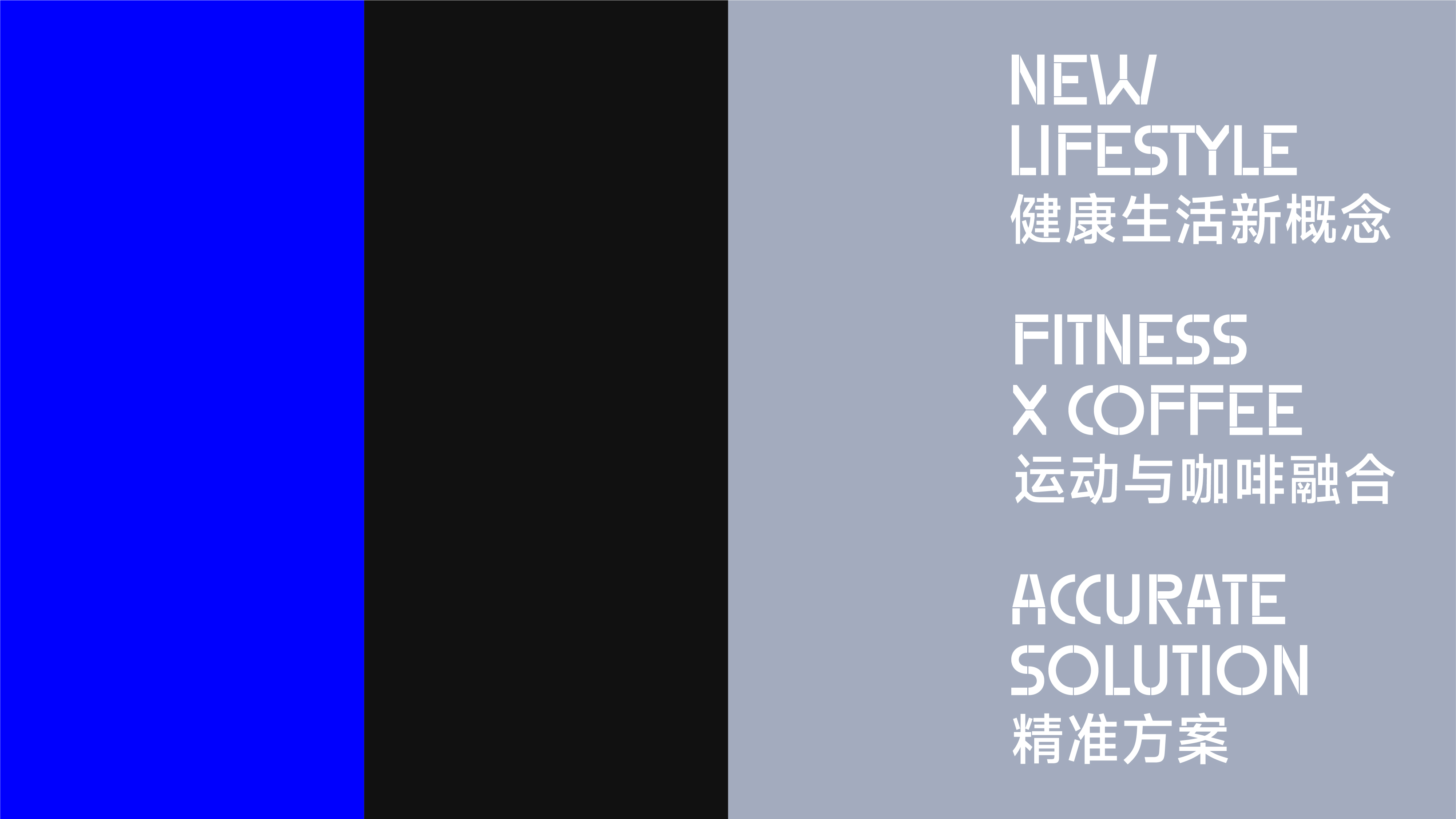
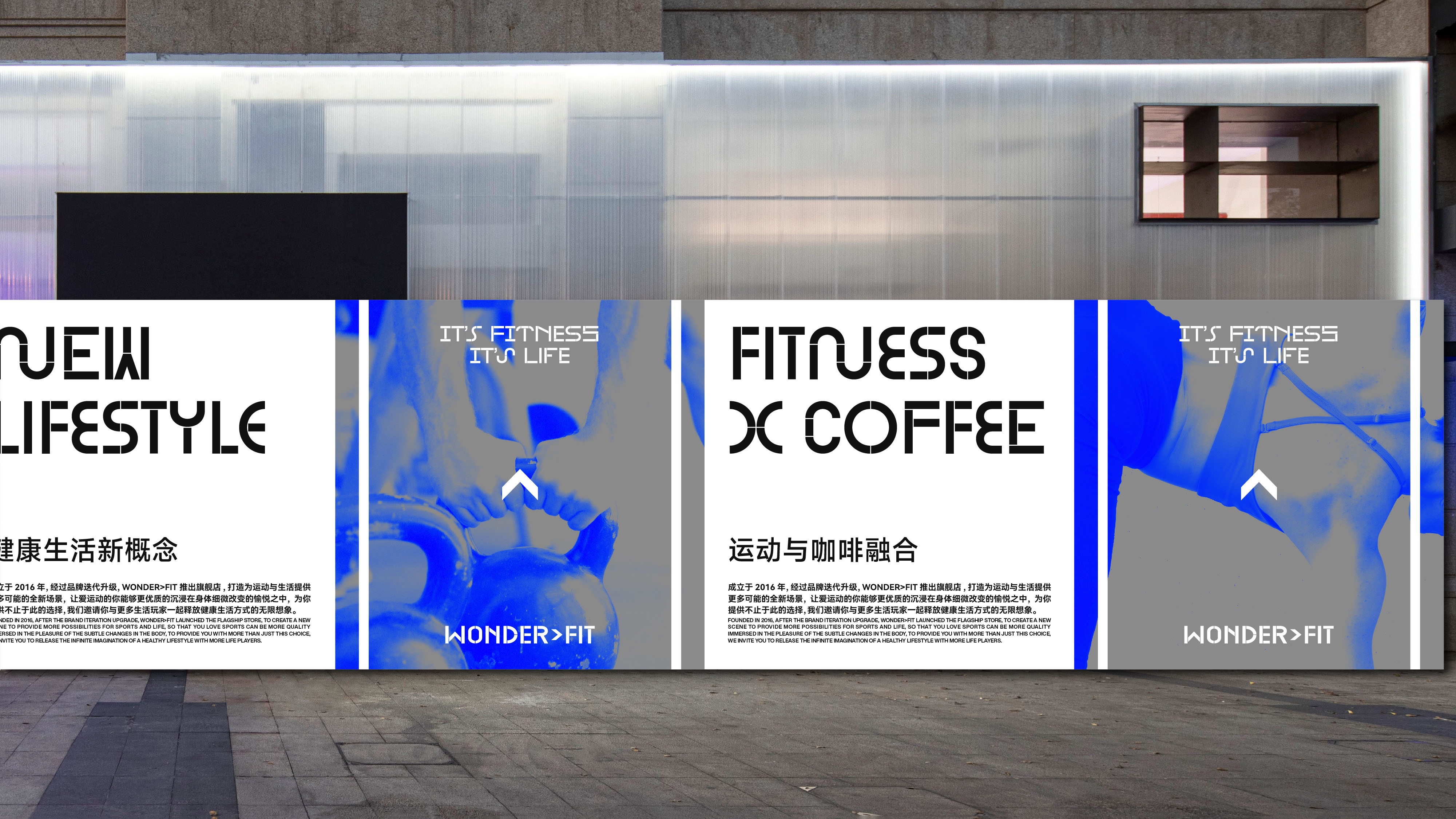
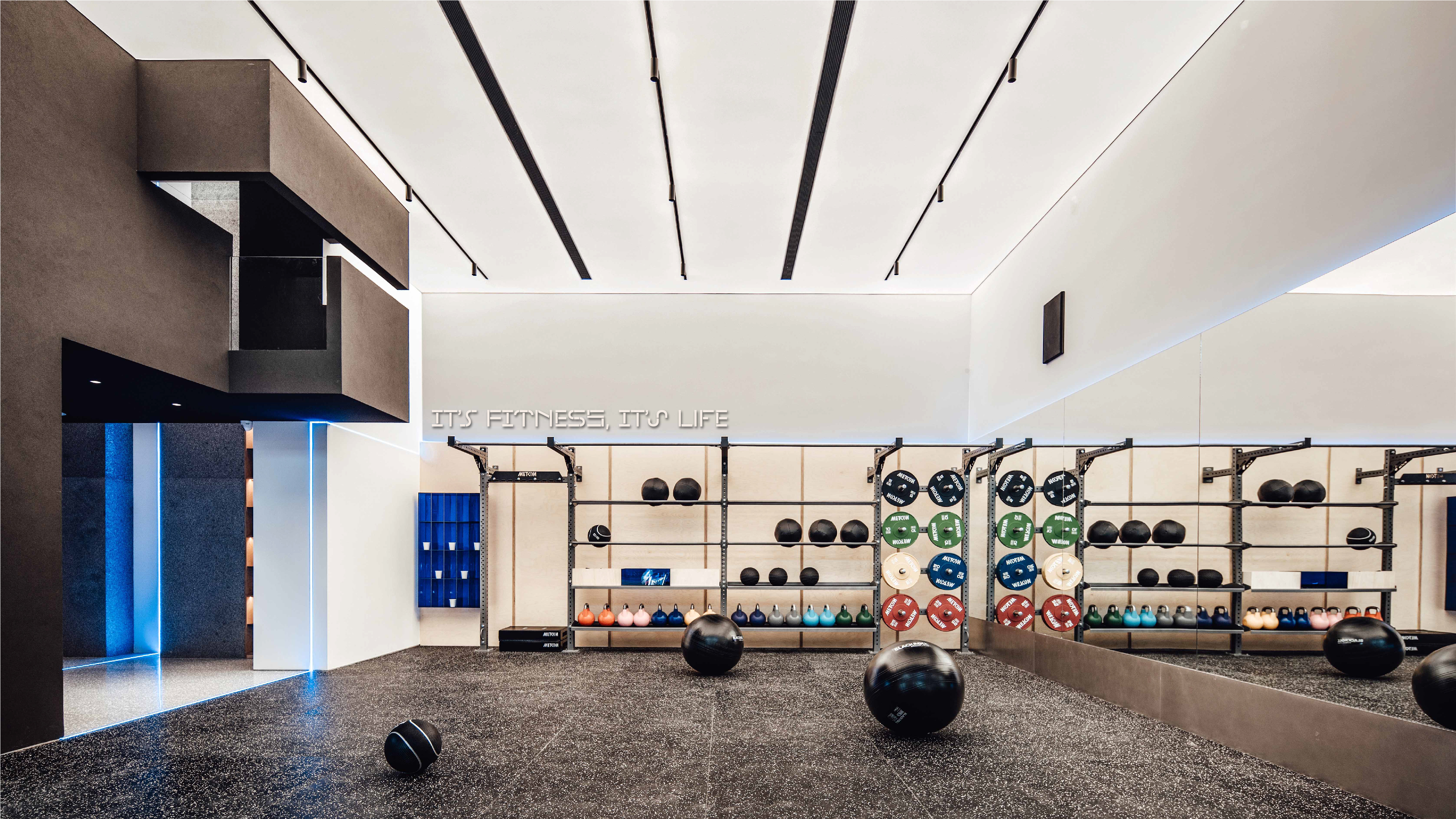
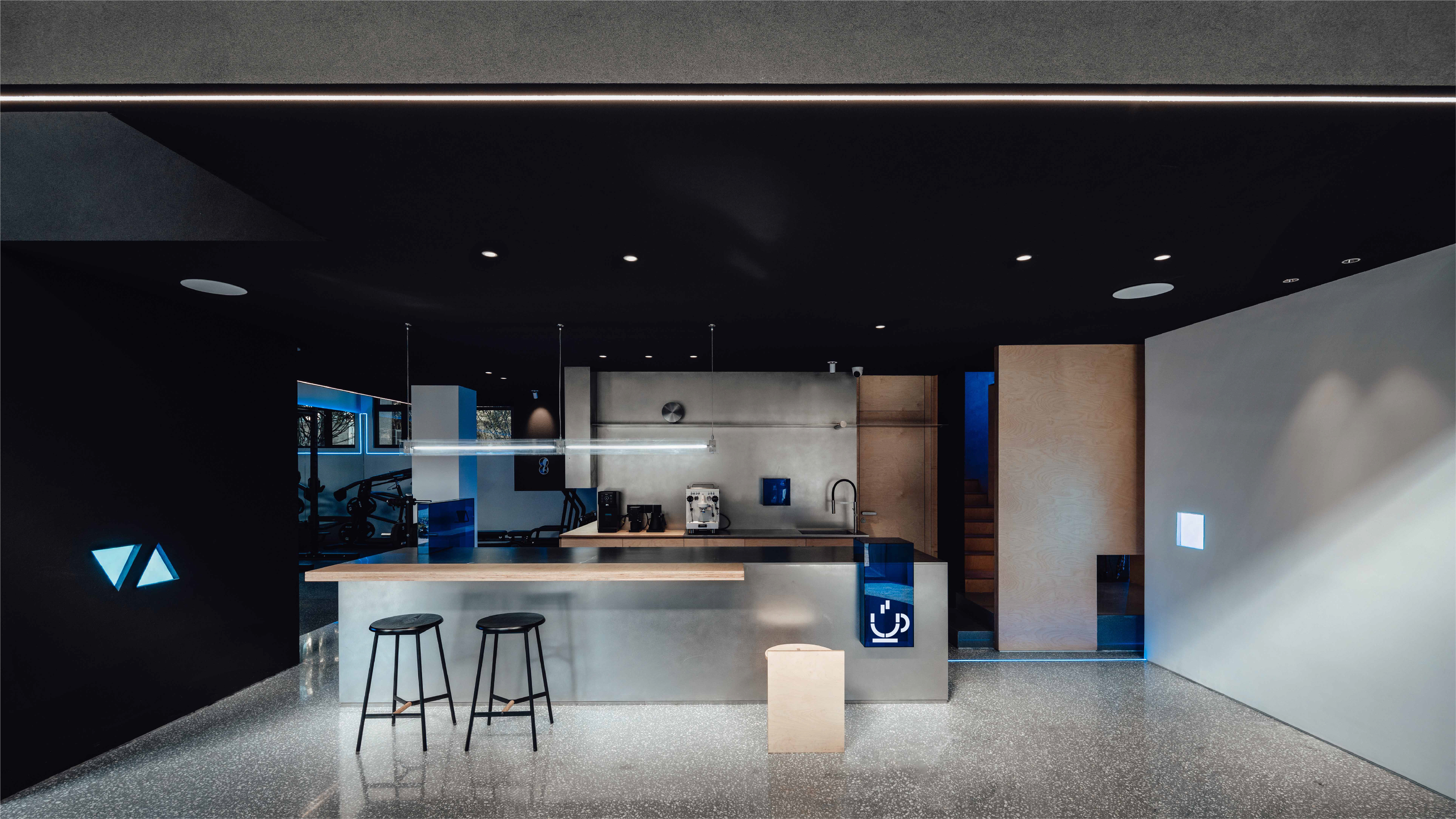
WONDER>FIT 是成立于 2016 年坐落于浙江台州的健身俱乐部,经过 5 年的精心运营,在当地收获了一系列忠实用户与不俗的口碑,品牌主理人因此在 2021 年末决定推出一间全新的门店作为旗舰店并以将原品牌转变为生活方式品牌作为目标进行迭代升级,以“健康生活新概念”、“运动与咖啡空间融合”和“精准方案”三个概念为核心打造为运动与生活提供更多可能的全新场景,让爱运动的用户能够更优质的沉浸在身体细微改变得愉悦之中。
WONDER>FIT is a fitness club established in 2016 in Taizhou, Zhejiang Province. After 5 years of careful operation, it has gained a series of loyal users and a good reputation in the local area, so the founder decided to launch a brand new space as the flagship club at the end of 2021 and iteratively upgrade the original brand with the goal of transforming it into a lifestyle brand rather than solely a gym, with the three concepts of “new concept of healthy life”, “integration of sports and coffee space” and “precise solutions” are the core to create a new scene that provides more possibilities for sports and life, so that users can be more quality immersed in the pleasure of subtle changes in their body.
WONDER>FIT is a fitness club established in 2016 in Taizhou, Zhejiang Province. After 5 years of careful operation, it has gained a series of loyal users and a good reputation in the local area, so the founder decided to launch a brand new space as the flagship club at the end of 2021 and iteratively upgrade the original brand with the goal of transforming it into a lifestyle brand rather than solely a gym, with the three concepts of “new concept of healthy life”, “integration of sports and coffee space” and “precise solutions” are the core to create a new scene that provides more possibilities for sports and life, so that users can be more quality immersed in the pleasure of subtle changes in their body.


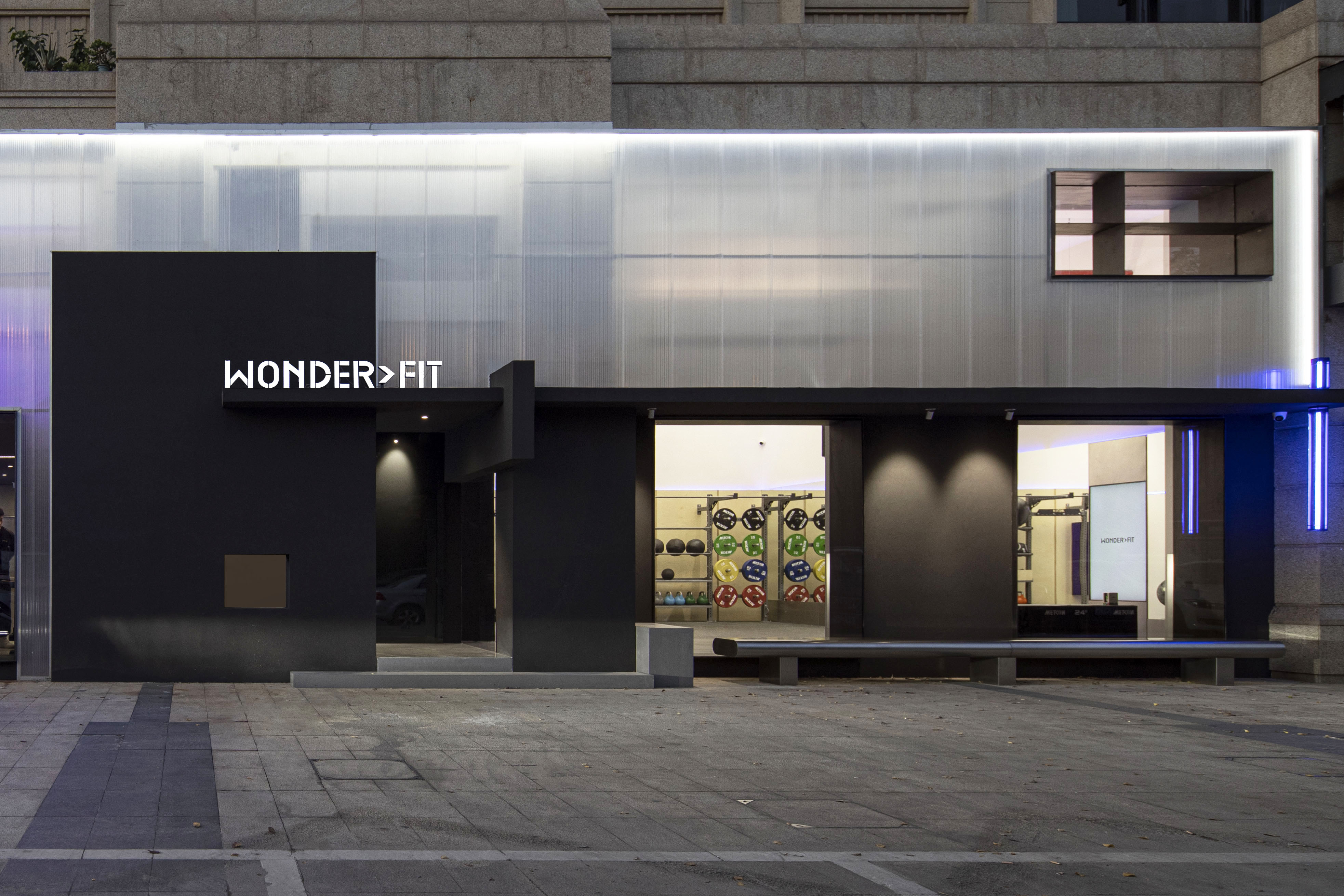
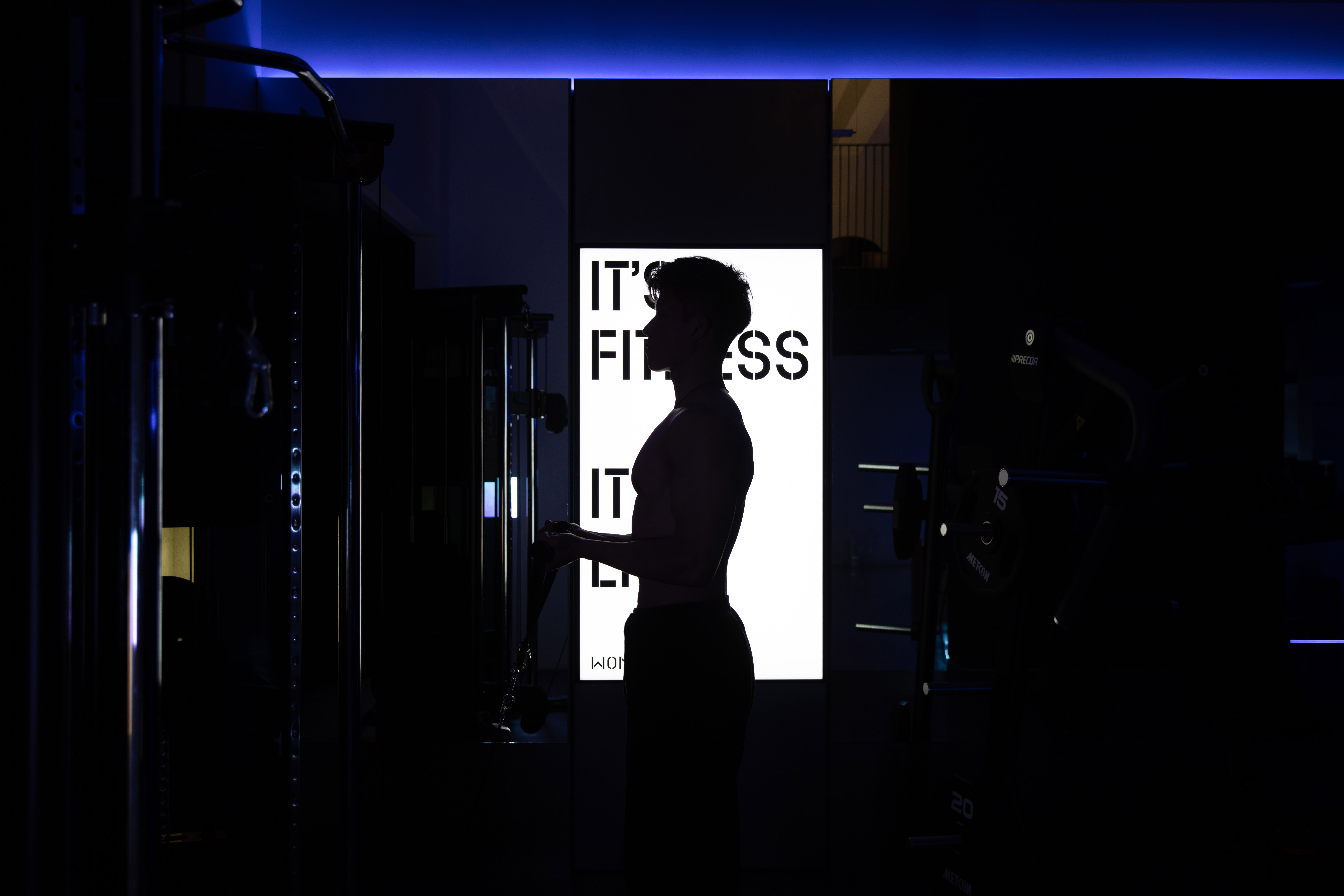
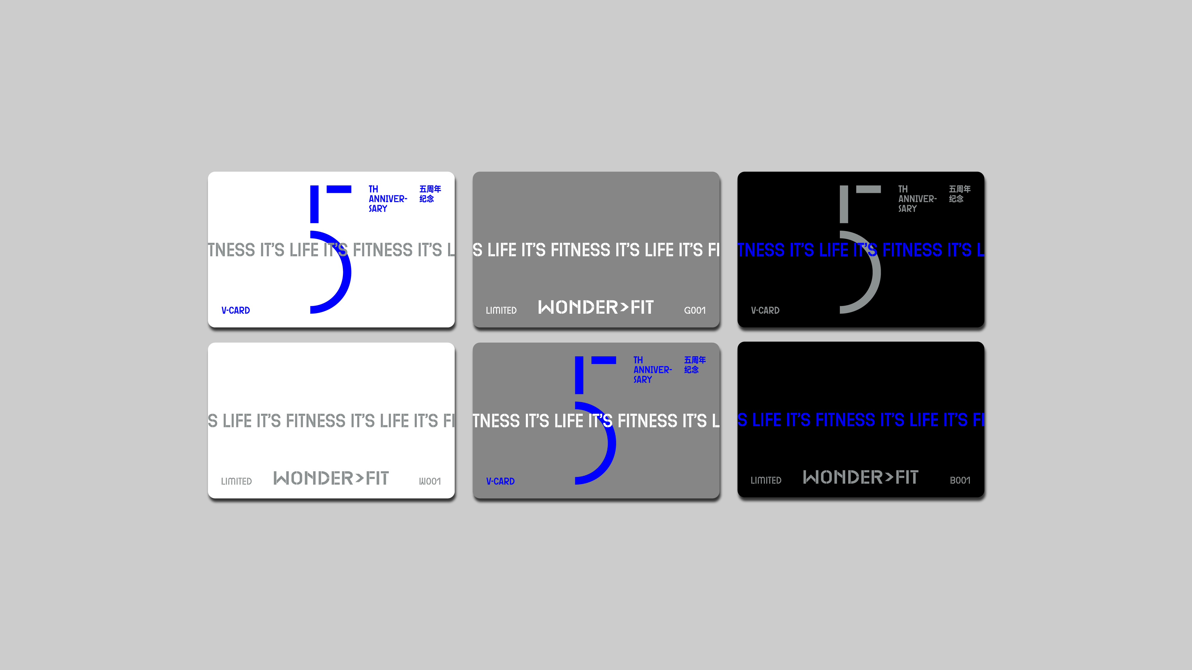
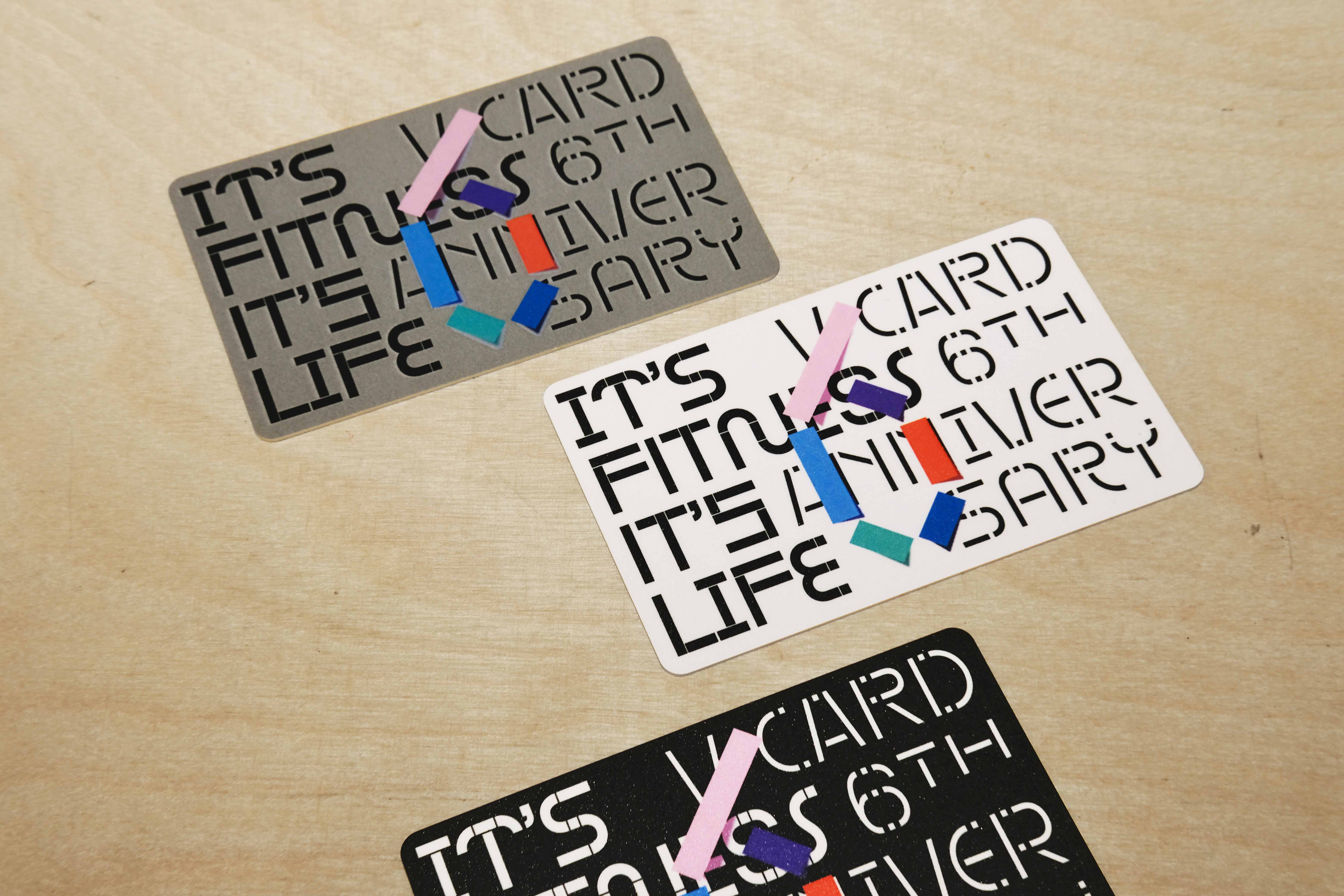
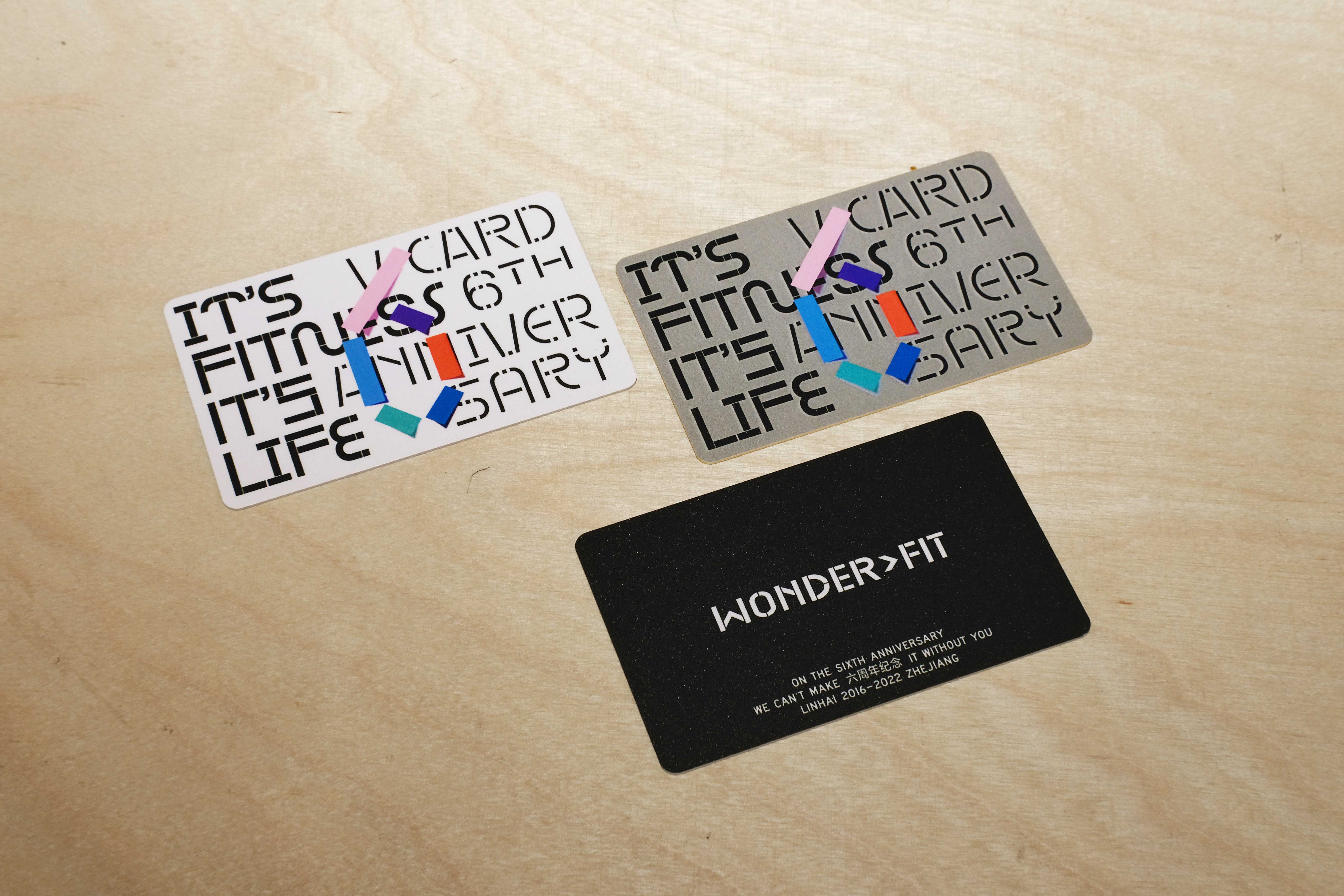
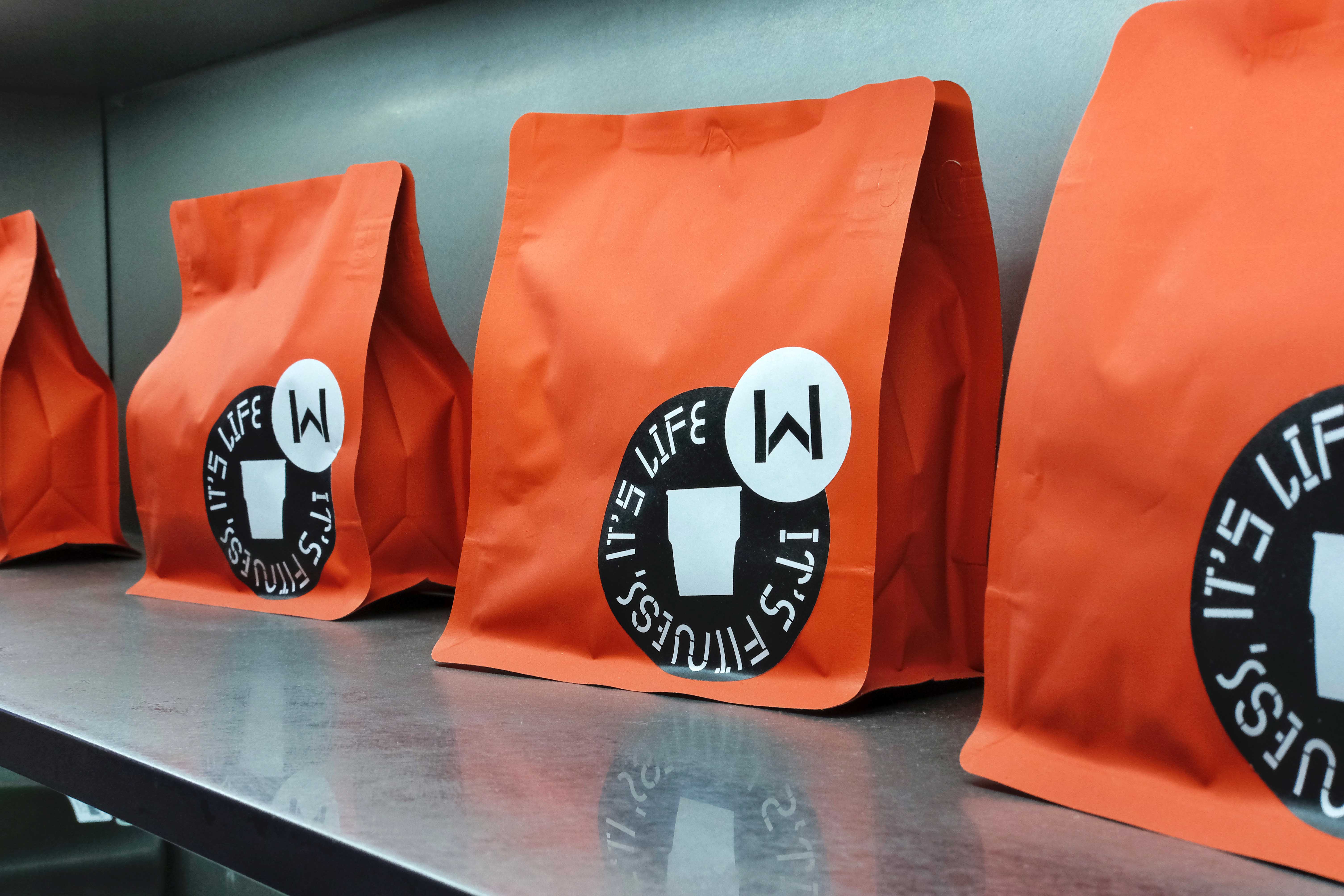
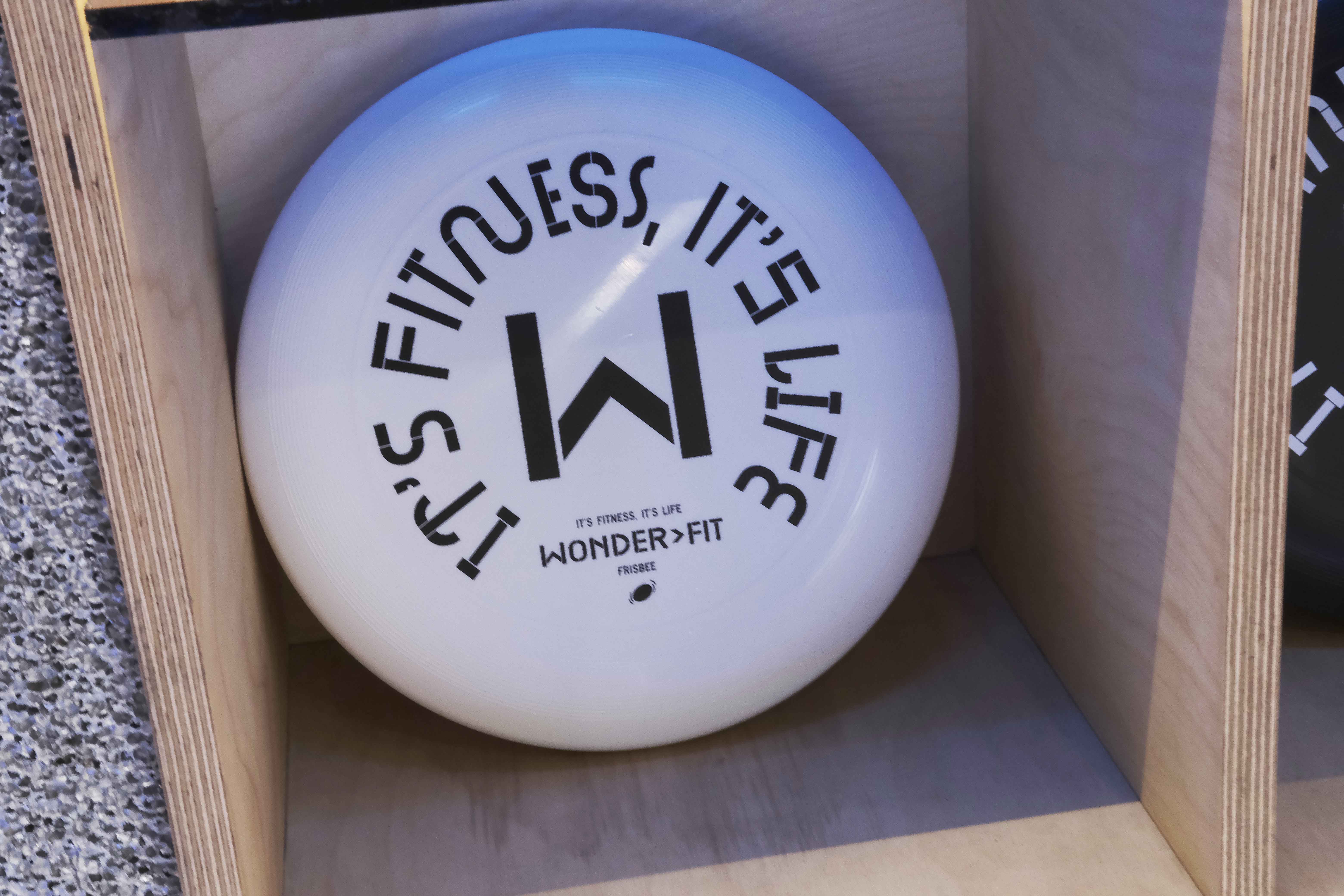
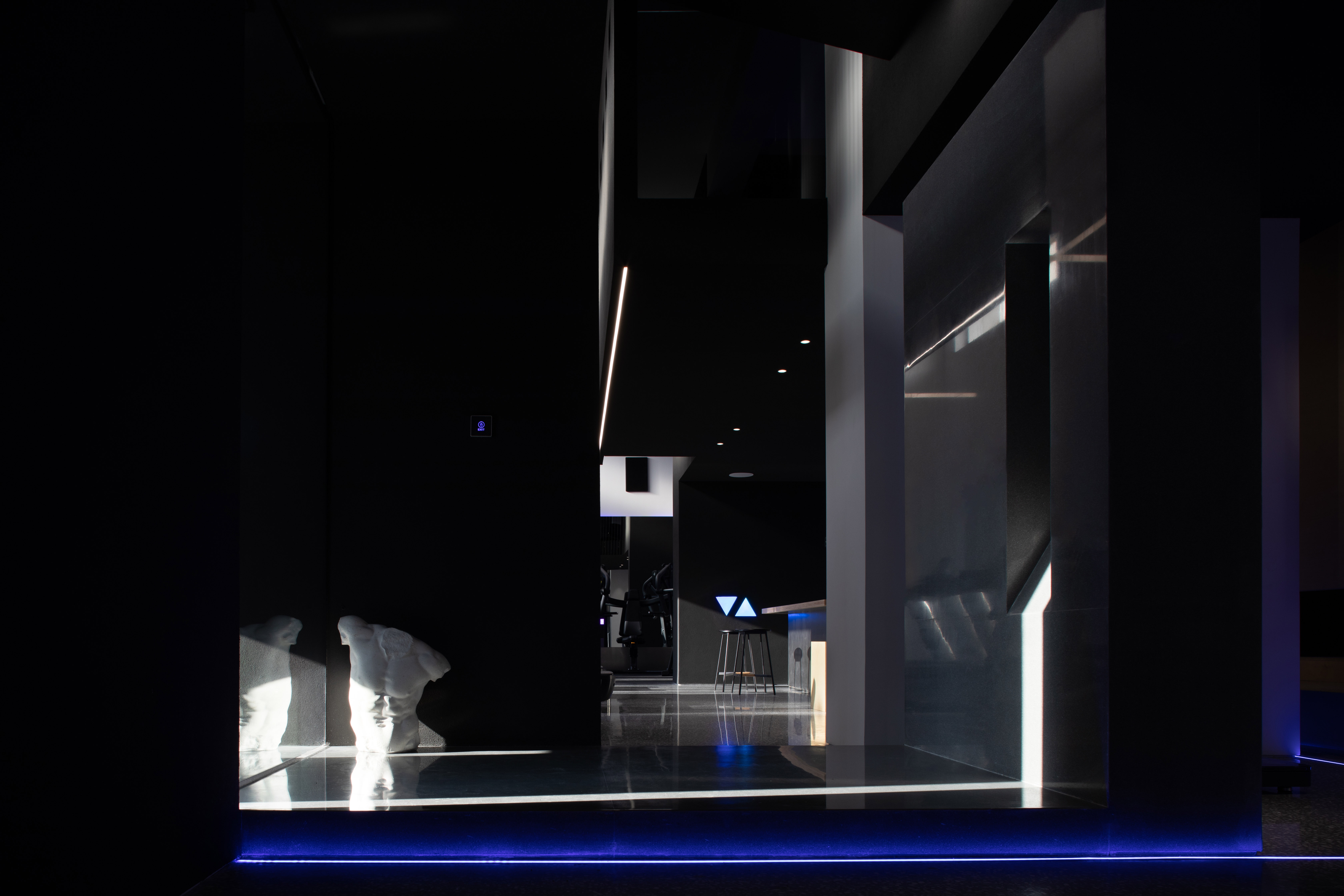
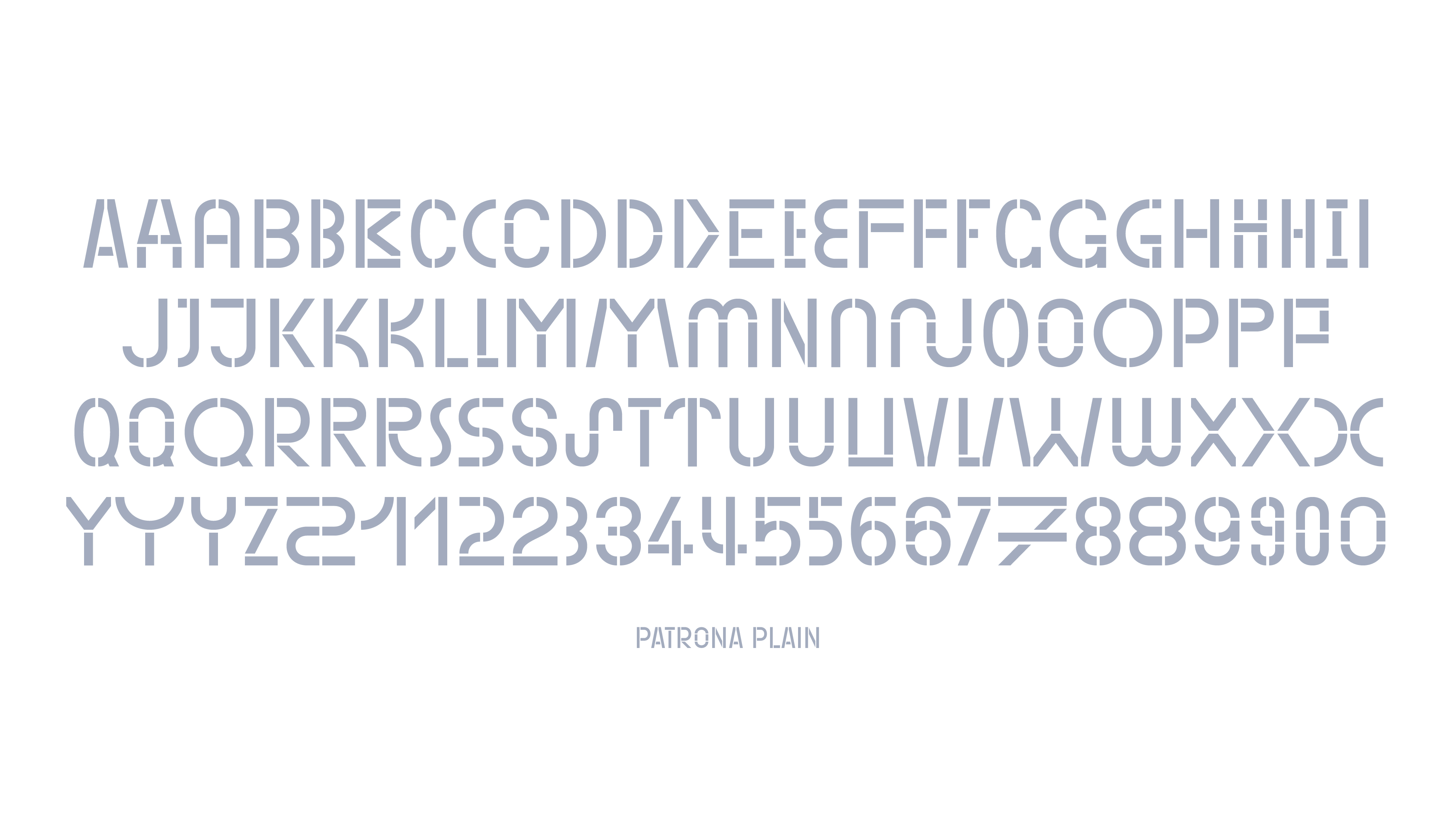
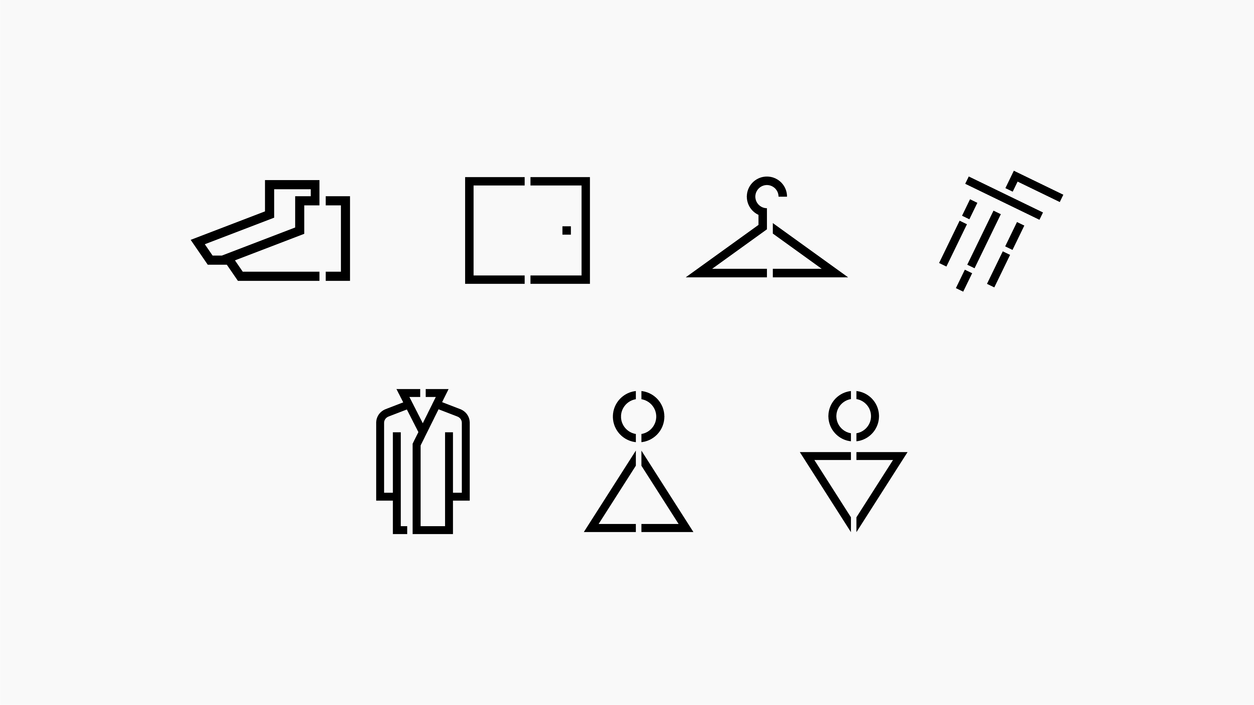
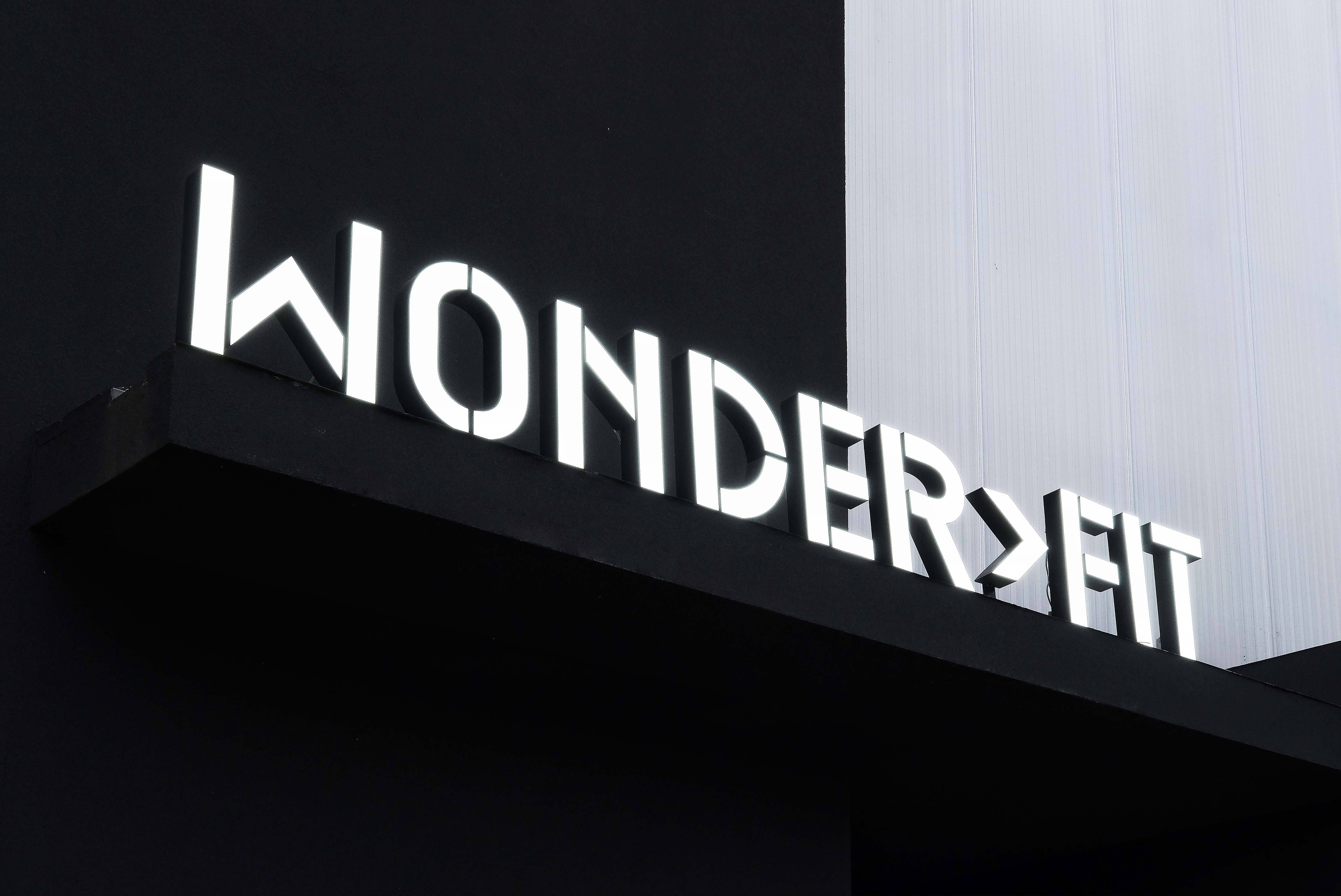
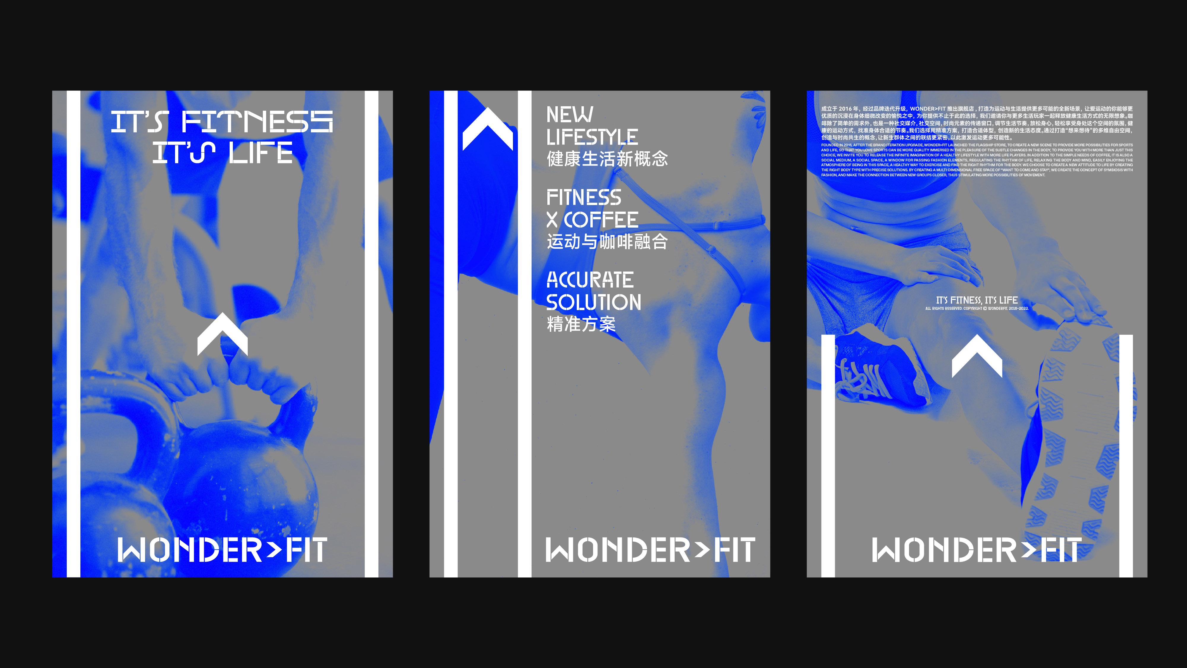
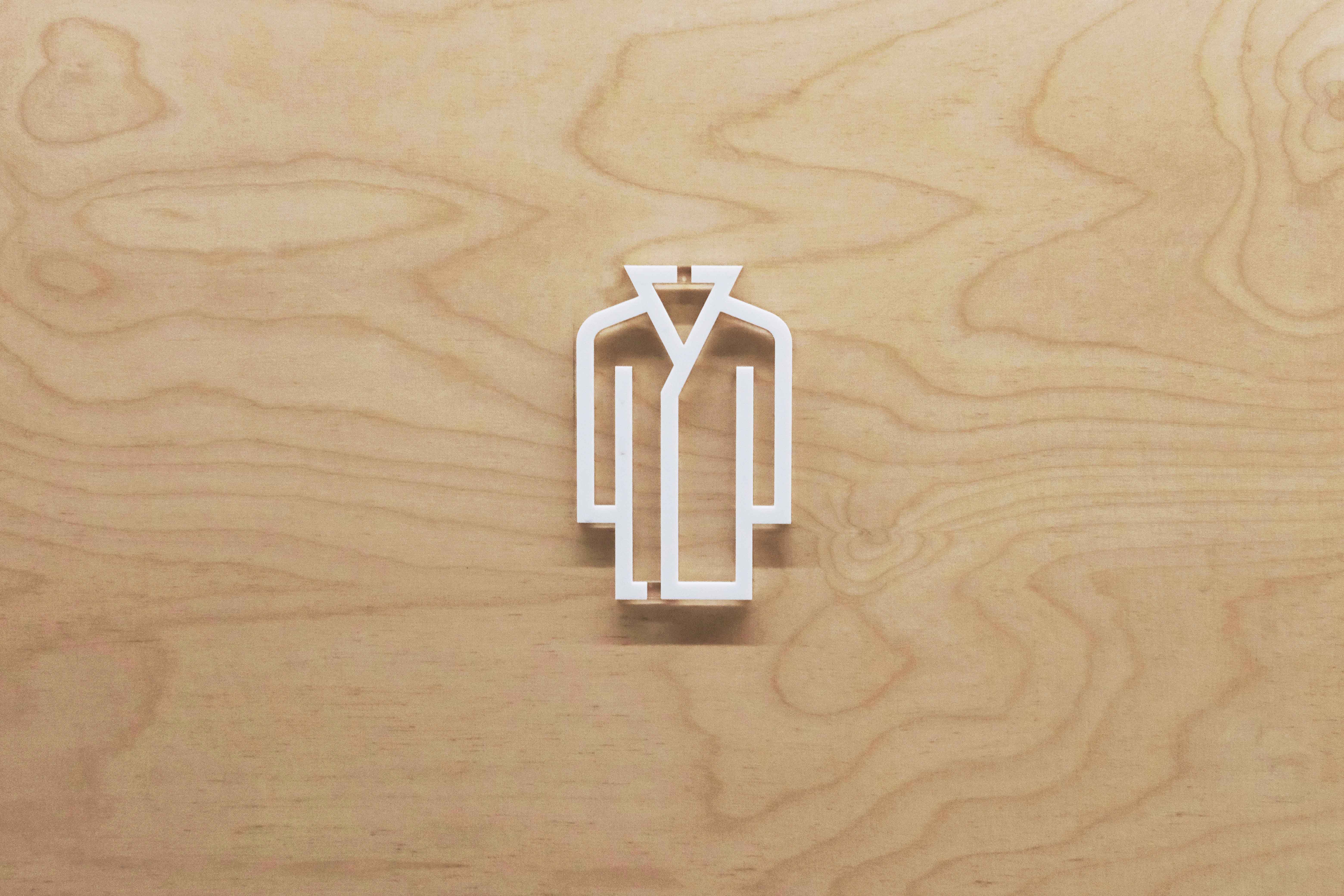
WONDER>FIT 全新的视觉识别形象以 stencil(透字板)风格的字型为基础,源自品牌原标识中就存在的透字板风格的英文字体标识。在此次品牌唤新的设计中,我们认为品牌原标识在整体风格上并无问题,只是在字体的笔画造型和粗细比例上稍显陈旧,因此我们在保留原字体标识整体风格的前提下将字型设计得更加轻盈与现代。紧接着,我们在「WONDER」与「FIT」之间增加了一个三角箭头符号,将原先的「WONDERFIT」做了一个细小的拆分,一方面在阅读层面上使整个单词本身即成为一个简洁且清晰的品牌口号——想要更健康,从而拥有一种向前的动力;另一方面,我们相信 WONDER>FIT 自身的性质决定了其空间体验将会是消费者对其品牌建立印象与连接的更重要的所在,因此新标识中增加的「箭头」与品牌整体设定「蓝色」也呼应了旗舰店空间设计中出现的一系列三角符号与空间装饰的色彩,使它的消费者对品牌印象能够更加连贯与统一。
WONDER>FIT's new visual identity is based on the stencil style typeface, which is derived from the original logotype. In this new design, we thought that there was nothing wrong with the overall style of the original logo, but the stencil shape and thickness ratio of the typeface were a bit old-fashioned, so we made the typeface lighter and more modern while keeping the overall style of the original logotype. We then added a triangular arrow symbol between “WONDER” and “FIT” and made a small split of the original word “WONDERFIT”, which on the one hand makes the whole word itself a simple and clear brand slogan - Wanna to be Healthier. On the other hand, we believe that the nature of WONDER>FIT itself determines that its space experience will be more important for consumers to build impressions and connections with its brand. The new logo and the brand's overall setting of “blue” also echo the series of triangular symbols and colors of the space decoration in the design of the space, so that its audiences will have a more consistent and uniform impression of the brand.

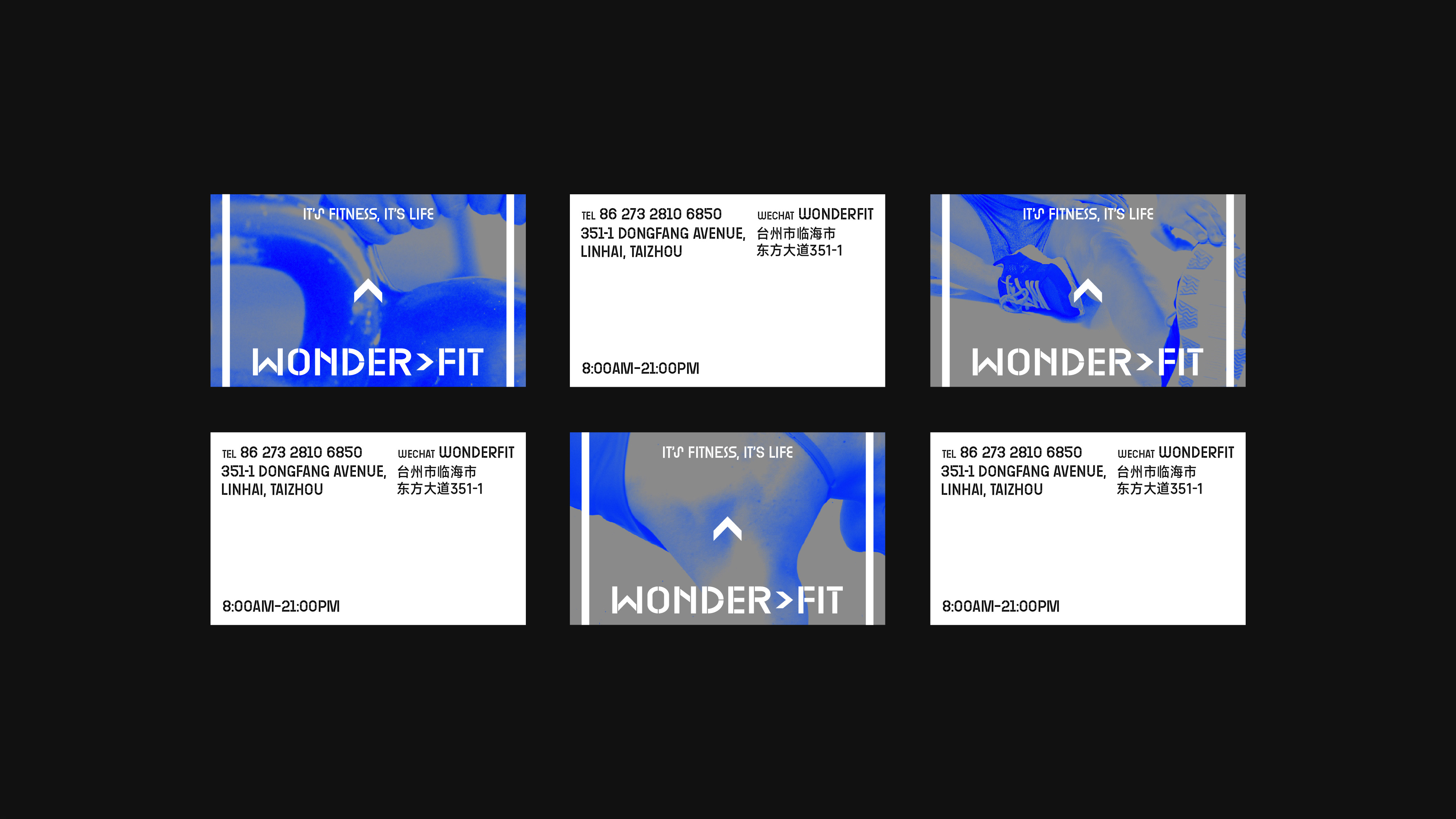
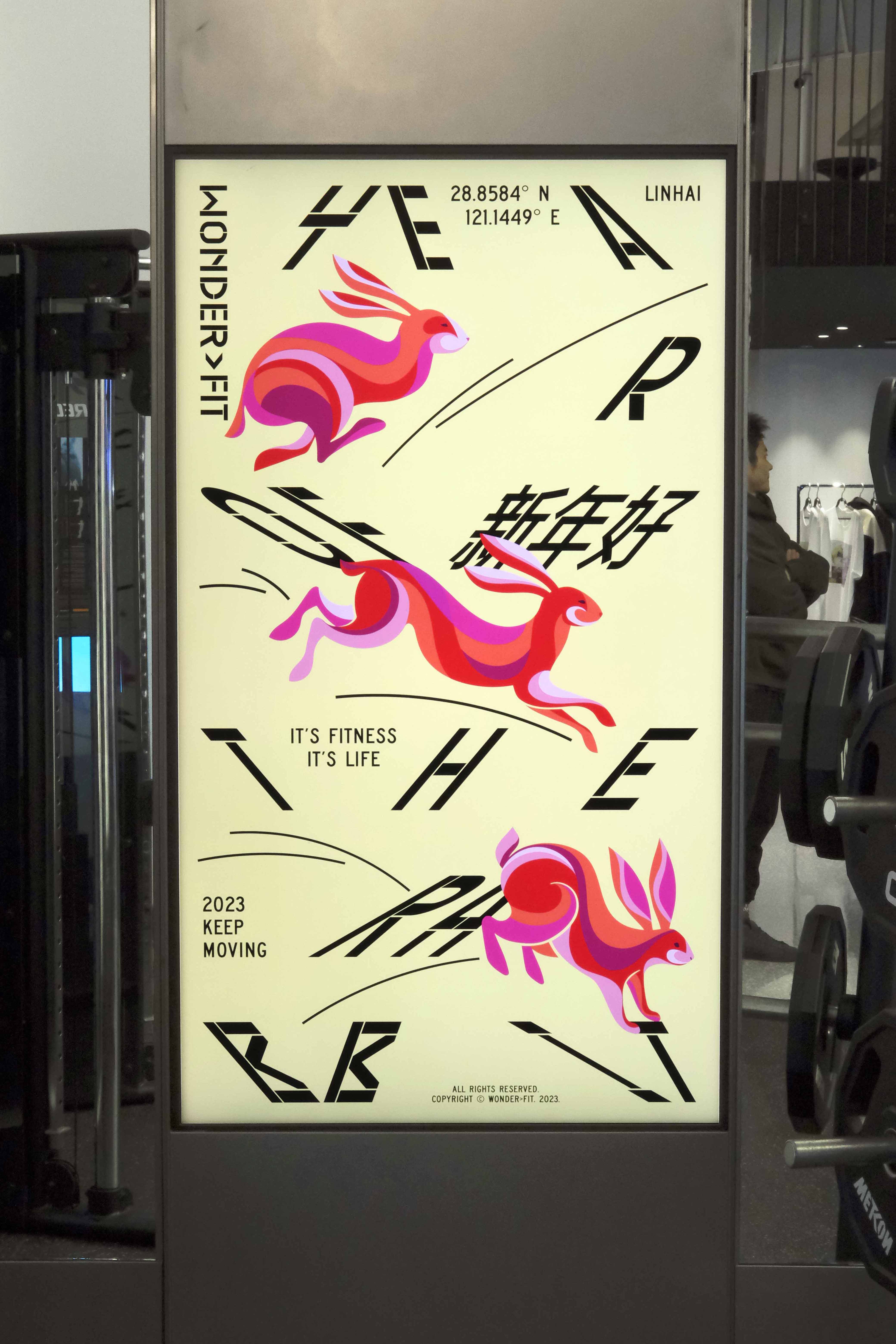
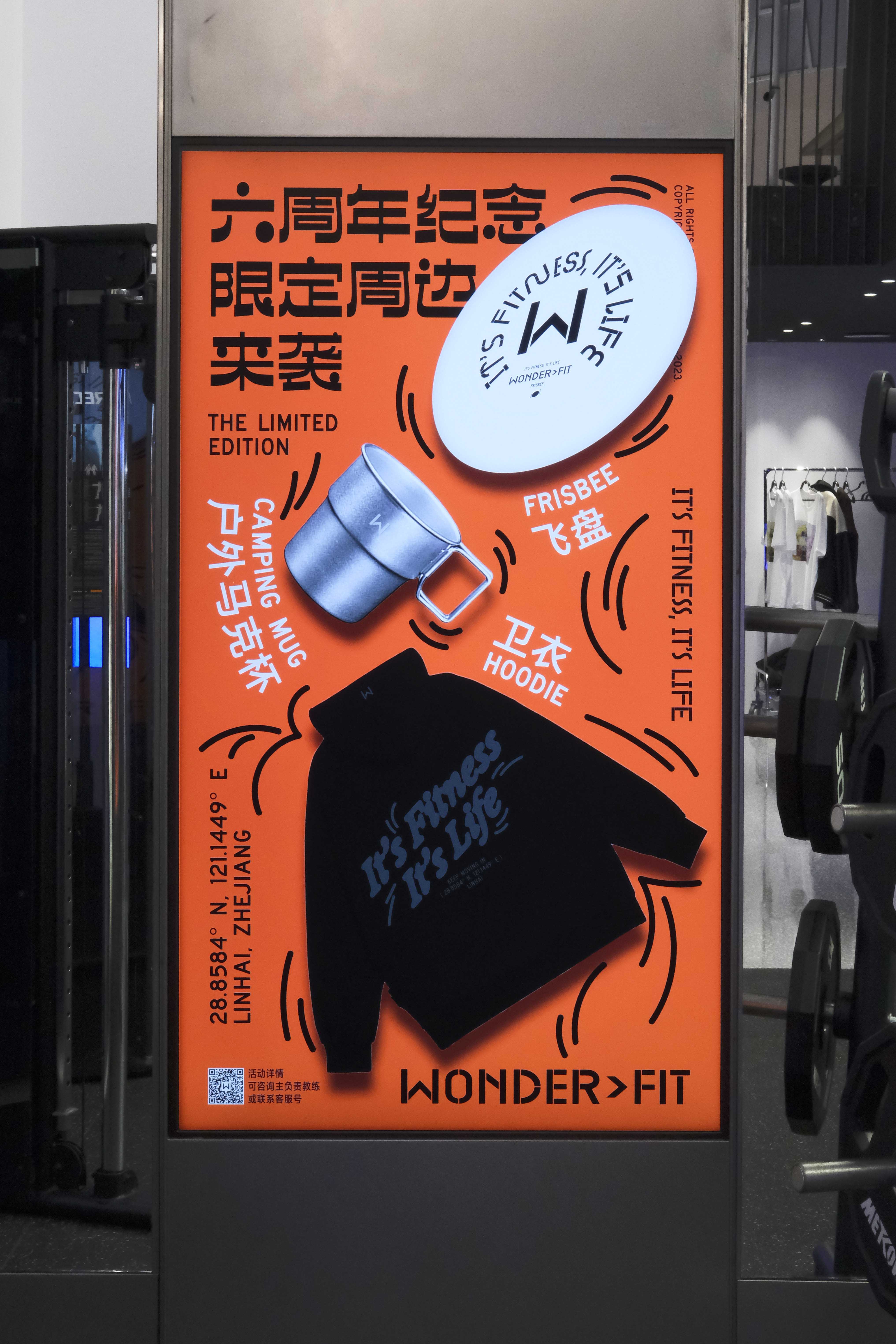
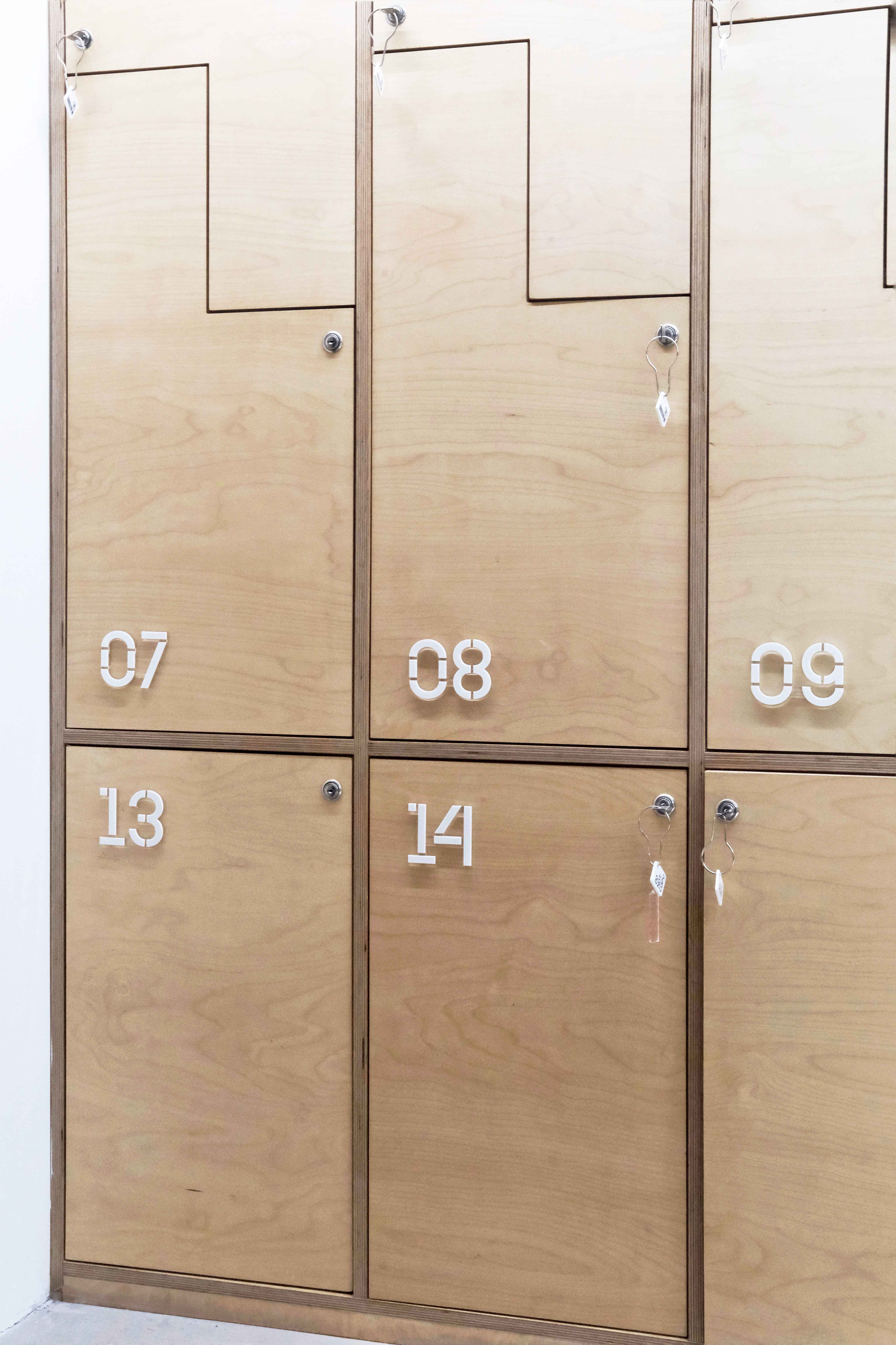
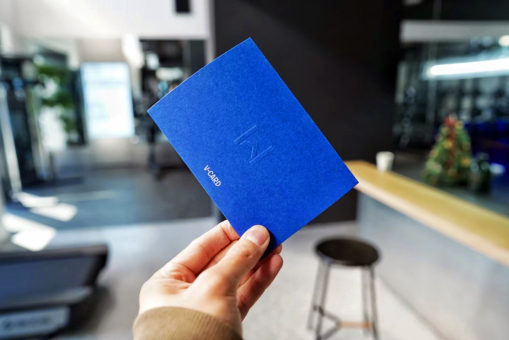
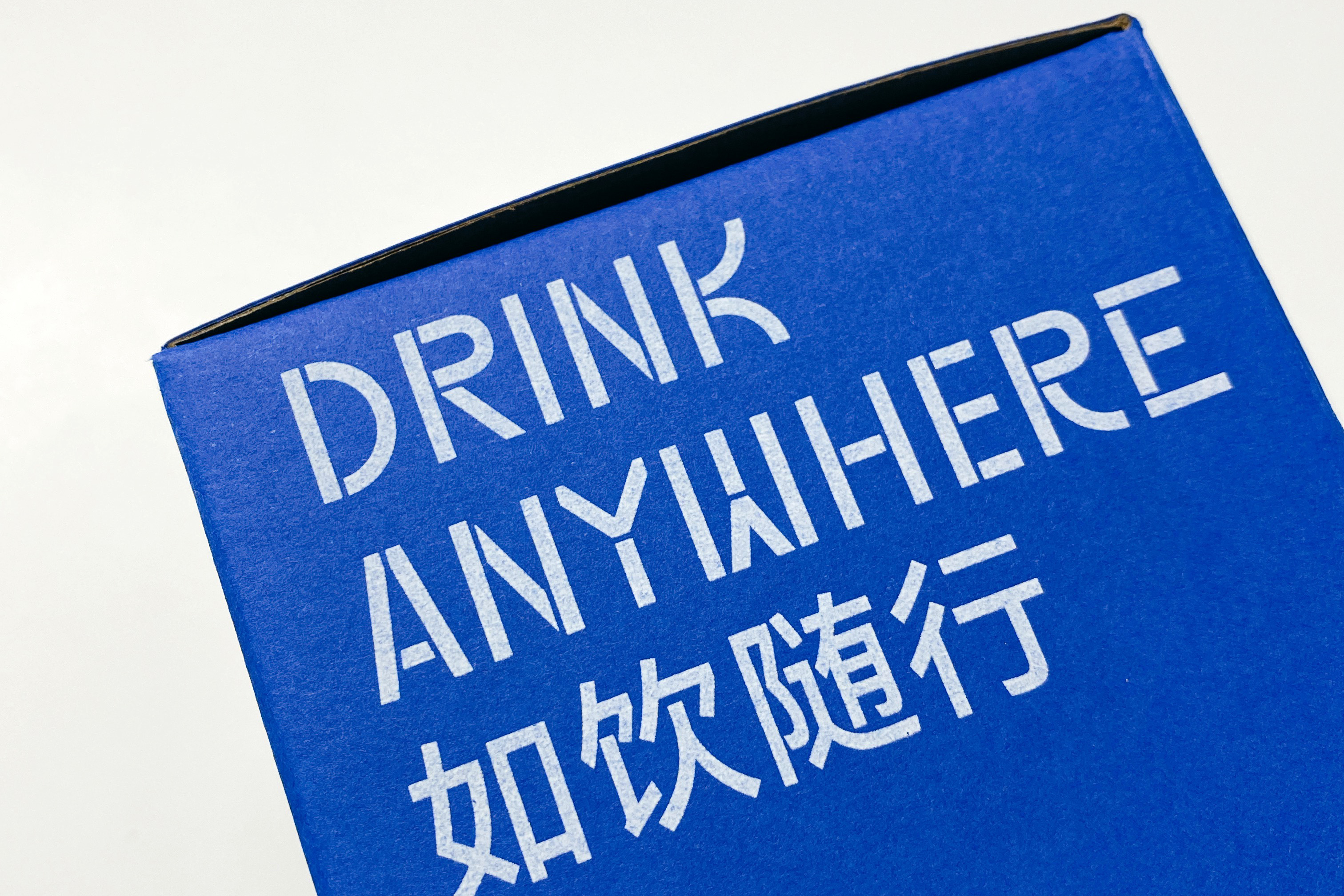
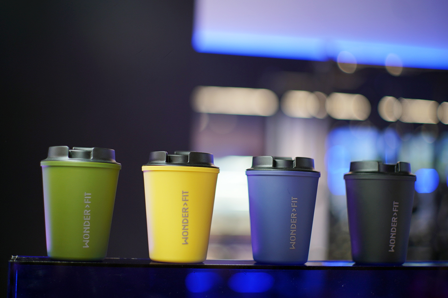
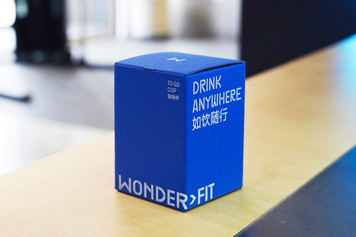
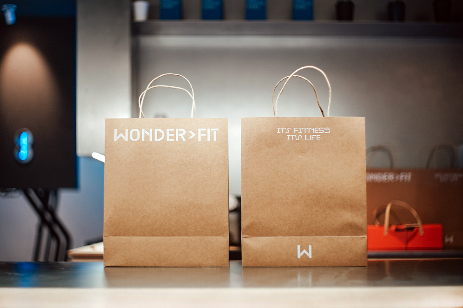
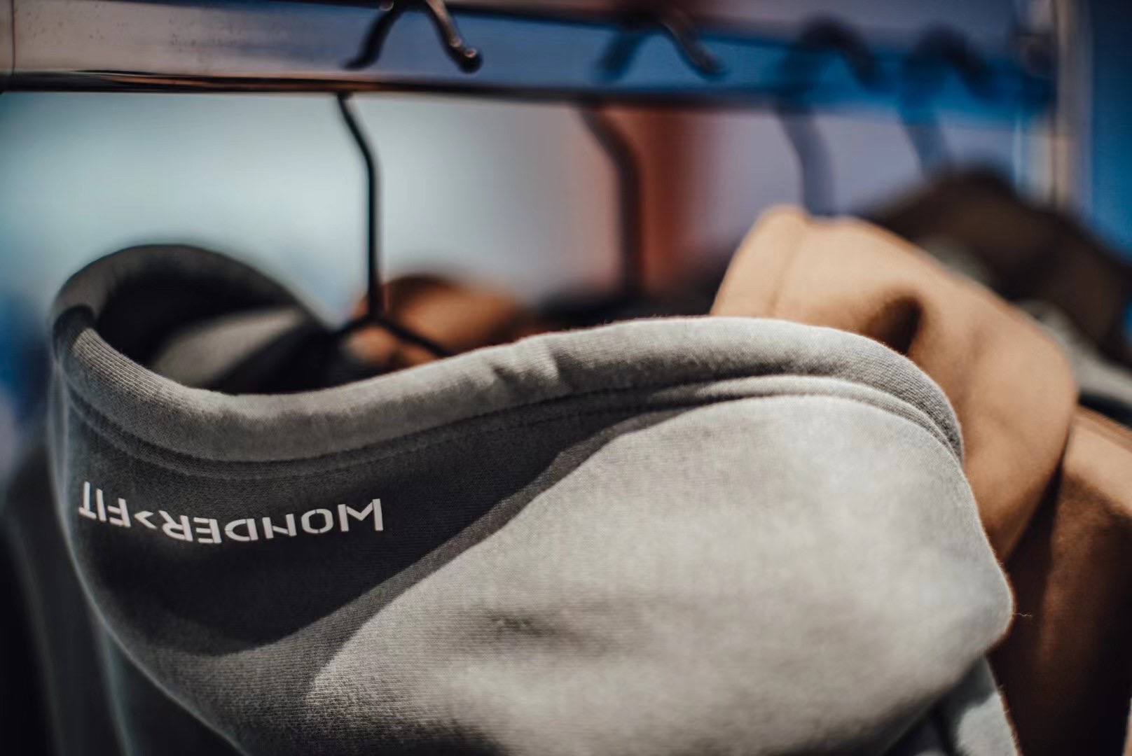
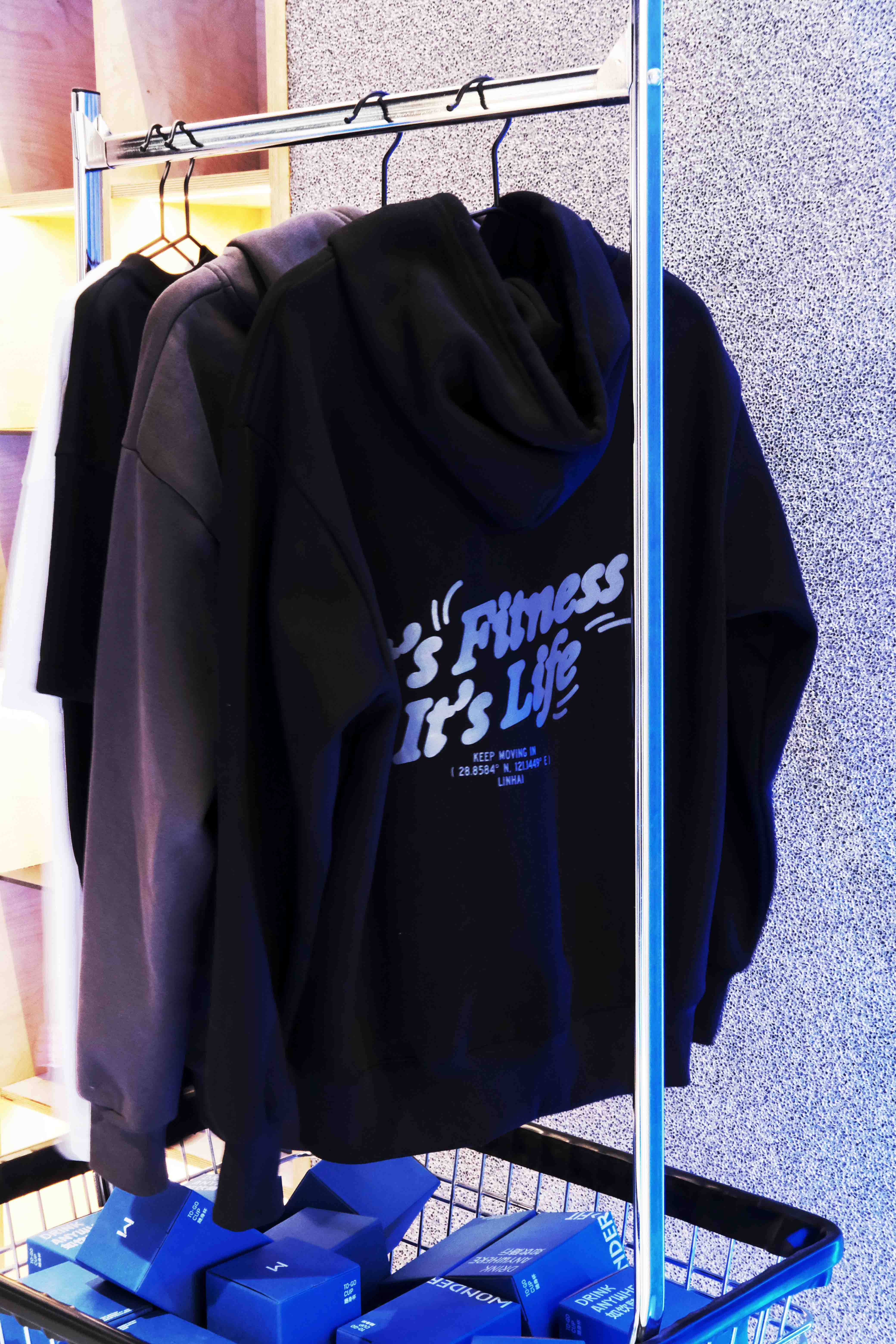
在此次品牌唤新落成的时间点,也恰逢品牌五周年的里程碑,借此我们与品牌方一同策划了五周年活动期间能够通过全新的设计产生助力的方方面面。在这个过程中,我们为 WONDER>FIT 陆续完成了五周年特别版会员卡的设计、水杯与服装等周边纪念品的设计,以及不同类型产品的包装设计。
The new inauguration of the brand also coincides with the milestone of the brand's fifth anniversary, so we worked with the brand to plan all aspects of the new design that would contribute to this period. In this process, we have completed the design of special edition membership cards, mugs, cloths, and apparel, as well as packaging design for different types of products for WONDER>FIT.