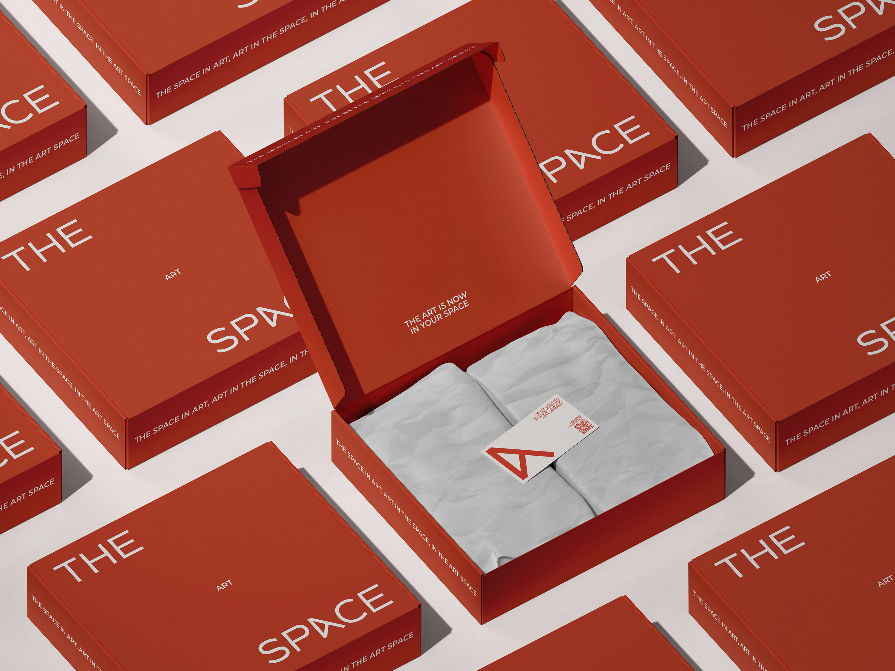
The Space
行业类型:餐饮
餐饮
文化艺术
实践类型:视觉识别系统设计
视觉识别系统设计
海报设计
包装设计
文案编辑
SECTOR: Food & Drinks
Food & Drinks
Arts & Culture
PRACTICE AREA:
Visual Identity System Design
Visual Identity System Design
Poster Design
Packaging Design
Copywriting
THE SPACE 的经营始于 2014 年,是上海早期为数不多的将咖啡、餐饮、艺术混合经营的空间之一。经过 7 年的经营与发展,THE SPACE 因其优质的咖啡与早午餐而得到了许多消费者的喜爱;同时,其空间也配备有与专业画廊同等级的艺术展示环境,在多年的经营间也为艺术爱好者呈现了一系列涉猎广泛的优质展览,如版画、摄影、绘画、设计等不同方面。在 The Space 自己的介绍中提到:「THE SPACE 是一个无法定义的空间,它为富有创造力、渴望表达、热衷交流的人们提供展示的场所,为思想者和行动者创造相聚的机会并激发出新的可能。此外,还为追求品质的人们提供一杯好咖啡以及一段闲适的时光……」。
Started in 2014, THE SPACE is one of the few early spaces in Shanghai that mixes coffee, drinks, food, and art. After 7 years of operation and development, THE SPACE has gained a lot of popularity for its quality coffee and brunch, while at the same time, the space is equipped with an art display environment on par with professional galleries, and has presented a wide range of quality exhibitions for art lovers over the years, such as prints, photography, painting, design and other aspects. THE SPACE's own description says, “The Space is an indefinable space that provides a venue for creative, expressive, and communicative people to meet, create opportunities for thinkers and doers to meet, and inspire new possibilities. It also offers a good cup of coffee and a leisurely time for those who seek quality ……”.
Started in 2014, THE SPACE is one of the few early spaces in Shanghai that mixes coffee, drinks, food, and art. After 7 years of operation and development, THE SPACE has gained a lot of popularity for its quality coffee and brunch, while at the same time, the space is equipped with an art display environment on par with professional galleries, and has presented a wide range of quality exhibitions for art lovers over the years, such as prints, photography, painting, design and other aspects. THE SPACE's own description says, “The Space is an indefinable space that provides a venue for creative, expressive, and communicative people to meet, create opportunities for thinkers and doers to meet, and inspire new possibilities. It also offers a good cup of coffee and a leisurely time for those who seek quality ……”.
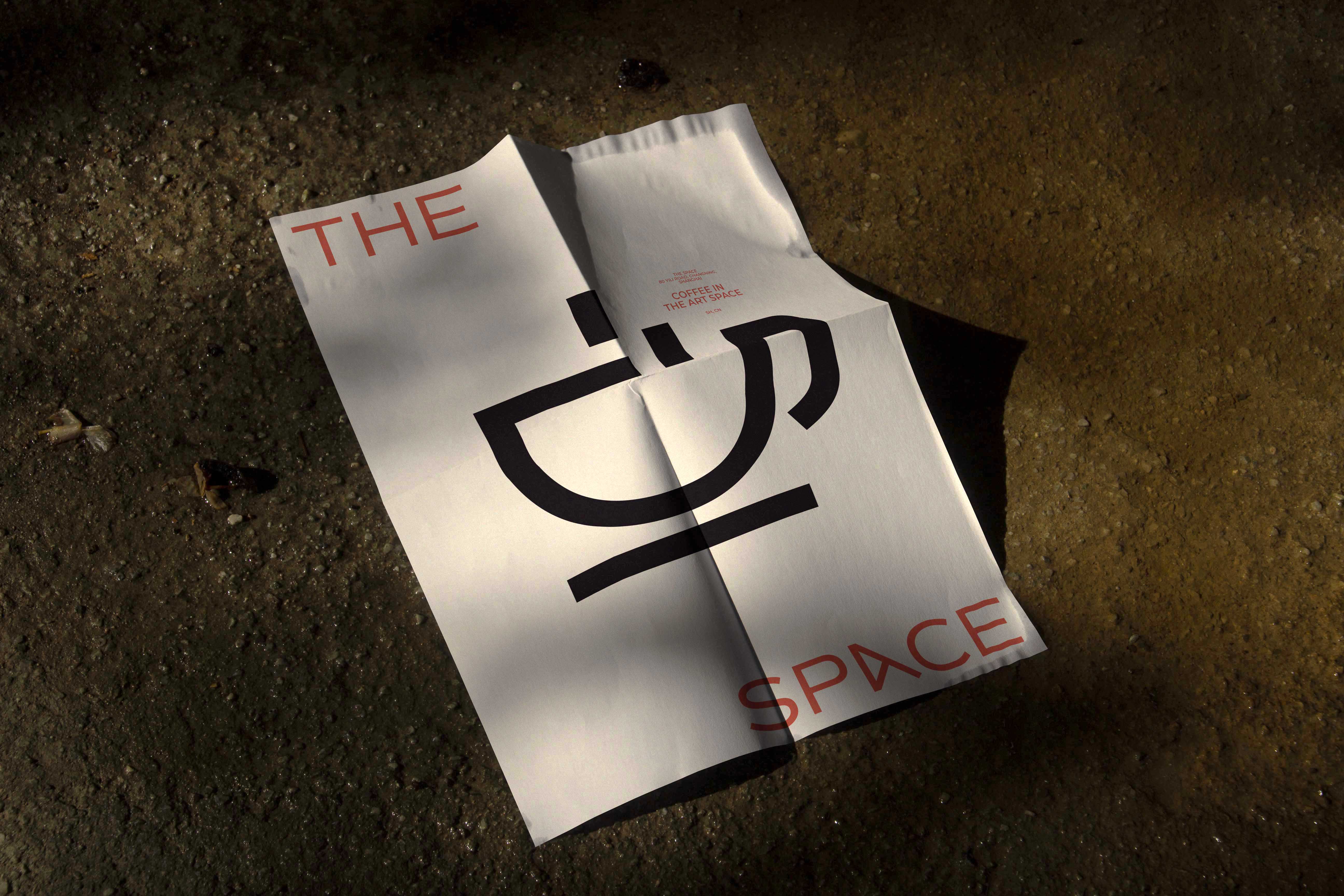


我们与 THE SPACE 的初次相识缘于 2019 年为新西兰设计师凯瑟琳·格里菲斯策划的展览最后落地在这里。经过后续一系列小规模的设计合作之后,我们收到 THE SPACE 的邀请为他们整理和设计一套完整的视觉识别,以帮助他们开启一段新的征程。据统计,上海的咖啡店数量目前已经高居全球第一,走在上海可以遇见各式各样的咖啡店,也已经出现了越来越多像 THE SPACE 一样进行混合业态经营的零售和餐饮空间。在这样的环境下,是彻底打造迥然不同的形象还是延续品牌已有的风格?是融入吸引眼球的纷繁潮流还是延续品牌原本的干净利落?是为 THE SPACE 增加一个明确的定语还是保持它的无法定义?这些问题和选择一时间成了我们与品牌方讨论最多的部分。
We first met THE SPACE in 2019 when the exhibition we curated for New Zealand designer Catherine Griffiths launched there. After a series of small-scale design collaborations, we were asked by THE SPACE to put together and design a new visual identity to help them embark on a new journey. According to statistics, Shanghai has the highest number of coffee shops in the world, you can find all kinds of coffee shops in Shanghai, and there are more and more retail and restaurant spaces like The Space with mixed business operations. In such an environment, is it better to create a completely different image or to continue the brand's existing style? Is it better to incorporate eye-catching trends or to continue the brand's original cleanliness? Should we add a definitive term to THE SPACE or keep it undefined? These questions and choices became the most discussed part of our discussions with the two founders of the brand.
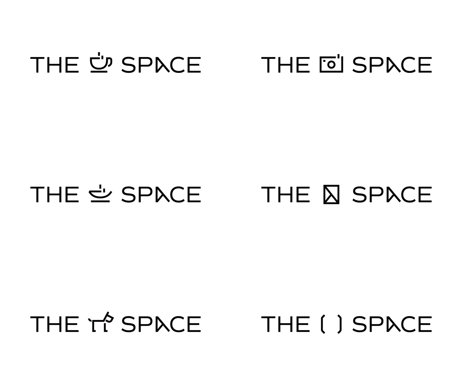
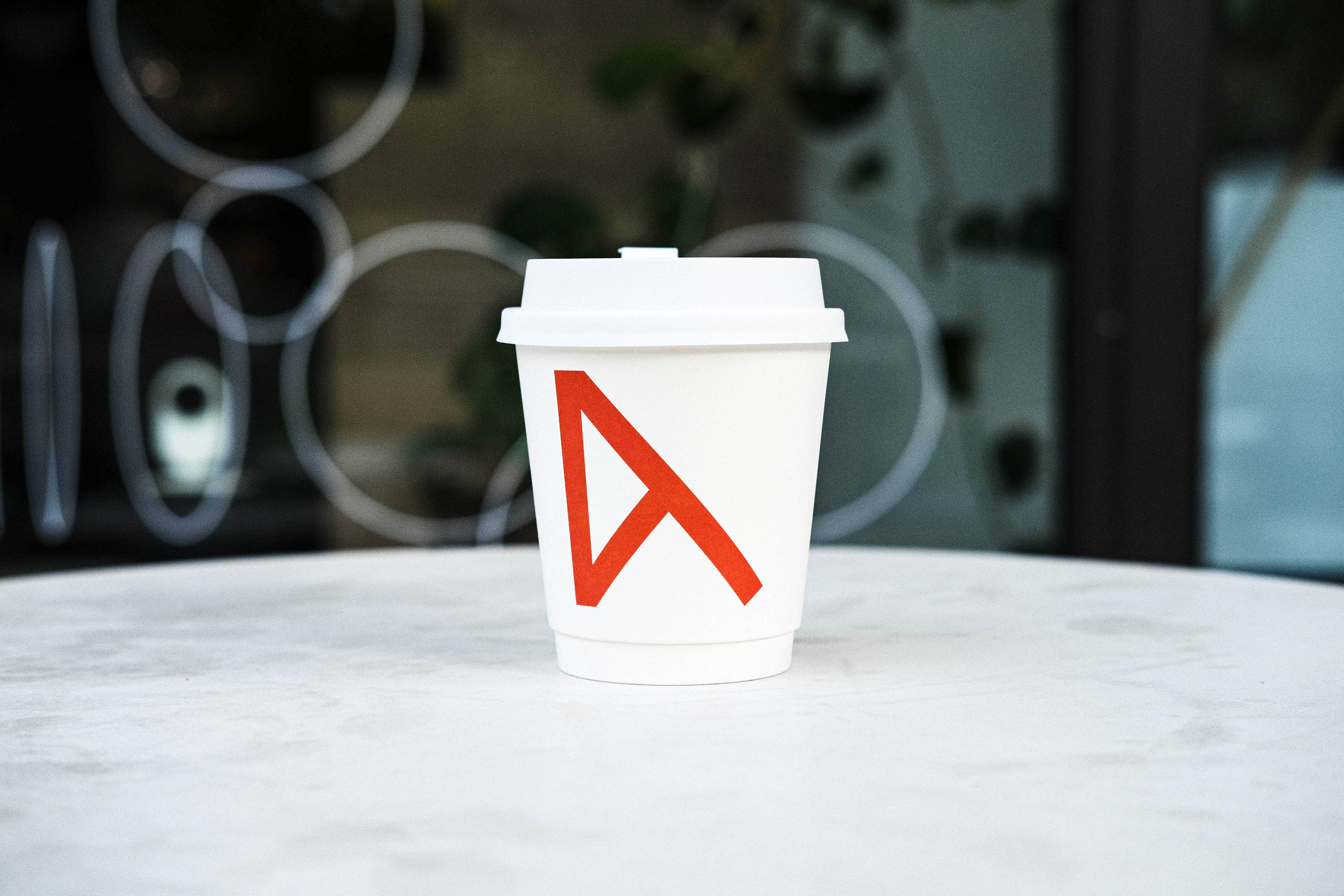
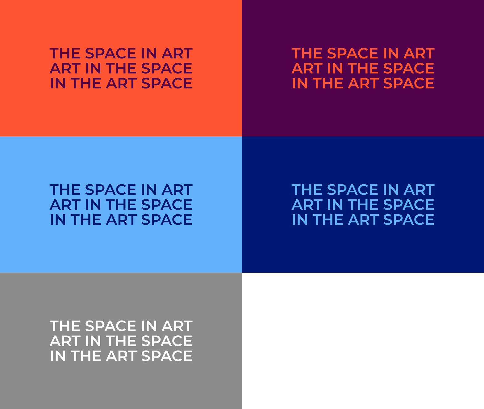
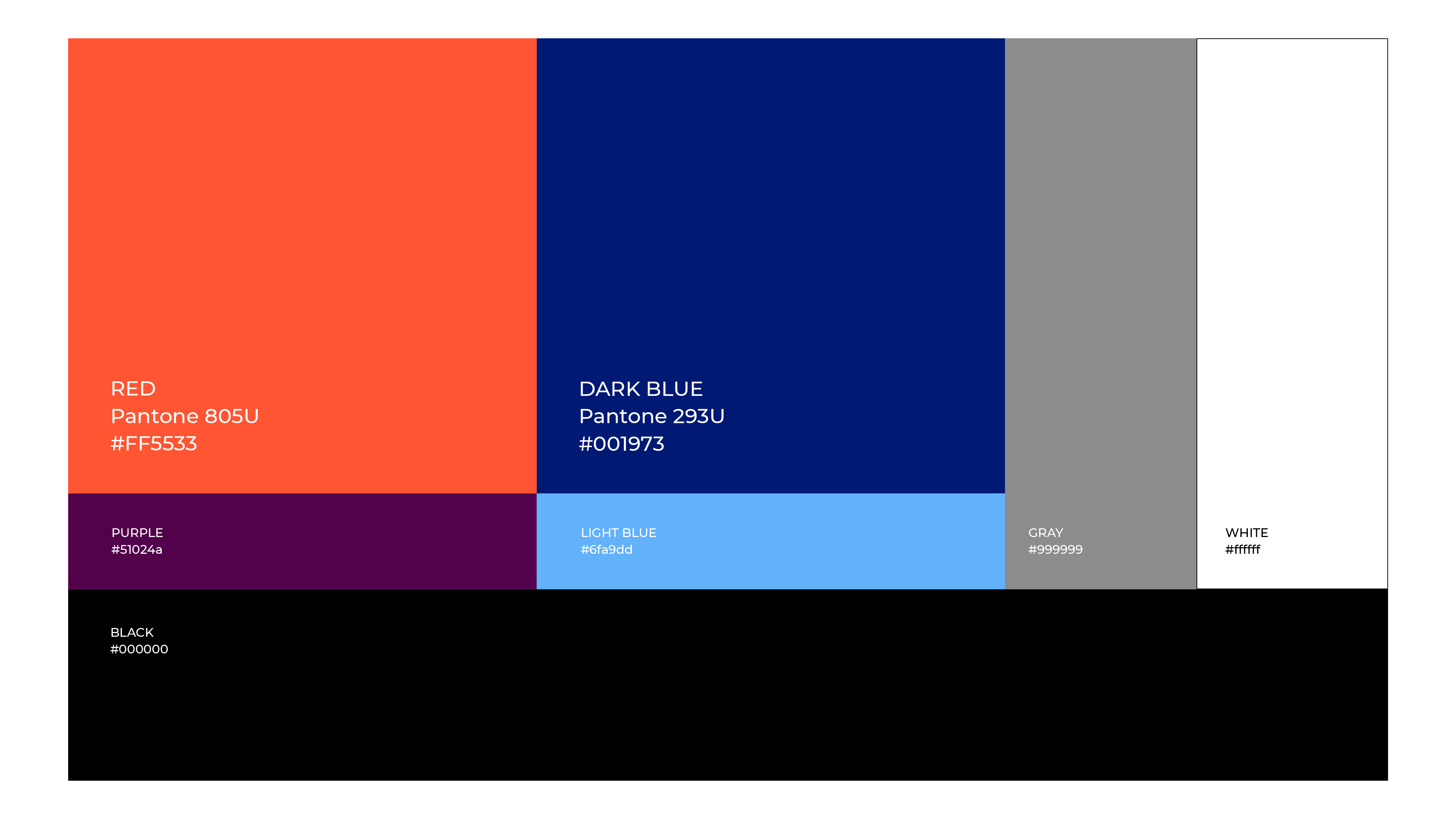
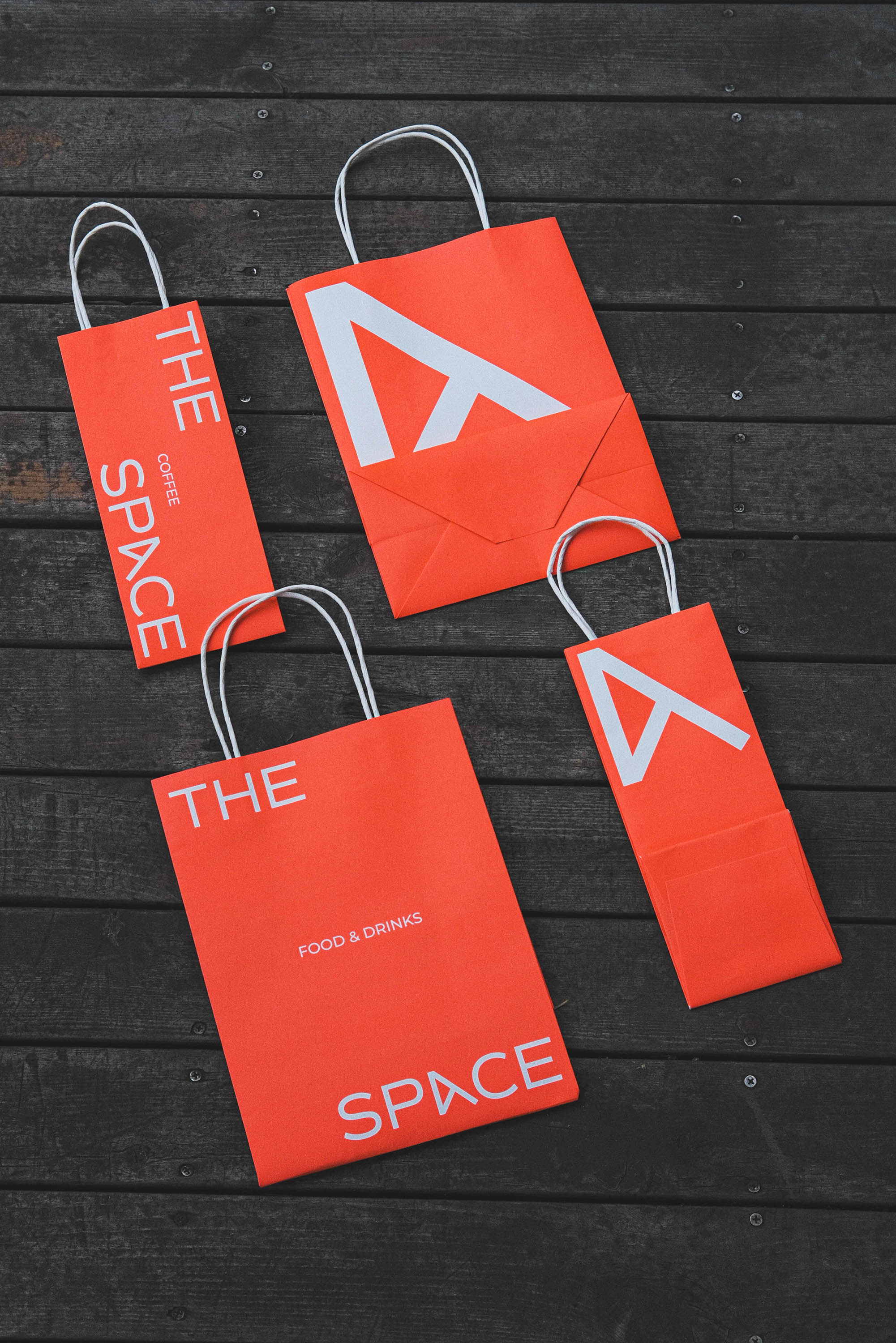
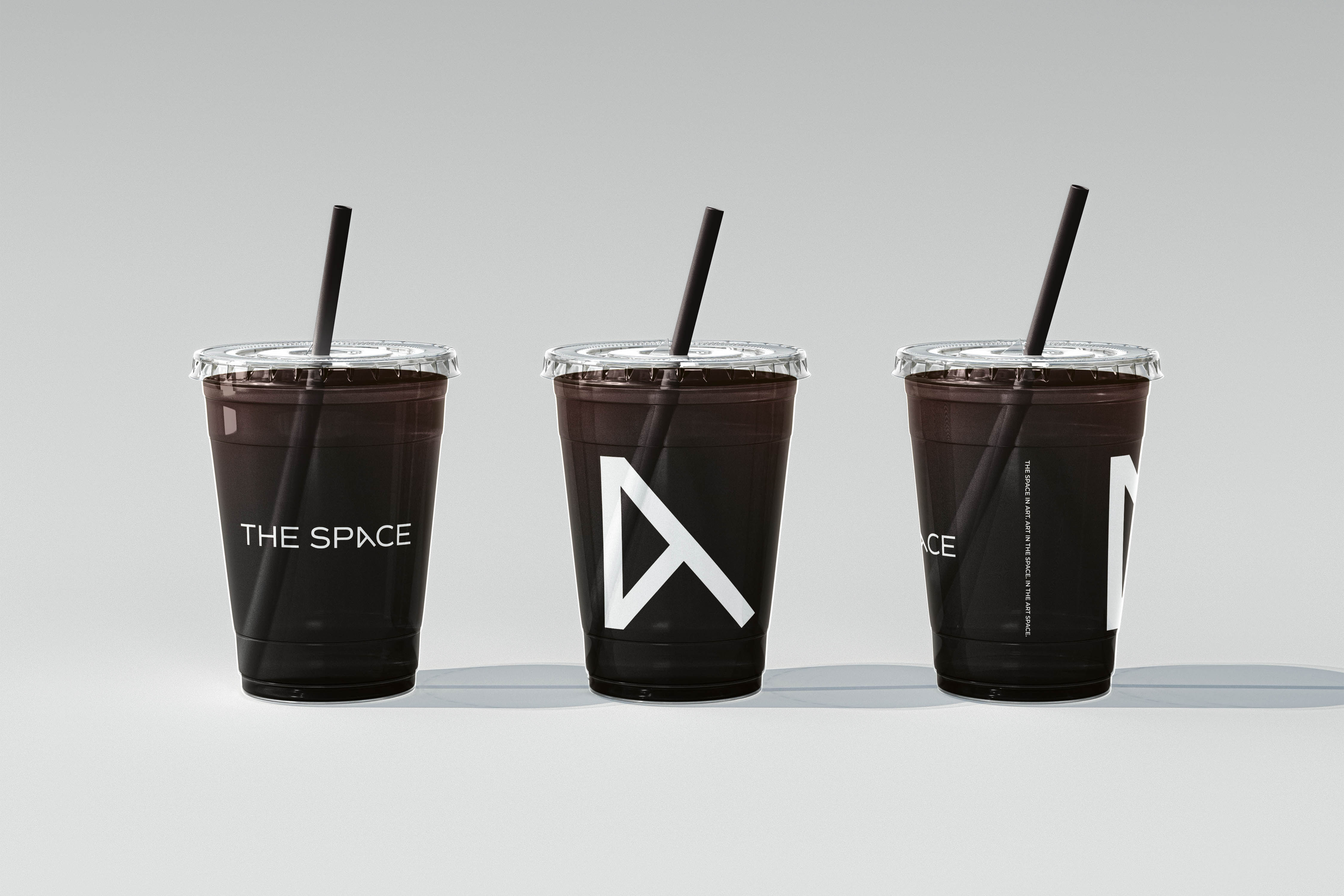
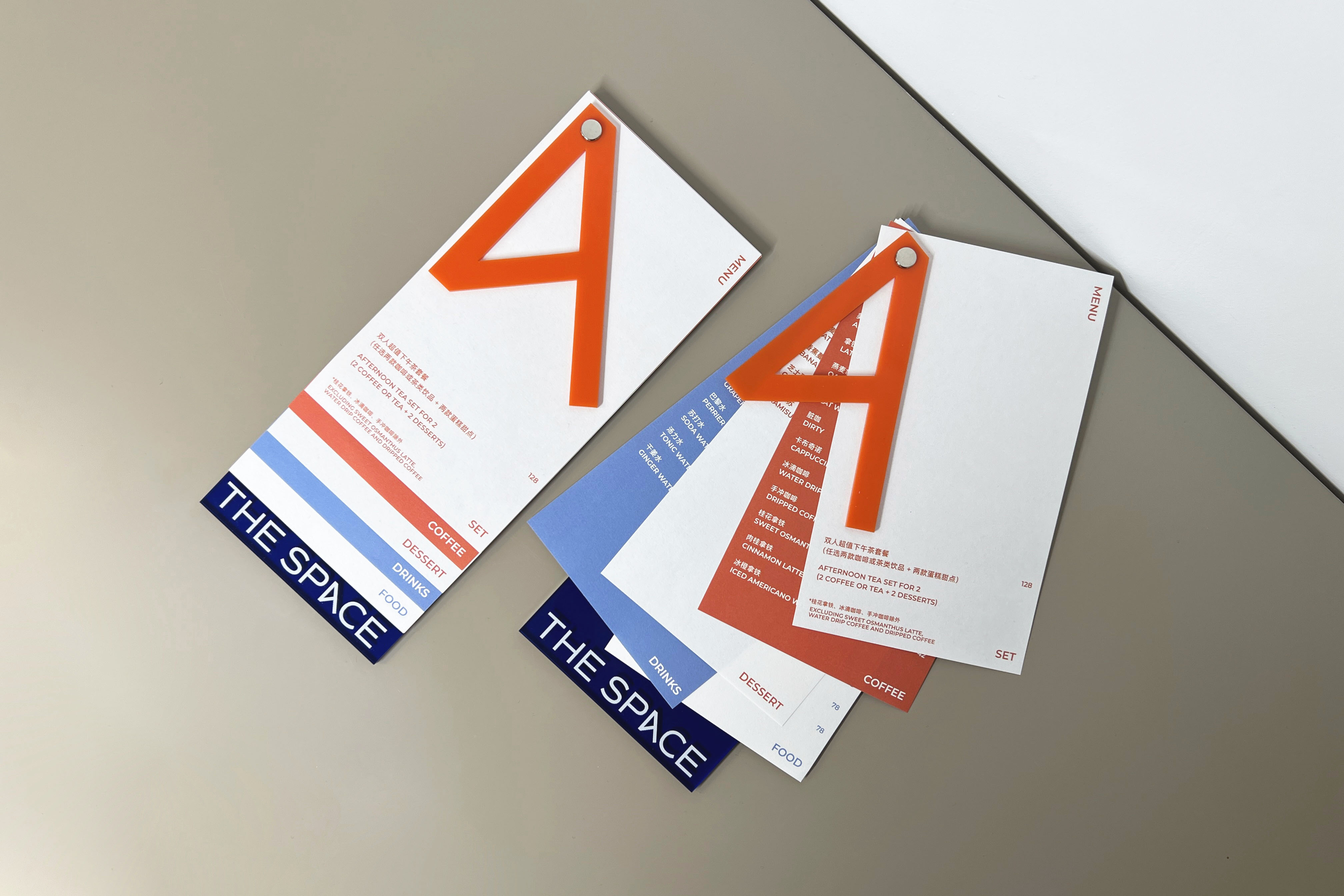
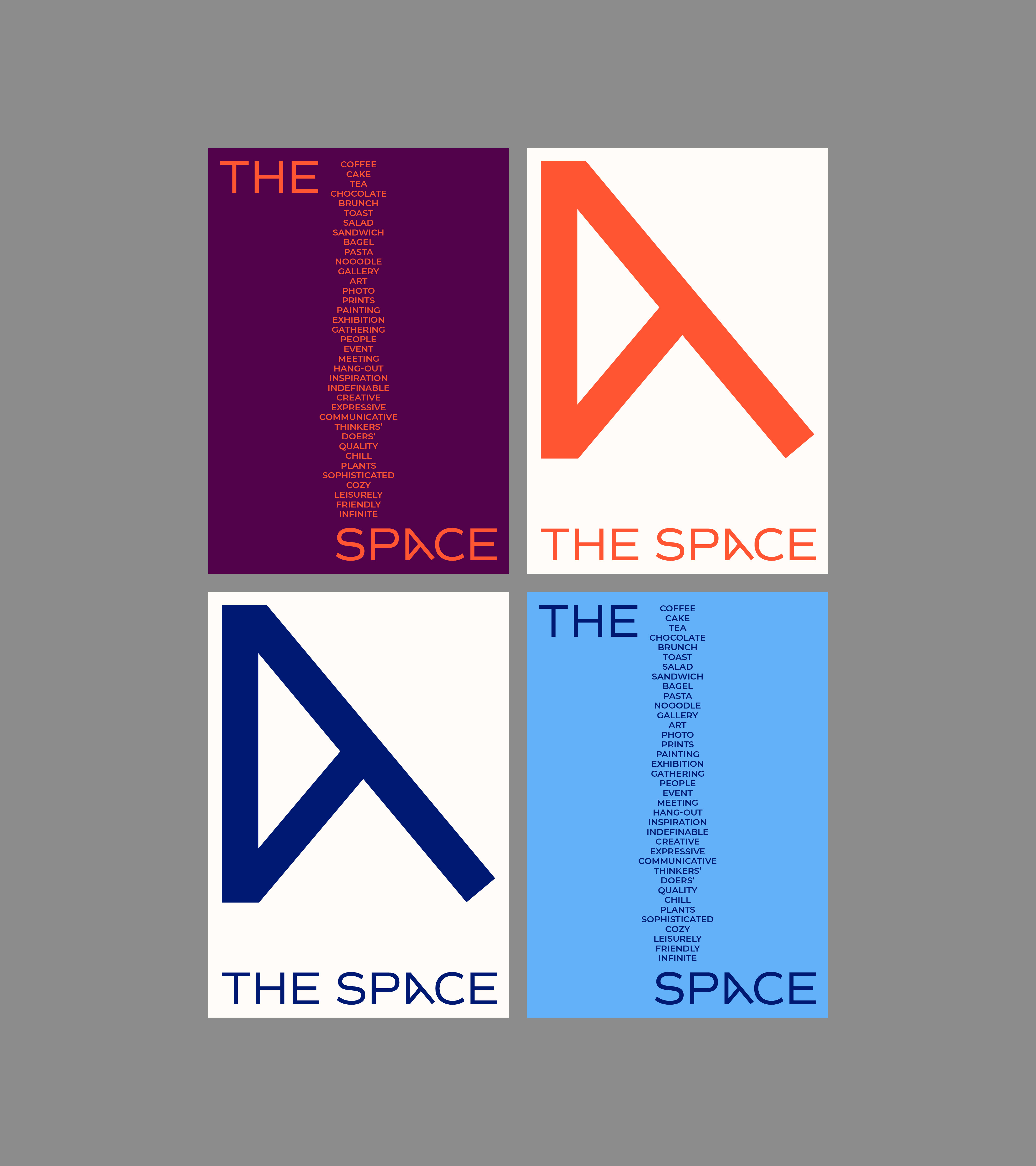
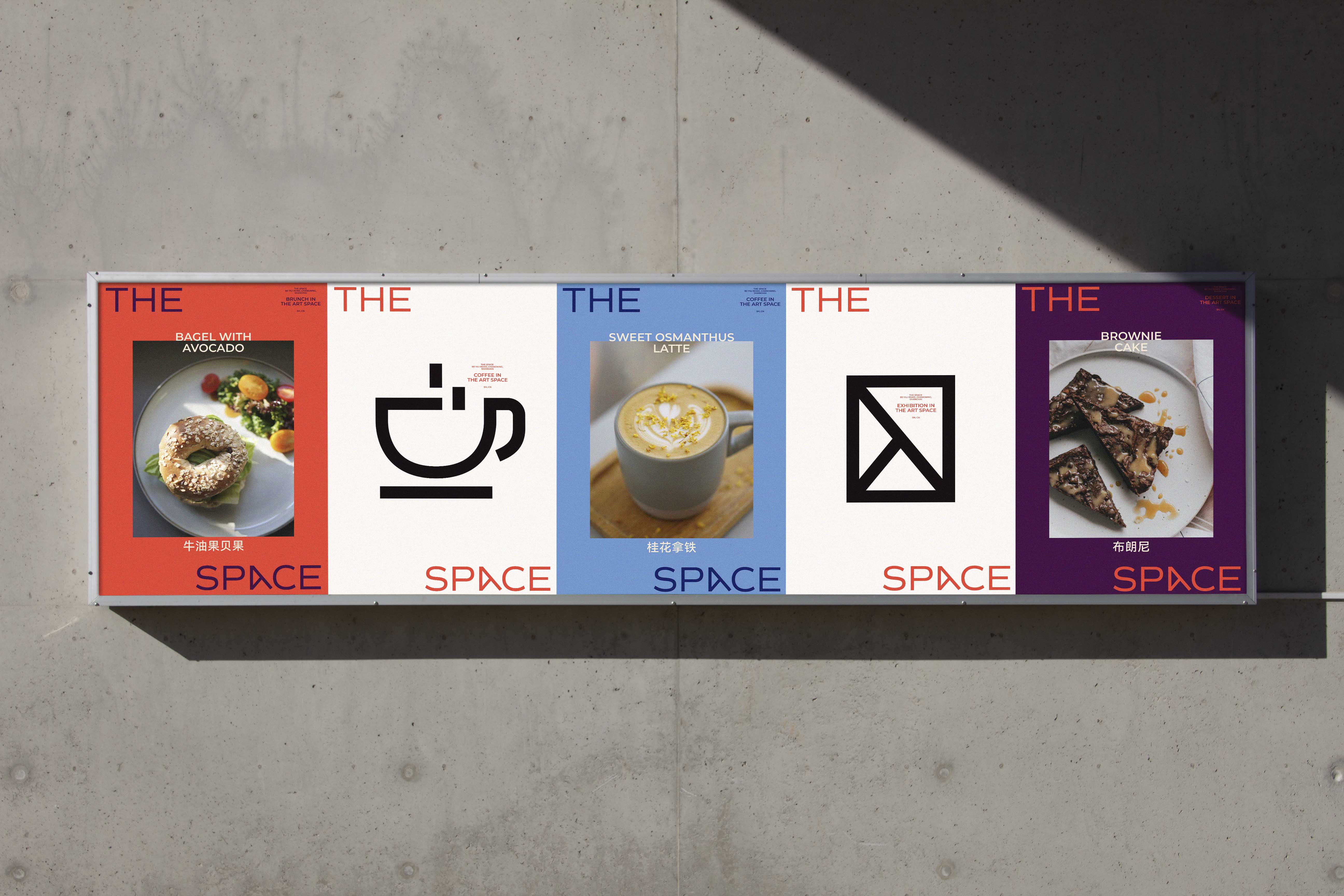
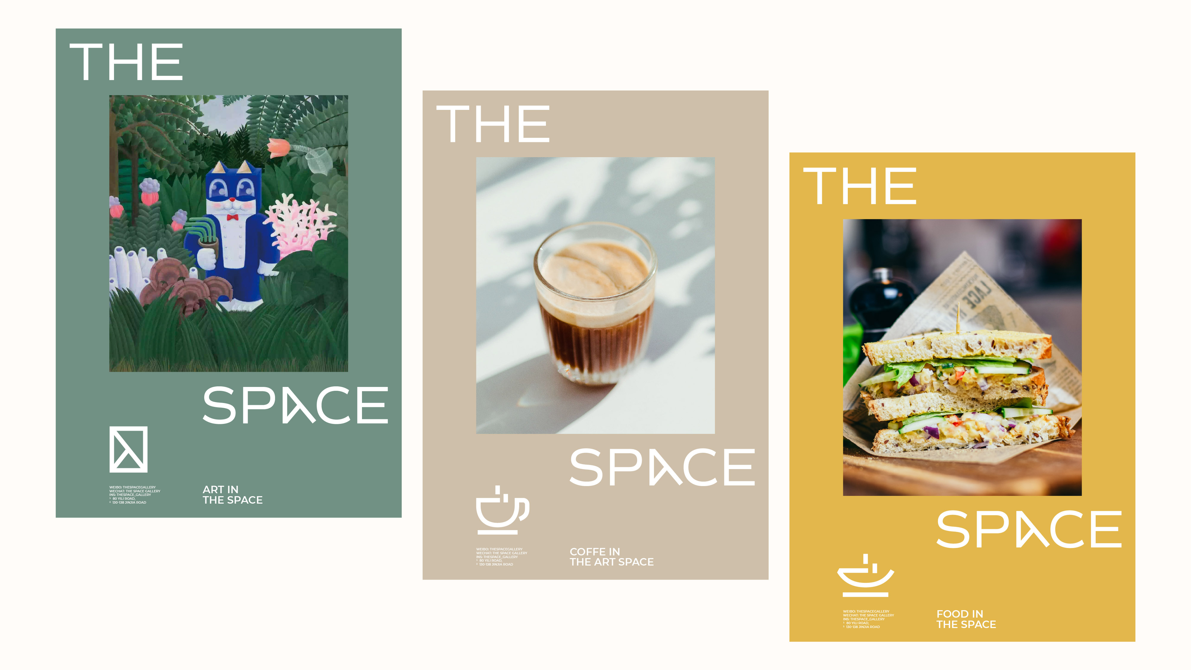
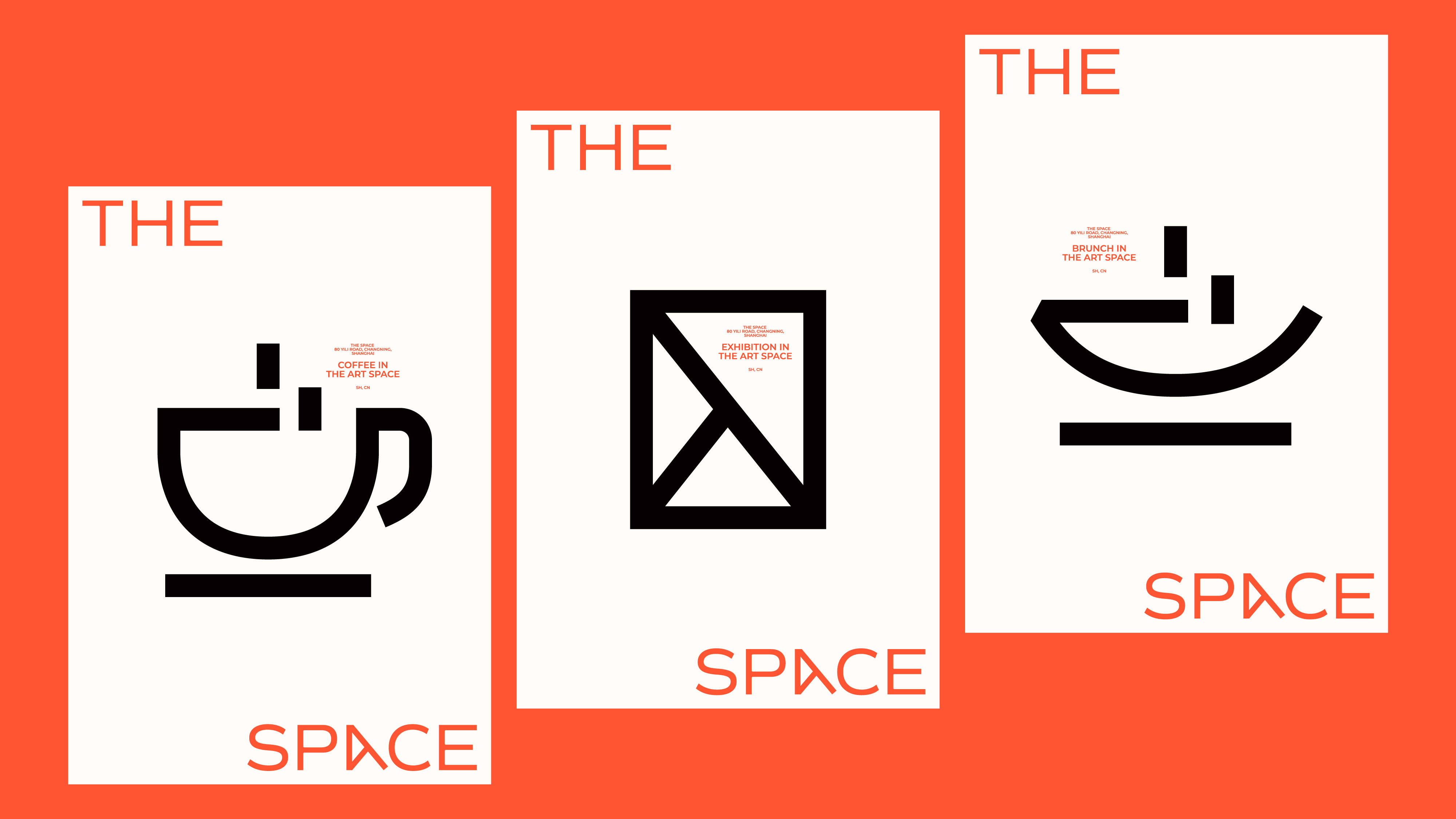
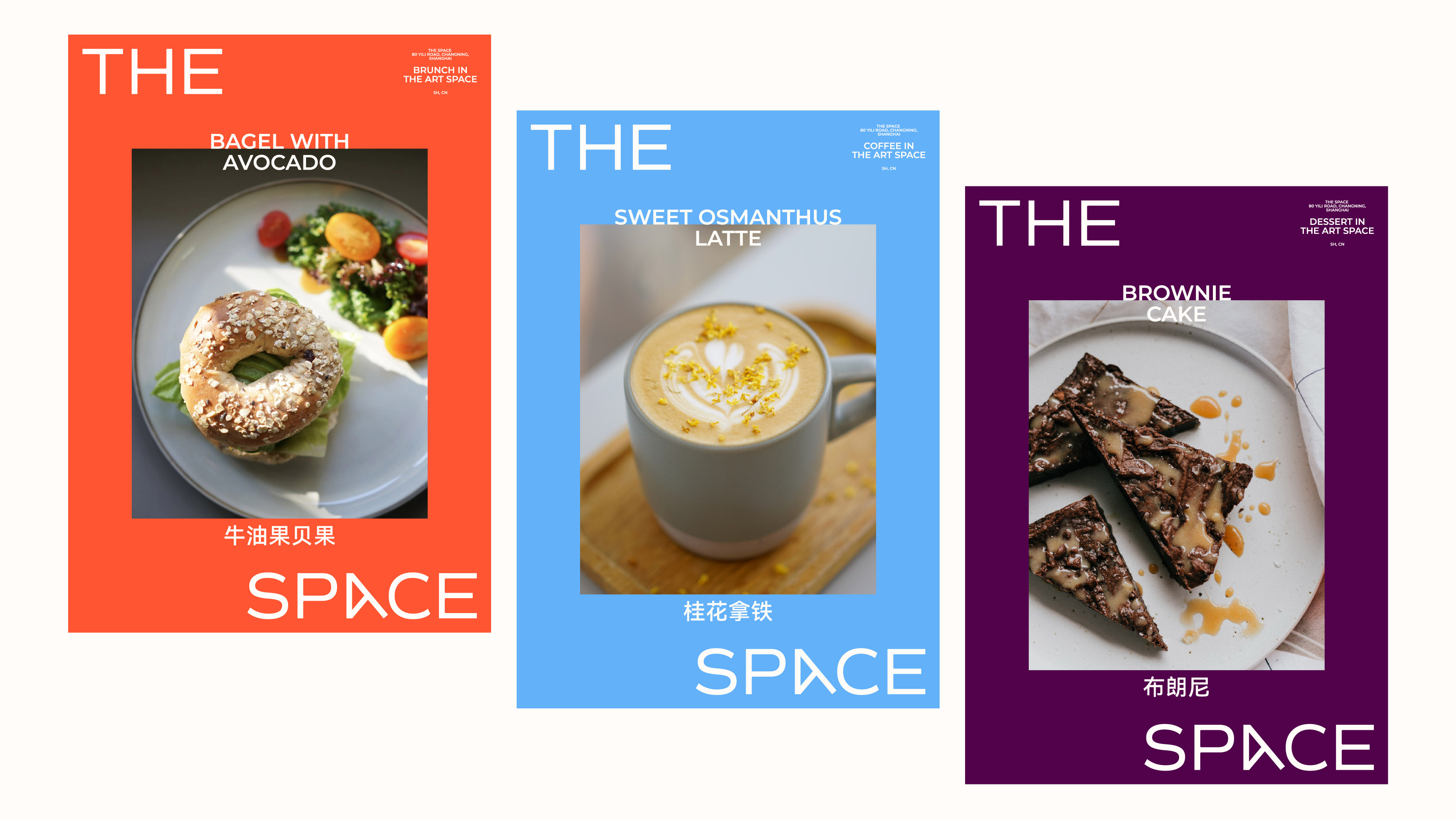
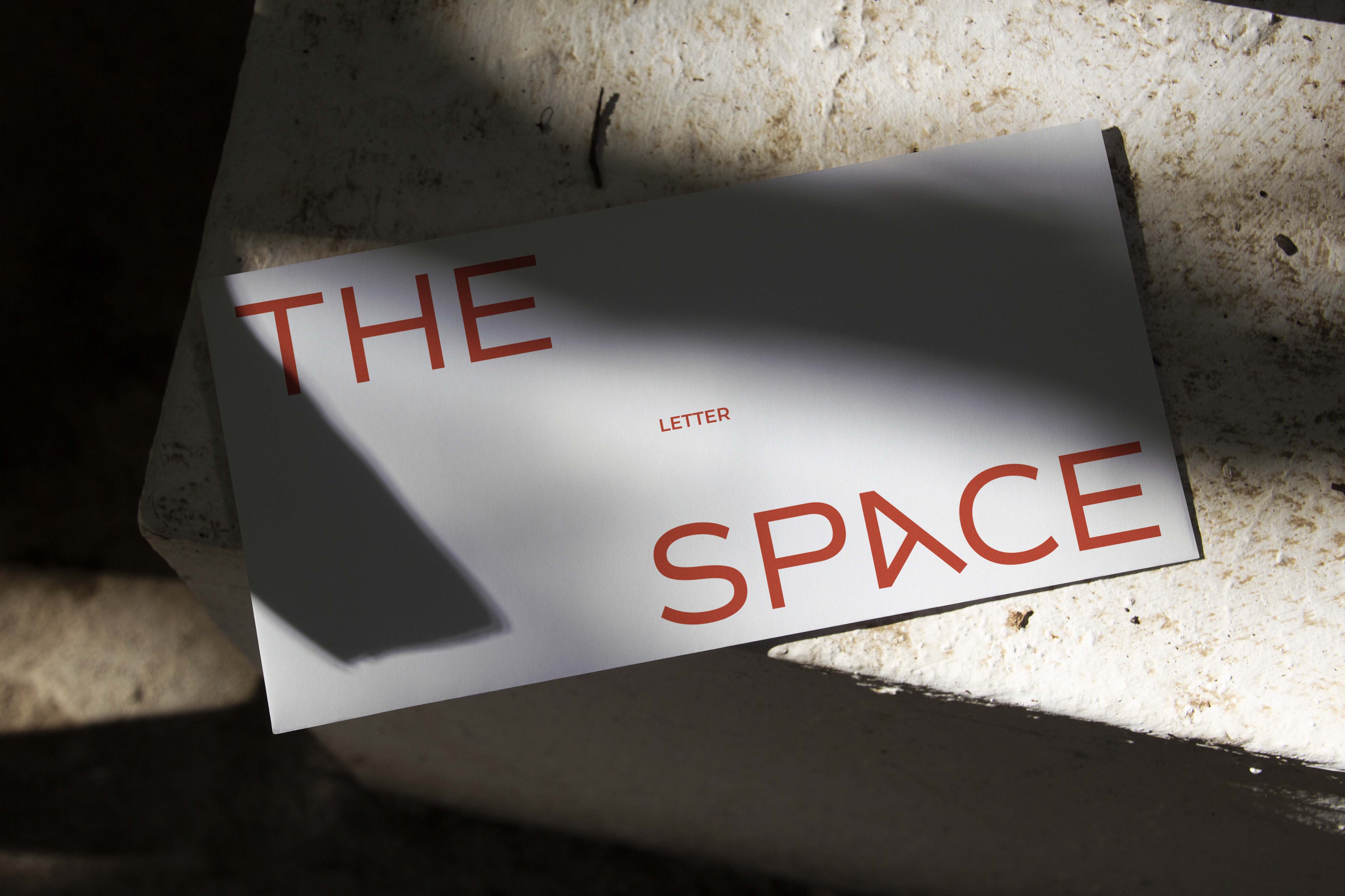
最终,我们决定从品牌原标识的建筑几何中继续出发,将「无法定义」的空白融入对「THE SPACE」语法式的拆解,让「THE SPACE」成为「THE XXX SPACE」以这种方式为这个「无法定义」的空间创建不同的「定义」,也似乎成为一种邀请所有与品牌相关的人一起为这处空间创建定义的邀约。基于这个思路,整套视觉语言很自然的被铺陈开来,「THE SPACE」能够被灵活的运用在不同的版面上,既是品牌的标识和名称,也成为版面中具体信息的一部分。同时,基于这个名字本身的特质,我们为品牌撰写了颇具玩味的文字注解「IN THE ART SPACE, ART IN THE SPACE, THE SPACE IN ART」。品牌名称中的字母 A 被设计成一枚结构感分明造型,既是对原标识造型语言的一种延续,也成为 THE SPACE 新形象中的独立符号,着重暗示这个品牌的艺术属性。
In the end, we decided to move on from the architectural geometry of the brand's original logo and integrate the gap of “undefinable” into the grammatical dismantling of “THE SPACE”, so that “THE SPACE” becomes “The XXX Space”. It also seems to be an invitation to all people related to the brand to create a definition for this space. Based on this idea, the whole visual language is naturally laid out, and “THE SPACE” can be flexibly used in different layout, both as the brand's logo and name, and as part of the specific information in the pages. At the same time, we wrote a playful note “IN THE ART SPACE, ART IN THE SPACE, THE SPACE IN ART” for the brand based on the qualities of the name itself. The letter A in the brand name is designed as a structured shape, a kind of continuation of the original logo, but also a separate symbol in the new identity of THE SPACE, emphasizing the artistic nature of the brand.
In the end, we decided to move on from the architectural geometry of the brand's original logo and integrate the gap of “undefinable” into the grammatical dismantling of “THE SPACE”, so that “THE SPACE” becomes “The XXX Space”. It also seems to be an invitation to all people related to the brand to create a definition for this space. Based on this idea, the whole visual language is naturally laid out, and “THE SPACE” can be flexibly used in different layout, both as the brand's logo and name, and as part of the specific information in the pages. At the same time, we wrote a playful note “IN THE ART SPACE, ART IN THE SPACE, THE SPACE IN ART” for the brand based on the qualities of the name itself. The letter A in the brand name is designed as a structured shape, a kind of continuation of the original logo, but also a separate symbol in the new identity of THE SPACE, emphasizing the artistic nature of the brand.

