牡丹亭
The Peony Pavilion
行业类型:文化艺术
文化艺术
时尚
实践类型:视觉识别系统
视觉识别系统
艺术指导
文案
字体设计
SECTOR:Arts & Culture
Arts & Culture
Fashion
PRACTICE AREA:
Visual Identity System
Visual Identity System
Art Direction
Copywriting
Typeface Design
《牡丹亭》,是明代剧作家汤显祖的代表性传奇戏剧作品,创作于 1598 年,描写了大家闺秀杜丽娘和书生柳梦梅的生死之恋。与《紫钗记》、《南柯记》和《邯郸记》并称为“玉茗堂四梦”。文化 IP 机构广燊行文化于 2020 年得到授权,开始融合一系列适合当代年轻人文化与时尚生活的方式,将「牡丹亭」打造成为一个具有中国古典文化属性的能够与年轻世代对话的时尚 IP 品牌,用于开展一系列市集、艺术衍生品开发等活动。
The Peony Pavilion is a legendary play by Ming Dynasty playwright Tang Xianzu, written in 1598, depicting the love between a young lady, Du Liniang, and a scholar, Liu Mengmei, in a life-and-death relationship. It is known as “The Four Dreams of Yu Ming Tang”, together with “The Purple Hairpin”, “The Book of Nanke” and “The Book of Handan”. In 2020, the cultural IP organization, Guang Sun Xing Culture, was authorized to integrate a series of ways to suit the cultural and fashionable life of contemporary youth, and to make “The Peony Pavilion” a fashionable IP brand with the attributes of classical Chinese culture that can speak to the young generation for a series of activities such as bazaar and art derivatives development.

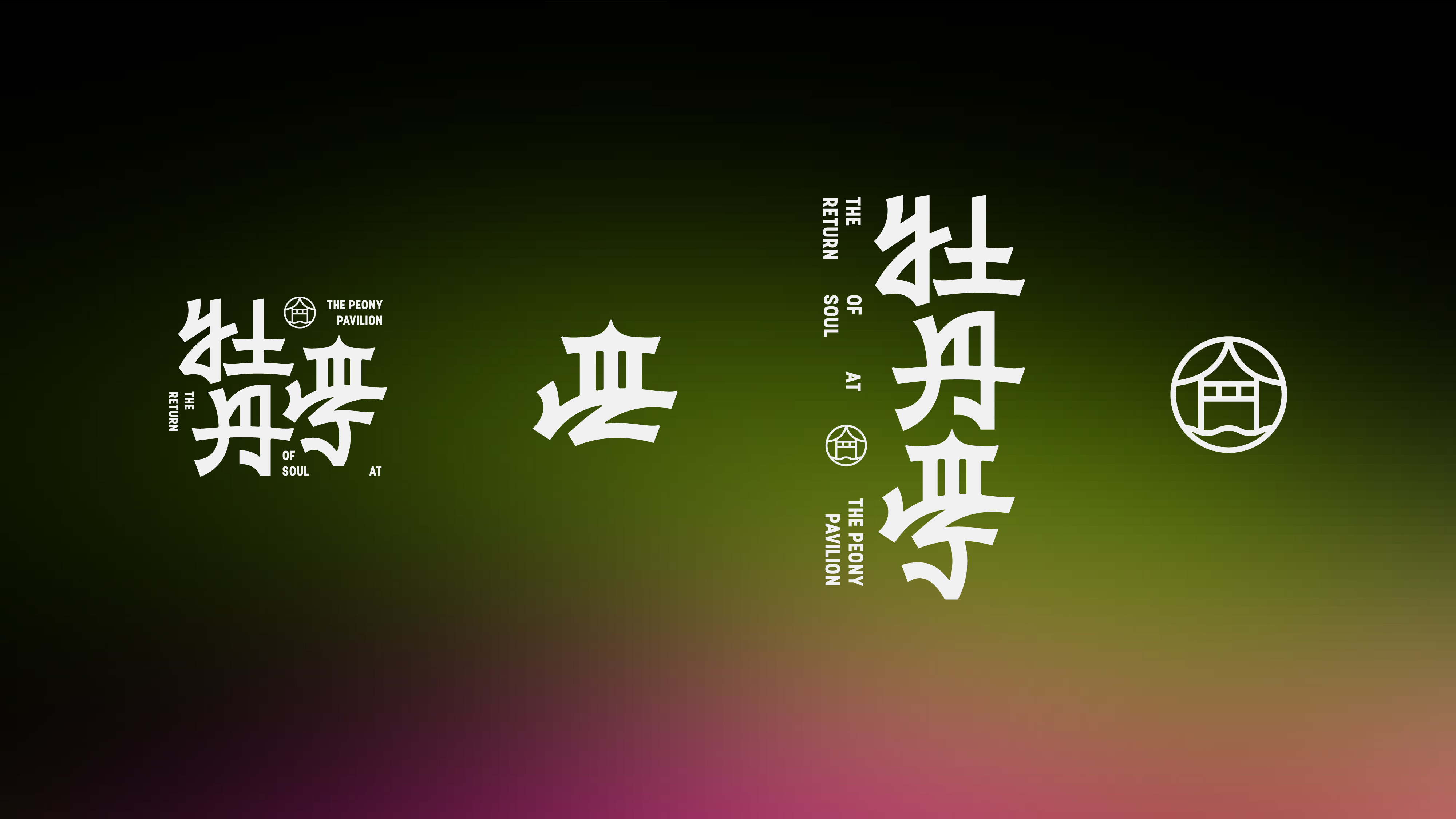
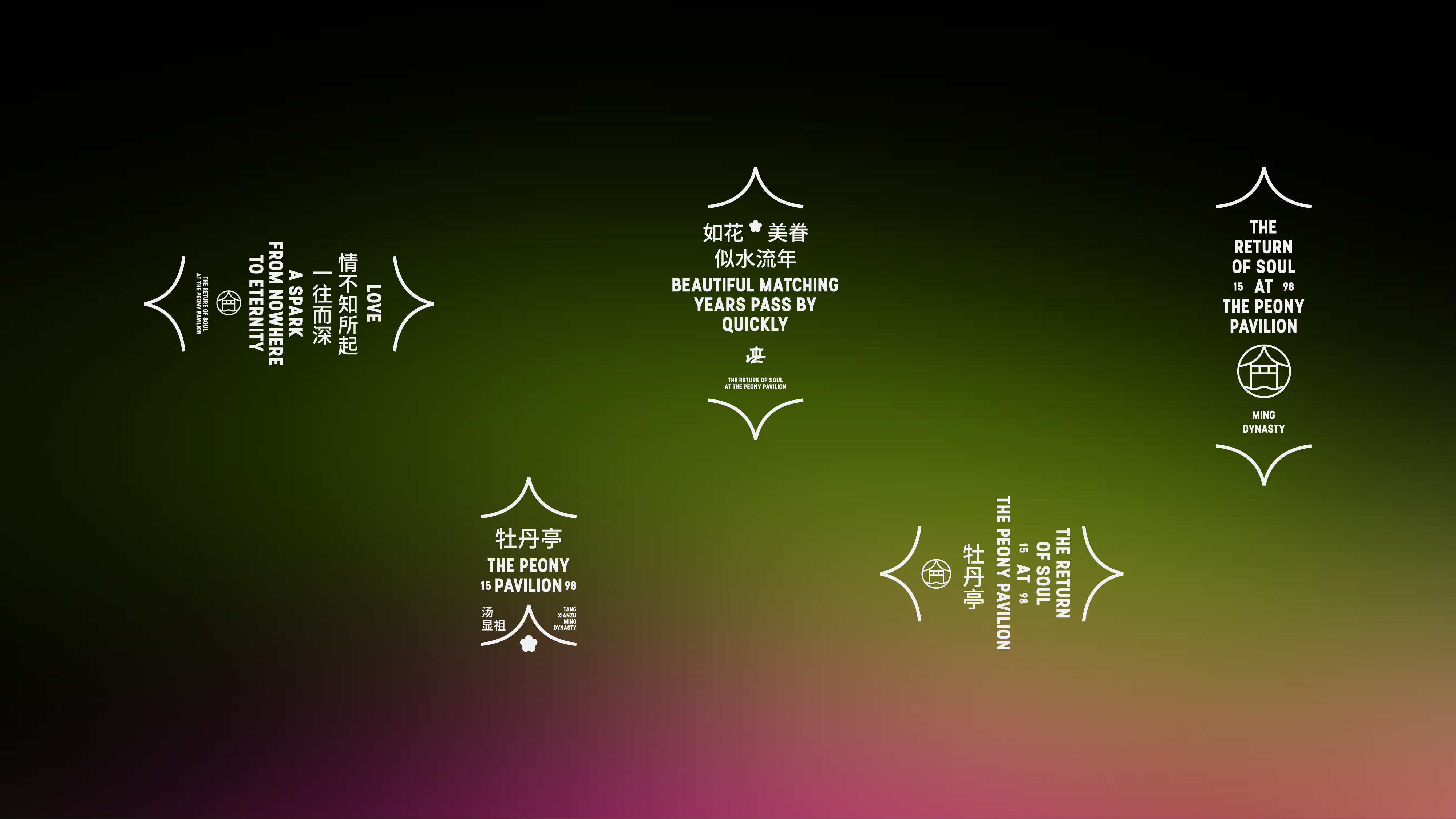
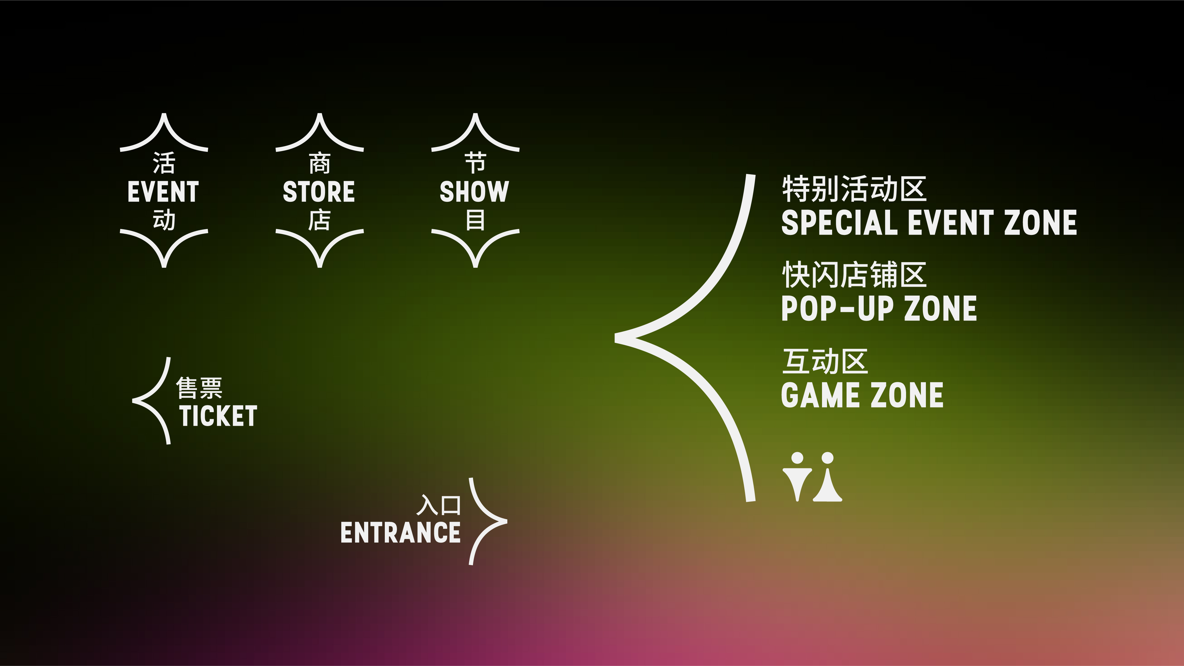
受广燊行文化的邀请,Pocca 对这个既古老又全新的概念进行了设计的演绎。我们将最能够代表中国文化的抽象元素「汉字」作为设计的核心,参考长久以来牡丹亭的剧目和文学著作中使用过的书法字符造型,结合现代的美学与品味,定制了颇具识别度的又有别于传统书法字型的中文字体标识,以传递出魂牵梦萦的韵味。同时,「亭」字的上半部分被设计成可以单独拆分开来的具有「亭子」意象的抽象符号,让中文「象形文字」的特征在设计中合乎情理的呈现。再进一步聚焦的细节元素上,「亭」字顶端的「人」字形的线条结构也被提取成为辅助排版的视觉符号,在应用中既可以作为括号或者书名号,也可以作为导视系统中的箭头符号。从完整的字型标识聚焦到其中一个字符的局部,再到字符局部的局部,在一层一层缩小尺度而得到的元素中,不仅使整个视觉系统的核心视觉意象得到连贯的延续,也让表层的视觉样式在观看者的脑海中得到规整与强化。基于这样一种系统,整个视觉识别以一种稳定又灵活多变的方式去满足品牌在未来面临的线上线下传播、产品销售、IP授权等多场景的应用需求。
Pocca was invited by Guang Sun Xing Culture to create an identity for this ancient and new concept. We took the abstract element “Chinese characters”, which best represents Chinese culture, as the core of the design. Referring to the calligraphic characters used in the long-standing The Peony Pavilion dramas and literary works, we combined modern aesthetics and taste to customize a recognizable Chinese wordmark that is different from the traditional calligraphic characters’ style, in order to convey the haunting rhythm. At the same time, the upper part of the character “亭 (pavilion)” was designed as an abstract symbol with “pavilion” imagery that can be detached separately, allowing the characteristics of Chinese “pictographs” to be presented in a logical way. Further focusing on the detailed elements, the line structure of the character “人” at the top of the character “亭 (pavilion)” is also extracted as a visual element to assist typography setting, which can be used as either a bracket or a book name symbol, or as an arrows in the wayfinding system for off-line events. From the focus of the complete glyph of the wordmark to the partial of one of the characters, and then to another smaller partial of the partial of the character, in the elements obtained by reducing the scale layer by layer, not only the core visual imagery of the whole visual system is continued coherently, but also the visual style of the surface layer is regularized and strengthened in the viewer's mind. Based on such a system, the whole visual identity is stable and flexible to meet the future needs of the brand in multiple scenarios such as online and offline communication, product sales and IP licensing.