机·智:第十八届上海青年美术大展
Tech·Wit: The 18th Shanghai Youth Art Exhibition
行业类型:
文化艺术
实践类型:
视觉识别设计
海报设计
SECTOR:
Arts & Culture
Arts & Culture
PRACTICE AREA:
Visual Identity Design
Poster Design
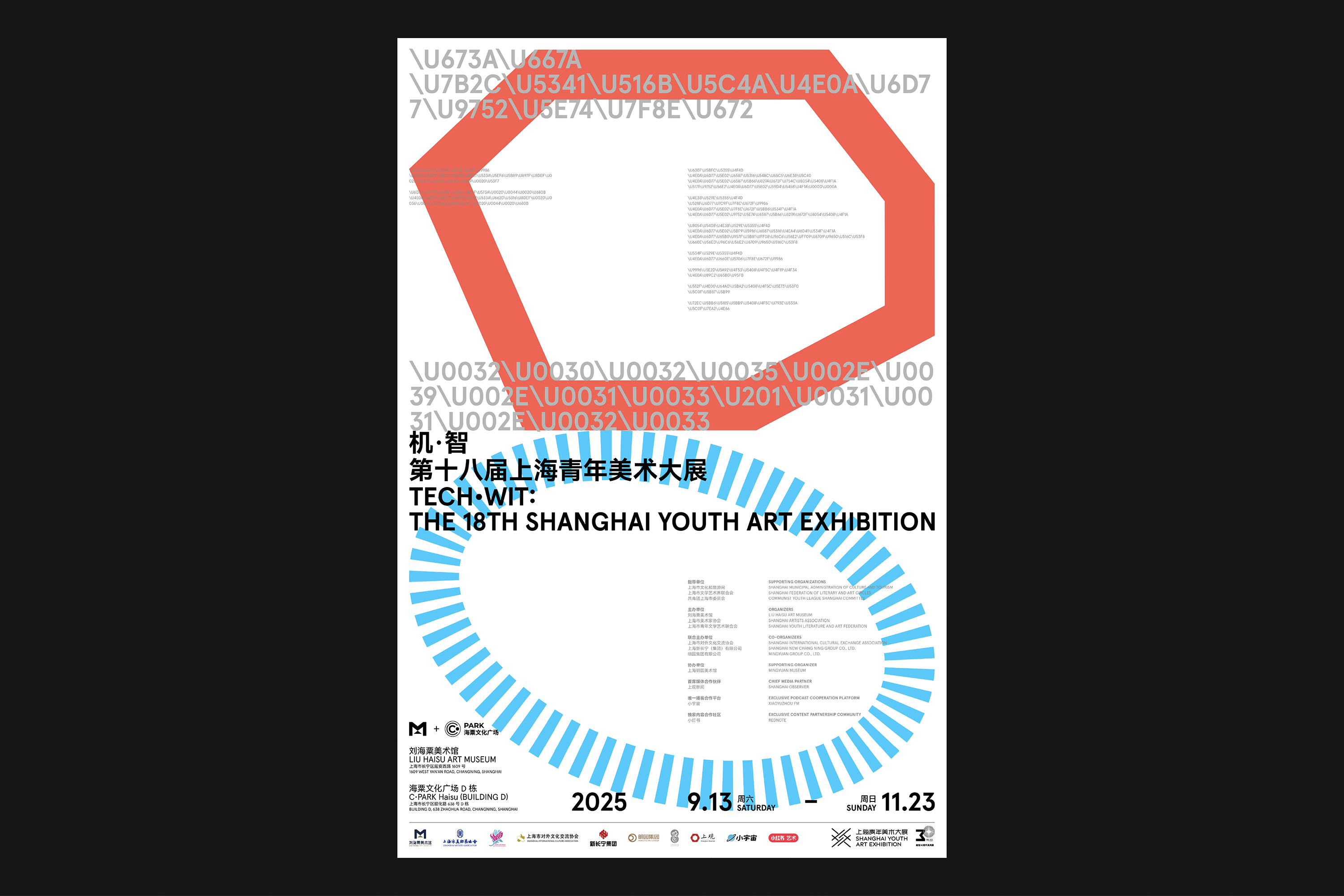
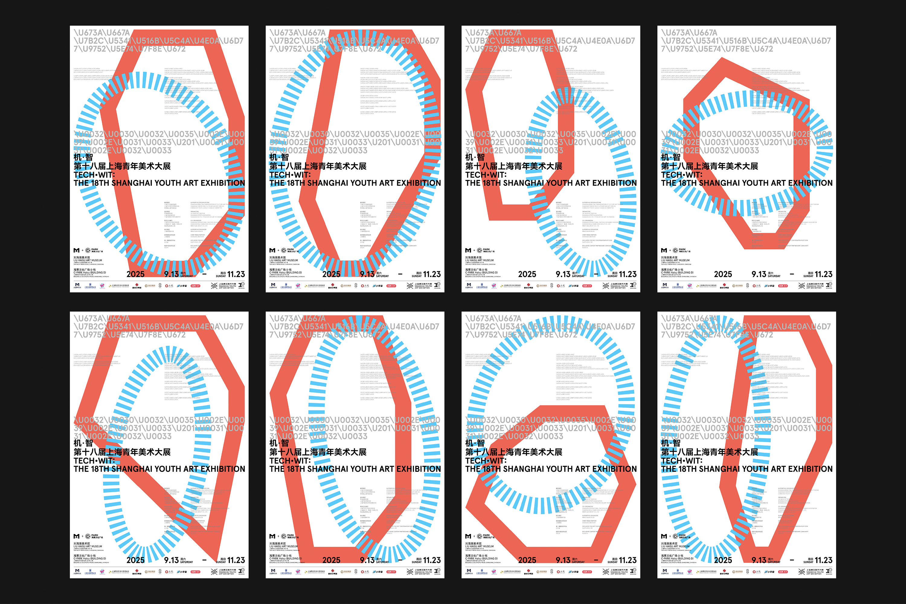
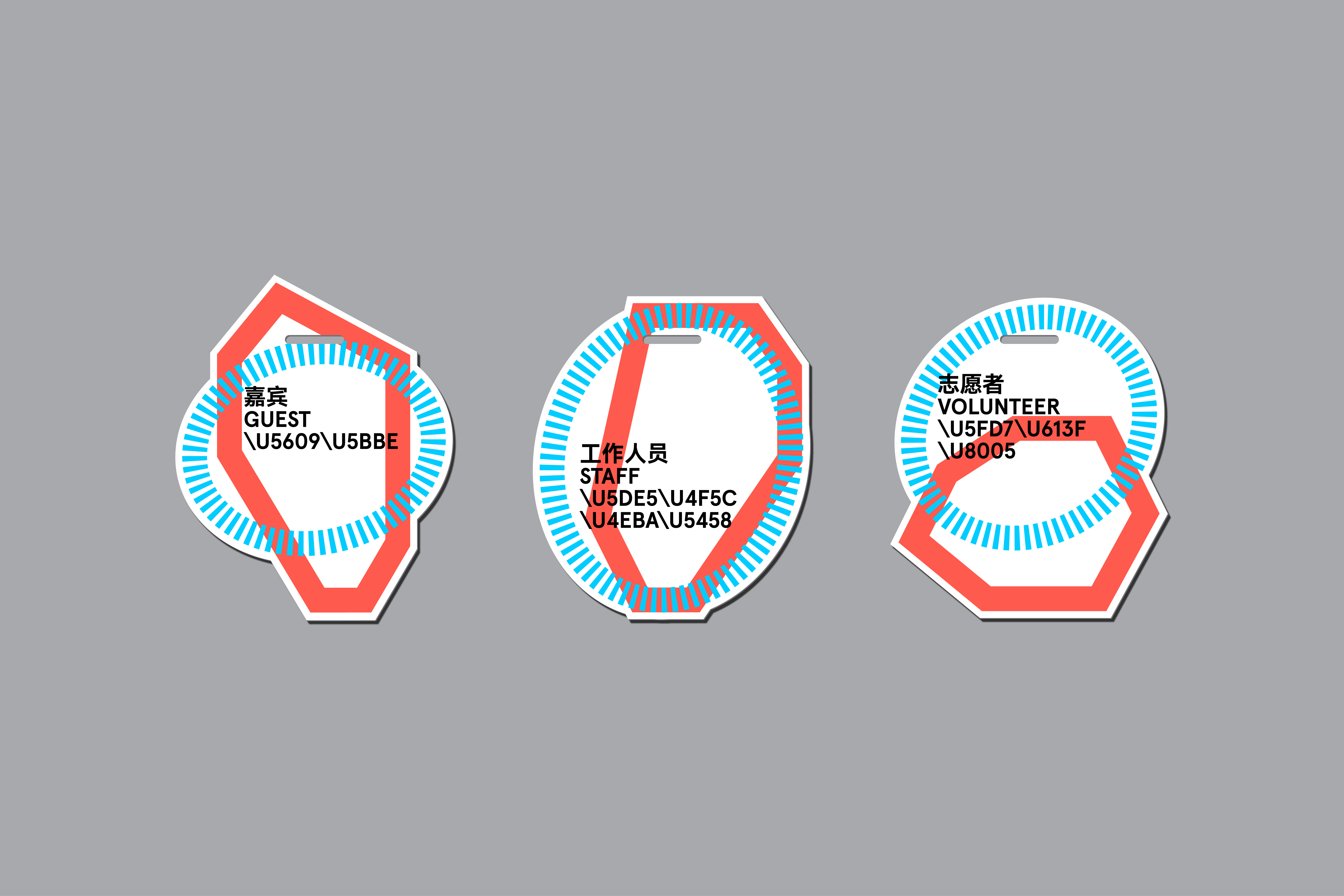
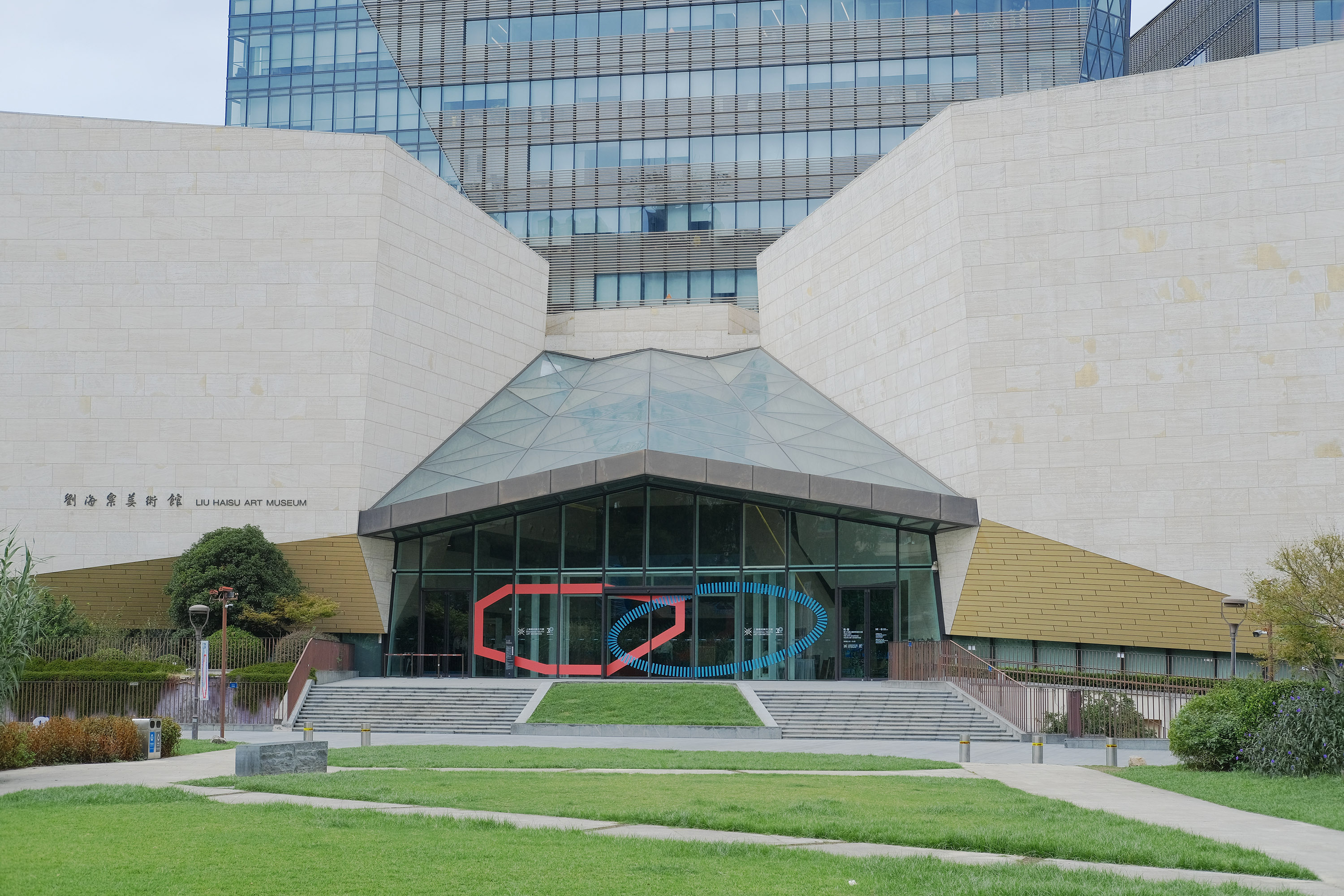
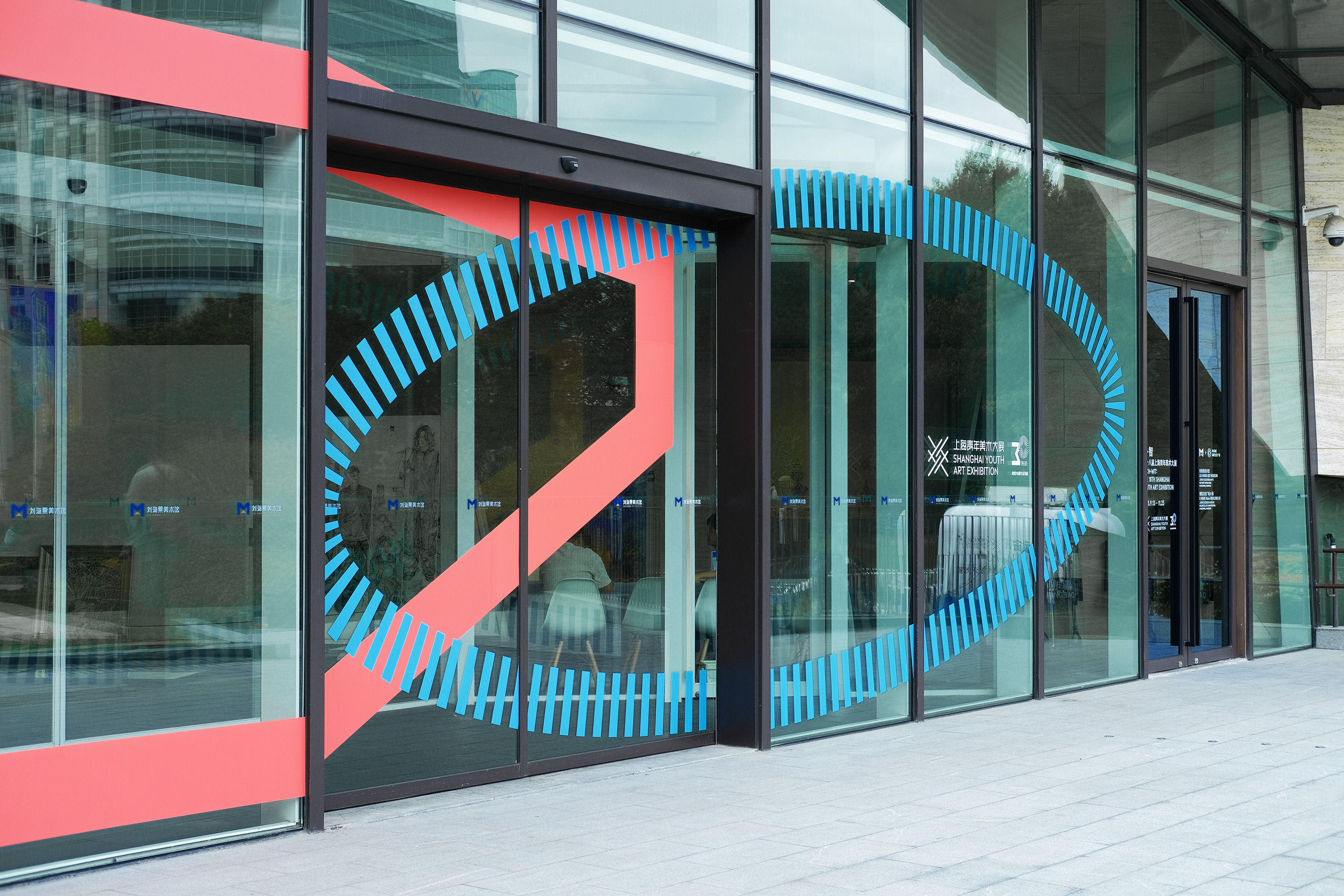
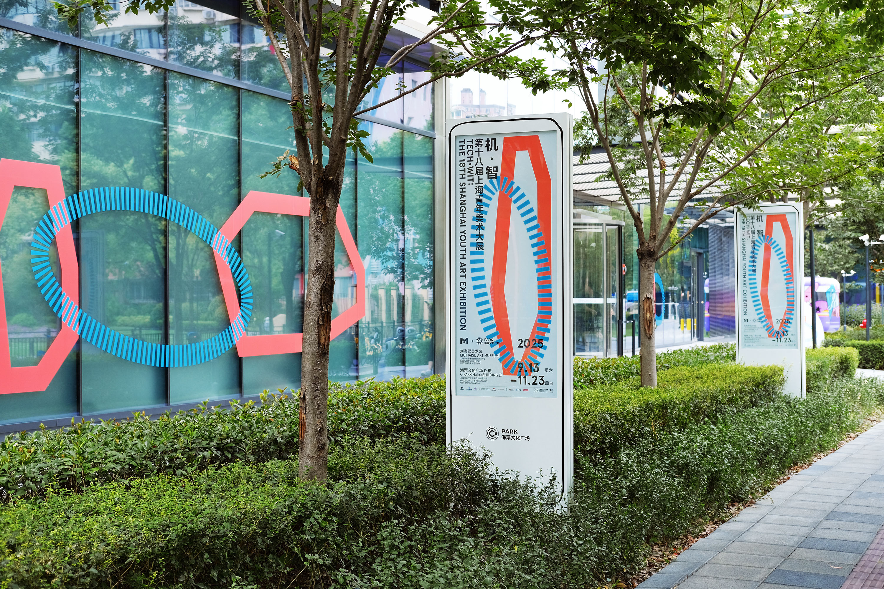
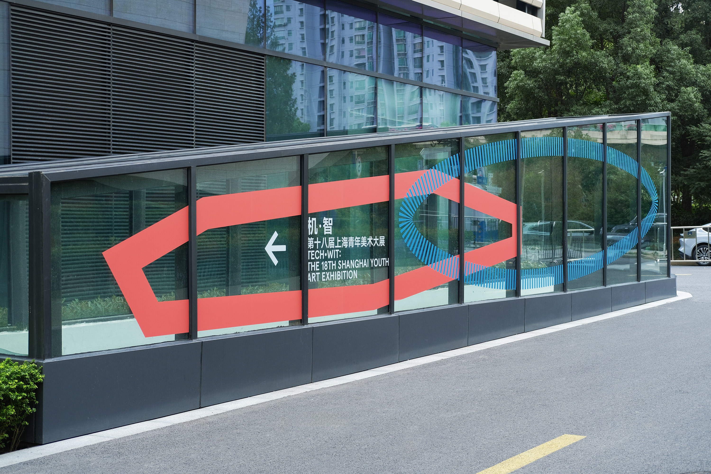
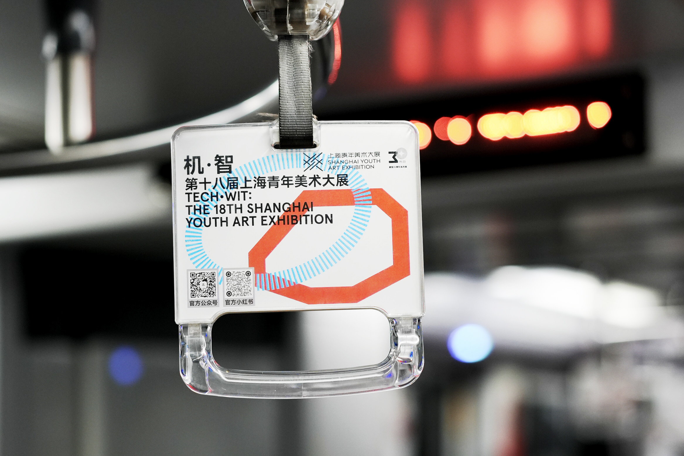
此次“机·智——第十八届上海青年美术大展”的视觉形象设计根植于“机·智”主题,呼应展览对人工智能与人类智慧关系的探讨。视觉形象及海报整体采用白色基底,象征技术与艺术交汇的纯粹可能。红色实线多边形是人工智能的理性与精确的代表,将展览的文字以 Unicode 编码呈现,呼应“机”的数字化本质;蓝色虚线圆形喻示人类智慧的整体性与有机感,以中英文字符表现“智”的人类文明的融汇。 在图形语言中,实与虚、多边与圆形、编码与文字形成多重对比,直观表达“人机合作与对抗”的策展焦点。延展应用中,红蓝两个图形可自由变形、交错、分离、融合,隐喻“机”与“智”间动态而复杂的对话关系,传递青年艺术家在技术变革时代的思考及通过艺术进行的回应。
The visual identity design for this exhibition, "Tech · Wit: The 18th Shanghai Youth Art Exhibition" is deeply rooted in the theme of "Tech · Wit" echoing the exploration of the relationship between artificial intelligence and human intellect. The overall visual identity and posters employ a white base, symbolizing the pure potential at the intersection of technology and art. A solid red polygon represents the rationality and precision of artificial intelligence, with the exhibition text presented in Unicode encoding to reflect the digital essence of "Tech". A dashed blue circle symbolizes the holistic and organic nature of human wisdom, using both Chinese and English characters to express the integration of human civilization in "Wit". In the graphical language, contrasts between solid and dashed lines, polygons and circles, and encoded versus textual elements create multiple layers of contrast, visually articulating the curatorial focus on "human-machine collaboration and confrontation." In extended applications, the red and blue graphics can freely transform, intersect, separate, and merge, metaphorically representing the dynamic and complex dialogue between "Tech" and "Wit" conveying young artists' reflections and artistic responses in an era of technological transformation.