Stepper Custom-Made
行业类型:时尚
时尚
零售
实践类型:品牌唤新
品牌唤新
视觉识别系统设计
包装设计
编辑设计
SECTOR:Fashion
Fashion
Retail
PRACTICE AREA:
Brand Refresh
Brand Refresh
Visual Identity System Design
Packaging Design
Editorial Design
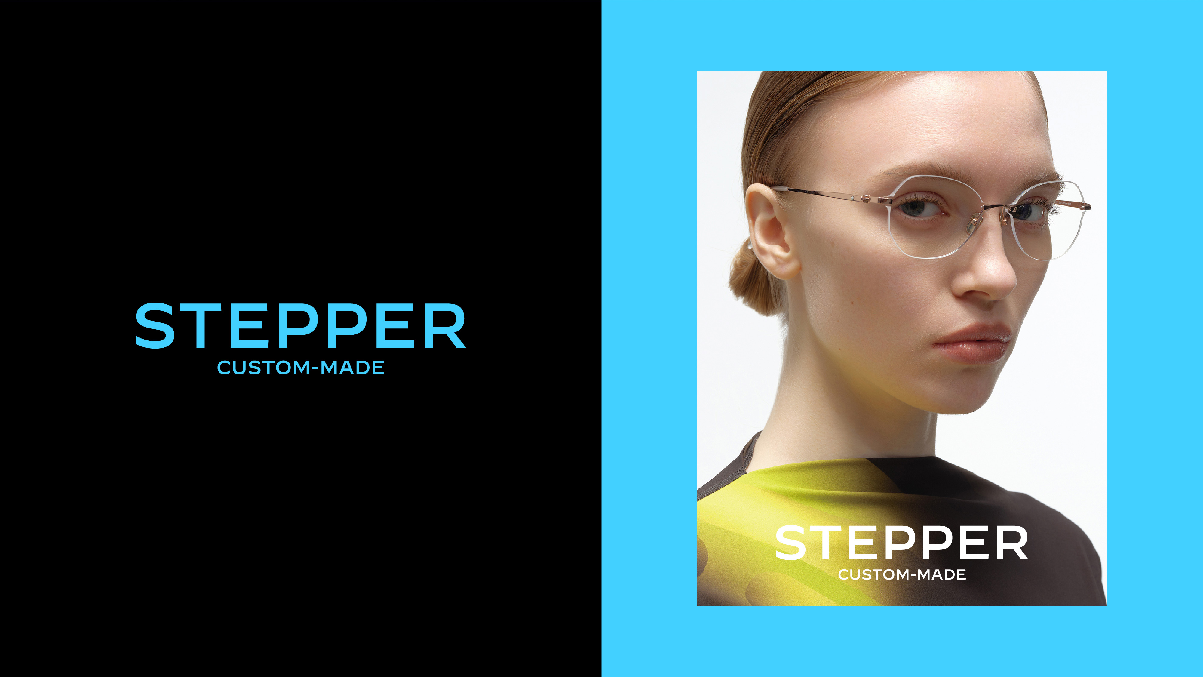
Stepper 由 Hans Stepper 于 1970 年在德国斯图加特创立,旨在设计和创造业内最好的眼镜产品。自成立以来,Stepper 以其 "德国设计 "的理念、专业的品质和智识的共鸣,被誉为世界领先的以人为本的德国眼镜品牌。Stepper Custom-Made 是 Stepper 在中国市场独立运营的品牌运营商,其品牌 DNA 是将德国血统、人文艺术传统、行业领先的研究标准、工匠精神和顶级材料融合在眼镜设计中,并针对中国市场强调个性化和智能穿戴设备的经营理念,呈现出更加年轻和科技的姿态。
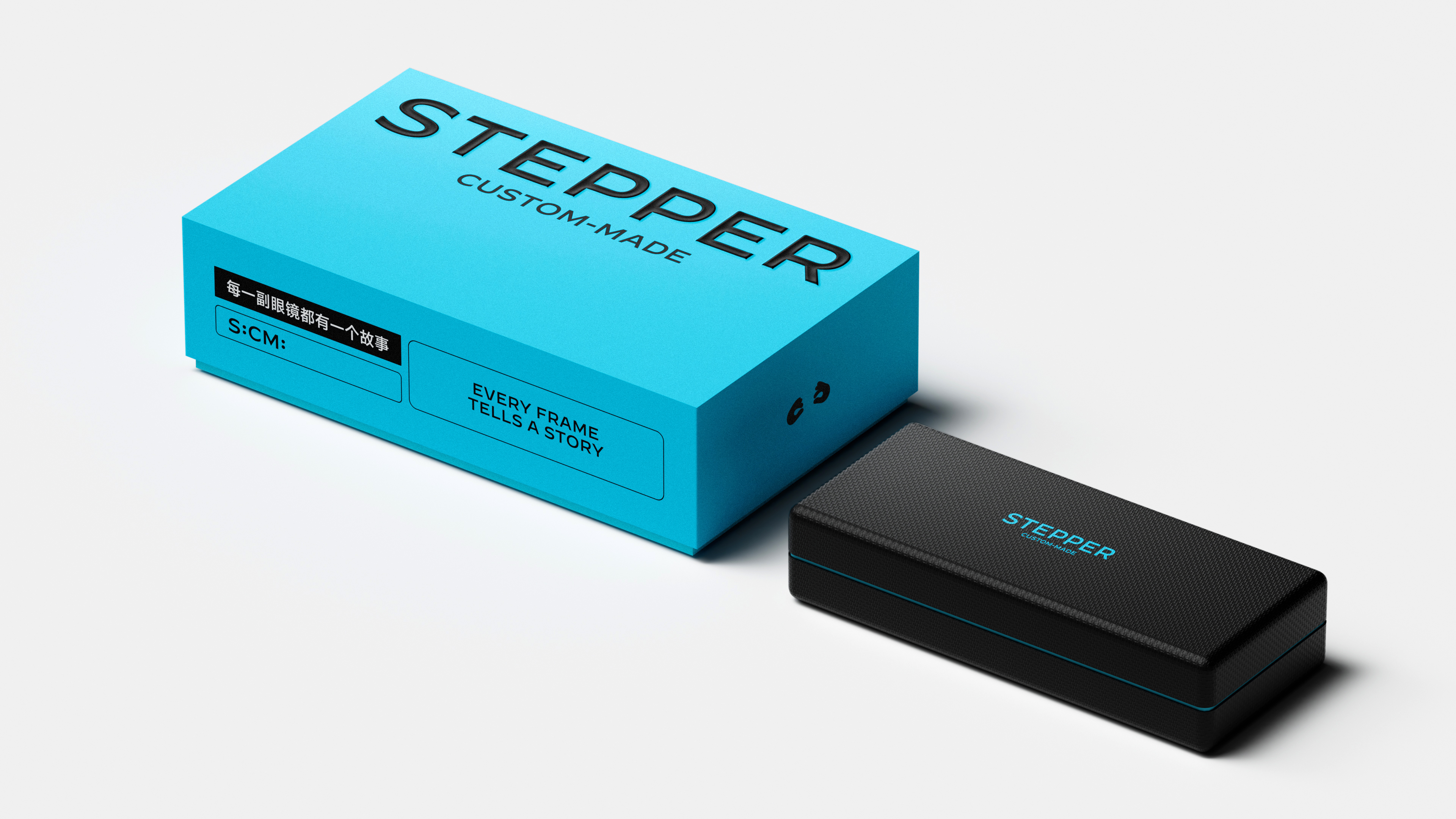
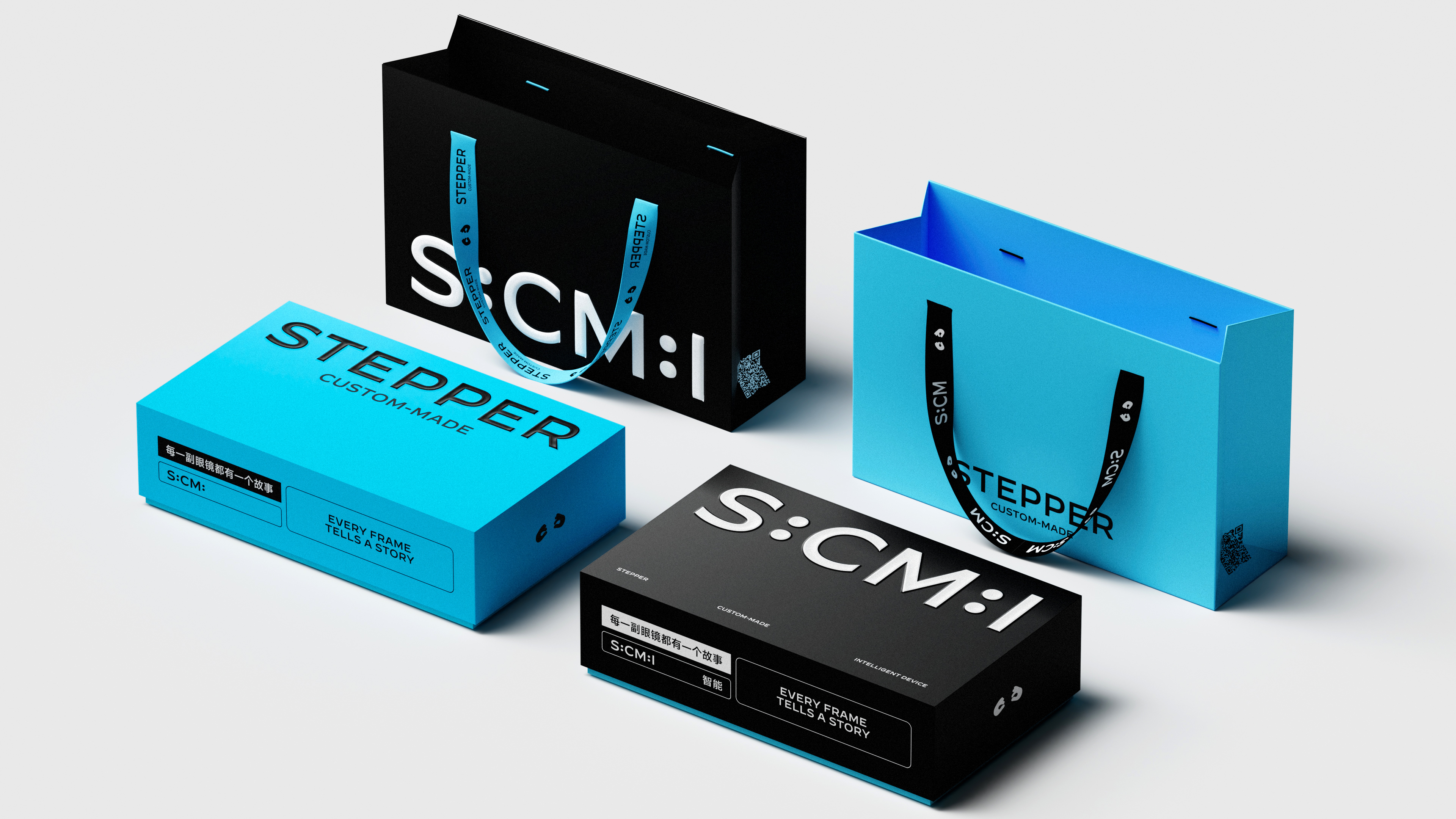
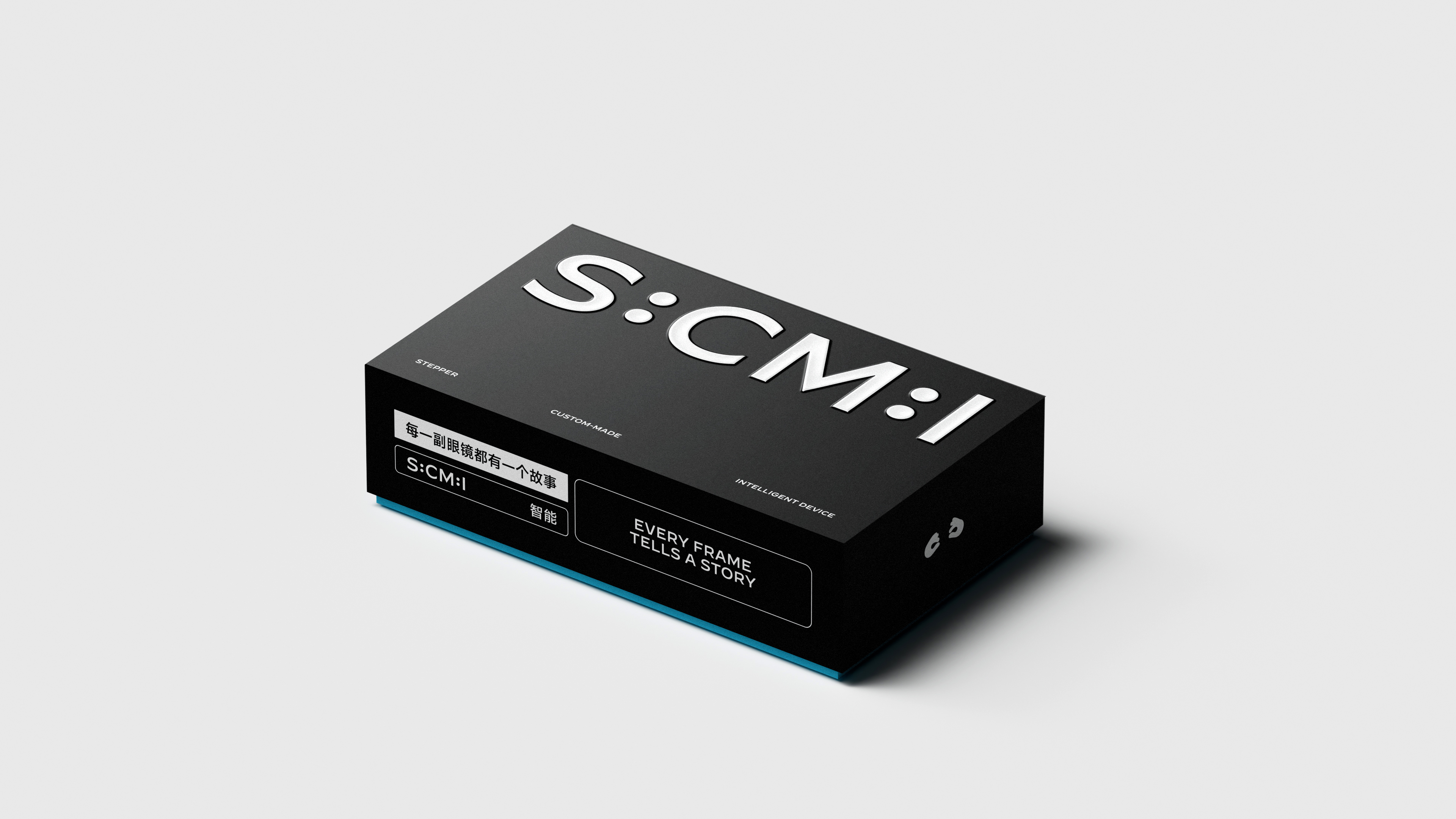
Pocca 与 Stepper Custom-Made 的市场机构紧密合作,为该品牌优化并设计了全新的视觉识别系统及包装系统,以帮助品牌在数字化与实体应用中强化设计、模块化、年轻和技术驱动的愿景。
Stepper was founded in 1970 in Stuttgart, Germany by Hans Stepper to design and create the best eyewear products in the industry. Since its inception, Stepper has been known as the world's leading human-centered German eyewear brand with its “German design” philosophy, professional quality and intellectual resonance. Stepper Custom-Made is Stepper's independently operated brand operator in the China market with a brand DNA that combines German heritage, humanistic artistic traditions, industry-leading research standards, craftsmanship and top quality materials in eyewear design, and a more youthful and technological stance with an emphasis on personalization and smart wearable devices.
Working closely with Stepper Custom-Made's marketing agency, Pocca designed a new visual identity and packaging system for the brand to help reinforce the brand's design, modular, youthful and technology-driven vision through both digital and physical applications.
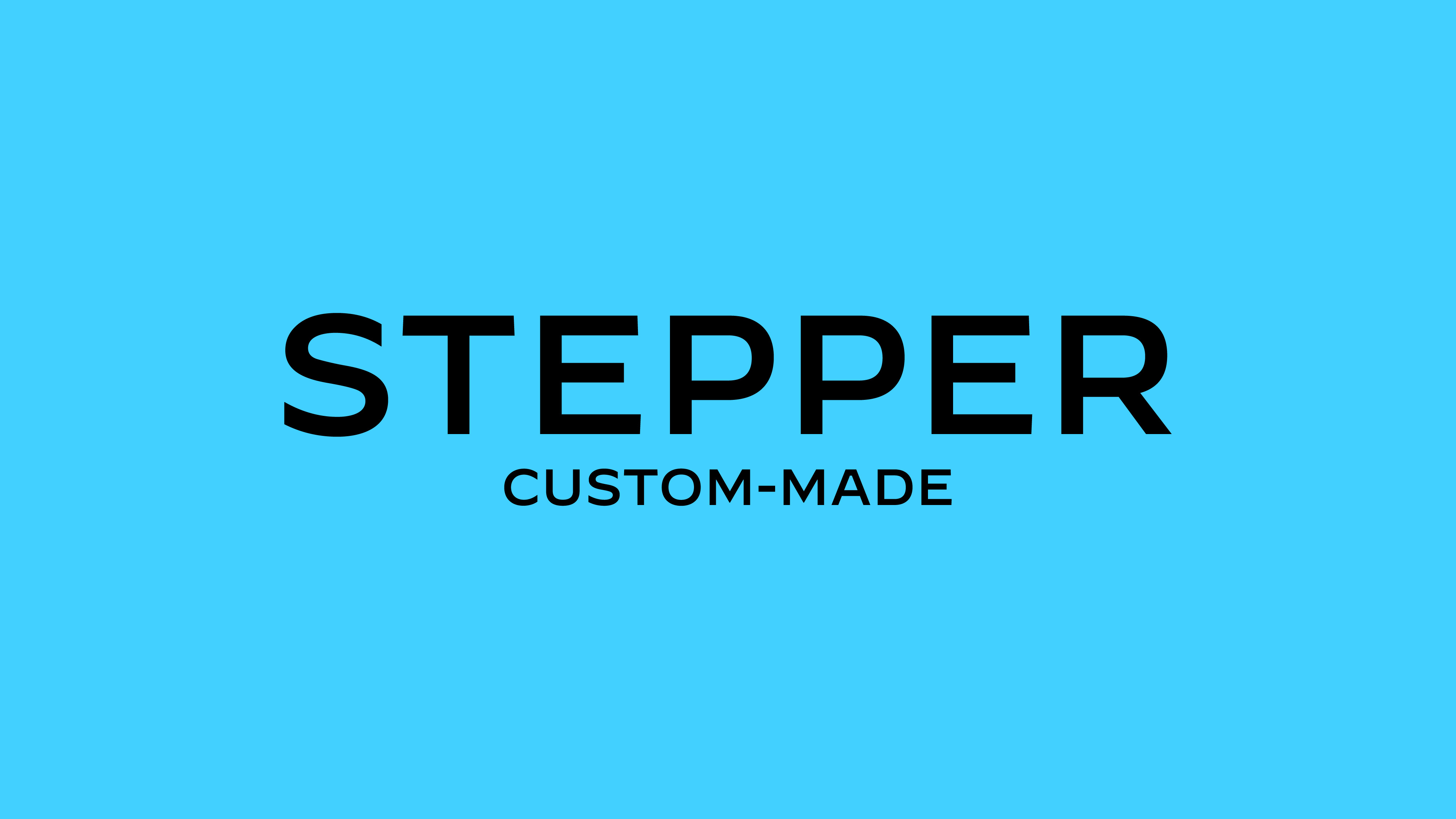
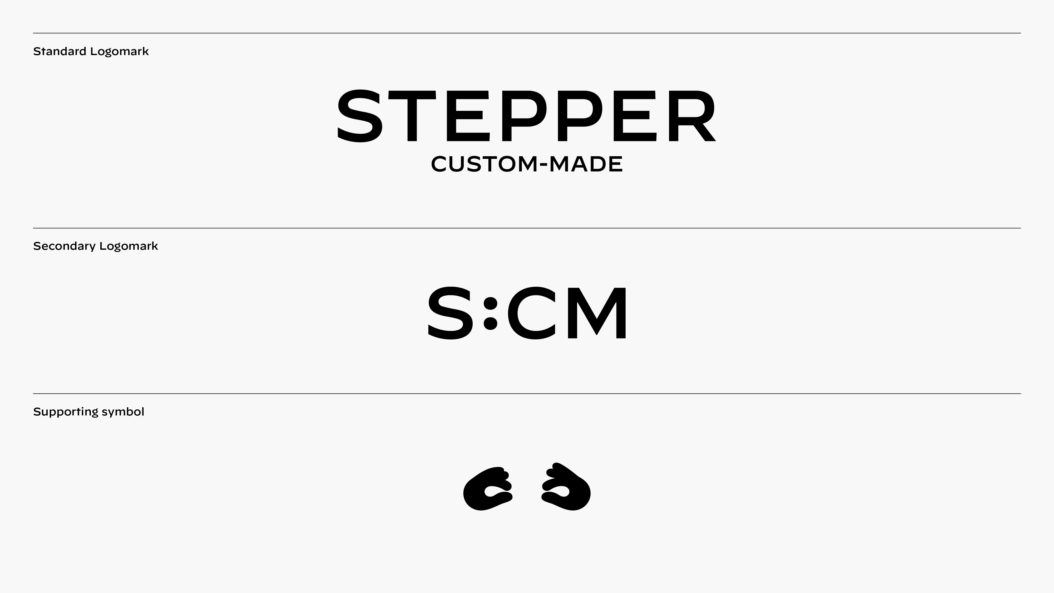
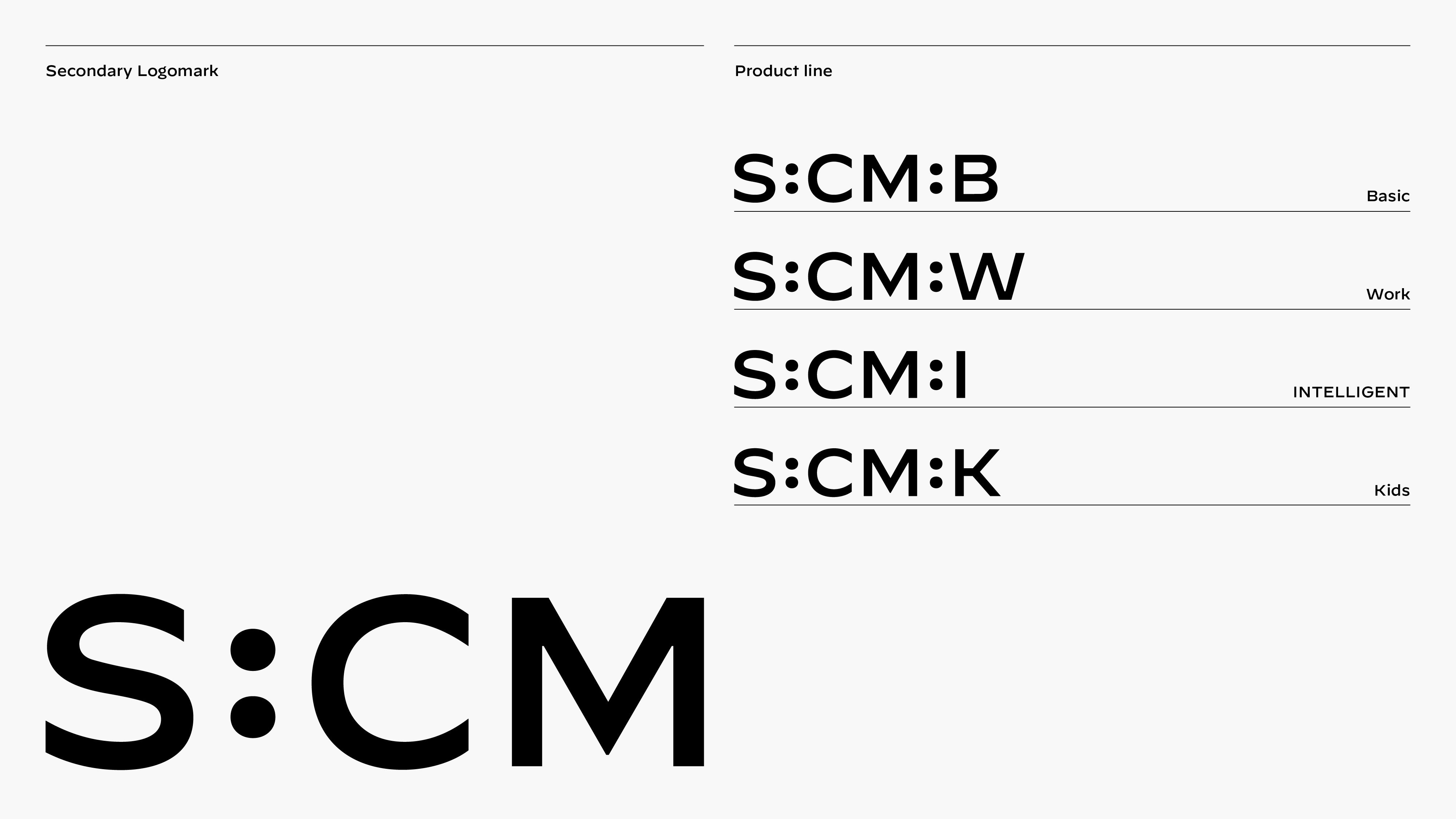
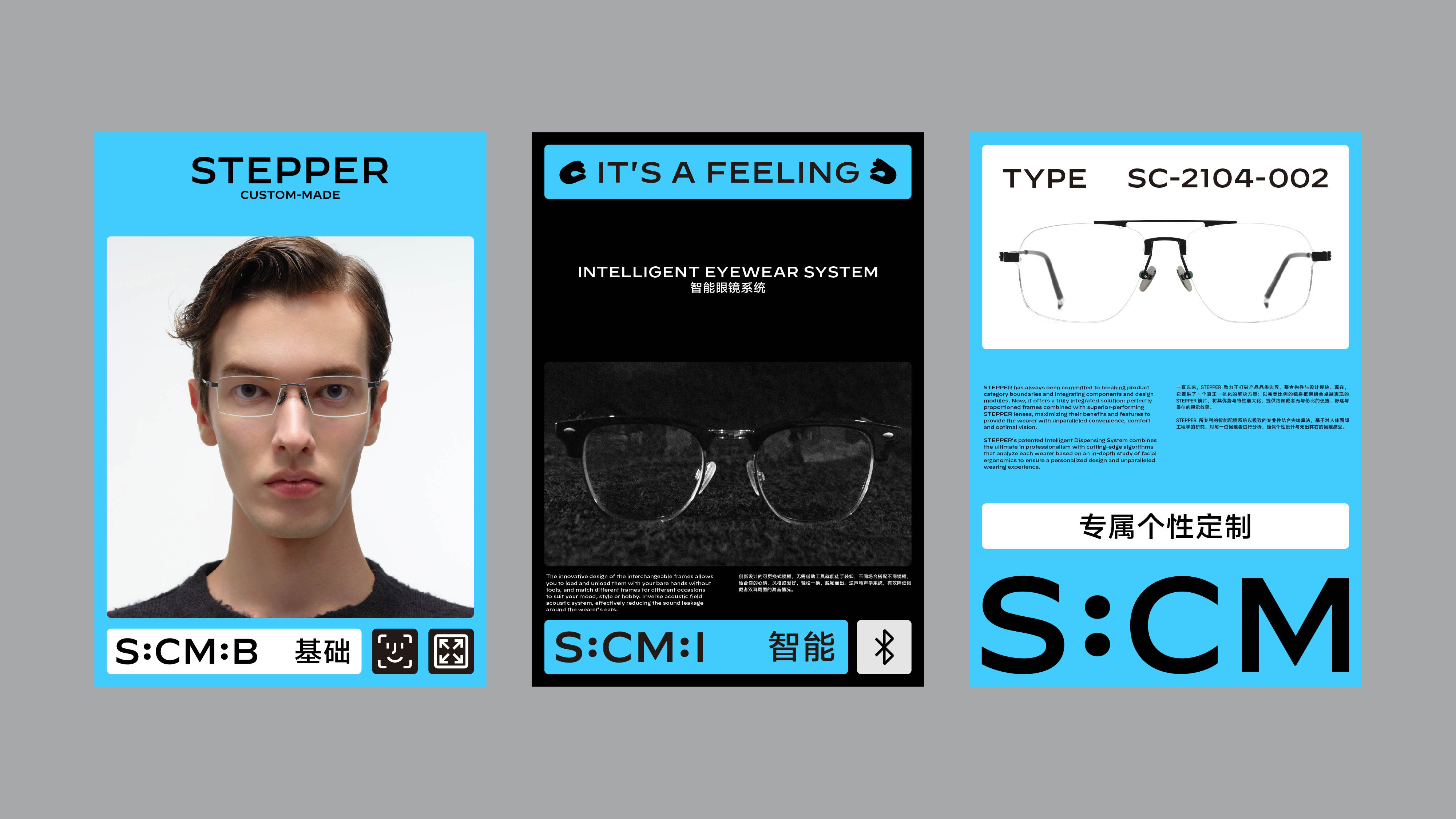
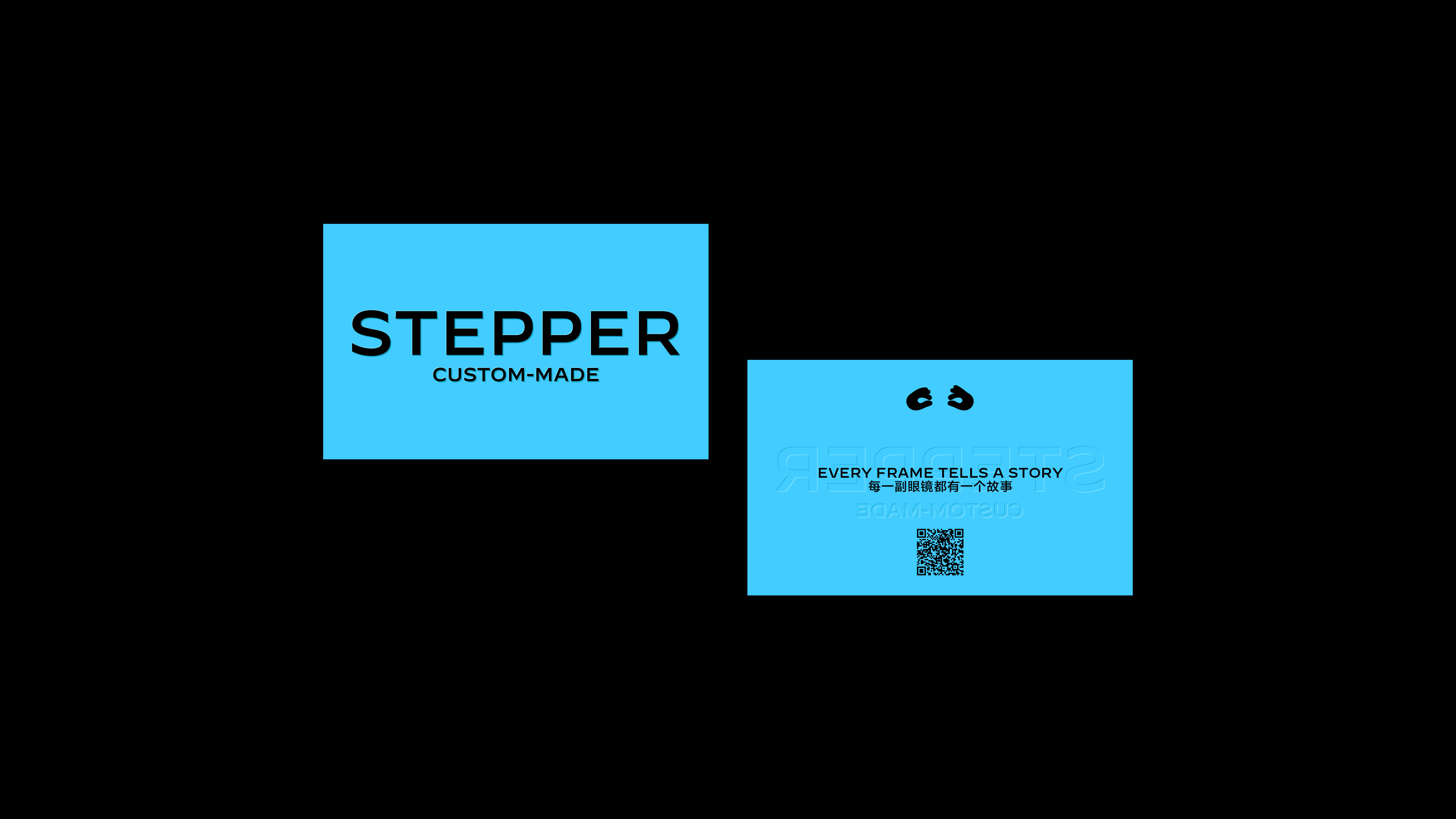
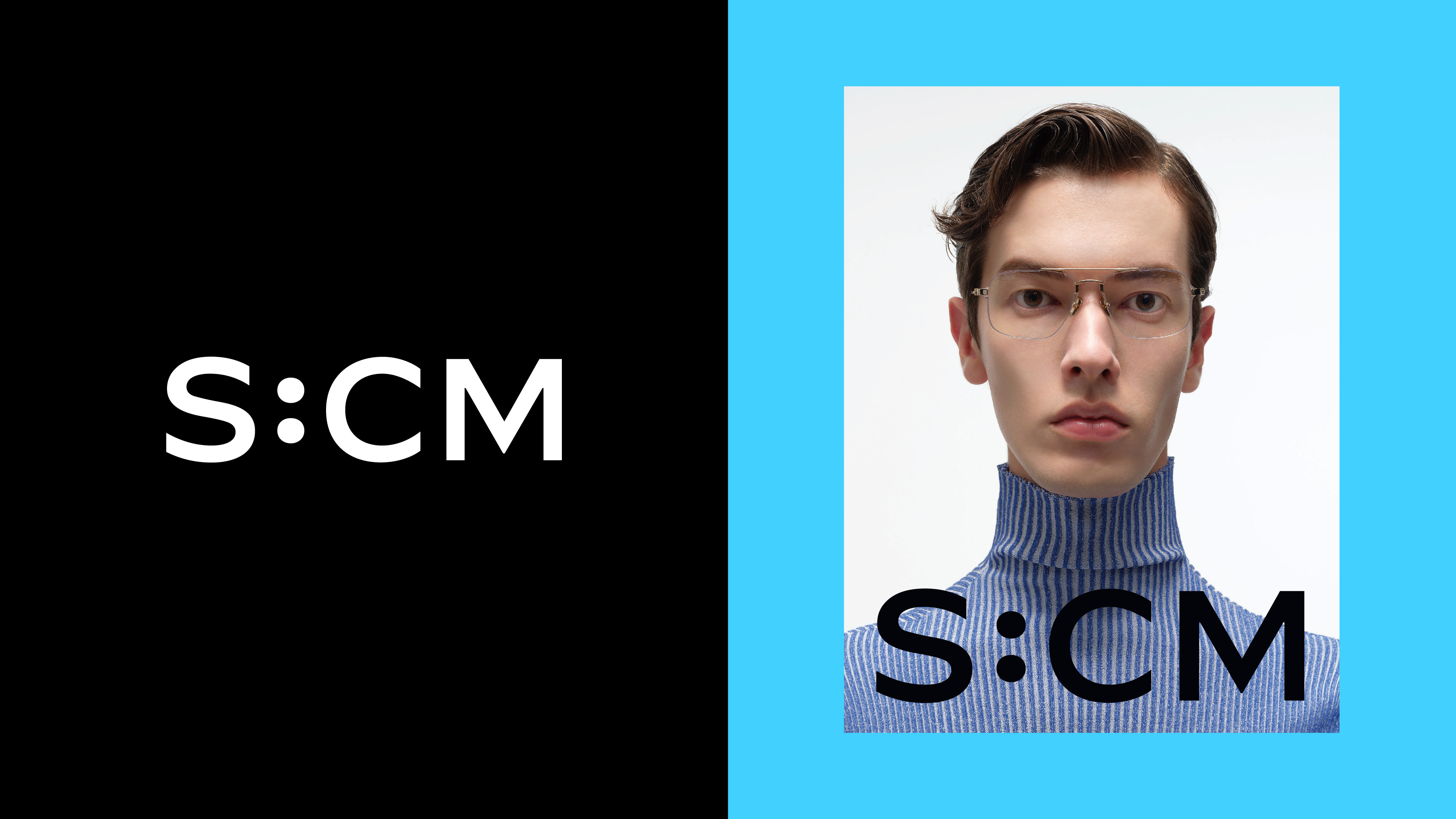
灵感来自于 Stepper 历史上在德国的第一家商店的招牌上的字体,我们延续此字体风格为 Stepper Custom-Made 设计了一个全新的基于字型的模块化标识系统,在使用品牌全称的完整字标以外,用 S:CM:B 代表「Basic 基础款」、S:CM:W 代表「Work 工作款」、S:CM:I 代表「Intelligent 智能款」和 S:CM:K 代表「Kids 儿童款」,以帮助其以更专业和清晰的方式展示不同类型的眼镜产品。同时,受人们佩戴眼镜方式与姿势的启发,我们为 Stepper Custom-Made 添加了一个辅助性的视觉符号——一双佩戴眼镜的手,它的趣味性和灵活性足以与线上和线下应用中的各种信息在版面编排中进行互动。
Inspired by the typeface on the signage of Stepper's historic first store in Germany, we continued the style of this typeface to design a new type-based modular identity system for Stepper Custom-Made in addition to the full brand name. S:CM:B for "Basic," S:CM:W for "Work," S:CM:I for "Intelligent," and S:CM:K for "Kids" to help present and identify the different product lines of eyewear in a more professional and clear manner. At the same time, inspired by the way people wear glasses and their posture, we added a secondary visual symbol to the brand – a pair of hands wearing glasses that is fun and flexible enough to interact with the various information in the layout of the online and offline applications.
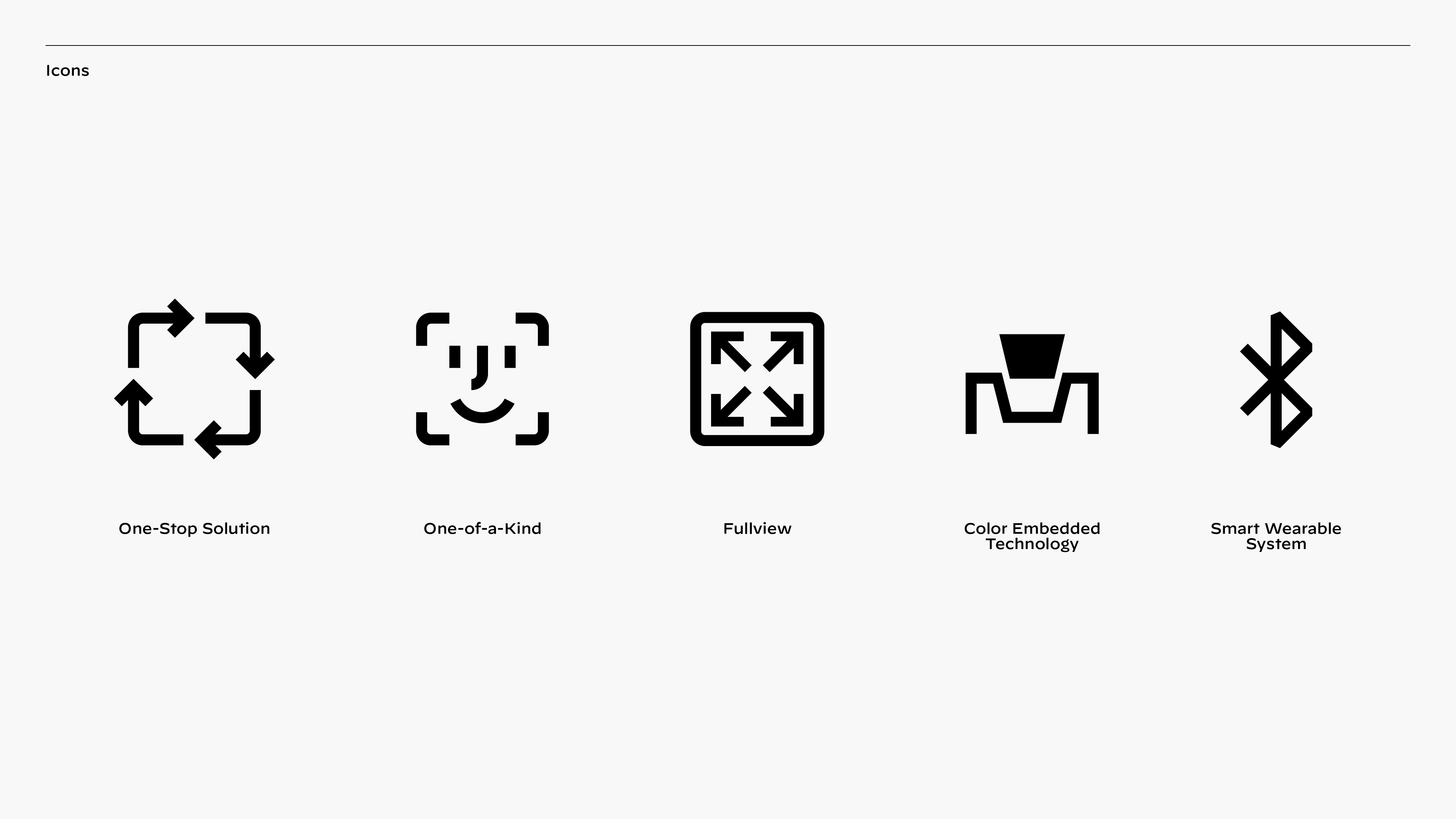
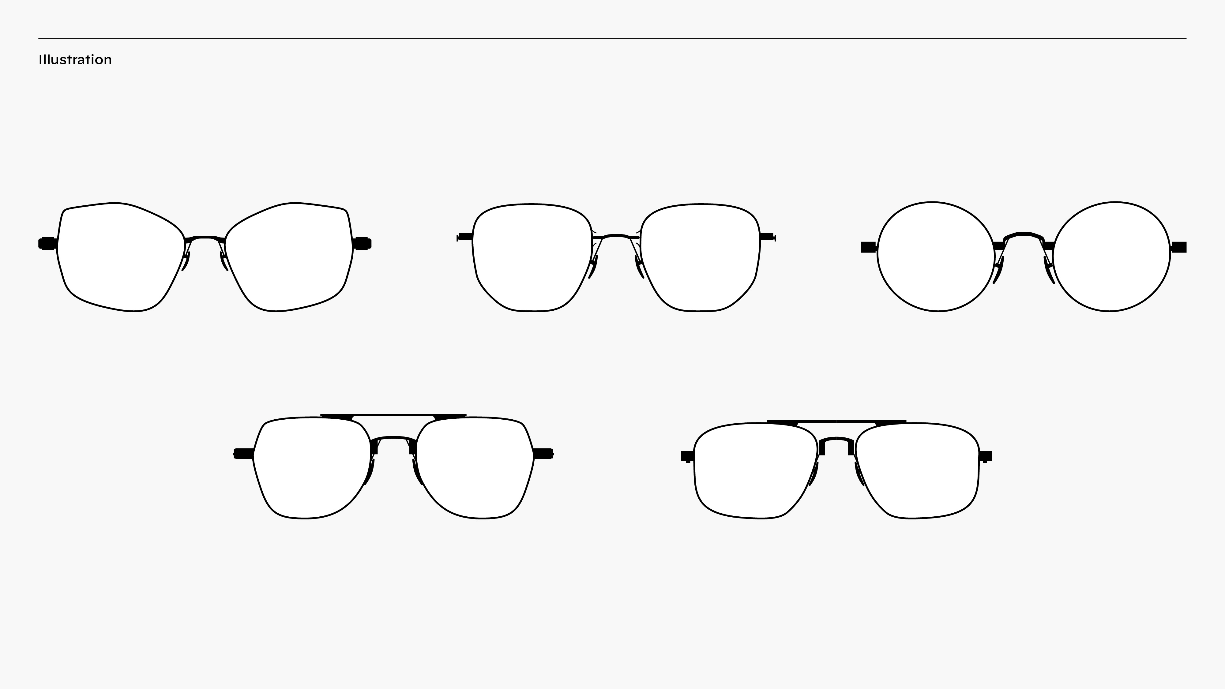


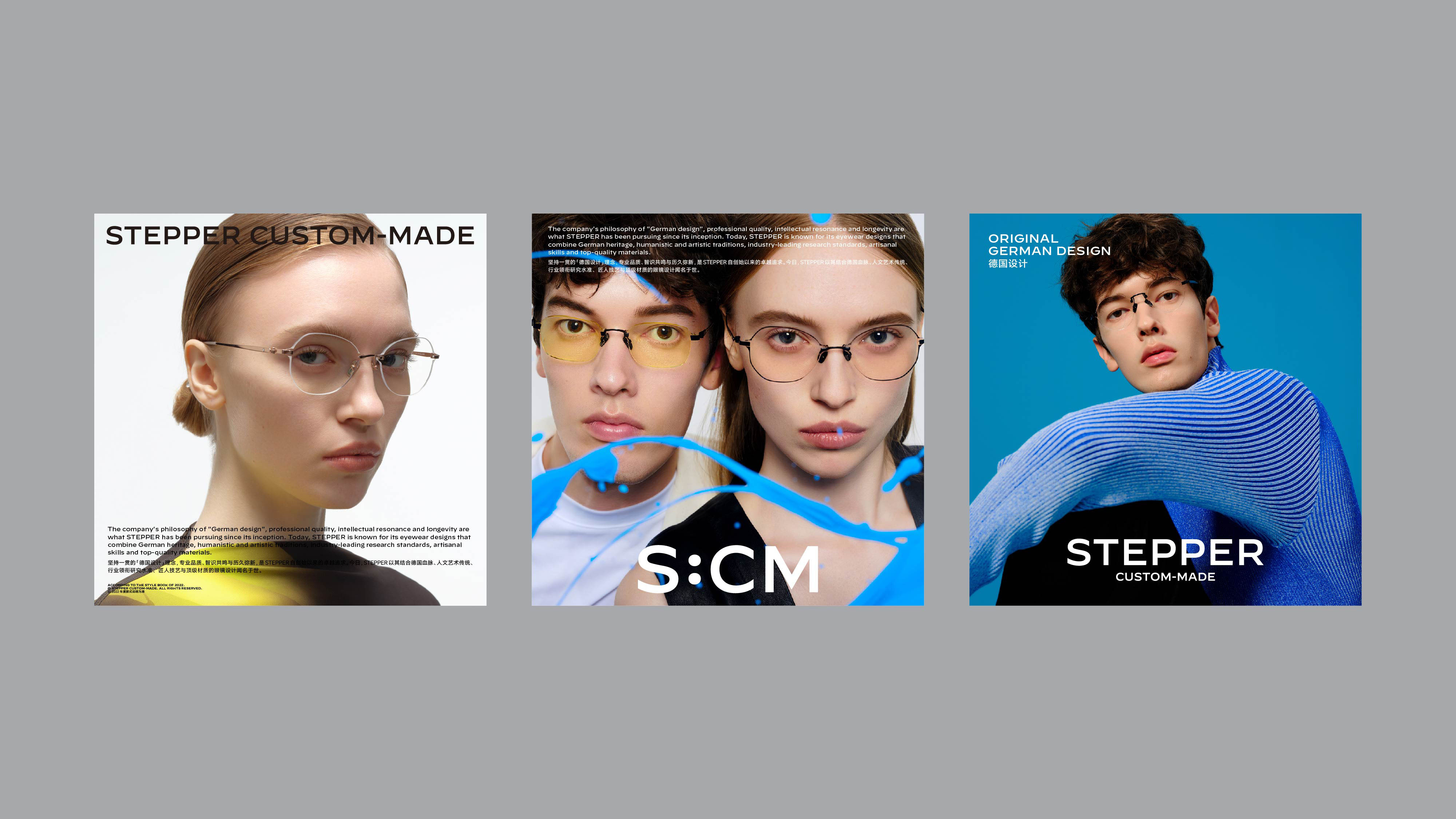
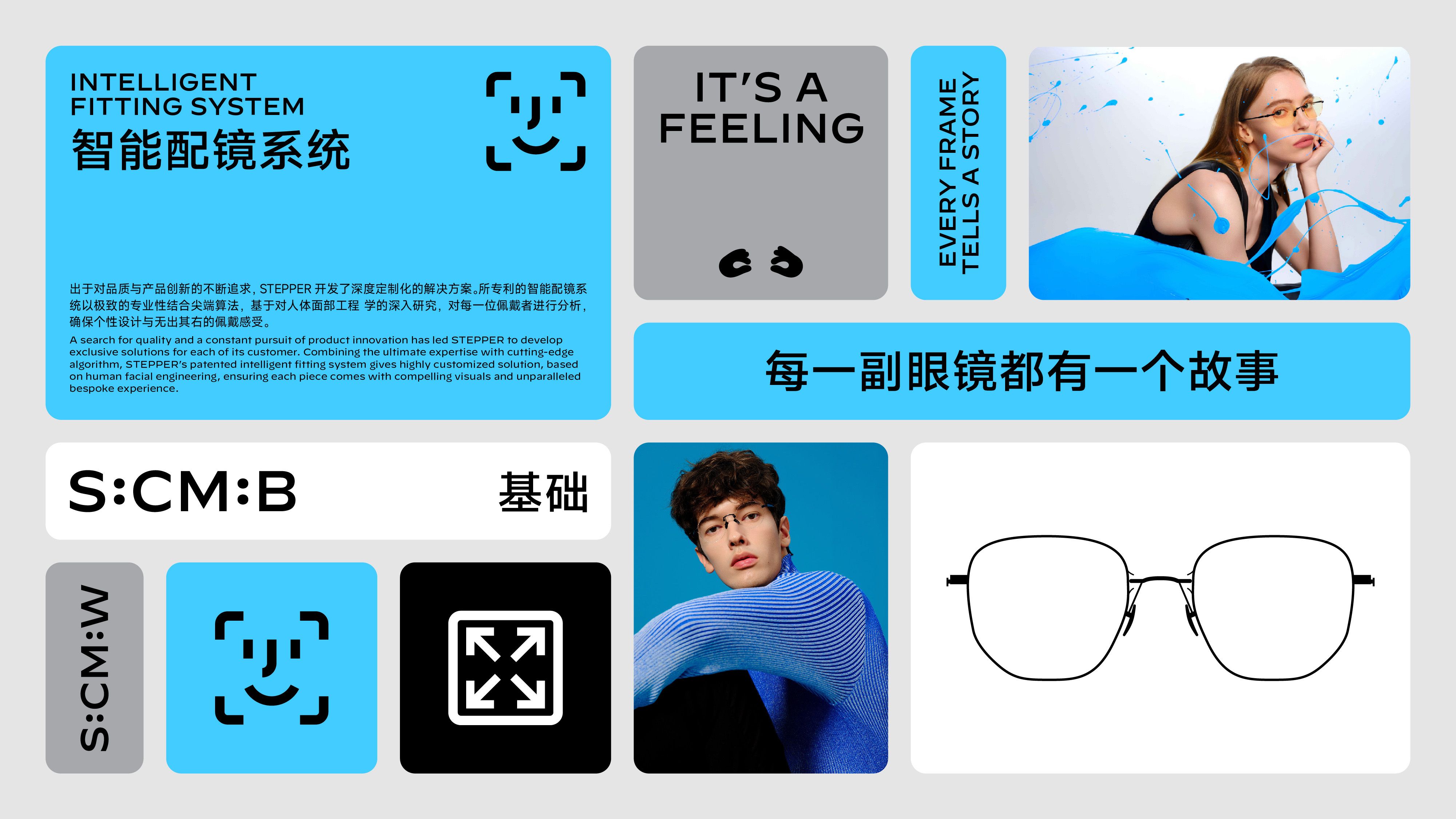
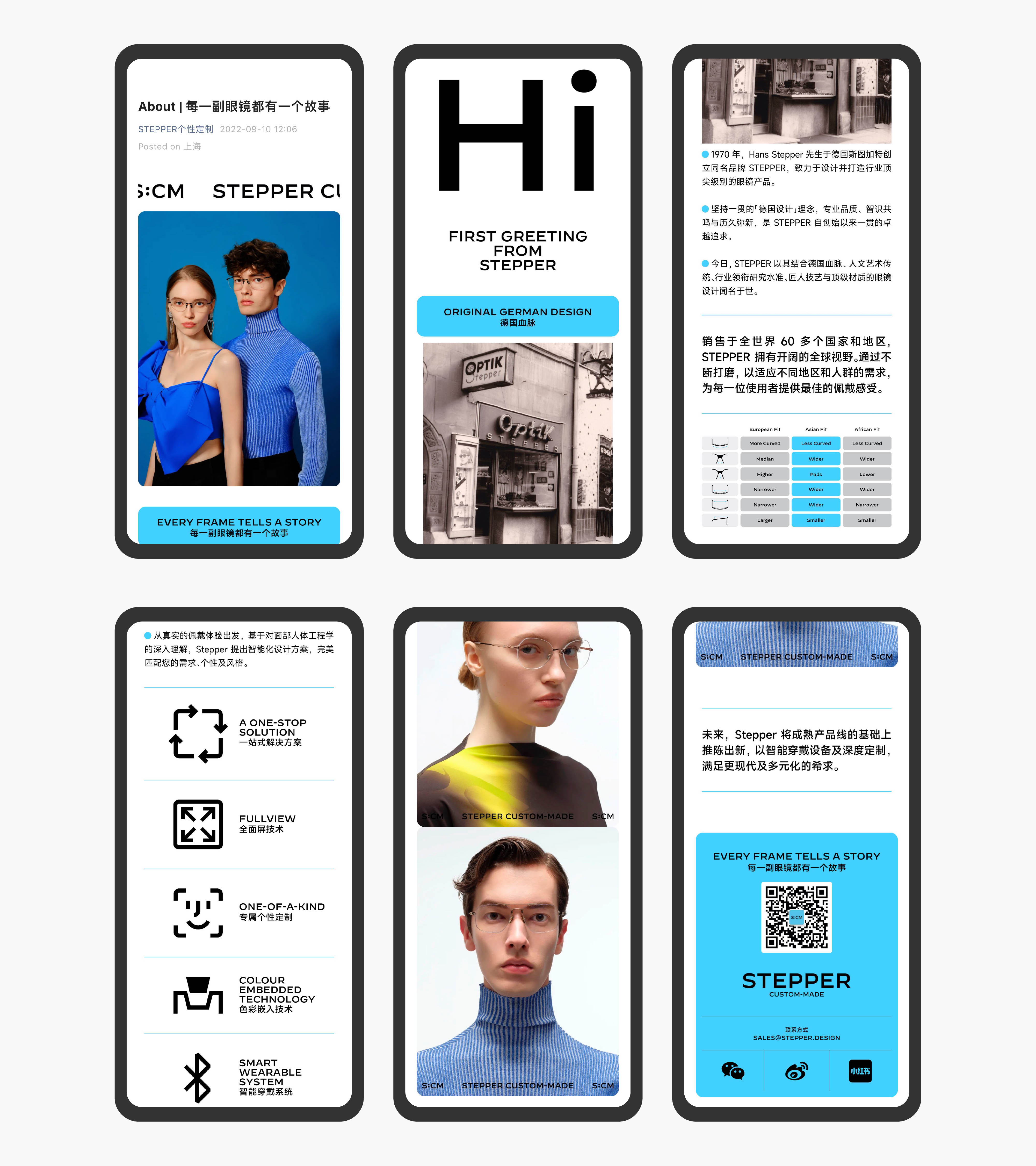
此外,我们通过将信息分类并灵活的嵌入圆角的矩形,得到一套模块化的版面编排与视觉逻辑,也回应了 Stepper Custom-Made 的模块化且定制化的特征与卖点。编码、模块、理性成为这一系列品牌视觉识别系统设计中的核心线索,帮助品牌从数字应用到包装、广告和展会的大量接触点上发挥作用。
In addition, by categorizing information and flexibly embedding rectangles with rounded corners, we get a modular set of layout and visual logic that echoes Stepper Custom-Made's modular and customizable features and selling points. Coding, modularity, and rationality became the core cues in the design process, helping the brand function across a wide range of touchpoint from digital applications to packaging, advertising, and trade shows.


