Sounder Wang
行业类型:时尚
时尚
零售
实践类型:品牌唤新
品牌唤新
视觉识别系统
线上店铺设计
包装设计
SECTOR:Fashion
Fashion
Retail
PRACTICE AREA:
Brand Refresh
Brand Refresh
Visual Identity System
E-Marketing Design
Packaging Design
Sounder Wang 是由首饰设计师王淞于 2018 年在伦敦成立的独立原创品牌。品牌希望以生活观察者的角度,透过设计产生对首饰制作的形式、材质与过程的思考,发现个人与所处环境之间的细腻关系,让佩戴者产生不同的新体验。
Sounder Wang is an independent and original brand founded by jewelry designer Wang Song in London in 2018. The brand hopes to generate thoughts on the form, material and process of jewelry making through design from the perspective of a life observer, and to discover the delicate relationship between individuals and their environment, so that the wearer can have a new and different experience.
Sounder Wang is an independent and original brand founded by jewelry designer Wang Song in London in 2018. The brand hopes to generate thoughts on the form, material and process of jewelry making through design from the perspective of a life observer, and to discover the delicate relationship between individuals and their environment, so that the wearer can have a new and different experience.


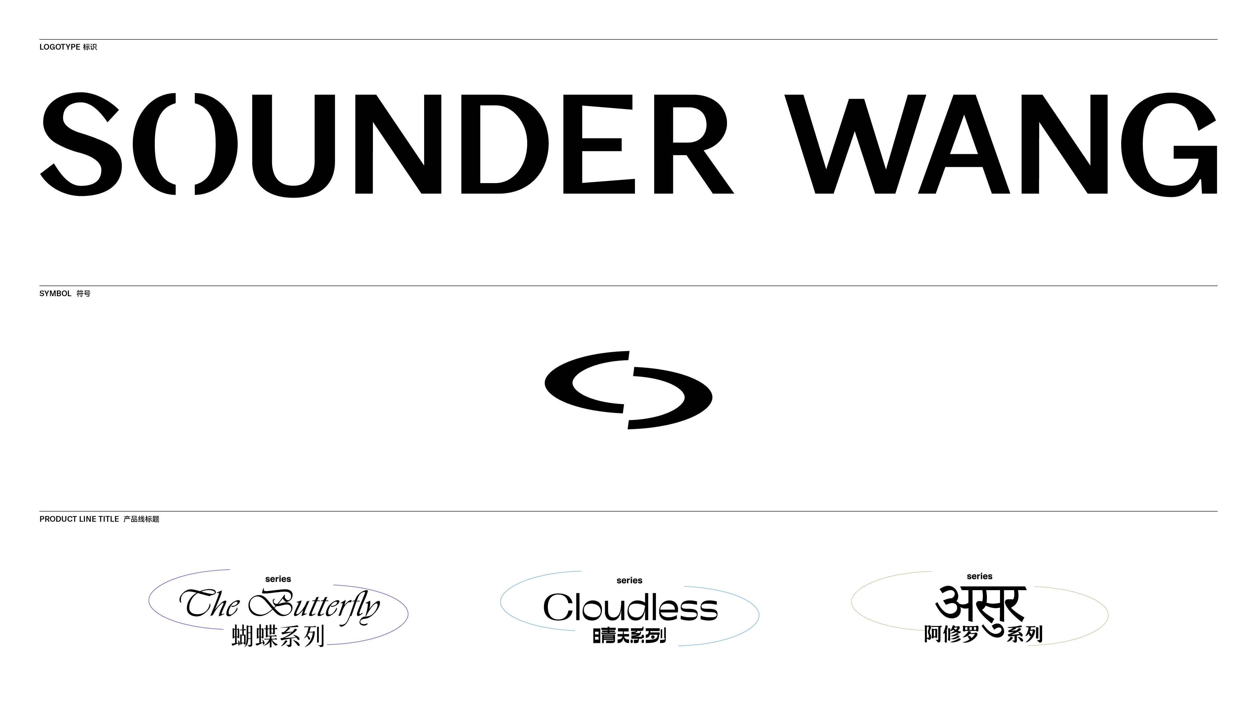
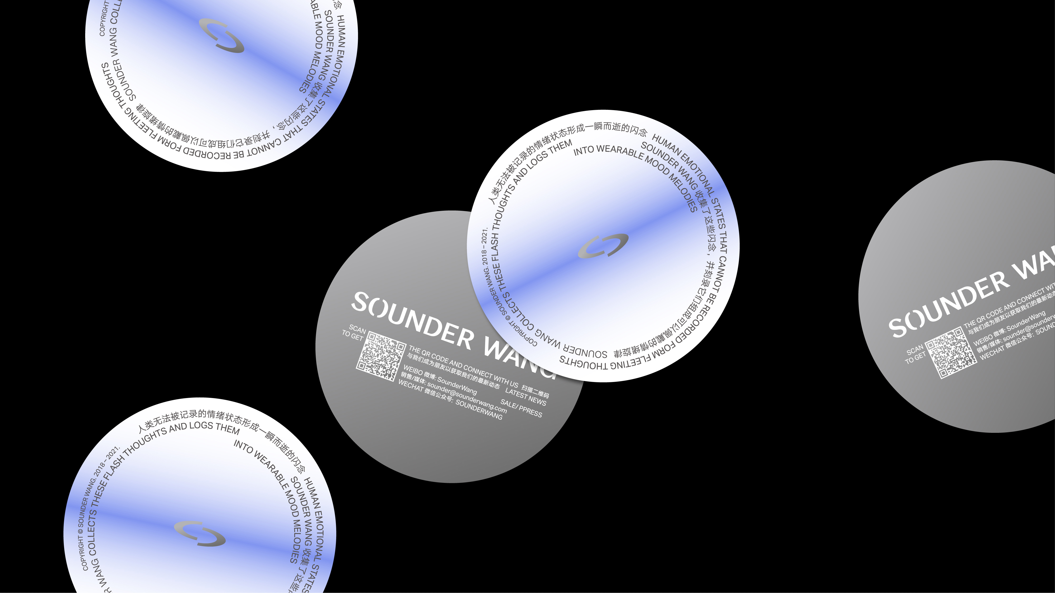
受到 Sounder Wang 的邀请,Pocca 为该品牌进行了完整的品牌唤新工作。源于 Sounder Wang 成立后发布的第一款磁吸结构的首饰,在品牌原有的标识中,字母 O 即是两半分割的结构。我们在全新的字体标识中保留了一处充满故事的视觉线索,在字型的笔画造型中增加了更多「工艺」与「精心设计与制作」的感受,相较于完全无衬线风格的原字标,新标识的字型更具有轻微风格化的倾向。而将字母 O 单独提取出来而成的符号,将造型作压扁和向右倾斜的处理,则进一步强化了 Sounder Wang 在首饰设计中呈现的先锋与未来感的氛围。延展开来,这枚左右分割的 O 形符号,像是一枚括号一样,能够与产品、文章、活动等需要强调的标题产生自然的互动,成为一个可以灵活使用的视觉元素。
Pocca was invited by Sounder Wang to do a complete branding refresh. From the first magnetic structure of jewelry released after Sounder Wang's founding, the letter O was the two halves of the brand's original logo. We kept a visual cue of the story in the new logotype, and added more “craftsmanship” and “careful design and production” to the stroke design of the typeface, giving the new logo a slightly more stylized look than the completely sans-serif style of the original. The letter O is extracted separately as a symbol, and the shape is flattened and tilted to the right, further reinforcing the pioneering and futuristic atmosphere of Sounder Wang in jewelry design. In extension, the left-right split O-symbol, like a bracket, interacts naturally with the headings of products, articles, events, etc., making it a flexible visual element that can be used.
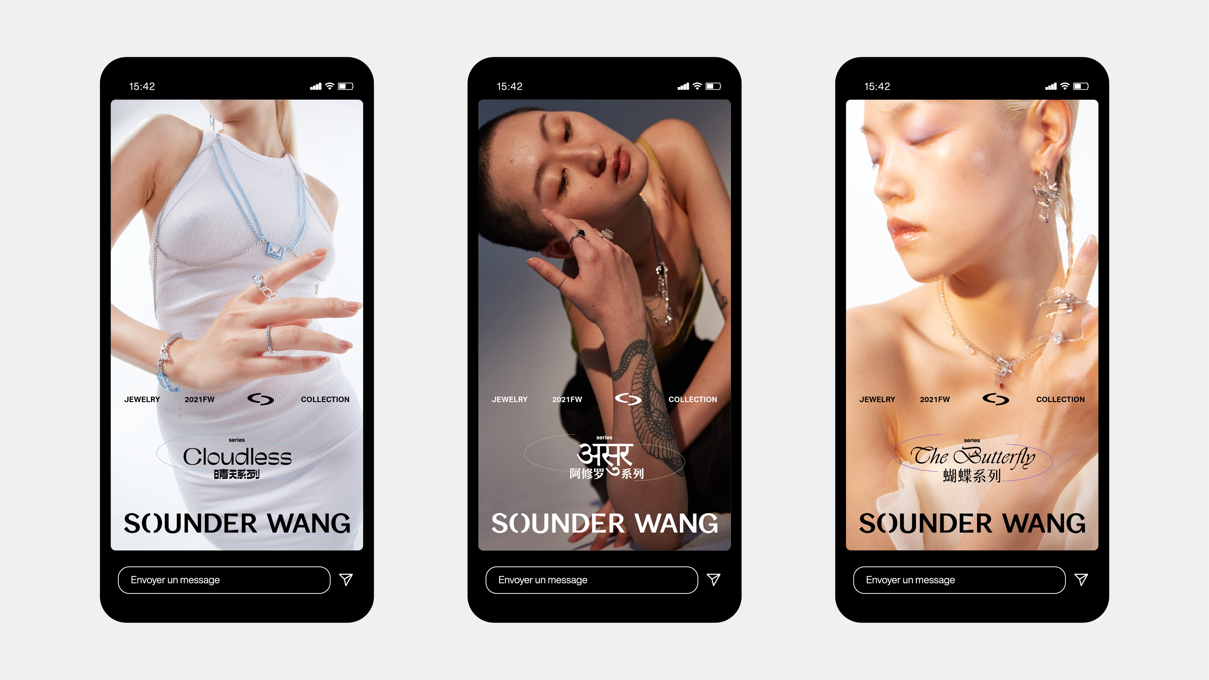
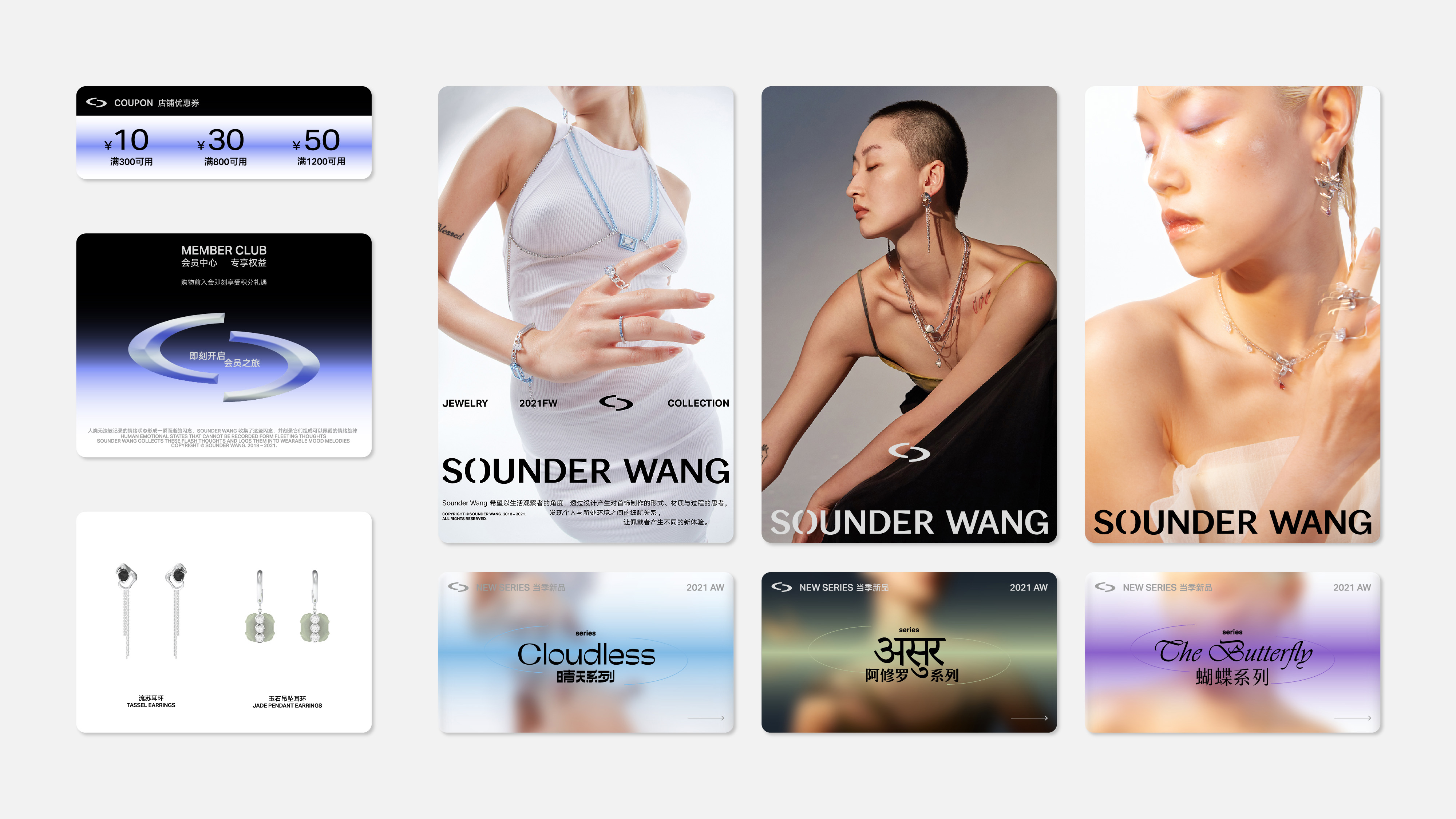
与 O 形符号的目的指向相同,为了在新的品牌形象中进一步前调 Sounder Wang 的未来感与先锋态度,明亮的蓝紫色渐变被设定为品牌的代表色,并通过精美的印刷呈现在包装系统中。
To further foreground Sounder Wang's futuristic and pioneering attitude in the new brand identity, the bright blue-purple gradient was set as the brand's representative color and was beautifully printed in the packaging system.