视觉识别、海报设计、艺术指导
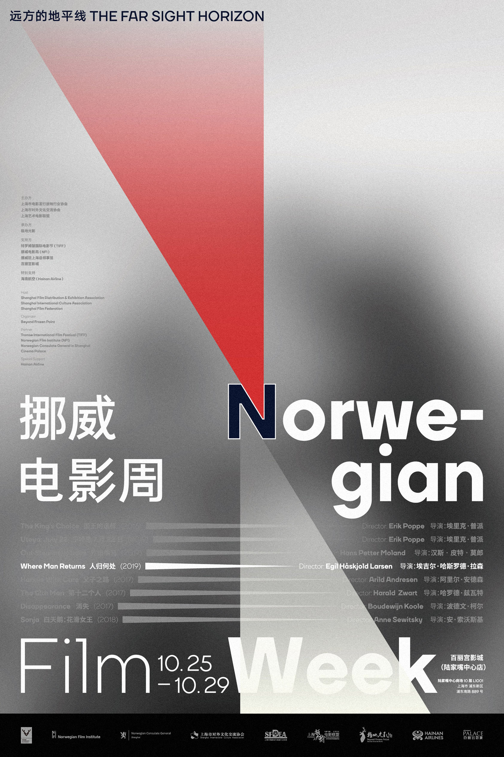
为由“极地光影“在上海策划的“远方的地平线——挪威电影周“进行的活动推广主视觉及海报设计。设计中选择以字母“N“作为视觉识别的核心,源于英文“挪威(Norway)“的首字母以及策划方“极地光影“专注于“北欧(Nordic)“的首字母及背景。字母“N“上下两处三角形的负空间恰好为画面提供了两道光芒的投射的情境:一道借由挪威国家标志的红蓝双色望向北方的“远方的地平线“,一道成为来自北方的电影光影的投射。同时,亦在主海报之外,为此次电影周期间的八部挪威电影分别设计独立海报,从每部电影中各截取一幅标志性的色调与画面模糊化处理成为每张海报的背景,用模糊的视觉诱发窥探的欲望,也直接的呈现每部电影的氛围。简洁利落却极富辨识度的色彩与形式成为此次挪威电影周最有力且让人记忆深刻的视觉识别。
为由“极地光影“在上海策划的“远方的地平线——挪威电影周“进行的活动推广主视觉及海报设计。设计中选择以字母“N“作为视觉识别的核心,源于英文“挪威(Norway)“的首字母以及策划方“极地光影“专注于“北欧(Nordic)“的首字母及背景。字母“N“上下两处三角形的负空间恰好为画面提供了两道光芒的投射的情境:一道借由挪威国家标志的红蓝双色望向北方的“远方的地平线“,一道成为来自北方的电影光影的投射。同时,亦在主海报之外,为此次电影周期间的八部挪威电影分别设计独立海报,从每部电影中各截取一幅标志性的色调与画面模糊化处理成为每张海报的背景,用模糊的视觉诱发窥探的欲望,也直接的呈现每部电影的氛围。简洁利落却极富辨识度的色彩与形式成为此次挪威电影周最有力且让人记忆深刻的视觉识别。
Visual Identity, Poster Design, Art Direction
The key visual and poster design for the event "The Far Sight Horizon - Norwegian Film Week", organized by Beyond Frozen Piont. The letter "N" was chosen as the core of the visual identity, derived from the initials of "Norway" and Polaris' focus on The initials of "Nordic" and the background. The negative space of the triangle above and below the letter "N" provides the context for two light projections: one by the red and blue colors of the Norwegian national symbol looking north to the "distant horizon", and one as a projection of the film's light from the north. In addition to the main poster, we also designed separate posters for each of the eight Norwegian films during the film week, taking one from each film and blurring the iconic tones and images to become the background of each poster, using blurred visuals to induce the desire to peek, and also directly present the atmosphere of each film. The simple yet recognizable colors and forms become the most powerful and memorable visual identity of the Norwegian Film Week.
The key visual and poster design for the event "The Far Sight Horizon - Norwegian Film Week", organized by Beyond Frozen Piont. The letter "N" was chosen as the core of the visual identity, derived from the initials of "Norway" and Polaris' focus on The initials of "Nordic" and the background. The negative space of the triangle above and below the letter "N" provides the context for two light projections: one by the red and blue colors of the Norwegian national symbol looking north to the "distant horizon", and one as a projection of the film's light from the north. In addition to the main poster, we also designed separate posters for each of the eight Norwegian films during the film week, taking one from each film and blurring the iconic tones and images to become the background of each poster, using blurred visuals to induce the desire to peek, and also directly present the atmosphere of each film. The simple yet recognizable colors and forms become the most powerful and memorable visual identity of the Norwegian Film Week.