Norman Walsh
行业类型:时尚
时尚
零售
实践类型:品牌唤新
品牌唤新
字体设计
视觉识别系统设计
海报设计
插画
文案梳理
包装设计
SECTOR:Fashion
Fashion
Retail
PRACTICE AREA:
Brand Refresh
Brand Refresh
Typeface Design
Visual Identity System Design
Poster Design
Illustration
Brand Message Editing
Packaging Design
「Norman Walsh 在 1961 年成立于英国博尔顿(Bolton),是英国著名的践行「经典复古风格」的户外运动跑鞋品牌,从二十世纪六十年代开始就用最优质的材料制作适用于不同体育项目的训练鞋,并曾成为英国奥运选手的专属用鞋以及英国马拉松国家队指定跑鞋的供应商,成为近三十年来英训鞋的代表品牌之一。如今,Walsh 凭借灵活、舒适、轻盈、制作精良的特点继续受到人们的喜爱。Norman Walsh 品牌进入中国市场以后,其秉承小而美且本土化的实践在新兴品牌中一直处于前列,并于 2021 年中旬完成了数字化转型,完成了柔性供应链改造,既能够进行个性化定制,也能过进行工业化大规模生产。 为了帮助品牌提升在视觉推广维度上的综合质量,Pocca 受 Norman Walsh 在中国的独立品牌运营商——Walsh China 的邀请,对该品牌在中国市场的视觉识别和推广形象进行了系统性的优化与完善。
Norman Walsh was founded in 1961 in Bolton, England, and is a famous British outdoor sports running shoe brand practicing "classic retro style". It has become one of the representative brands of British training shoes in the past three decades. Today, Walsh continues to be loved for its sleek, flexibility, comfort, lightness, and well-made. Since its entry into the China market, the Walsh has been at the forefront of emerging brands with its small and exquisite direction, and localized approach. It completed its digital transformation in mid-2021 with a flexible supply chain transformation that allows for both personalization and industrial mass production.Pocca was invited by Walsh China, Norman Walsh's independent brand operator in China, to systematically optimize and develop the brand's visual identity system in the China market in order to help the brand improve its overall quality in the visual communication dimension.
Norman Walsh was founded in 1961 in Bolton, England, and is a famous British outdoor sports running shoe brand practicing "classic retro style". It has become one of the representative brands of British training shoes in the past three decades. Today, Walsh continues to be loved for its sleek, flexibility, comfort, lightness, and well-made. Since its entry into the China market, the Walsh has been at the forefront of emerging brands with its small and exquisite direction, and localized approach. It completed its digital transformation in mid-2021 with a flexible supply chain transformation that allows for both personalization and industrial mass production.Pocca was invited by Walsh China, Norman Walsh's independent brand operator in China, to systematically optimize and develop the brand's visual identity system in the China market in order to help the brand improve its overall quality in the visual communication dimension.
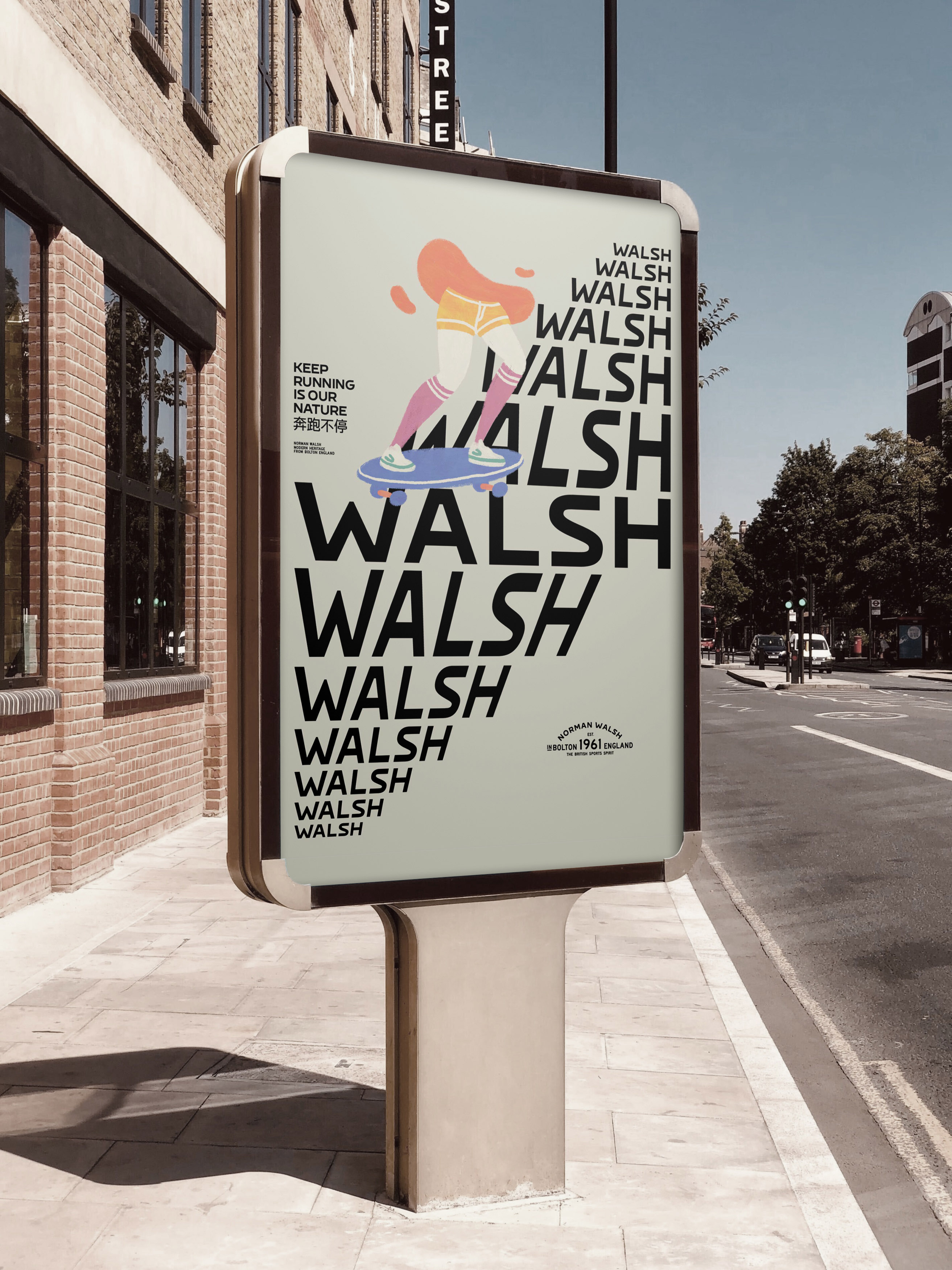

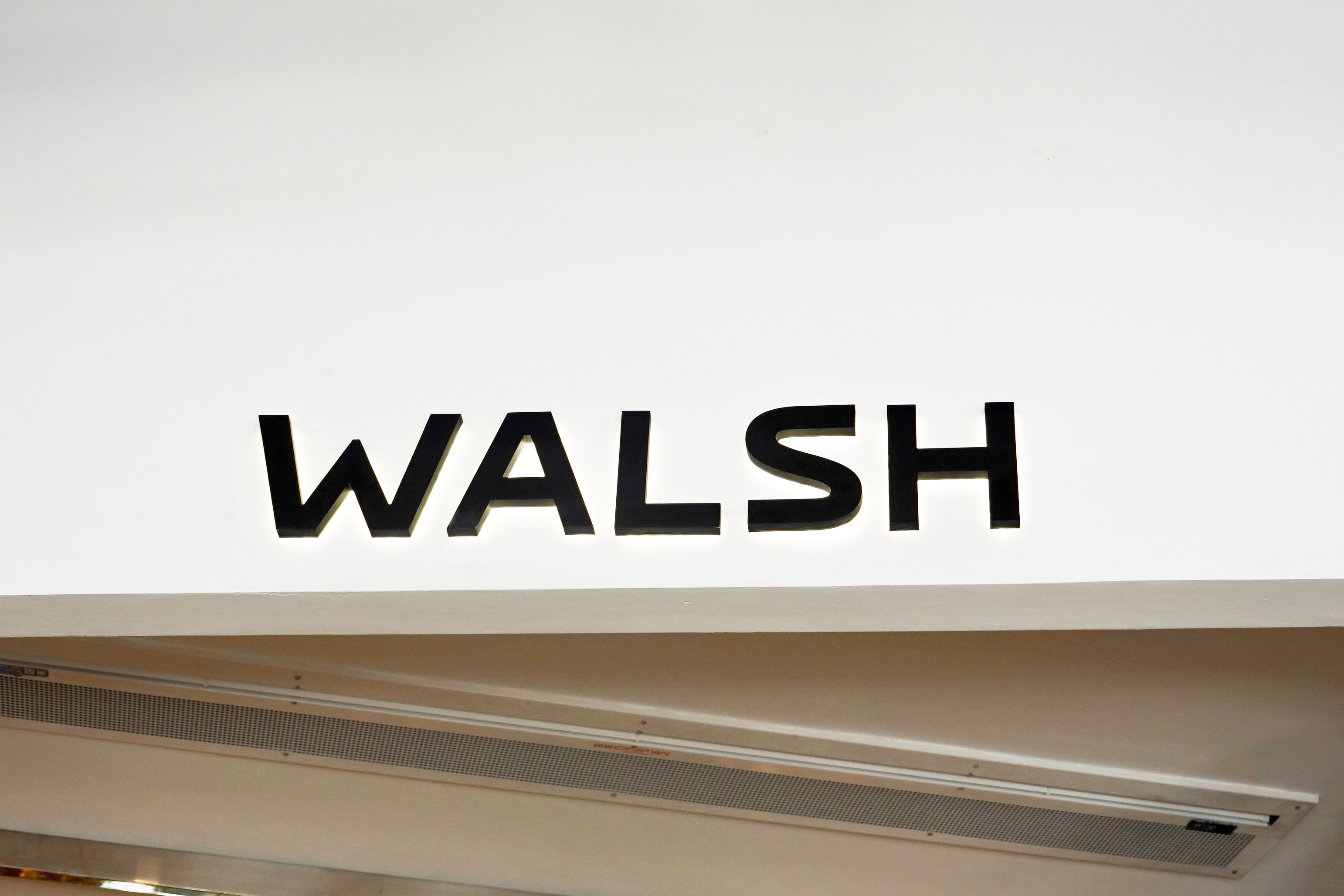

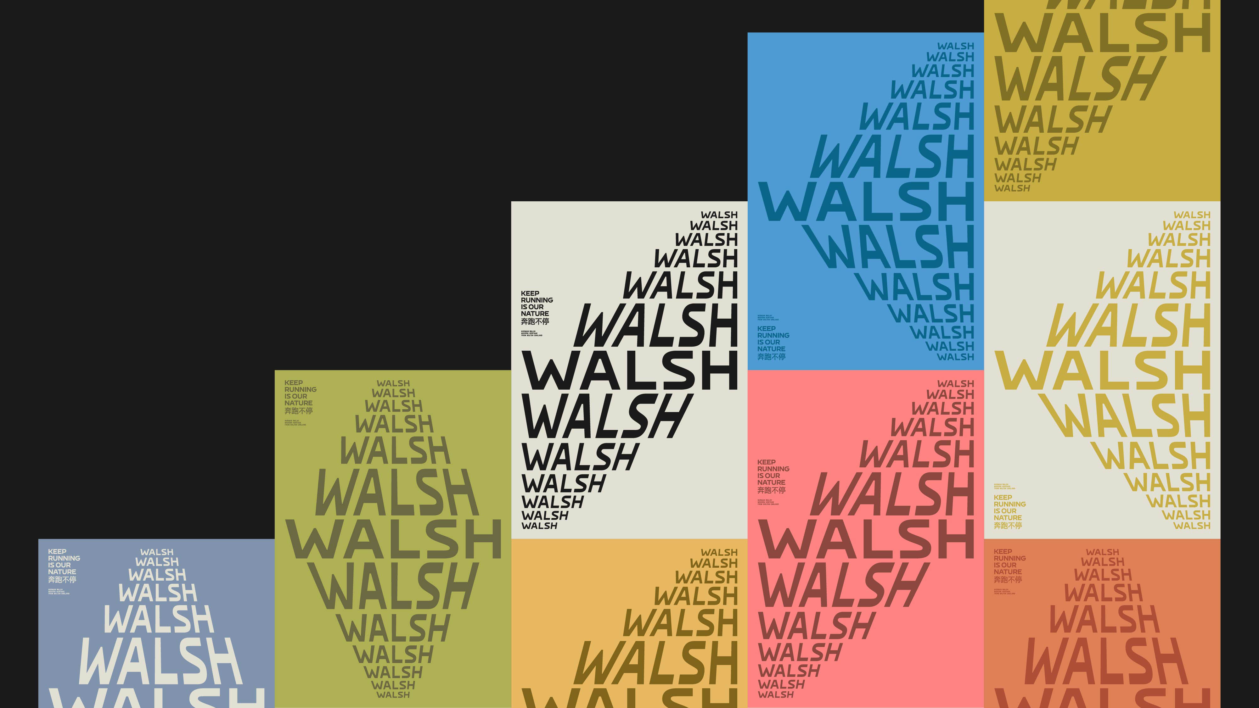
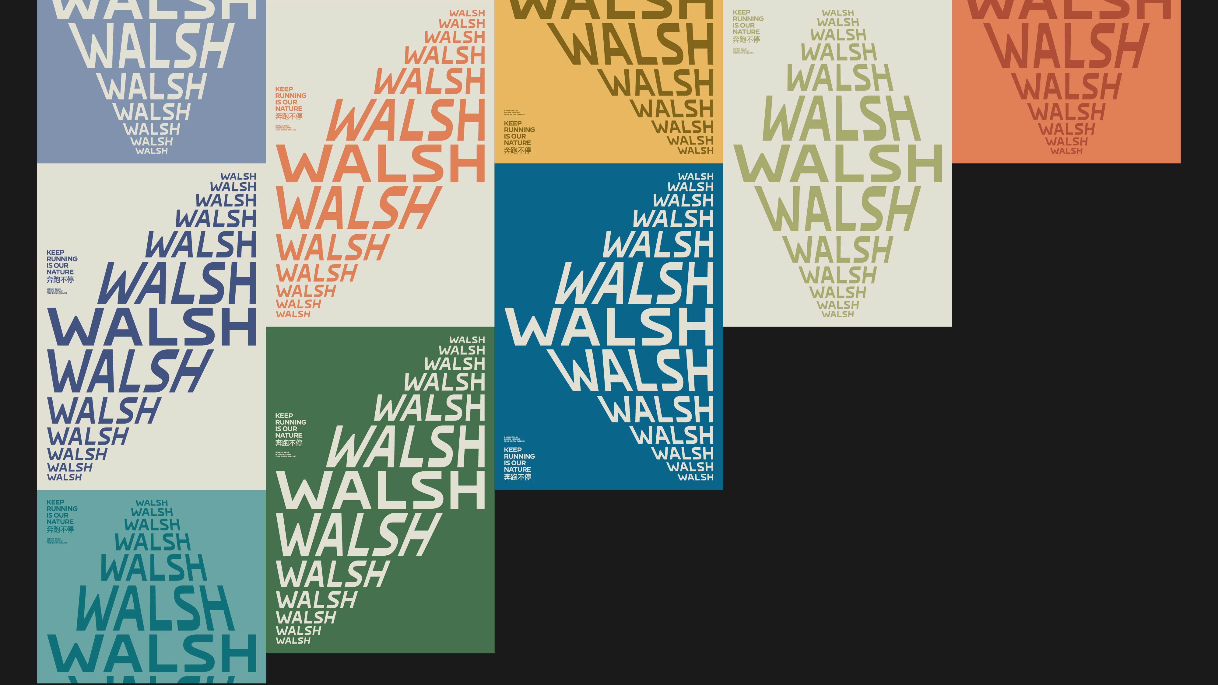
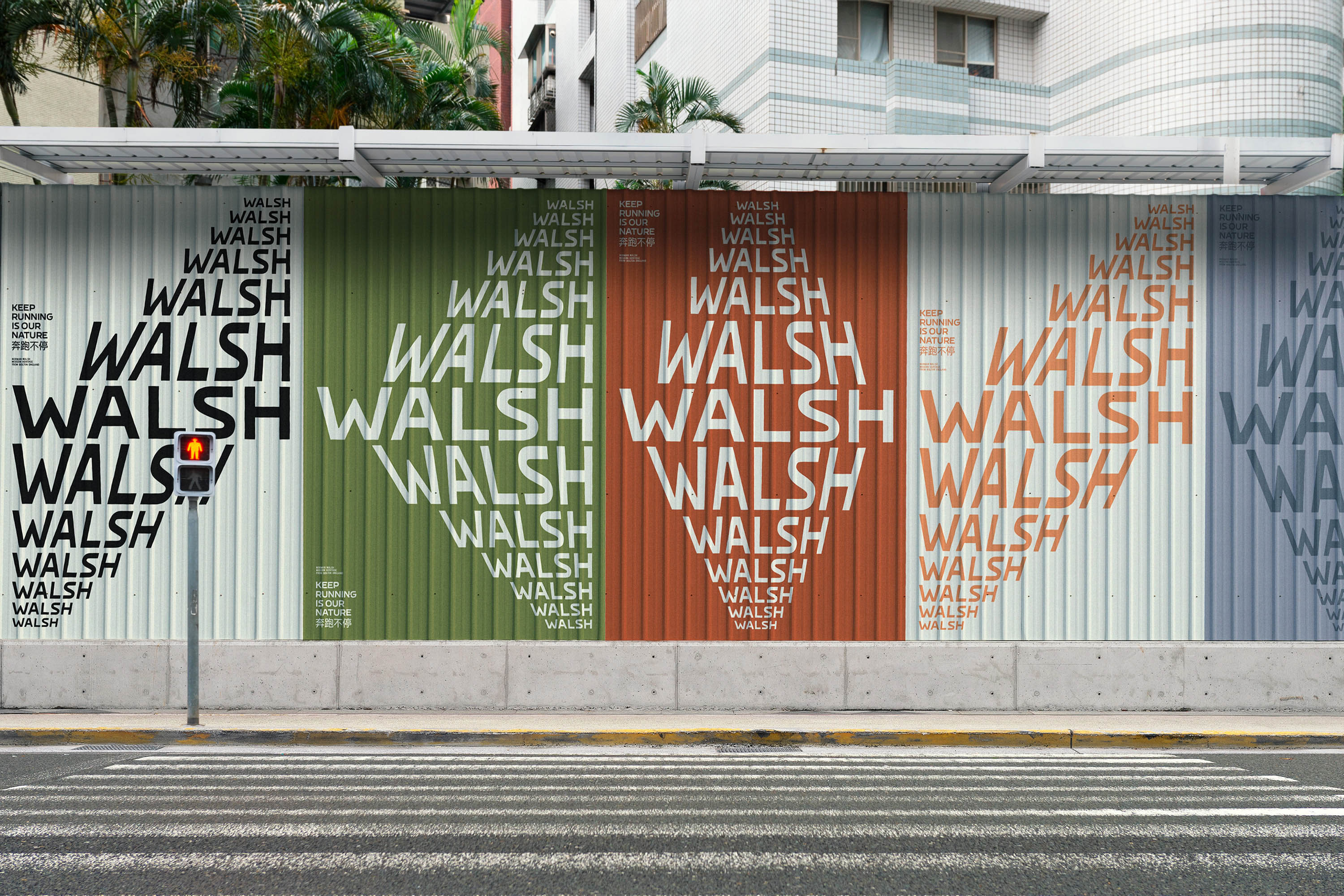
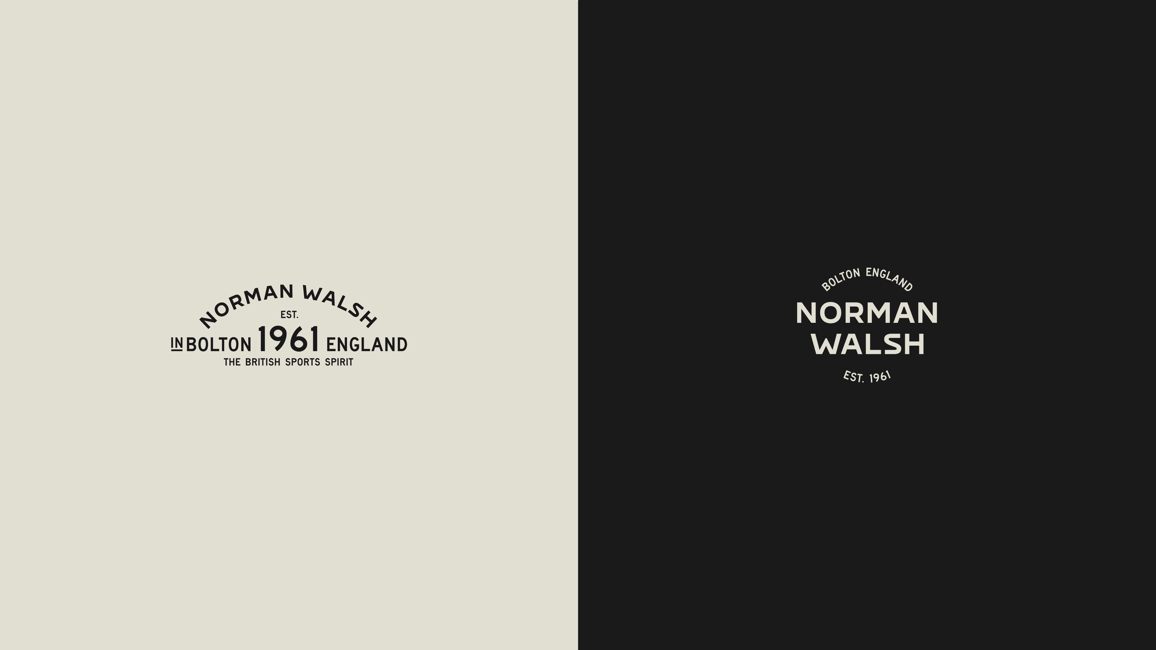
在这个项目中,我们首先优化了品牌原有的拉丁字型品牌标识。保留大写字母 S 首尾平齐的造型特点,维持整体字母造型稍扁、圆润、硬朗的视觉感受,我们将原字标中不甚统一的细节依次修改完善,得到了既继承了原字标气质又更符合现代视觉美学趣味的全新字标。随后,又基于字标中的字型设计,将其进一步扩展成为一套属于 Walsh 在中国市场的定制品牌标题字体 Walsh Sans。在整套字体的制作过程中,我们得到了 3Type 的协助与支持,对一共 76 个字符的 921 对字偶间距进行了精心的调整与优化。
In this project, we first adjusted the brand's original logotype. While retaining the flush shape of the uppercase S and maintaining the slightly flat, rounded, and clean visual appearance of the overall letterform, we modified and improved the details that were not quite consistent in the original, resulting in a new logotype that inherited the original one and was more in line with modern visual aesthetics. It was then further expanded into a set of custom branded headline typeface, Walsh Sans, based on the typeface design in the logotype. In the process of creating the font, we were assisted a lot by 3Type to carefully adjust and optimize the kernings of 921 pairs in 76 characters.

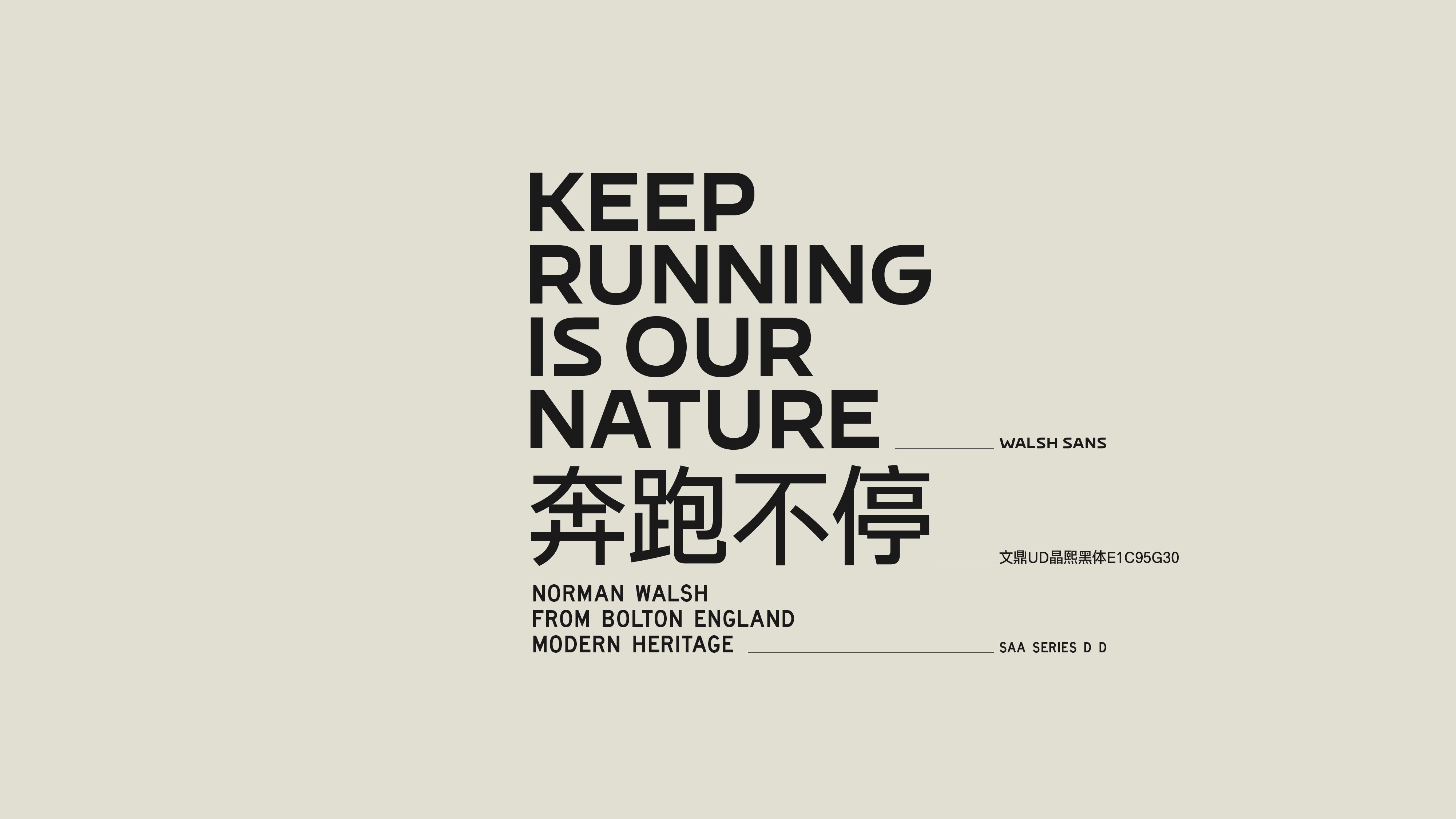
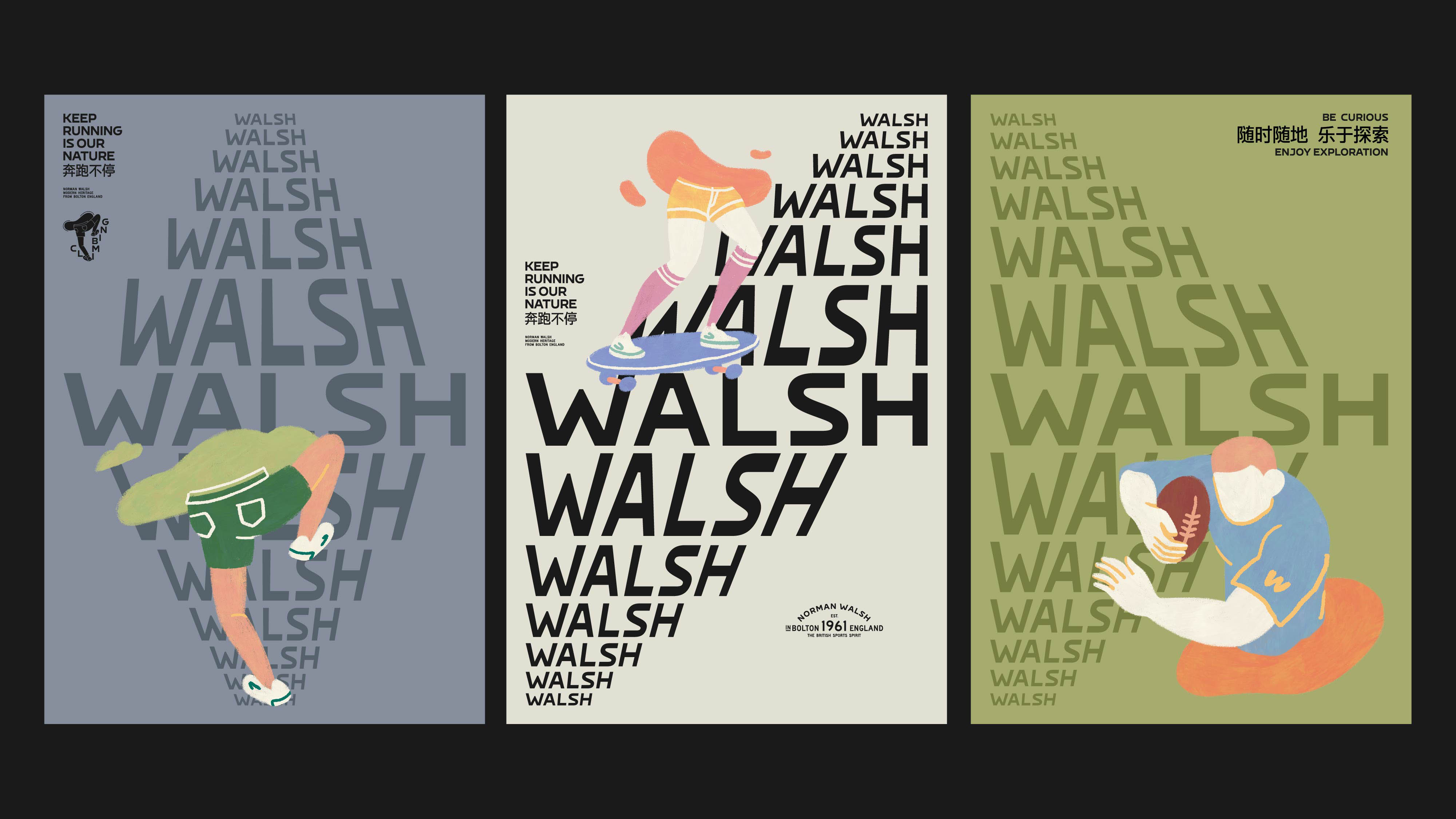
对于英文的正文与辅助信息的字型设定,我们希望能够从某种角度暗示出一些英国和户外运动的基因,于是我们观察到了英国公路标识中使用的 Transport 和 Motorway 这种字宽较窄且偏 mono 风格的字型,然而这两款字型的数字化版本中笔画造型的细节均不尽完美,综合考虑数字化字体的质量、公路感受、复古气质后,我们最终挑选了 SAA Series D D,它瘦高的字符造型与较宽的 Walsh Sans 呈现的对比,也使文本组合强化了对比度和节奏感。最后在中文正文字型的挑选中,我们为 Walsh 选用了来自台湾文鼎字库的字面宽且方正、笔画造型干净且现代的「晶熙黑体 E1C95G30」,作为从文字字型角度进入当代年轻人生活的策略。
For the English body text and supporting information, we wanted to suggest some British and outdoor sports genes from a certain angle, so we observed the narrower and mono-style fonts Transport and Motorway used in the British road signs, but the details of the strokes in the digital versions of these two fonts are not perfect. After considering the quality of the digital appearance, the road feeling, and the retro vibe, we finally chose SAA Series D D. The contrast between its tall and thin character shape and the wider Walsh Sans also enhanced the contrast and rhythm of the text combination. Besides, for the Chinese typeface, we chose the wide and square typeface, AR UD JingXiHei E1C95G30, from Arphic Foundry, as a strategy to enter the lives of today's youth from a font perspective.
For the English body text and supporting information, we wanted to suggest some British and outdoor sports genes from a certain angle, so we observed the narrower and mono-style fonts Transport and Motorway used in the British road signs, but the details of the strokes in the digital versions of these two fonts are not perfect. After considering the quality of the digital appearance, the road feeling, and the retro vibe, we finally chose SAA Series D D. The contrast between its tall and thin character shape and the wider Walsh Sans also enhanced the contrast and rhythm of the text combination. Besides, for the Chinese typeface, we chose the wide and square typeface, AR UD JingXiHei E1C95G30, from Arphic Foundry, as a strategy to enter the lives of today's youth from a font perspective.

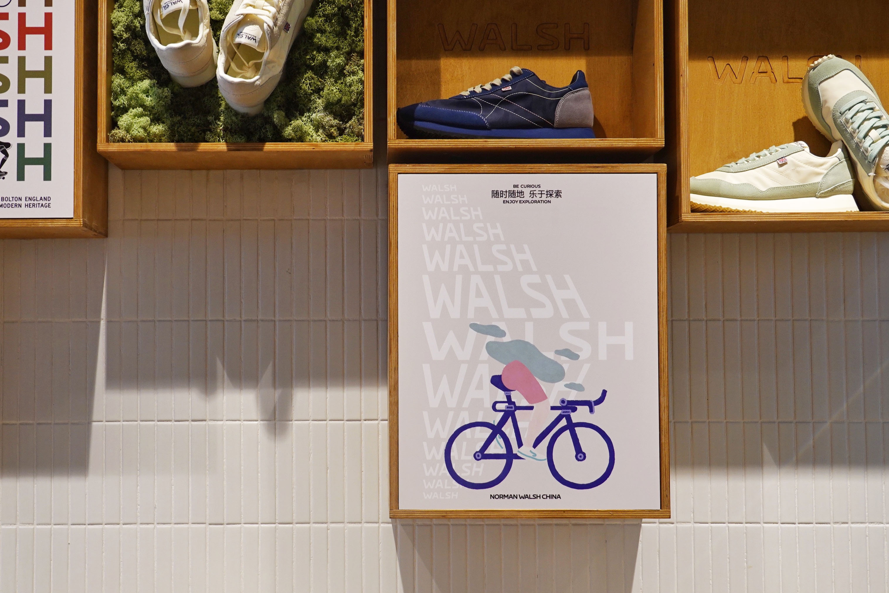
在保持 Walsh 的经典复古风格和户外运动属性作为整个设计的基调的前提下,我们为品牌新增添了了「复古蓝」和「米白」作为主色调,用于产品包装和视觉推广的核心;并搭配出一组经过优化的全新复古且当代的色板,用于帮助品牌在视觉推广中扩展丰富性和趣味性,也将作为产品设计中的色彩参考;在新的品牌字标的基础上生成出命名为 The Moving Walsh 的文字肌理,让运动的动感通过文字本身即能够得到直观的呈现;为延续 Walsh 在中国市场经营中一直以来对趣味性的倾向,我们创作出一组以受当代年轻人簇拥的运动为主题的插图系列;制定了有助于统一线上和线下视觉信息排布的网格系统。最后,在这个元素丰富且灵活的视觉系统的基础上,我们为 Norman Walsh(China)设计的全新的产品包装系统和随产品附属的一系列辅助应用物料中,则选取了一种与推广类视觉形成对比的更为简洁且朴素的设定,以此强化人们在如今这个信息噪杂的时代环境中对品牌的记忆,已经将更多的带给人们的感动交给 Walsh 的鞋履本身。

While maintaining Walsh's classic retro style and outdoor sports attributes as the overall design tone, we added ‘off-blue’ and ‘off-white’ as the main colors for the core of the product packaging and visual system; and a new set of optimized retro and contemporary color palette to help expand the richness and fun of the brand in all of the promotional touchpoint, which will also be used as a reference for product design. To continue Walsh's long-standing tendency for fun in the Chinese market, we created a series of illustrations based on the sports theme embraced by the youth today in China. A grid system was developed to help unify online and offline visual information. Finally, based on this rich and flexible visual system, the new packaging system for Norman Walsh (China) and the accompanying range of supporting materials were designed in a simpler setting in contrast to the promotional visuals, in order to reinforce the brand's memory in today's information-rich environment and to give more of a touch to Walsh's footwear itself.