去听嗏
My Jinji
行业类型:
餐饮
实践类型:概念指导
概念指导
艺术指导
品牌命名
产品规划
文案
视觉识别系统设计
海报设计
包装设计
SECTOR:
Food & Drinks
PRACTICE AREA:
Concept Direction
Concept Direction
Art Direction
Brand Naming
Product Strategy
Copywriting
Visual Identity System
Poster Design
Packaging Design
「My Jinji 去听嗏」是坐落于上海市中心的一间新式茶饮店,专注于用现煮茶、新鲜牛奶、新鲜水果等原料制作健康的日常茶饮。店铺的诞生源于一对服装设计背景的夫妻对茶饮的热爱,而品牌名称的确定源自 Pocca 在与两位品牌创始人的谈话中捕捉到的他们对于音乐的喜爱。
“My Jinji” is a new tea-based drink store located in the heart of Shanghai, specializing in healthy daily tea-based drinks made with freshly brewed tea, fresh milk and fresh fruit. The store was born from a couple with a background in fashion design and a love for tea, and the name of the brand came from a conversation Pocca had with the two brand founders about their love for music.


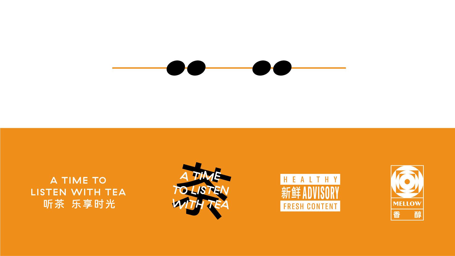
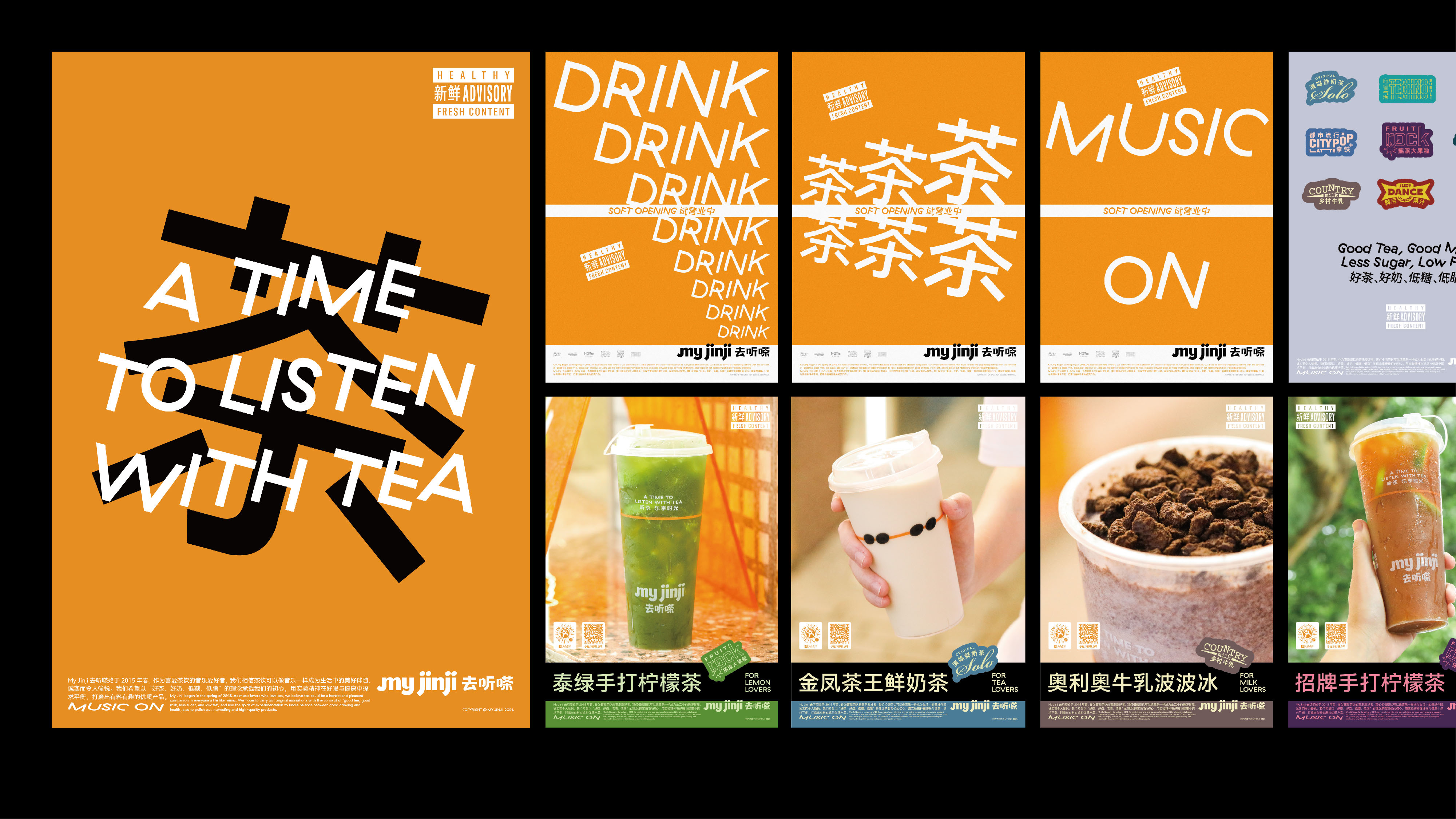
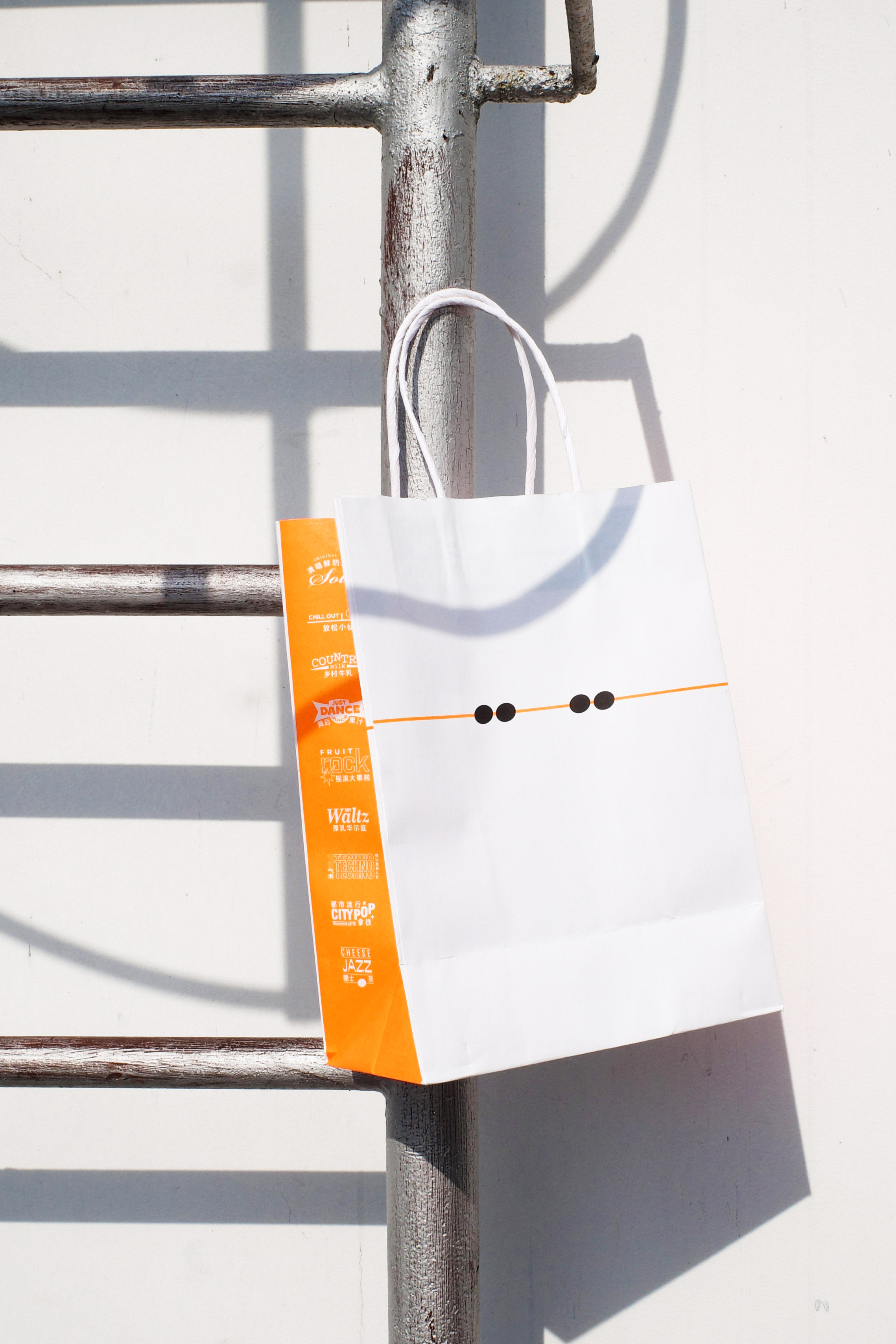
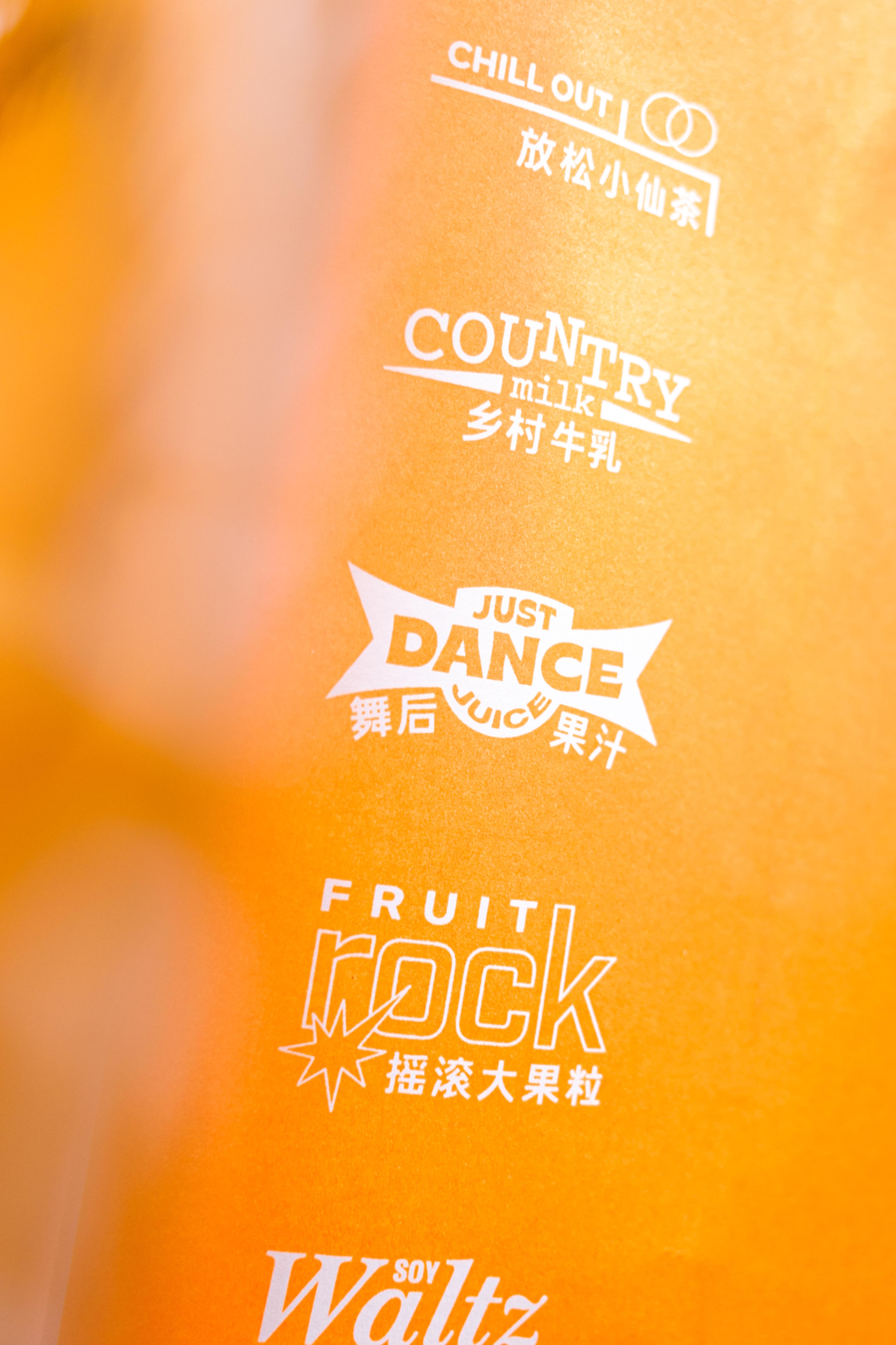
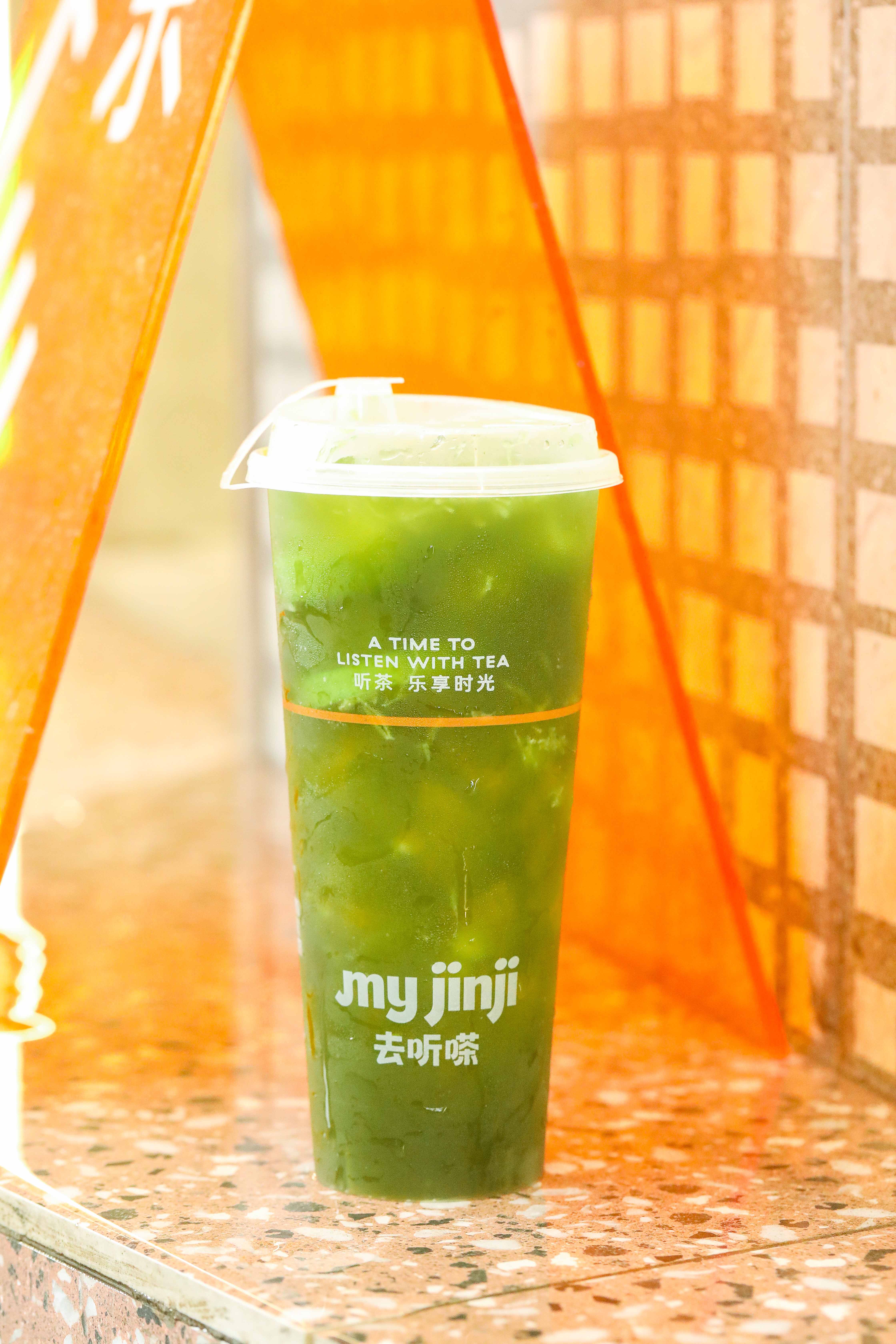
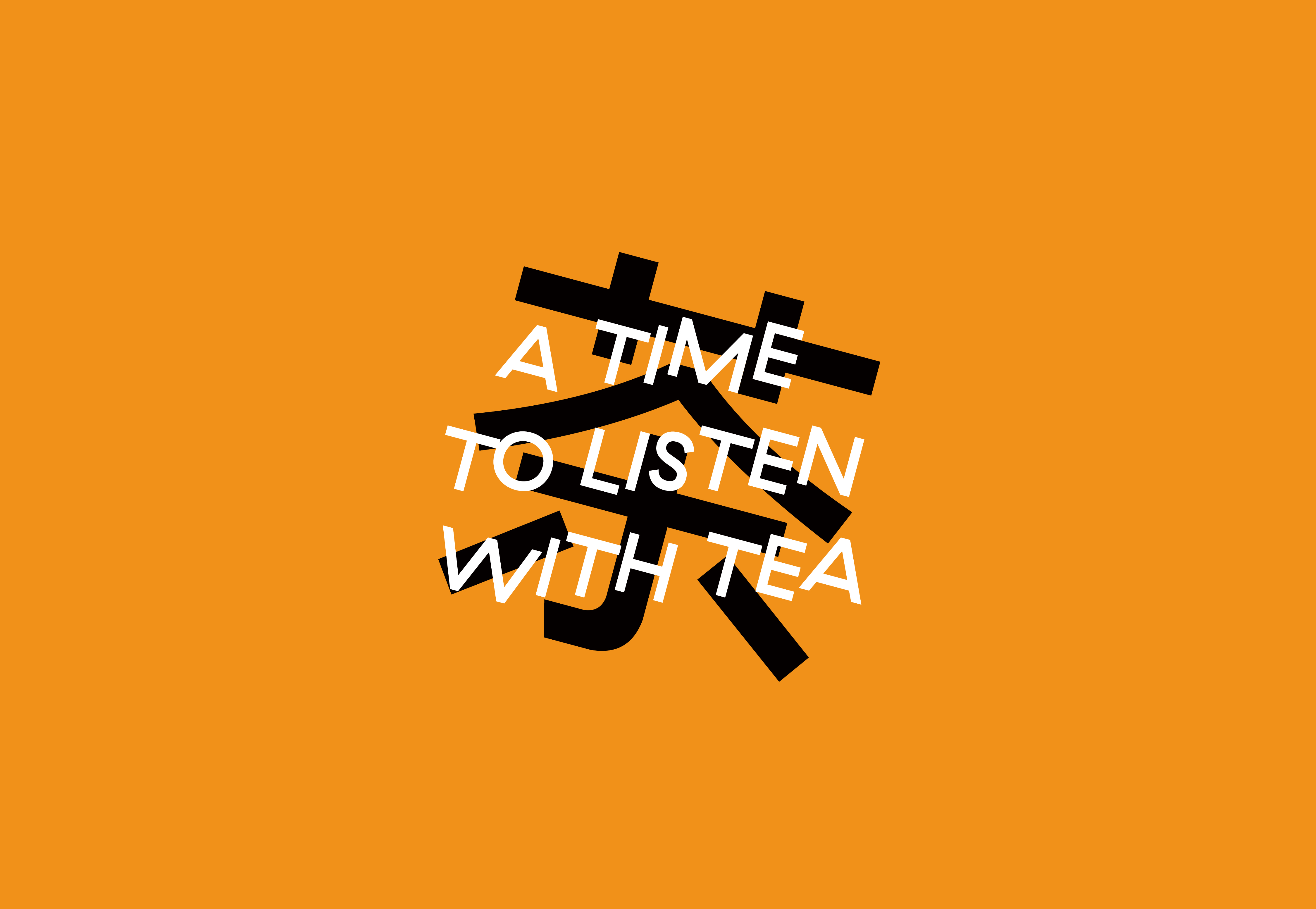
在开始整个关于 My Jinji 品牌的梳理和设计后,我们首先对品牌原有的产品进行了细致的梳理,将原本庞杂的产品划分在综合销量、相似度、产品线等不同因素的考量下进行了删减与重新整理,并基于品牌新确立的音乐主题,我们将所有删减后的产品按照音乐类型而划分出 9 个全新的产品线。并且,9 款产品线的名称也均以音乐作为出发点进行命名为:乡村牛乳、舞后果汁、电音气泡、放松小仙茶、嚼士茶、都市流行拿铁、摇滚大果粒、清唱鲜奶茶、厚乳华尔兹,而每款茶饮也均按照相对应的产品线进行了名称的调整。为了契合全新的产品线与产品风格,我们为品牌撰写了全新的概念口号「听茶,乐享时光(A Time to Listen with Tea)」为品牌以全新面孔示人做出了一份简短的宣言。
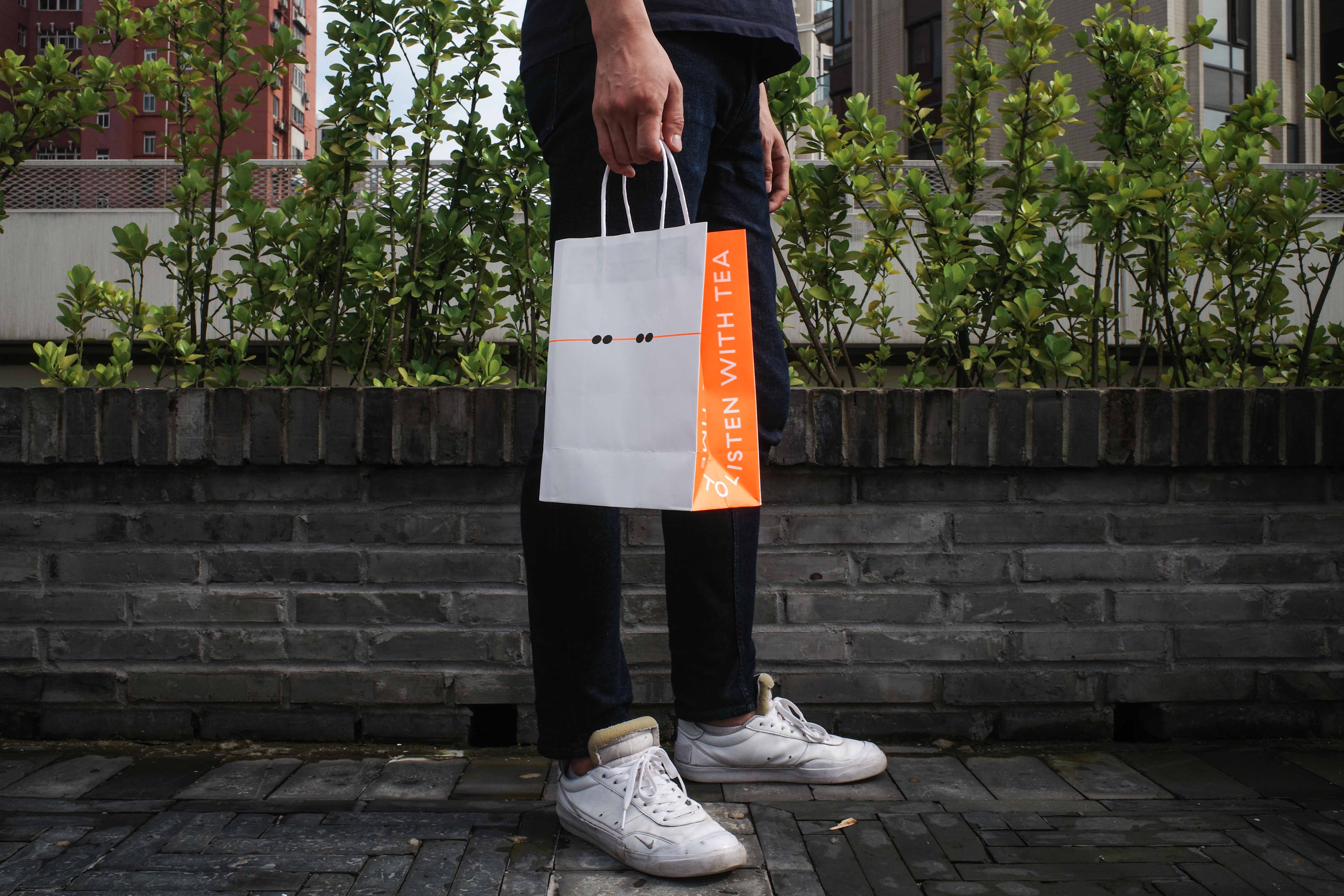
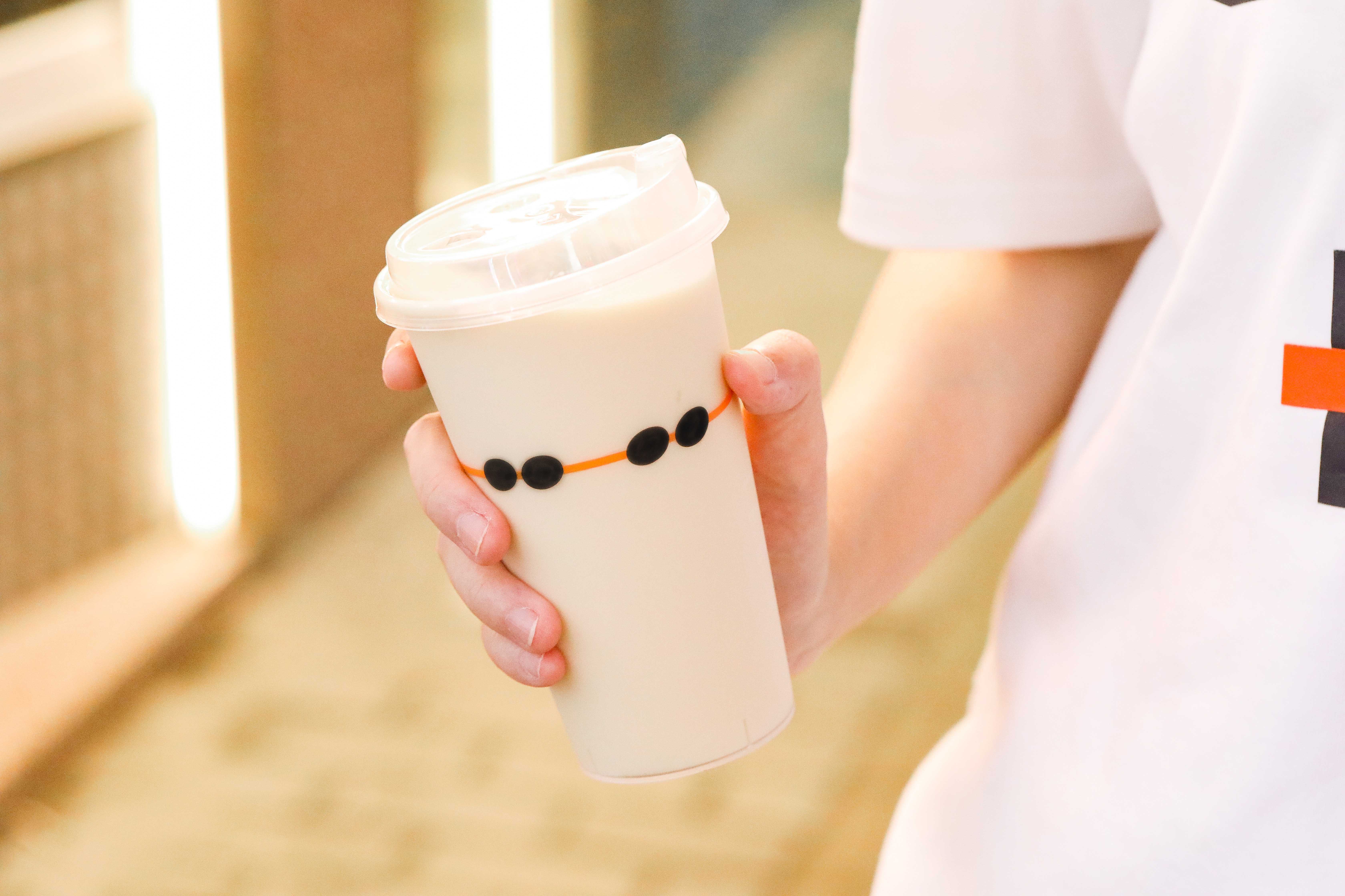
在视觉识别的设计上,我们首先将五线谱中「线条」与「音符」的意象挪用到品牌的中英文字体标识之中,让整个字型流露出一种慵懒、有趣、恣意的感受。其次,我们为每个产品线名称均设计了单独的文字模块风格的标识,通过不同的配色与字型的搭配呈现出相对应的音乐风格。在视觉延展应用的部分,我们从黑胶唱片的封面设计中得到启发,为品牌增添了一系列能够营造音乐联想的符号。最后,我们将茶饮的愉悦交给了一抹明亮且愉悦的荧光橙色作为品牌的主色调,统领品牌的对外发声。
After starting the entire My Jinji branding and design process, we began by carefully sorting through the brand's original products, cutting and reorganizing the original product categories based on sales, similarity, product lines, and other factors. Based on the brand's newly established music vibe, we divided all of the cut-down products into 9 new product lines. Moreover, the names of the 9 product lines were named with music styles as the starting point: Country Milk, Just Dancing Juice, Techno Bubble, Chill Out, Cheese Jazz, City Pop Latte, Fruit Rock, Original Solo, Soy Waltz, and each tea drink also had its name adjusted according to the corresponding product line. In order to fit the new product line and product style, we wrote a new concept tagline for the brand, “A Time to Listen with Tea”, as a short declaration for the brand to show a new face.
In visual side, we first appropriated the imagery of “lines” and “notes” in the five-line score into the brand's bilingual logotype, so that the entire logotype flowed with a lazy, fun and unrestrained feeling. Secondly, we designed a separate typographic lockups for each product line name, presenting the corresponding music style through different color schemes and typeface matching. In the part of visual extension application, we took inspiration from the cover design of vinyl records and added a series of symbols that can create musical association for the brand. Finally, we gave the pleasure of tea drinking to a bright and pleasant fluorescent orange as the main color of the brand, leading the brand's external voice.