
Maidesite
行业类型:
零售
实践类型:品牌重塑
品牌重塑
品牌策略研究
品牌定位
产品策略研究
用户与消费者洞察
视觉识别系统
艺术指导
包装设计
电商平台
网站设计指导
SECTOR:
Retail
Retail
PRACTICE AREA:
Rebranding
Rebranding
Brand Strategy
Brand Positioing
Product Strategy
User & Customer Research
Visual Identity System
Art Direction
Packaging
E-commerce Design
Website Design Direction

Maidesite 是一个专注于为消费者提供高品质升降桌的品牌,目前的销售主要面对德国及欧洲市场。经过数年的发展,Maideiste 的产品销量和品牌影响力逐步提升,借此契机,Pocca 受委托重新审视与研究品牌的市场定位、品牌战略及产品规划,并基于全新的品牌定位和品牌故事,为 Maidesite 构建了具有明显差异化的焕然一新的品牌视觉形象。
新定位,新样貌
在新的品牌定位驱动下,Maidesite 将不再仅仅是销售升降桌,更是通过功能集成、适应多种场景、个性化高度可调的桌面产品,帮助用户轻松、便捷、轻松地切换到需要桌面支撑的各种居家活动模式。让热爱现代智能家居生活的人们能够更便捷、自由地沉浸在丰富多彩的工作与生活的状态中。
放大一个简单的概念
围绕“高、低、起、落”这个简单且直接的视觉叙事概念,我们为品牌定制了可以自由升降的模块化的英文字型标识和源自 Maidesite 首字母缩写的 M 符号,并将这一概念进一步延伸和放大到品牌视觉应用的各个触点:海报、广告、社交媒体、印刷品、电商平台、网站等,将可调节的高度与多元活力和多样化的情感紧密结合,创造趣味,产生吸引。
新定位,新样貌
在新的品牌定位驱动下,Maidesite 将不再仅仅是销售升降桌,更是通过功能集成、适应多种场景、个性化高度可调的桌面产品,帮助用户轻松、便捷、轻松地切换到需要桌面支撑的各种居家活动模式。让热爱现代智能家居生活的人们能够更便捷、自由地沉浸在丰富多彩的工作与生活的状态中。放大一个简单的概念
围绕“高、低、起、落”这个简单且直接的视觉叙事概念,我们为品牌定制了可以自由升降的模块化的英文字型标识和源自 Maidesite 首字母缩写的 M 符号,并将这一概念进一步延伸和放大到品牌视觉应用的各个触点:海报、广告、社交媒体、印刷品、电商平台、网站等,将可调节的高度与多元活力和多样化的情感紧密结合,创造趣味,产生吸引。
Maidesite is a Chinese brand that focuses on providing users with high-quality height adjustable tables and with the current main sales markets are in Germany and Europe. After several years of development and growth, Maidesite's product sales and brand influence have gradually increased. Taking this opportunity, Pocca was commissioned to re-examine the brand positioning, branding strategy, and product planning for Maidesite, and to create a new brand visual identity and system for the brand based on the new brand positioning and brand story.
New positioning, new vibe
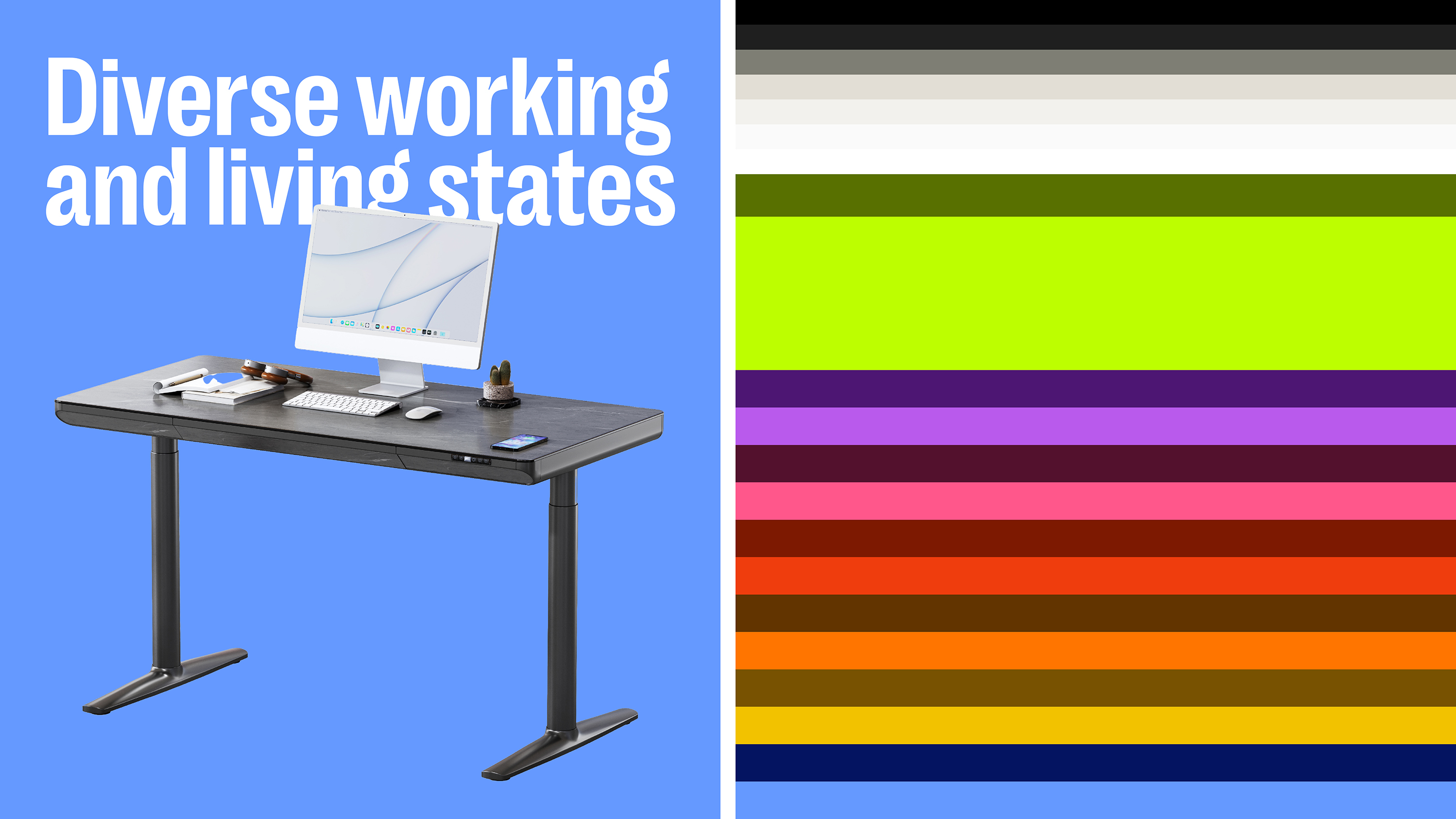
In the new brand positioning, Maidesite will no longer sell just a monotonous height-adjustable desk or table, but it will help users easily, conveniently, and effortlessly switch to different home activity modes that require desk support through its functionally integrated, adaptable to multiple scenarios, and personalized height-adjustable desk products. This enables people who love modern smart home living to more conveniently and freely immerse themselves in their diverse working and living states.
Amplify one simple concept
Focusing on a simple and direct concept of "high, low, rise and fall", we customized a modular logotype and a M symbol derived from the acronym for Maidesite, and further extended and amplify this concept to various touchpoints in visual applications: posters, ads, social media, prints, e-commerce platforms, websites, etc., closely combining "high, low, rise and fall" with diverse vitality and diverse emotions to touch the audience.
New positioning, new vibe
In the new brand positioning, Maidesite will no longer sell just a monotonous height-adjustable desk or table, but it will help users easily, conveniently, and effortlessly switch to different home activity modes that require desk support through its functionally integrated, adaptable to multiple scenarios, and personalized height-adjustable desk products. This enables people who love modern smart home living to more conveniently and freely immerse themselves in their diverse working and living states.Amplify one simple concept
Focusing on a simple and direct concept of "high, low, rise and fall", we customized a modular logotype and a M symbol derived from the acronym for Maidesite, and further extended and amplify this concept to various touchpoints in visual applications: posters, ads, social media, prints, e-commerce platforms, websites, etc., closely combining "high, low, rise and fall" with diverse vitality and diverse emotions to touch the audience.


触达多元场景
以模块化、高辨识度的英文字型标识为基础,我们为品牌打造了造型多样的动态标识家族。结合横向的版面模块划分与丰富的辅助色板,在横向分割、变化丰富的布局中,帮助品牌从支持不同使用场景的角度,通过桌面高度的变化来传递品牌愿景,并从视觉表达的角度,在视觉触点上呈现丰富的情感表达。
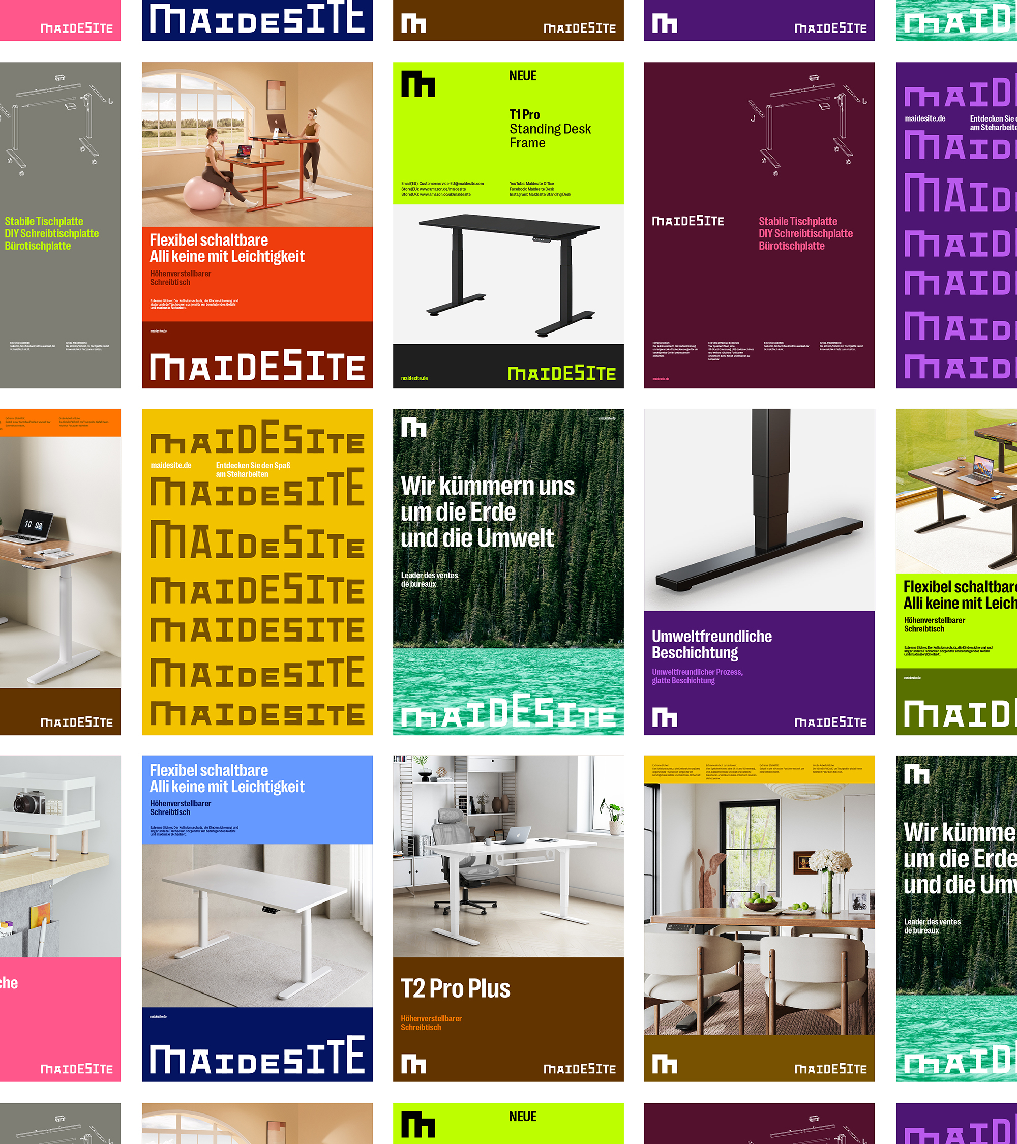
To reach diverse scenarios
Based on the customized modular and highly recognizable wordmark, Maidesite has a dynamic wordmark family with a variety of shapes. Combined with the horizontal grid system and colorful secondary color palette in the horizontally divided and varied layout, it helps the brand convey the story from the perspective of supporting different usage scenarios through the changes in the height of the desktop, and presents rich emotional expression in the visual touch points from the perspective of visual expression.


呈现更多信息的紧凑字型
在品牌标准应用字体的决策中,我们选取了来自 Pangram Pangram 的 Right Grotesk 系列中的两款字体:PP Right Grotesk 和 PP Right Grotesk Compact。尤其考虑到该品牌的主要销售市场在德国,而德语中相同含义的单词和语句通常比英语更长。因此,较窄的紧凑字体样式可以帮助品牌压缩版面中的水平空间,并呈现出醒目大胆的文字编排效果。
Compact typefac for comprehensive information
Among the brand standard fonts, we selected two fonts from Pangram Pangram's Right Grotesk family, PP Right Grotesk and PP Right Grotesk Compact. Especially considering that the brand's main sales market is in Germany, German words and sentences with the same meaning are usually longer than English. Therefore, the narrower compact typeface style can help the brand compress the horizontal space in layout and express loud and bold typography treatment.


将“高度可调”的视觉提示植入细节
“高度可调”作为整个品牌视觉叙事中始终需要强化和放大的核心,它是整个视觉识别系统中最需要遵循的原则。品牌 M 符号顶端高低错落的造型能够可响应式地应用于不同的版面布局和媒体之中,例如文本框、屏幕分隔线以及各种标签化应用等。
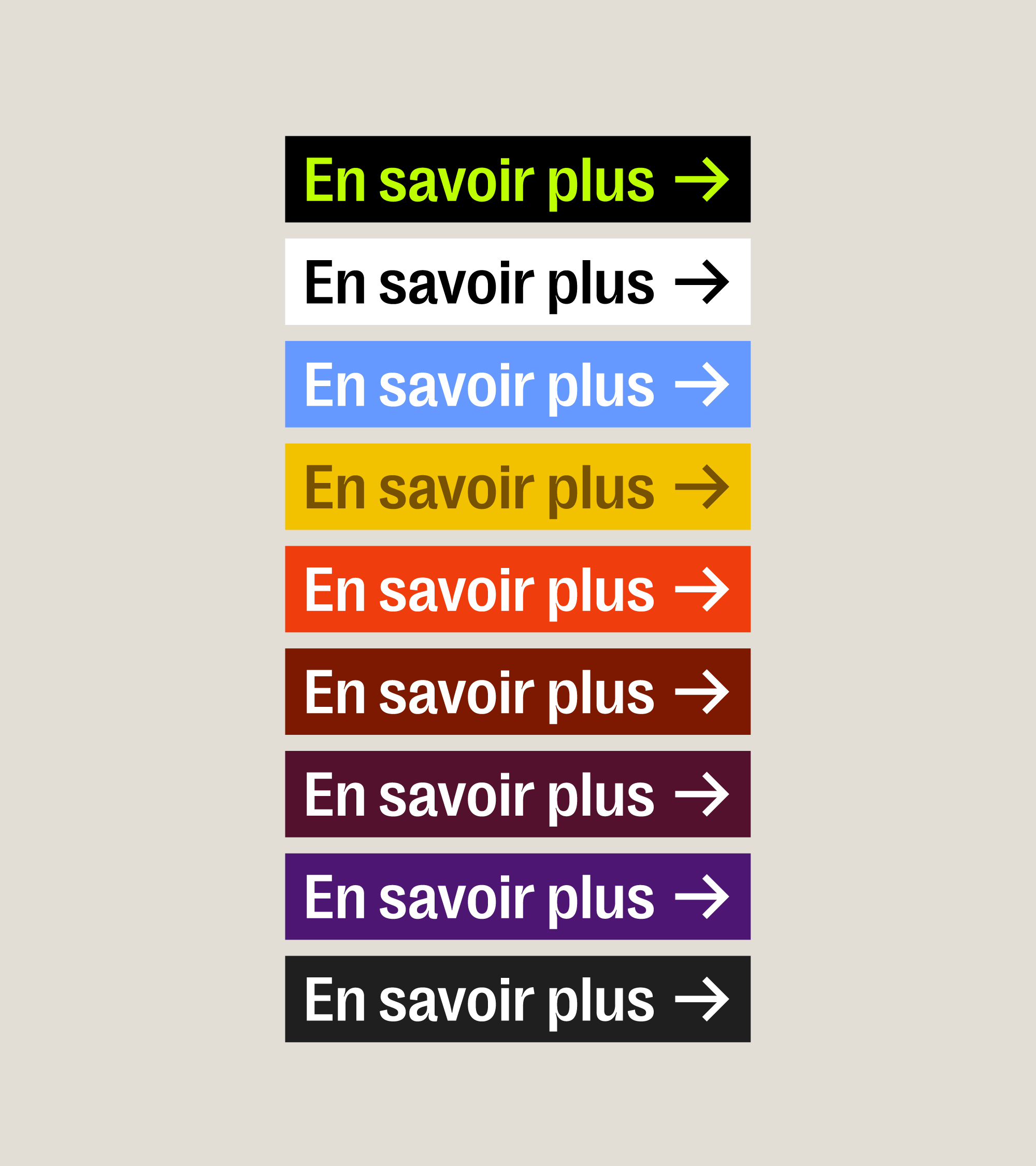
Implant the concept of "hight-adjustable" into details
The only concept that always strengthens and amplifies the brand's visual expression is "hight-adjustable", which is the most important principle in the entire visual identity system. Derived from the design of the brand's M symbol, this shape can also be used in different layouts and media in a responsive manner as a text box, screen divider, and various labels.


清晰明快的视觉元素
为了契合 Maidesite 简洁、大胆、现代的全新视觉形象,我们重新绘制了品牌所需的图标,重新定义了数据可视化的图表绘制规则以及其他辅助性的视觉元素,从而帮助品牌从内部运营到外部宣传,拥有统一有序的视觉品质。
Supporting visual elements in bold and clean Vibe
In line with Maidesite's new concise, bold and modern visual image, we also re-drew the required icons for the brand, redefined the chart drawing rules for data visualization and other auxiliary visual elements, so as to help Maidesite has a unified and orderly visual quality from internal operations to external publicity.


