度粒
DULi
行业类型:
餐饮
实践类型:视觉识别系统设计
视觉识别系统设计
编辑设计
摄影指导
环境图形设计
SECTOR:
Food & Drink
PRACTICE AREA:
Visual Identity System Design
Visual Identity System Design
Editorial Design
Photography Direction
Environmental Graphics
源自一个对植物性料理的美味不妥协的团队,DULi 度粒甄选川菜浓郁口味的精华,兼容世界各地菜肴的风味灵感,创作出独具魅力的亚洲融合菜。餐厅的理念是希望所有人都能够在度粒被素食打开新的味蕾体验,发现新的味觉惊喜,轻松体验到由精选的植物性食材带来的视觉与味觉丰富层次。
Pocca 在此次项目中与品牌方和室内设计团队紧密合作,完成了包括设计与概念策略、中英双语定制字型标识、视觉识别系统、环境视觉指导、摄影艺术指导、印刷制作监理在内的完整工作脉络。基于对整体用餐体验的考虑,为了不产生过度的视觉干扰,我们通过严谨克制的方式将餐厅兼容并蓄的东方气质与创意融合料理的特征呈现给热爱植物性料理新体验的食客,并最大化的将餐厅的故事交由「用餐」与「食物」本身去娓娓道来。
Born from a team that does not compromise on the deliciousness of plant-based cuisine, DULi selects the essence of the rich flavors of Sichuan cuisine and incorporates flavors inspired by dishes from around the world to create a unique Asian fusion cuisine. The concept of the restaurant is that everyone can be opened to new taste bud experiences and discover new taste surprises at DULi by vegetarian food, and easily experience the rich layers of visual and taste sensations brought by selected plant-based ingredients.
Pocca worked closely with the brand and the interior design team on this project, completing a complete line of work including concept strategy, bilingual customized logotype design, visual identity system, environmental visual direction, photography direction, and print production supervision. With the overall dining experience in mind, and in order not to create excessive visual distractions, we presented the restaurant's eclectic oriental flavor and creative fusion cuisine to diners who love new experiences in plant-based cuisine through a rigorous and restrained approach, and maximized the story of the restaurant to be told by “dining” and “food” itself.
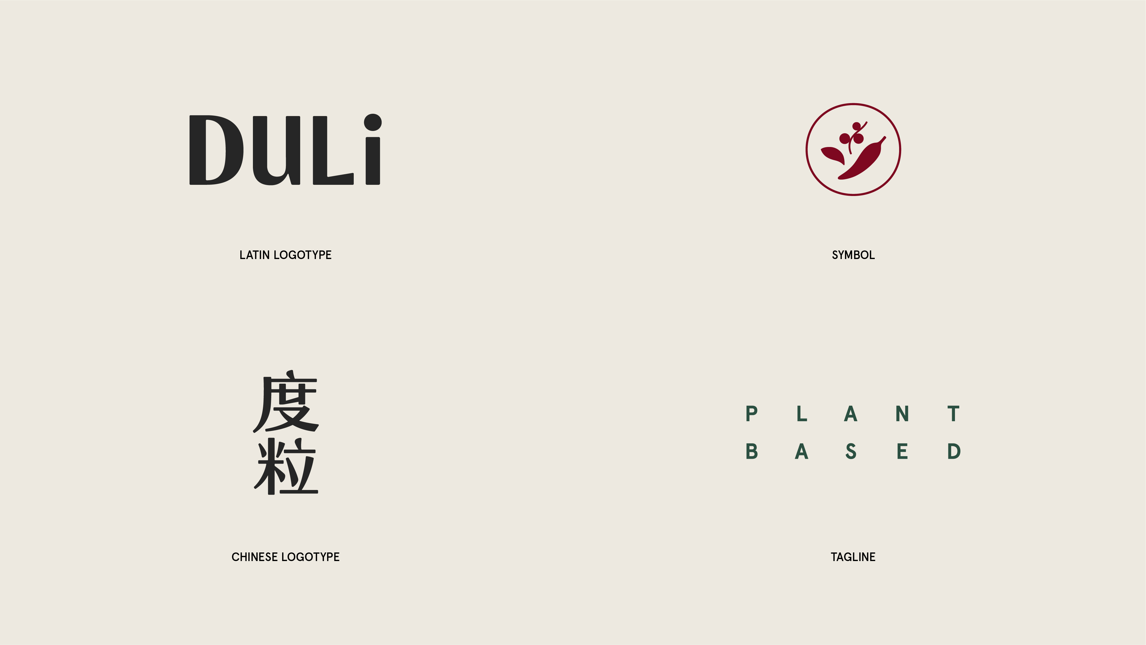
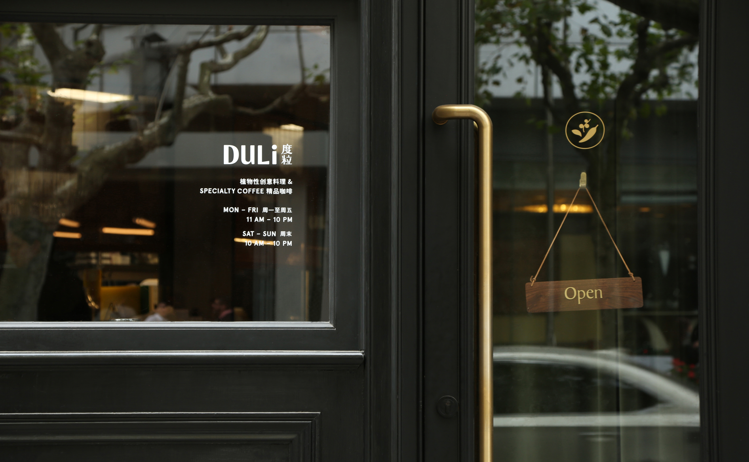
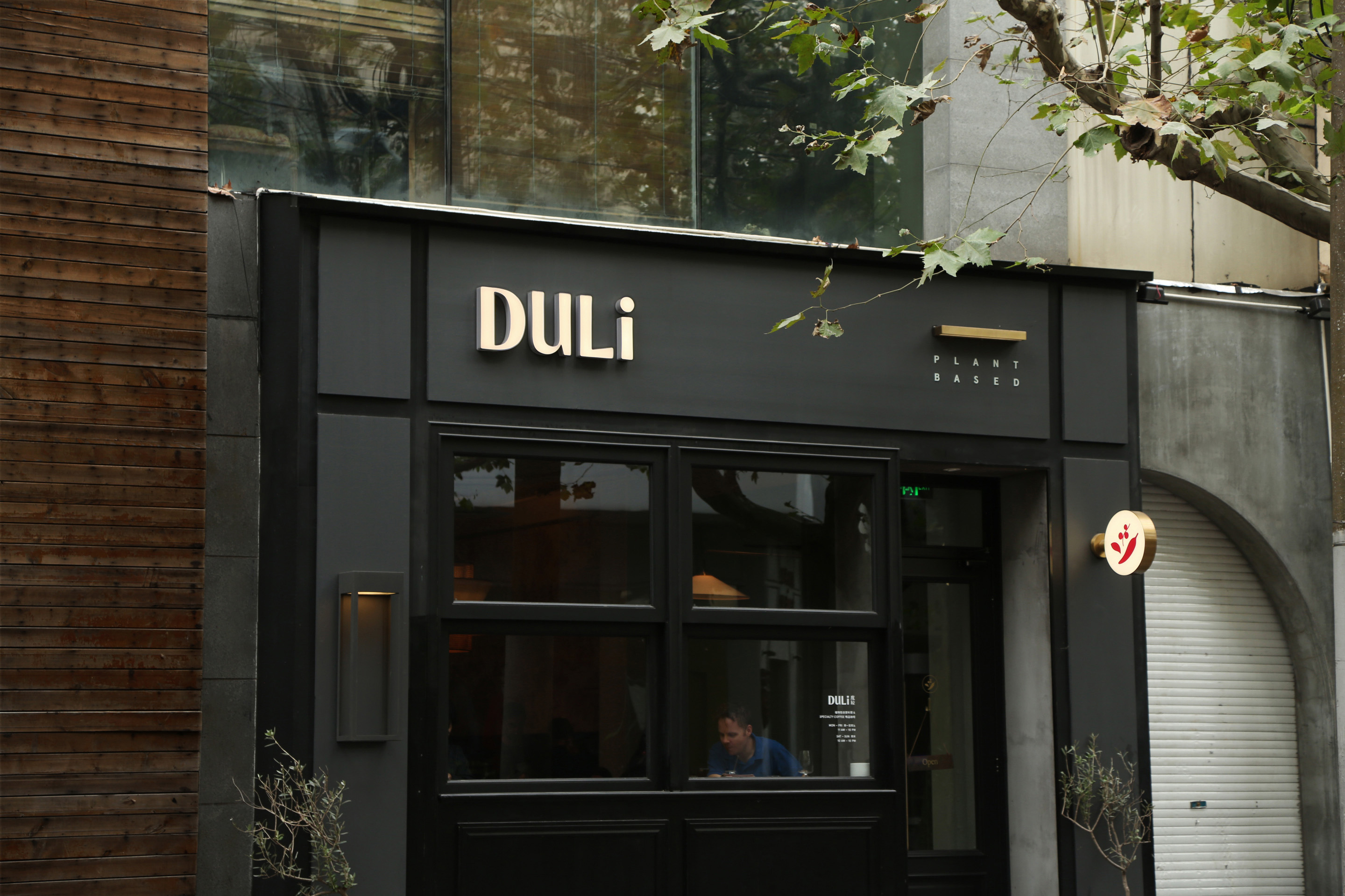
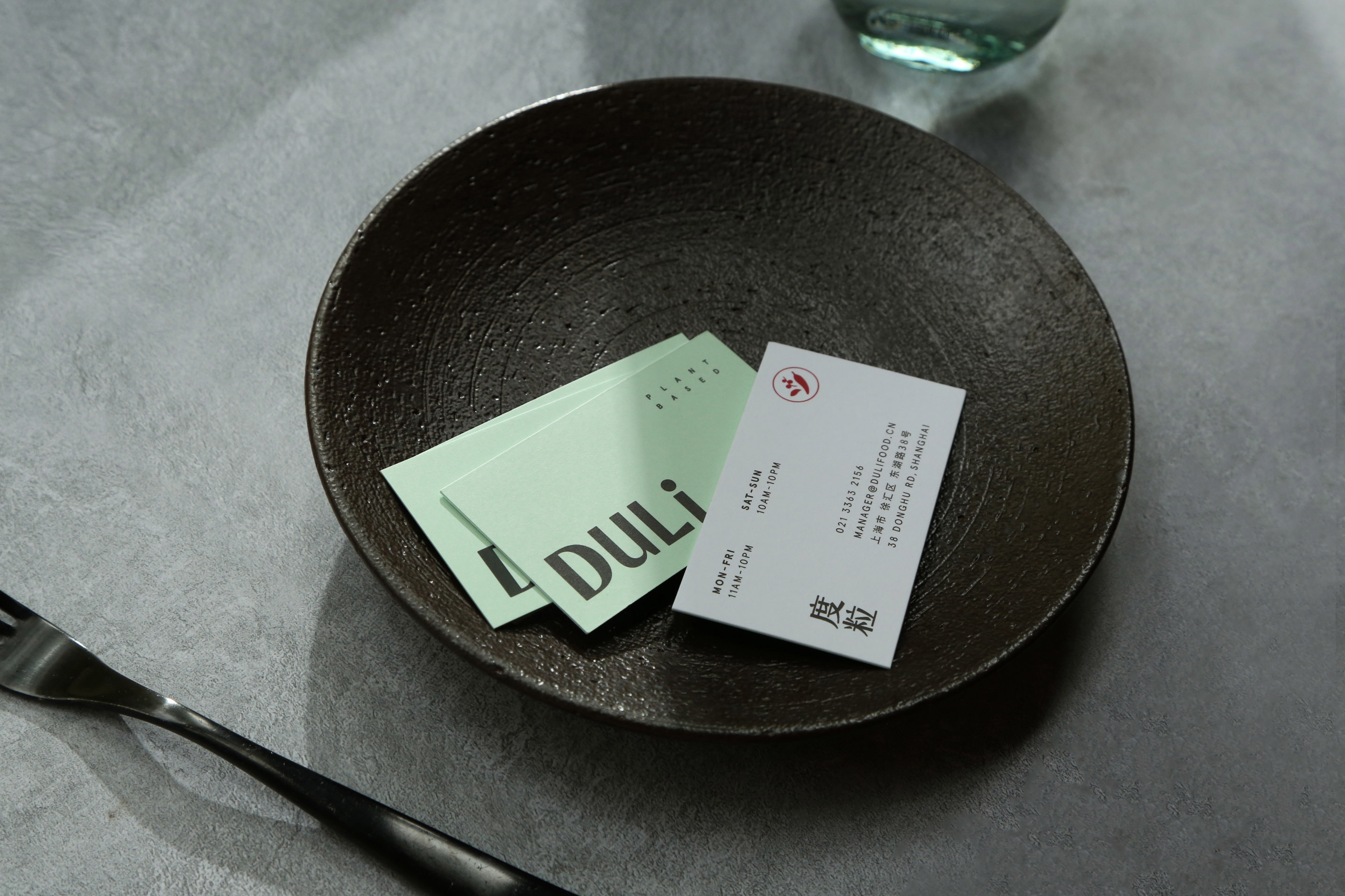
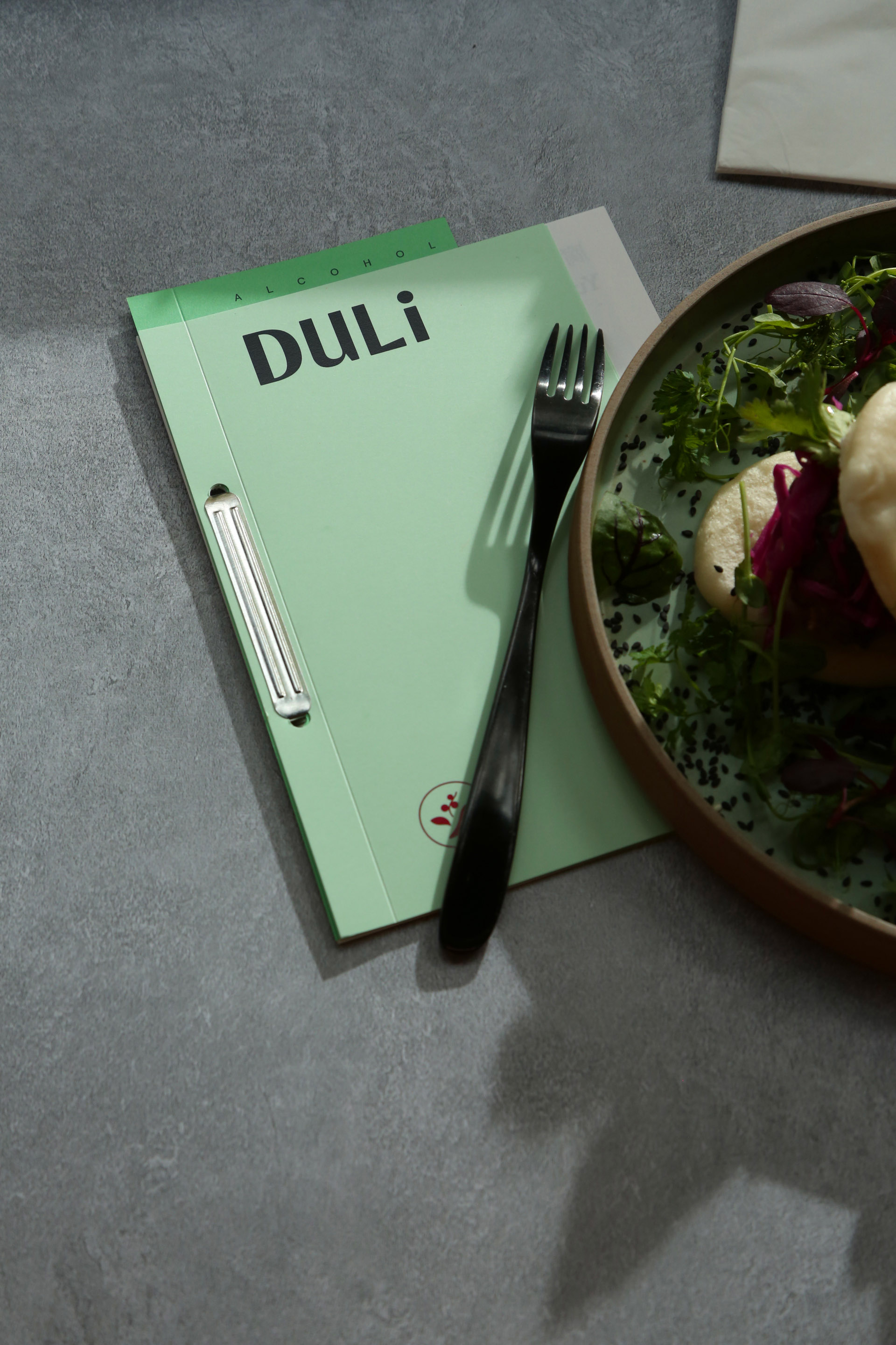
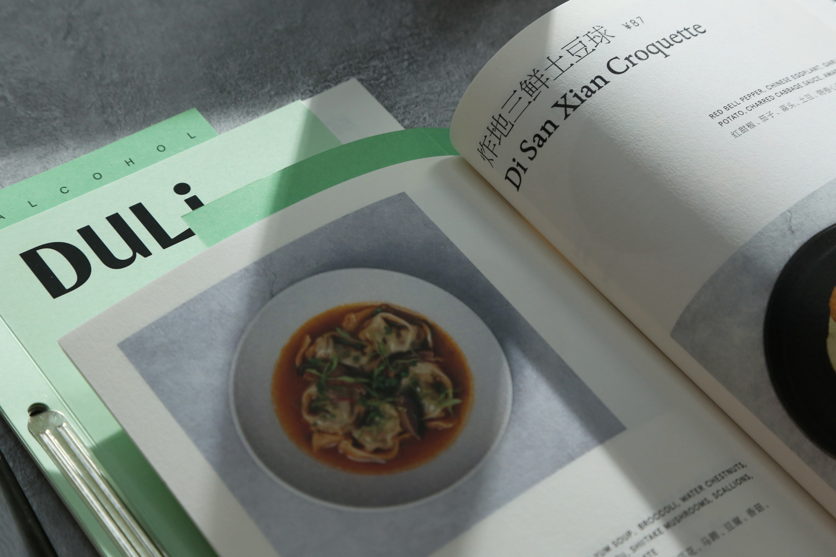
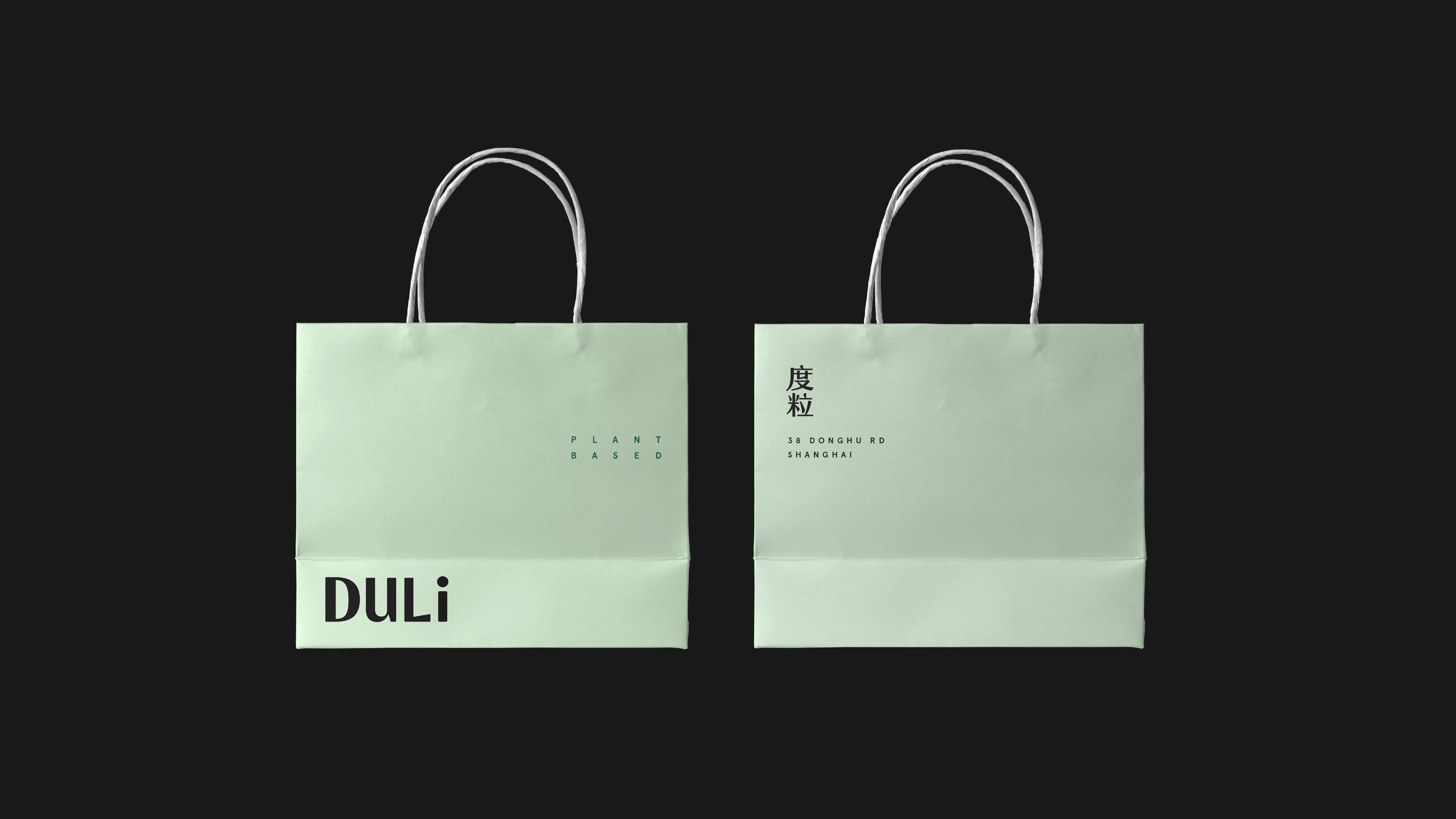
在概念研究的过程中,我们认为 Duli 这个名称本身即具有很强的记忆点与易传播的属性,既现代又有趣,且暗示了菜肴具有浓郁的口味。因此,我们通过定制的中英文字型强调这个名称,使其直接成为简洁有力的品牌核心标识。其次,Duli 作为一间东方特色的亚洲融合餐厅又拥有颇具东方的气息的室内设计,且希望自己具有随和又神秘的人格,为食客提供充满惊喜且精心烹饪的食物,被大家大家乐于谈论与传播。因此需要一个轻松简洁又风格化的形象,无论是在美学抑或功能性层面。这促使我们在字体标识之外又创建了一枚具有有机感的 icon 作为视觉识别的支持元素,来辅助传递「东方」与「植物性」的情绪,同时也通过这种有机又精巧的设计帮助品牌塑造精品餐厅的质感。
During the conceptual research process, we felt that the name DULi was memorable and easy to communicate, modern and fun, and suggested the strong flavors of the dishes. Therefore, we emphasized the name with customized Chinese and English typeface, making it a straightforward and powerful core brand identity. Secondly, DULi, as an Asian fusion restaurant with an oriental interior style, wanted to have an easy-going and mysterious personality, offering surprising and well-prepared food that everyone would enjoy talking about and spreading. This required a relaxed, simple and stylized image, both on an aesthetic and functional level. This led us to create an organic icon in addition to the logotype as a visual identity support element, to help convey the “oriental” and “botanical” mood, and to help the brand create the quality of a boutique restaurant through this organic and subtle design.

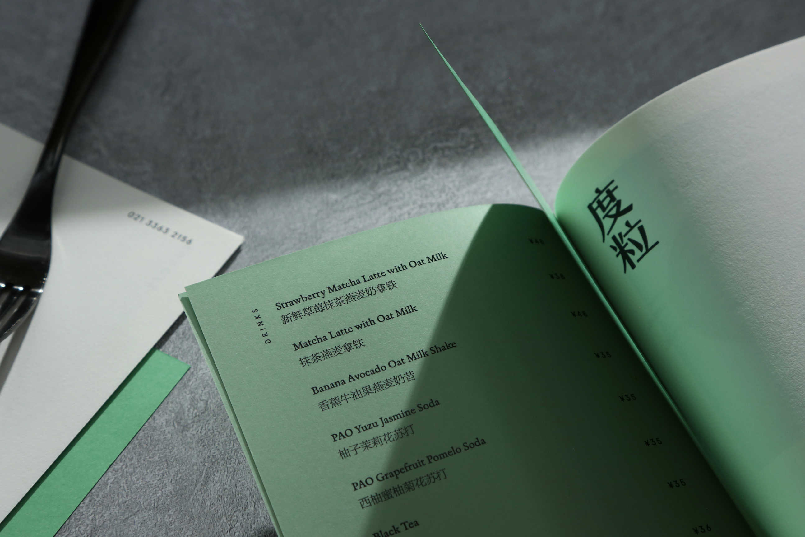
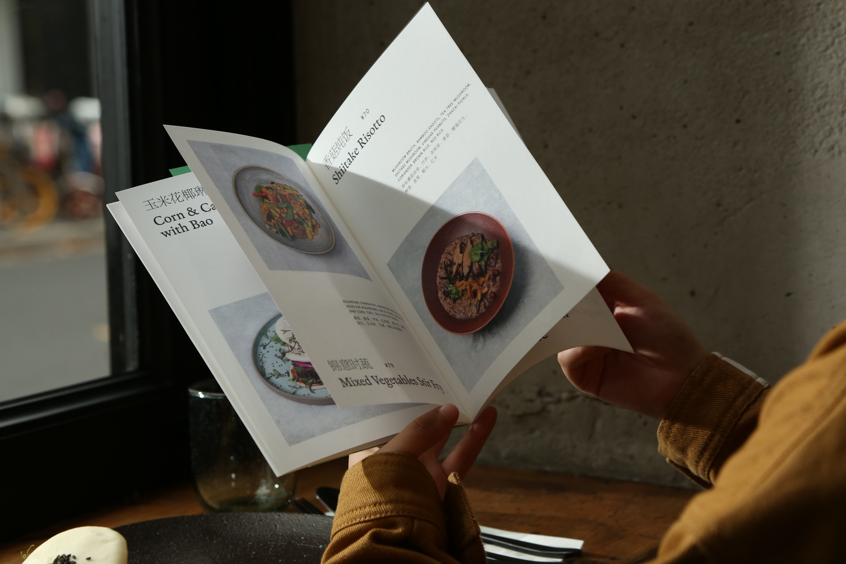
DULi 对菜品的设定是在同一时间并不会有很多菜品选择,而是会定期更新和替换不同的应季单品。因此,在菜品的摄影部分,我们选择使用的俯视的视角完整的呈现菜品的样貌,并在活页菜单中大尺幅的呈现照片,且每页仅呈现一道菜品。以此,让阅读菜单成为一种如同翻阅生活杂志或旅游杂志般的体验。
DULi's approach to the menu is not to have a large selection of dishes at the same time, but to regularly update and replace different seasonal items. Therefore, for the photography part of the menu, we chose to use a top view to present the complete appearance of the dishes together with their containers and textured background, and present the photos in a large format in the flip-chart menu, with only one dish per page. In this way, reading the menu becomes an experience like flipping through a lifetyle magazine or a travel magazine.

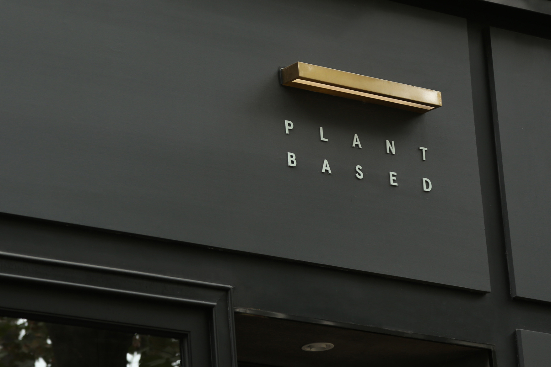
在餐厅门头的设计中,除了白色的灯箱面板之外,我们选择使用黄铜色金属材质来延续空间设计中的棕色和木质调的材料语言。标识灯箱的灯光被特别调整为稍暗的明度,以让整个感受更显柔和。门头右上角的餐厅口号「PLANT BASED」也选用了与视觉系统相契合的浅浅的薄荷绿颜色来避免过于无性格的纯白色。
In addition to the white light box panel, we chose to use brass metal to continue the brown and wood tone material language in the design of the restaurant facade. The lighting of the signage box was specifically adjusted to a slightly dimmer brightness to soften the overall feeling. The slogan “PLANT BASED” in the upper right corner of the facade was also chosen in a light mint green color to match the visual system and to avoid the characterless white.