诗歌之城
City of Poetry
行业类型:
文化艺术
实践类型:活动视觉形象设计
活动视觉形象设计
海报设计
SECTOR:
Arts & Culture
PRACTICE AREA:
Event Visual Identity Design
Event Visual Identity Design
Poster Design

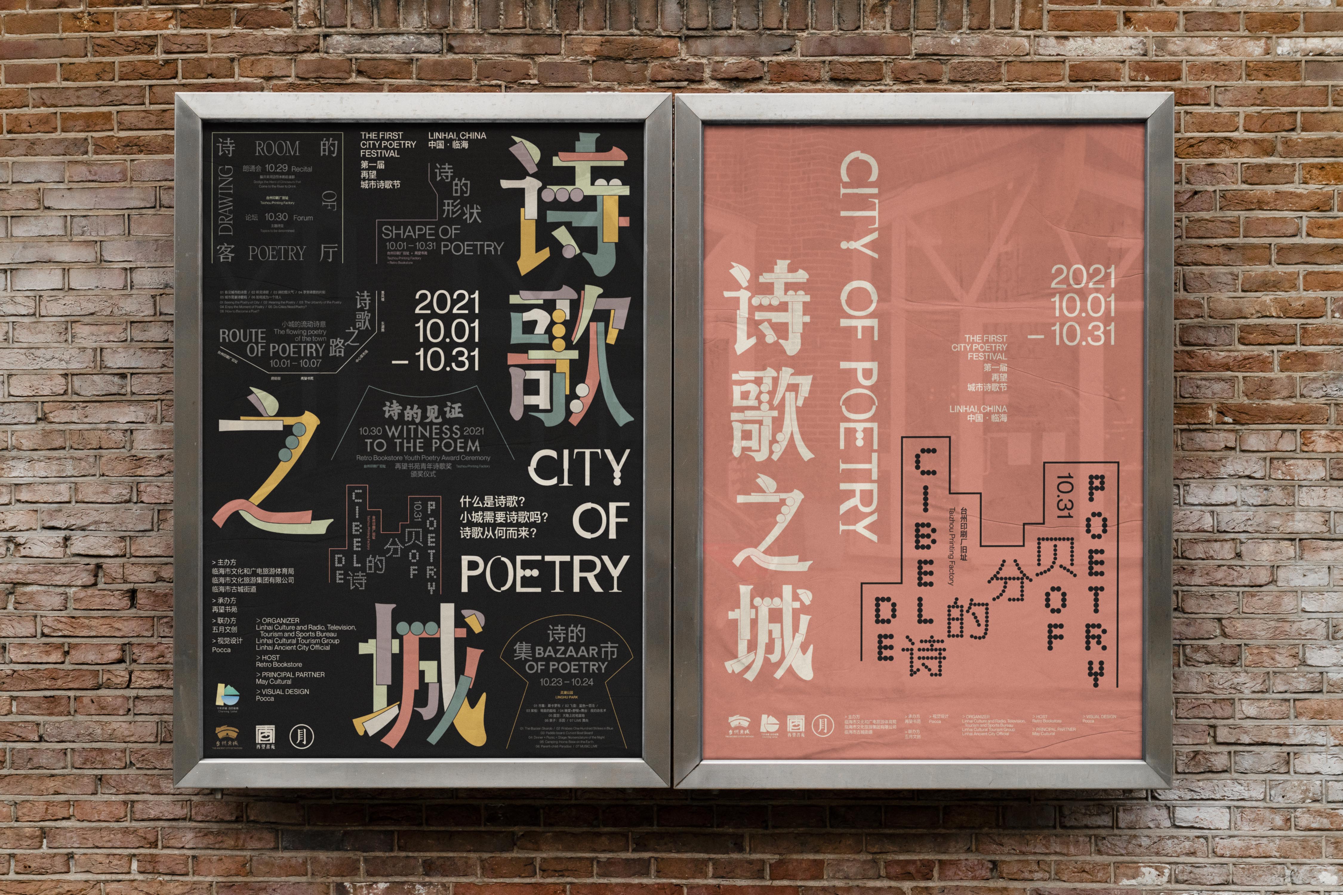
「诗歌之城——第一届再望城市诗歌节」是在浙江临海举办的首个以诗歌为主题为期一个月的城市艺术生活节。关于这次活动的主题与深意,策展团队在对活动的介绍中提到:「讳莫如深的圆湖、六角形的广场、巨蛇般的城墙,还有被光阴洗涤的建筑,构成了这座看不见的城市。但这些庞然巨物的存在只是为了掩盖它动人的细节。那环形城墙上的每一块砖上都刻着谶语一般的诗句,只有朝露和台风中的雨水能使它们呈现……这些诗句就是这座城市的掌纹。」
在此次项目中,Pocca 受活动主办方的邀请为此次活动的推广设计了整体的视觉形象、系列海报、活动现场物料及衍生品的创作。
“City of Poetry - The 1st City Poetry Festival” is the first month-long poetry-themed urban art and lifestyle festival held in Linhai, Zhejiang Province. Regarding the theme and deep meaning of the event, the curatorial team mentioned in the introduction of the event: “The secretive round lake, the hexagonal square, the giant snake-like walls, and the buildings washed by the time, constitute this invisible city. But these behemoths exist only to conceal its moving details. Each brick of that circular wall is inscribed with prophetic verses, and only the morning dew and the rain in typhoons can make them appear ...... These verses are the palimpsest of the city.”
In this project, Pocca was invited by the event organizer to design the overall visual identity, series of posters, event site materials and derivatives for the promotion of the event.
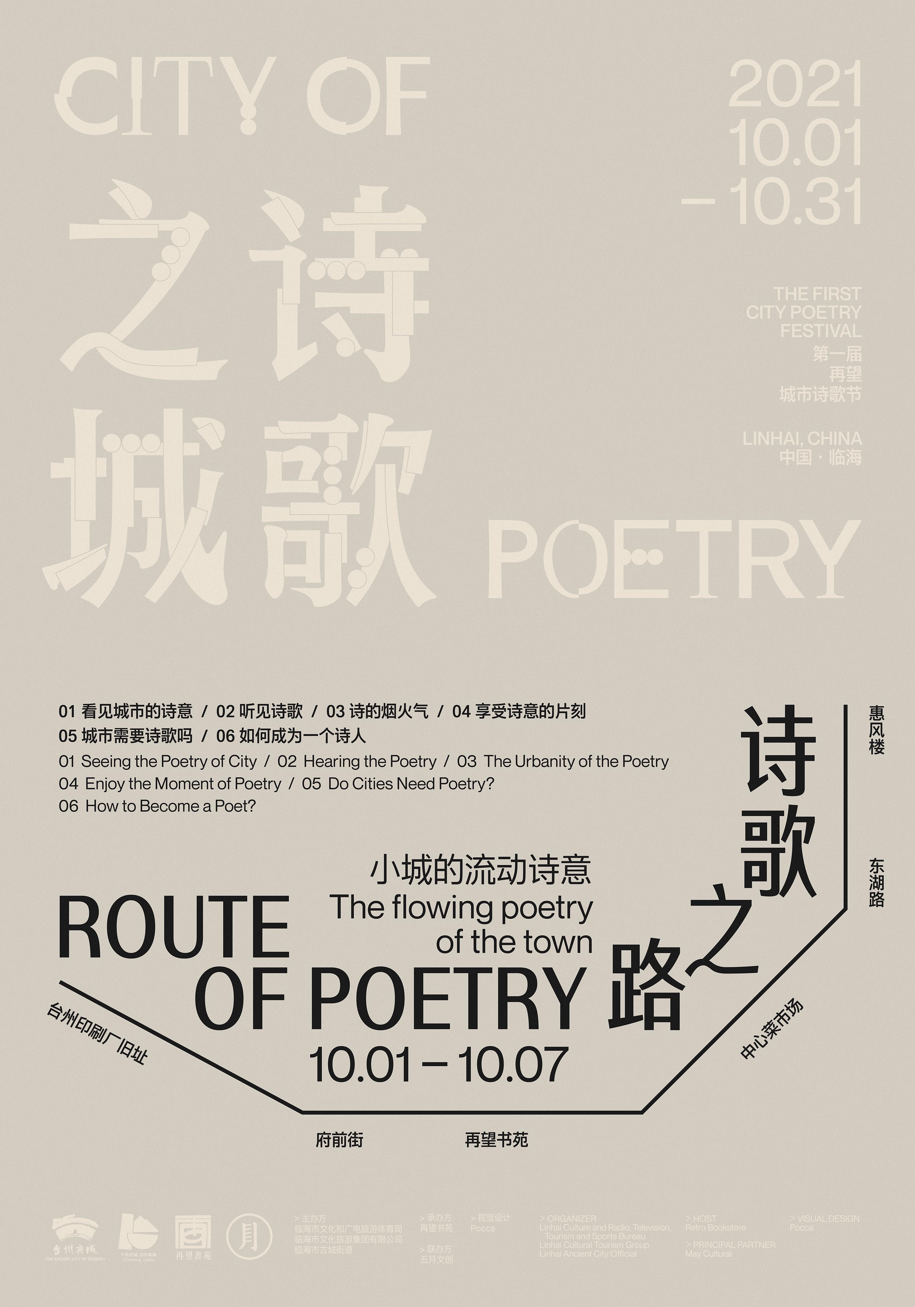
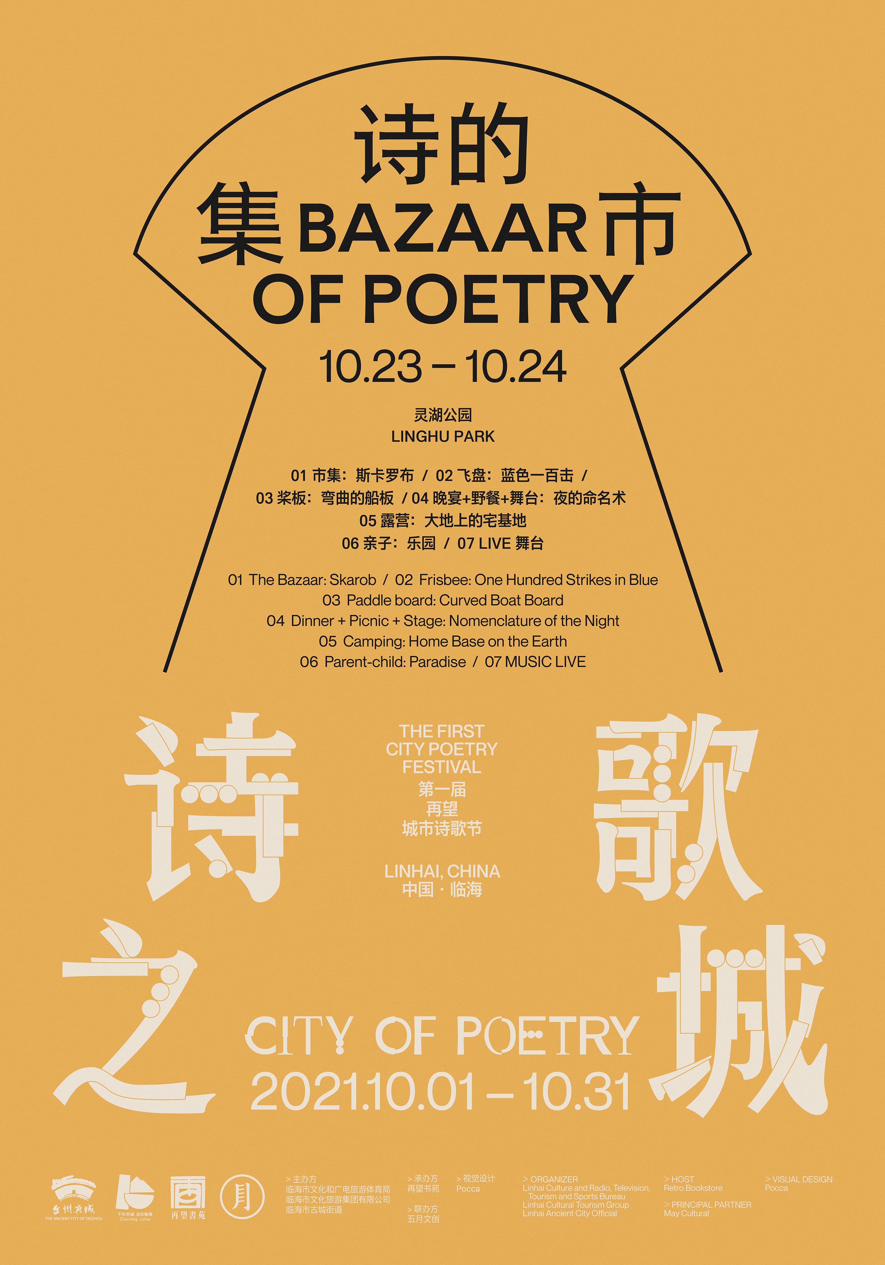
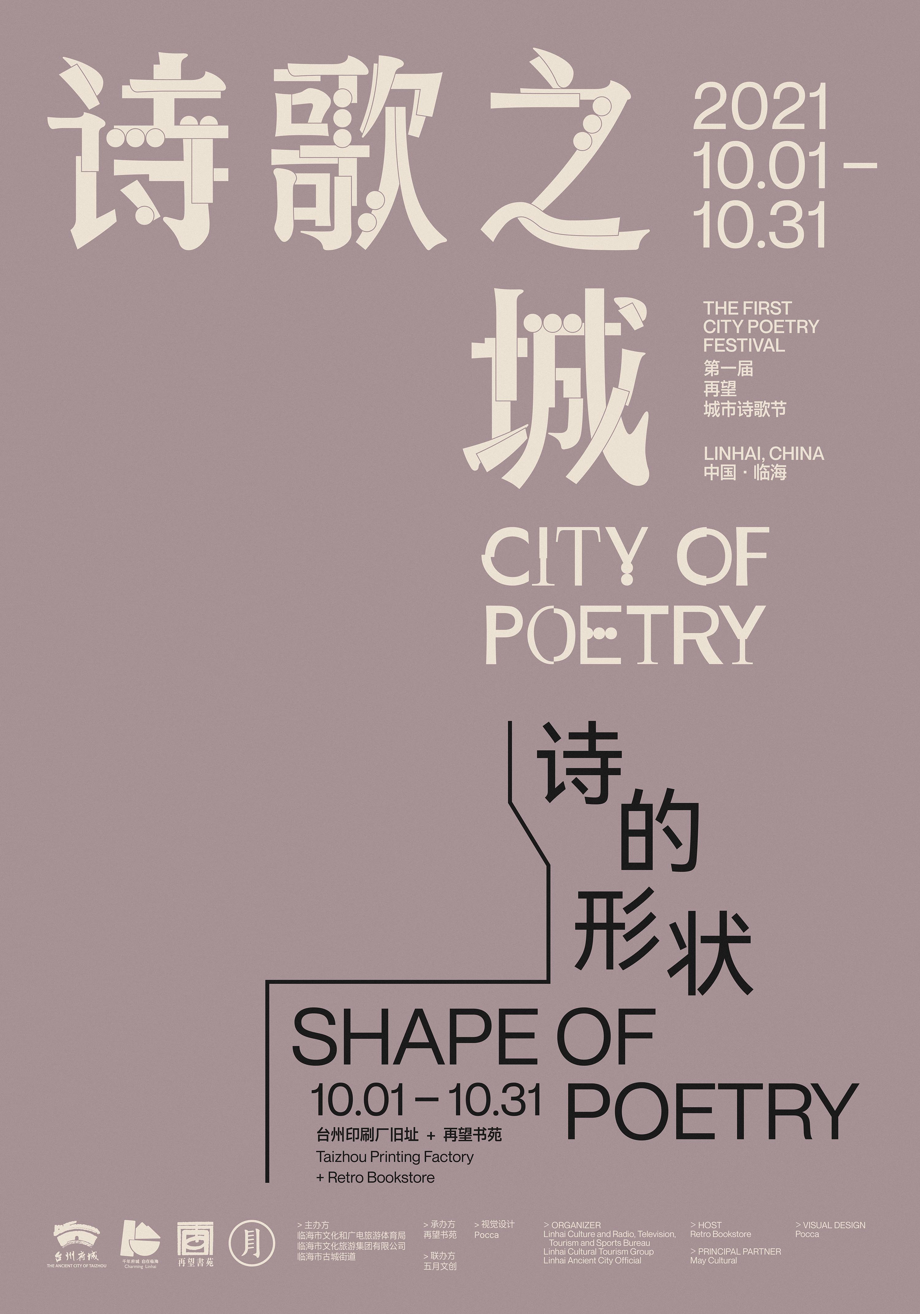
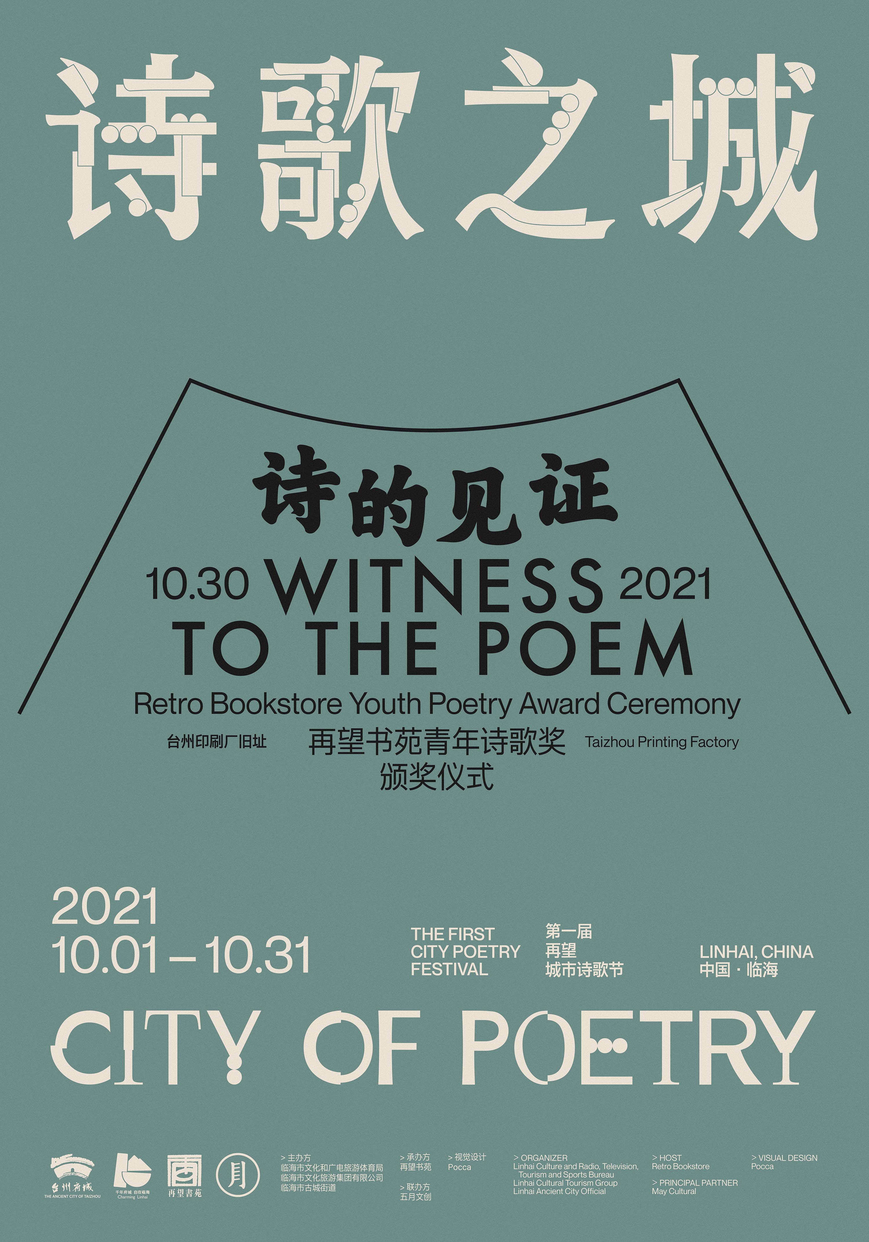
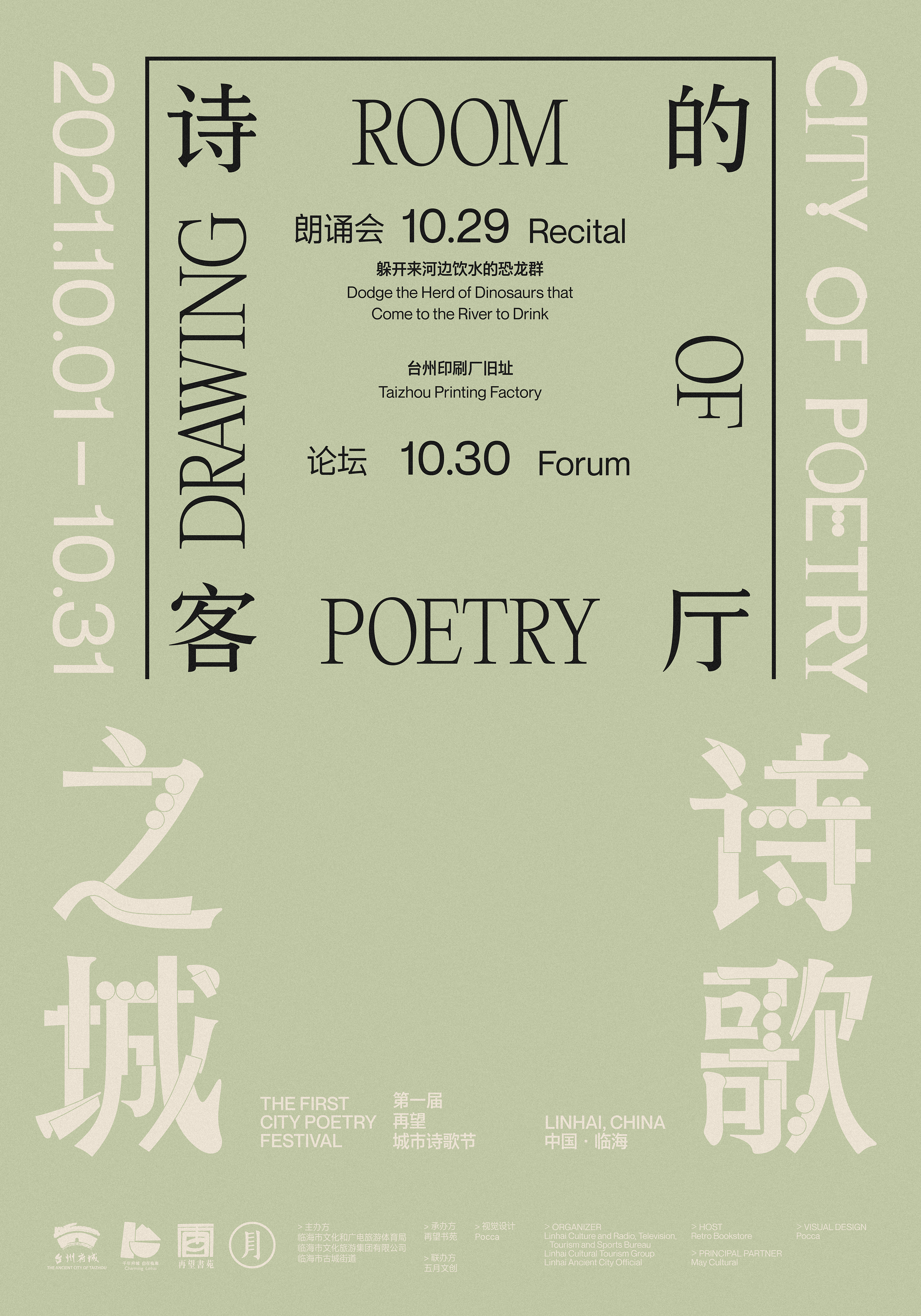
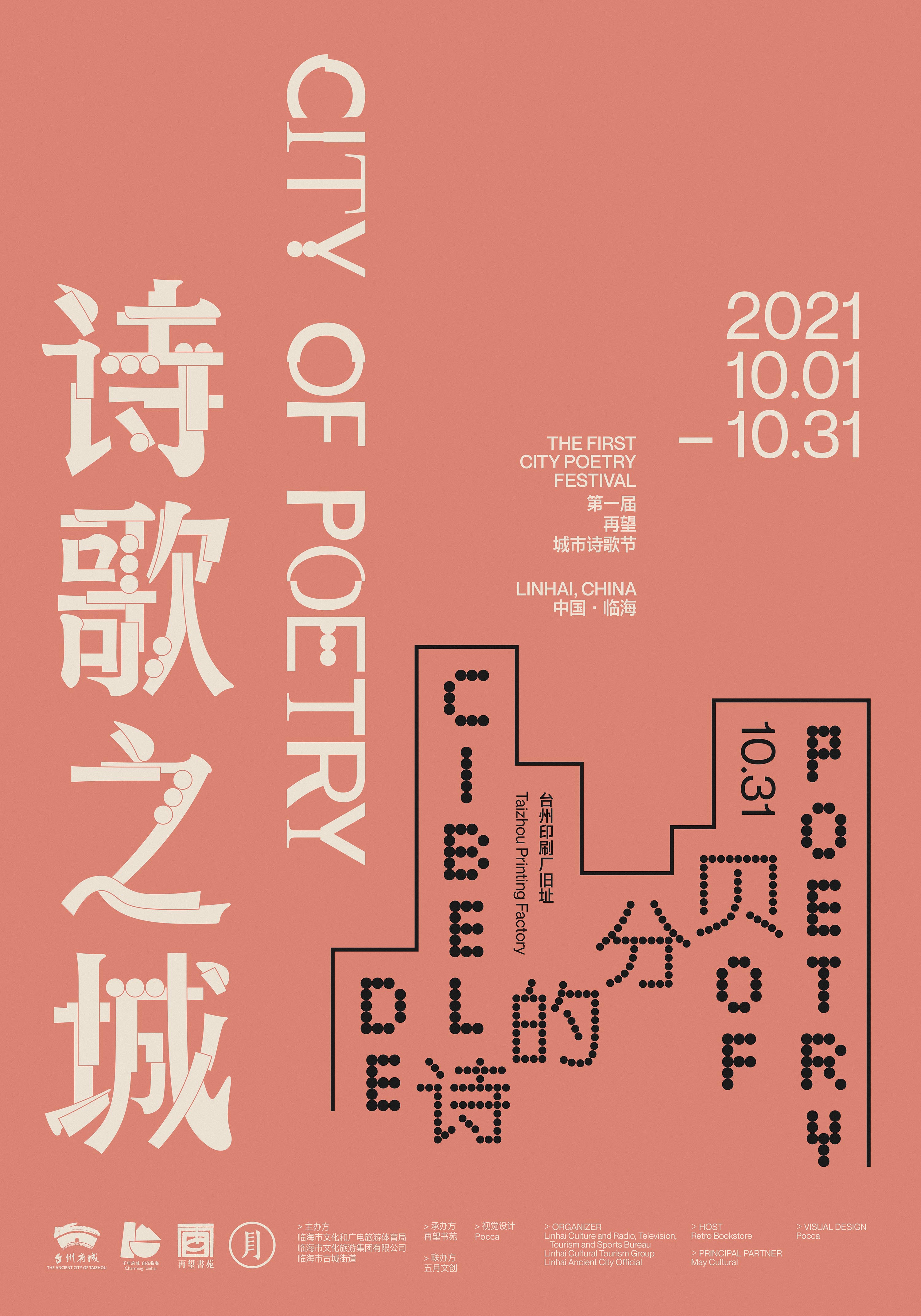
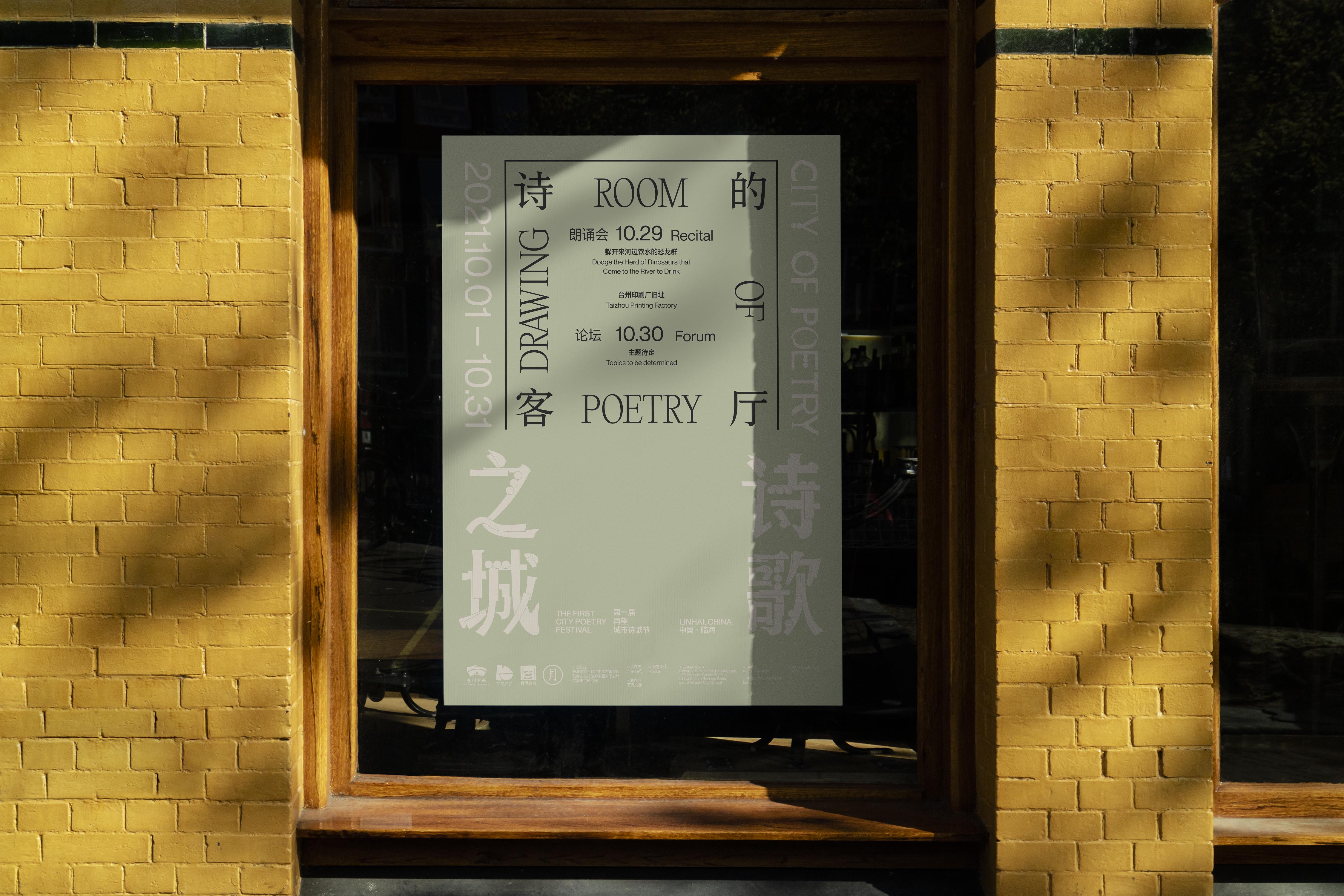
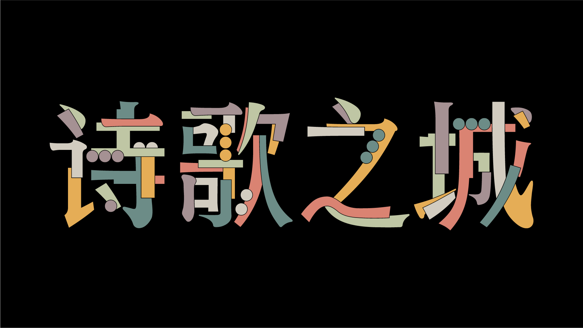
在视觉概念上,我们延续活动策展方最初提出的来源于卡尔维诺《看不见的城市》的概念初衷,尝试通过「文字性」与「符号化」的视觉肌理将整个活动的信息转化成一种在「字」与「符」中穿梭游走的节奏与谜面。有别于通常先整体后局部的创作顺序,这次的设计则是先从一个个的局部开始,而后演变成为一个有机的整体。在主海报中可以看到,我们为 6 个子活动挑选了 6 种不同的中英文字体并应用活动标题上。而每个子活动版面的几何造型一方面取决于文字信息的多少,另一方面来源于我们对活动内容和主题的解读。随后,我们将 6 个子活动的 6 种不同的中英文字体的笔画拆解,重组为此次活动的主标题「诗歌之城 City of Poetry」的字型。让最终得到的结果,无论是活动标题的字型还是完整的海报,也从一种视角反映了城市在不同维度作用下而发展出的有机的、穿插的、交融的结构状态,以及在处处充满故事的模样。
In terms of the visual concept, we continued the original concept proposed by the event curator, which was derived from Calvino's “Invisible Cities”, and tried to transform the whole event's message into a rhythm and riddle of “words” and “symbols” through the visual texture of “textuality” and “symbolization”. Unlike the usual order of creating the whole first and then the parts, this time the design starts from each single part first and then evolves into an organic whole. In the main poster, we chose 6 different typefaces for the 6 sub-activities and applied them to the titles. The geometry of each information layout of sub-event is depends on the amount of textual information on the one hand, and our interpretation of the content and theme of the information on the other. We then deconstructed the strokes of the 6 different typefaces for the 6 sub-events and reorganized them into the typeface for the main bilingual title of the event. The final result, both the typefaces of the event and the complete poster, reflects the organic, intertwined and intermingled structure of the city in different dimensions, and is full of stories everywhere.