啊特杰尼斯
ArtJanus
行业类型:文化艺术
文化艺术
专业服务
实践类型:
视觉识别
SECTOR:Arts & Culture
Arts & Culture
Professional Services
PRACTICE AREA:
Visual Identity
ArtJanus 啊特杰尼斯是一间为商业品牌提供基于艺术创意、艺术视角、艺术资源的整合传播服务的专业机构,其实践主要包括展览与艺术活动策划、品牌与艺术跨界合作。与此同时,也为艺术家、设计师提供专业的商业跨界合作经纪服务与顾问工作。
ArtJanus is a Shanghai-based professional practice which provides integrated services for bridging brands and artists. Based on artistic creativity, artistic perspective and art resources, they provide Exhibition and Art Event Planning, Cross-border Cooperation for Brands and Artists, and professional commercial cross-border cooperation services for artists and designers.
ArtJanus is a Shanghai-based professional practice which provides integrated services for bridging brands and artists. Based on artistic creativity, artistic perspective and art resources, they provide Exhibition and Art Event Planning, Cross-border Cooperation for Brands and Artists, and professional commercial cross-border cooperation services for artists and designers.

从品牌的自述中,我们了解到品牌名称中的 Janus 一方面源自古希腊神话中的时间之神(他拥有两面,一面白日,一面黑夜;一面追寻过往,一面探知未来),另一方面源自对日本知名经纪公司“杰尼斯”(曾为日本的 70年代创造出许许多多赤手可热的偶像,并影响了亚洲经纪与偶像运营的模式)的致敬。ArtJanus 作为一间全新的专业机构,希望艺术家与创意人不止在表述当下,更是能够以艺术与设计史为积淀,为畅想未来而创作。
From the brand's story, we know that ‘Janus’ in the brand name is derived from the god of time in ancient Greek mythology (he has two sides, one is for daytime and the other is for night; one pursues the past and the other side explores the future); on the other hand, it is a tribute to the well-known Japanese brokerage company ‘Janus’ (who created many bare-handed idols for Japan in the 1970s and influenced the Asian brokerage and idol operation model). As a brand-new professional agency, ArtJanus hopes that artists and creative people not only express the present, but also create for imagining the future based on the accumulation of art and design history.

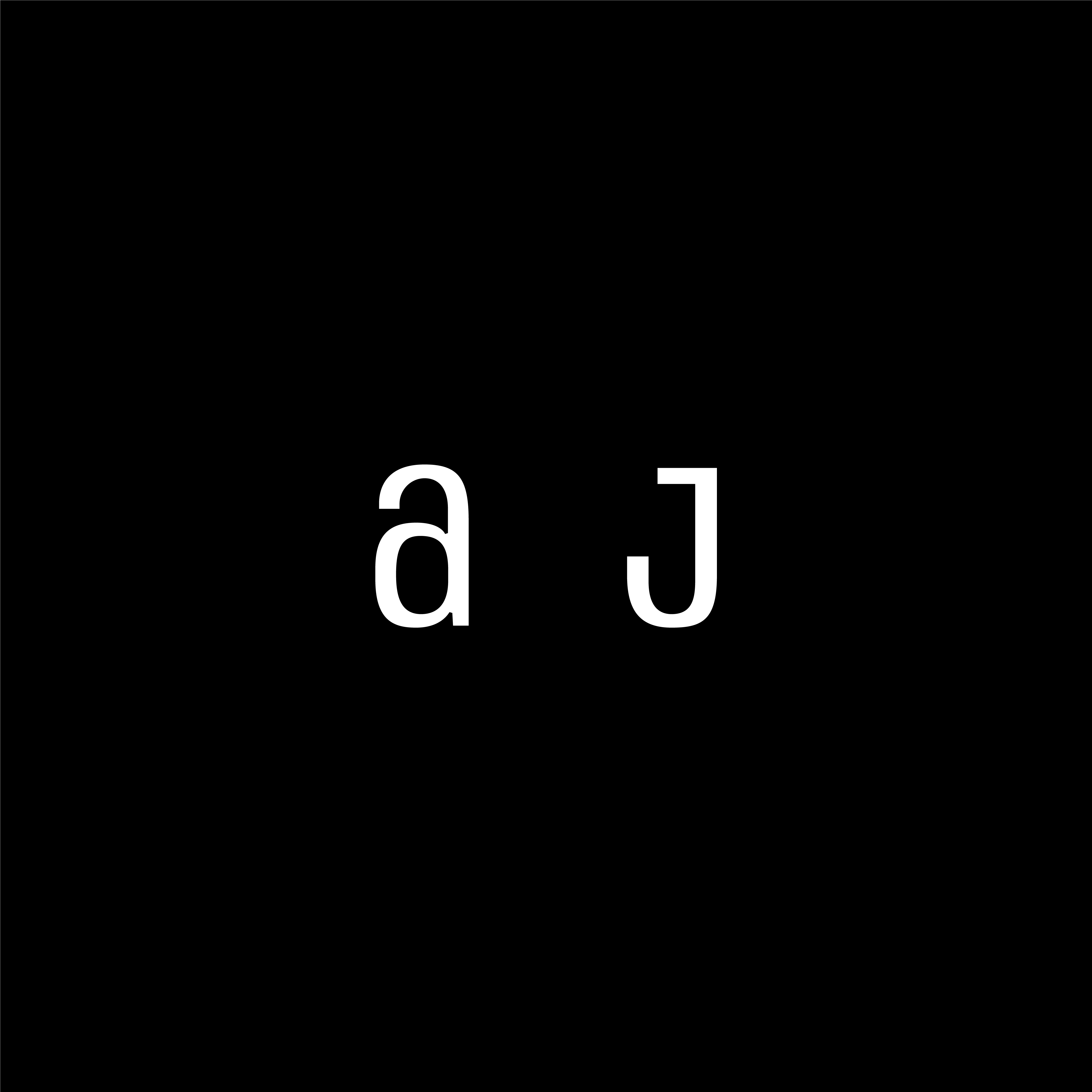
Pocca 被 ArtJanus 委托为其设计视觉识别,帮助其在竞争激烈的艺术行业中呈现一种崭新且独特的面貌。基于品牌对自己的解读,我们为 ArtJanus 定制了英文与中文字体标识。在英文字体标识中,我们通过混合大小写字母的方式和升高的字型去呈现一种先锋、时尚、多面混合、古今相融、逐向未来的态度,并通过细节处的调整将中英文字型进行视觉气质上的统一,强化具有定制化品质的专业实践。
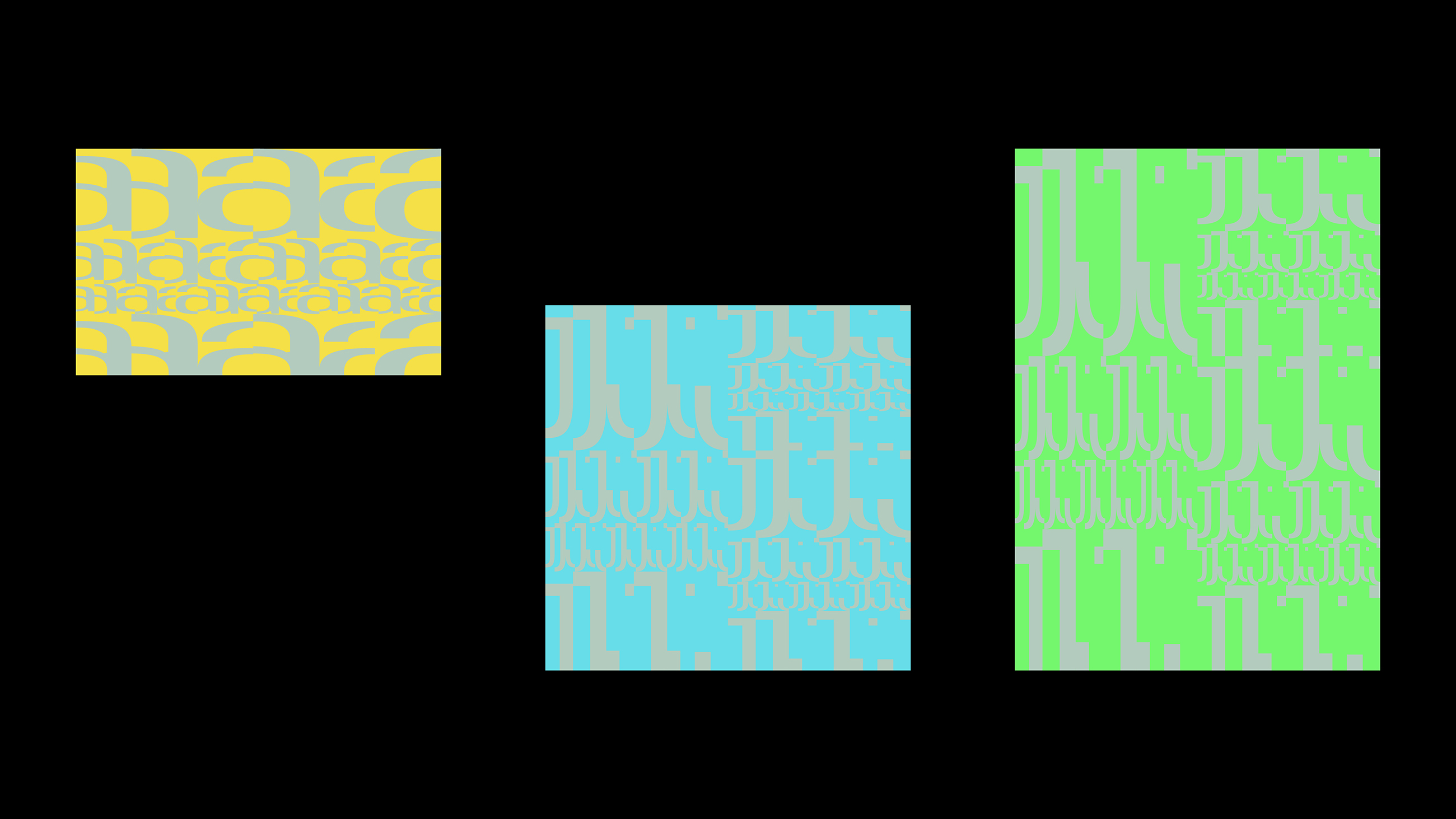
而作为一个以标识为核心的视觉识别系统,品牌的沟通的过程在短期内并不需要丰富的延伸材料。 因此,除了定制的字体标识外,我们将标识中的字型裁剪、打散、重组为四种不同颜色的可以自由拉伸并拼接的不同密度的抽象图案,烘托出品牌气质,也增添了趣味性,同时也满足了 ArtJanus 在成长初期能够轻松的自由创建各种所需的视觉内容的需求。
而作为一个以标识为核心的视觉识别系统,品牌的沟通的过程在短期内并不需要丰富的延伸材料。 因此,除了定制的字体标识外,我们将标识中的字型裁剪、打散、重组为四种不同颜色的可以自由拉伸并拼接的不同密度的抽象图案,烘托出品牌气质,也增添了趣味性,同时也满足了 ArtJanus 在成长初期能够轻松的自由创建各种所需的视觉内容的需求。
Pocca is commissioned to generate a core visual identity for ArtJanus to officially start their business during their existing projects and collaborations. We have carefully customized the English and Chinese wordmarks for the brand. We applied a method of mixing uppercase and lowercase letters and elevated typeface in the English wordmark to present a pioneering and fashionable attitude, and unified the typefaces of Chinese and English in the details, emphasizing professional services sense of quality.
As a visual identity system with logo as the core, the process of brand communication does not need rich extension materials in the short term. Therefore, in addition to the customized logotype, we cut, scattered, and reorganized the letterforms in the logotype into abstract patterns of different densities in four different colors that can be stretched and spliced freely, which highlights the brand vibe and adds interest. It also meets the needs of ArtJanus to be able to easily and freely create various required visual content in the early stages of growth.
As a visual identity system with logo as the core, the process of brand communication does not need rich extension materials in the short term. Therefore, in addition to the customized logotype, we cut, scattered, and reorganized the letterforms in the logotype into abstract patterns of different densities in four different colors that can be stretched and spliced freely, which highlights the brand vibe and adds interest. It also meets the needs of ArtJanus to be able to easily and freely create various required visual content in the early stages of growth.